

Bootstrap must learn grid system (layout) every day_javascript skills

1. Grid system (layout)
Bootstrap has a built-in responsive, mobile-first fluid grid system. As the screen device or viewport size increases, the system will automatically be divided into up to 12 columns.
I call the grid system in Bootstrap a layout here. It creates a page layout through a series of combinations of rows and columns, and then your content can be placed into the layout you created. Here is a brief introduction to the working principle of the Bootstrap grid system:
The implementation principle of the grid system is very simple, just by defining the container size, dividing it into 12 equal parts (there are also 24 or 32 equal parts, but 12 parts is the most common), then adjusting the inner and outer margins, and finally combining the media Query to create a powerful responsive grid system. The grid system in the Bootstrap framework divides the container into 12 equal parts.
When using it, you can recompile the LESS (or Sass) source code to modify the value of 12 according to the actual situation (that is, change it to 24 or 32. Of course, you can also divide it into more, but it is not recommended to use it this way).
2. Rules of use
Bootstrap comes with a set of responsive, mobile-friendly features built into it.
1. The data row (.row) must be contained in the container (.container) in order to give it appropriate alignment and padding. Such as:
<div class="container">
 <div class="row"></div>
</div>
2. Columns (.column) can be added to rows (.row), but the sum of the number of columns cannot exceed the total number of equally divided columns, such as 12. Such as:
<div class="container">
<div class="row">
 <div class="col-md-4"></div>
 <div class="col-md-8"></div>
3. The specific content should be placed within the column container (column), and only the column (column) can be used as a direct child element of the row container (.row)
4. Create spacing between columns by setting padding. Then offset the effect of padding by setting negative margins for the first and last columns
In order to better understand how the grid system of the Bootstrap framework works, let’s take a look at a sketch:

A brief explanation of the picture:
1. The outermost border has a large white area, which is equivalent to the visible area of the browser. There is a responsive effect in the grid system of the Bootstrap framework, which comes with four types of browsers (extra small screen, small screen, medium screen and large screen). Its breakpoints (pixel dividing points) are 768px, 992px and 1220px.
2. The second border (1) is equivalent to the container (.container). For different browser resolutions, the widths are different: automatic, 750px, 970px and 1170px. Set in lines 736 to 756 of bootstrap.css:
.container {
 padding-right: 15px;
 padding-left: 15px;
 margin-right: auto;
 margin-left: auto;
 @media (min-width: 768px) {
 .container {
 width: 750px;
 }
 @media (min-width: 992px) {
 .container {
 width: 970px;
 }
 @media (min-width: 1200px) {
 .container {
 width: 1170px;
 }
The horizontal bars No. 3 and 2 illustrate that the row (.row) of the container is divided into 12 equal parts, that is, columns. Each column has a "padding-left:15px" (pink part in the picture) and a "padding-right:15px" (purple part in the picture). This also causes the padding-left of the first column and the padding-right of the last column to occupy 30px of the total width, making the page unsightly. Of course, if you need to leave a certain spacing, this approach is good. As shown in lines 767~772 in bootstrap.css:
.col-xs-1, .col-sm-1, .col-md-1, .col-lg-1, .col-xs-2, .col-sm-2, .col-md-2, .col-lg-2, .col-xs-3, .col-sm-3, .col-md-3, .col-lg-3, .col-xs-4, .col-sm-4, .col-md-4, .col-lg-4, .col-xs-5, .col-sm-5, .col-md-5, .col-lg-5, .col-xs-6, .col-sm-6, .col-md-6, .col-lg-6, .col-xs-7, .col-sm-7, .col-md-7, .col-lg-7, .col-xs-8, .col-sm-8, .col-md-8, .col-lg-8, .col-xs-9, .col-sm-9, .col-md-9, .col-lg-9, .col-xs-10, .col-sm-10, .col-md-10, .col-lg-10, .col-xs-11, .col-sm-11, .col-md-11, .col-lg-11, .col-xs-12, .col-sm-12, .col-md-12, .col-lg-12 {
 position: relative;
 min-height: 1px;
 padding-right: 15px;
 padding-left: 15px;
4. The No. 3 horizontal bar is the row container (.row), which defines the "margin-left" and "margin-right" values as "-15px", which are used to offset the left padding and The right padding of the last column. You can see this in lines 763~767 of bootstrap.css:
.row {
 margin-right: -15px;
 margin-left: -15px;
5、将行与列给合在一起就能看到横条4的效果。也就是我们期望看到的效果,第一列和最后一列与容器(.container)之间没有间距。
横条5只是想向大家展示,你可以根据需要,任意组合列与列,只是他们的组合数之和不要超过总列数。
3、栅格选项
通过下面的截图可以比较清楚的来查看Bootstrap的栅格系统是如何在多种不同的移动设备上面进行工作的。

从上面的截图可以看出来,Bootstrap针对不同尺寸的屏幕(包括手机、平板、PC等等)设置了不同的样式类,这样让开发人员在开发时可以有更多的选择。根据我的理解:如果在一个元素上使用多个不同的上面的样式类,那么元素会根据在不同尺寸选择最合适(匹配最理想的)的样式类。简单的举例进行说明:比如在一个元素上我们使用了两个样式类:.col-md-和.col-lg。可以对照上面的截图来看
第一种情况:尺寸》=1200px;那么会选择.col-lg。
第二种情况:尺寸》=992px 并且尺寸《=1200px;那么会选择.col-md。
第三种情况:如果尺寸《992px;那么这两个样式类都将不会作用于元素上。
4、基本用法
网格系统用来布局,其实就是列的组合。Bootstrap框架的网格系统中有四种基本的用法。由于Bootstrap框架在不同屏幕尺寸使用了不同的网格样式,在这一节中所涉及到的示例,我们都以中屏(970px)为例进行介绍,其他屏幕的使用也类似这一种。
1)、列组合
列组合简单理解就是更改数字来合并列(原则:列总和数不能超12),有点类似于表格的colspan属性,例如:
<div class="container">
 <div class="row">
 <div class="col-md-4">.col-md-4</div>
 <div class="col-md-8">.col-md-8</div>
 </div>
 <div class="row">
 <div class="col-md-4">.col-md-4</div>
 <div class="col-md-4">.col-md-4</div>
 <div class="col-md-4">.col-md-4</div>
 </div>
 <div class="row">
 <div class="col-md-3">.col-md-3</div>
 <div class="col-md-6">.col-md-6</div>
 <div class="col-md-3">.col-md-3</div>
 </div>
</div>
使用上面的结构,你将看到下图的效果:

实现列组合方式非常简单,只涉及两个CSS两个特性:浮动与宽度百分比。在bootstrap.css文件的第1088行~1126行:
/*确保所有列左浮动*/

.col-md-1, .col-md-2, .col-md-3, .col-md-4, .col-md-5, .col-md-6, .col-md-7, .col-md-8, .col-md-9, .col-md-10, .col-md-11, .col-md-12 {
 float: left;
 }
/*定义每个列组合的宽度(使用的百分比)*/
 .col-md-12 {
 width: 100%;
 }
 .col-md-11 {
 width: 91.66666667%;
 }
 .col-md-10 {
 width: 83.33333333%;
 }
 .col-md-9 {
 width: 75%;
 }
 .col-md-8 {
 width: 66.66666667%;
 }
 .col-md-7 {
 width: 58.33333333%;
 }
 .col-md-6 {
 width: 50%;
 }
 .col-md-5 {
 width: 41.66666667%;
 }
 .col-md-4 {
 width: 33.33333333%;
 }
 .col-md-3 {
 width: 25%;
 }
 .col-md-2 {
 width: 16.66666667%;
 }
 .col-md-1 {
 width: 8.33333333%;
 }
5、列偏移
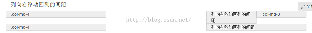
有的时候,我们不希望相邻的两个列紧靠在一起,但又不想使用margin或者其他的技术手段来。这个时候就可以使用列偏移(offset)功能来实现。使用列偏移也非常简单,只需要在列元素上添加类名“col-md-offset-*”(其中星号代表要偏移的列组合数),那么具有这个类名的列就会向右偏移。例如,你在列元素上添加“col-md-offset-4”,表示该列向右移动4个列的宽度。
<div class="container">
<div class="row">
<div class="col-md-4">.col-md-4</div>
<div class="col-md-2 col-md-offset-4">列向右移动四列的间距</div>
<div class="col-md-2">.col-md-3</div>
</div>
<div class="row">
<div class="col-md-4">.col-md-4</div>
<div class="col-md-4 col-md-offset-4">列向右移动四列的间距</div>
</div>
</div>
如上面的示例代码,得到的效果如下
实现原理非常简单,就是利用十二分之一(1/12)的margin-left。然后有多少个offset,就有多少个margin-left。在bootstrap.css中第1205行~1241行所示:
 .col-md-offset-12 {
 margin-left: 100%;
}
 .col-md-offset-11 {
 margin-left: 91.66666667%;
 }
 .col-md-offset-10 {
 margin-left: 83.33333333%;
 }
 .col-md-offset-9 {
 margin-left: 75%;
 }
 .col-md-offset-8 {
 margin-left: 66.66666667%;
 }
 .col-md-offset-7 {
 margin-left: 58.33333333%;
 }
 .col-md-offset-6 {
 margin-left: 50%;
 }
 .col-md-offset-5 {
 margin-left: 41.66666667%;
 }
 .col-md-offset-4 {
 margin-left: 33.33333333%;
 }
 .col-md-offset-3 {
 margin-left: 25%;
 }
 .col-md-offset-2 {
 margin-left: 16.66666667%;
 }
 .col-md-offset-1 {
 margin-left: 8.33333333%;
 }
 .col-md-offset-0 {
 margin-left: 0;
 }
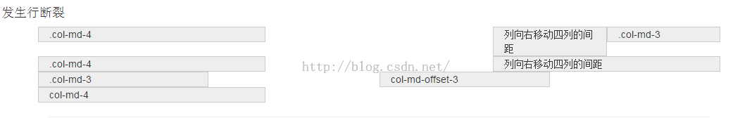
注意:
不过有一个细节需要注意,使用”col-md-offset-*”对列进行向右偏移时,要保证列与偏移列的总数不超过12,不然会致列断行显示,如:
上面代码中列和偏移列总数为3+3+3+4 = 13>12,所以发生了列断行。
如上面的示例代码,得到的效果如下
6、列排序
列排序其实就是改变列的方向,就是改变左右浮动,并且设置浮动的距离。在Bootstrap框架的网格系统中是通过添加类名“col-md-push-*”和“col-md-pull-*” (其中星号代表移动的列组合数)。
我们来看一个简单的示例:
<div class="container">
 <div class="row">
 <div class="col-md-4">.col-md-4</div>
 <div class="col-md-8">.col-md-8</div>
 </div>
</div>
默认情况之下,上面的代码效果如下:

“col-md-4”居左,“col-md-8”居右,如果要互换位置,需要将“col-md-4”向右移动8个列的距离,也就是8个offset ,也就是在“
也要将“col-md-8”向左移动4个列的距离,也就是4个offset,在“

Bootstrap仅通过设置left和right来实现定位效果。在boostrap.css文件的第1127行~第1204行可以看到具体的代码:
.col-md-pull-12 {
 right: 100%;
 }
 .col-md-pull-11 {
 right: 91.66666667%;
 }
 .col-md-pull-10 {
 right: 83.33333333%;
 }
 .col-md-pull-9 {
 right: 75%;
 }
 .col-md-pull-8 {
 right: 66.66666667%;
 }
 .col-md-pull-7 {
 right: 58.33333333%;
 }
 .col-md-pull-6 {
 right: 50%;
 }
 .col-md-pull-5 {
 right: 41.66666667%;
 }

 .col-md-pull-4 {
 right: 33.33333333%;
 }

 .col-md-pull-3 {
 right: 25%;
 }

 .col-md-pull-2 {
 right: 16.66666667%;
 }
 .col-md-pull-1 {
 right: 8.33333333%;
 }
 .col-md-pull-0 {
 right: 0;
 }

 .col-md-push-12 {
 left: 100%;
 }
 .col-md-push-11 {
 left: 91.66666667%;
 }
 .col-md-push-10 {
 left: 83.33333333%;
 }
 .col-md-push-9 {
 left: 75%;
 }
 .col-md-push-8 {
 left: 66.66666667%;
 }
 .col-md-push-7 {
 left: 58.33333333%;
 }
 .col-md-push-6 {
 left: 50%;
 }
 .col-md-push-5 {
 left: 41.66666667%;
 }
 .col-md-push-4 {
 left: 33.33333333%;
 }
 .col-md-push-3 {
 left: 25%;
 }
 .col-md-push-2 {
 left: 16.66666667%;
 }
 .col-md-push-1 {
 left: 8.33333333%;
 }
 .col-md-push-0 {
 left: 0;
}
7、列的嵌套
Bootstrap框架的网格系统还支持列的嵌套。你可以在一个列中添加一个或者多个行(row)容器,然后在这个行容器中插入列(像前面介绍的一样使用列)。但在列容器中的行容器(row),宽度为100%时,就是当前外部列的宽度。来看一个简单示例:
<div class="container">
 <div class="row">
  <div class="col-md-8">
  我的里面嵌套了一个网格
   <div class="row">
   <div class="col-md-6">col-md-6</div>
   <div class="col-md-6">col-md-6</div>
   </div>
  </div>
 <div class="col-md-4">col-md-4</div>
 </div>
 <div class="row">
  <div class="col-md-4">.col-md-4</div>
 <div class="col-md-8">
 我的里面嵌套了一个网格
  <div class="row">
   <div class="col-md-4">col-md-4</div>
   <div class="col-md-4">col-md-4</div>
   <div class="col-md-4">col-md-4</div>
  </div>
 </div>
 </div>
</div>
效果如下:

注意:嵌套的列总数也需要遵循不超过12列。不然会造成末位列换行显示。
本文都是通过最简单的案例,来剖析案例中涉及到的布局要点,希望对大家的学习有所帮助。

 Javascript Data Types : Is there any difference between Browser and NodeJs?May 14, 2025 am 12:15 AM
JavaScript core data types are consistent in browsers and Node.js, but are handled differently from the extra types. 1) The global object is window in the browser and global in Node.js. 2) Node.js' unique Buffer object, used to process binary data. 3) There are also differences in performance and time processing, and the code needs to be adjusted according to the environment.
 JavaScript Comments: A Guide to Using // and /* */May 13, 2025 pm 03:49 PM
JavaScriptusestwotypesofcomments:single-line(//)andmulti-line(//).1)Use//forquicknotesorsingle-lineexplanations.2)Use//forlongerexplanationsorcommentingoutblocksofcode.Commentsshouldexplainthe'why',notthe'what',andbeplacedabovetherelevantcodeforclari
 Python vs. JavaScript: A Comparative Analysis for DevelopersMay 09, 2025 am 12:22 AM
The main difference between Python and JavaScript is the type system and application scenarios. 1. Python uses dynamic types, suitable for scientific computing and data analysis. 2. JavaScript adopts weak types and is widely used in front-end and full-stack development. The two have their own advantages in asynchronous programming and performance optimization, and should be decided according to project requirements when choosing.
 Python vs. JavaScript: Choosing the Right Tool for the JobMay 08, 2025 am 12:10 AM
Whether to choose Python or JavaScript depends on the project type: 1) Choose Python for data science and automation tasks; 2) Choose JavaScript for front-end and full-stack development. Python is favored for its powerful library in data processing and automation, while JavaScript is indispensable for its advantages in web interaction and full-stack development.
 Python and JavaScript: Understanding the Strengths of EachMay 06, 2025 am 12:15 AM
Python and JavaScript each have their own advantages, and the choice depends on project needs and personal preferences. 1. Python is easy to learn, with concise syntax, suitable for data science and back-end development, but has a slow execution speed. 2. JavaScript is everywhere in front-end development and has strong asynchronous programming capabilities. Node.js makes it suitable for full-stack development, but the syntax may be complex and error-prone.
 JavaScript's Core: Is It Built on C or C ?May 05, 2025 am 12:07 AM
JavaScriptisnotbuiltonCorC ;it'saninterpretedlanguagethatrunsonenginesoftenwritteninC .1)JavaScriptwasdesignedasalightweight,interpretedlanguageforwebbrowsers.2)EnginesevolvedfromsimpleinterpreterstoJITcompilers,typicallyinC ,improvingperformance.
 JavaScript Applications: From Front-End to Back-EndMay 04, 2025 am 12:12 AM
JavaScript can be used for front-end and back-end development. The front-end enhances the user experience through DOM operations, and the back-end handles server tasks through Node.js. 1. Front-end example: Change the content of the web page text. 2. Backend example: Create a Node.js server.
 Python vs. JavaScript: Which Language Should You Learn?May 03, 2025 am 12:10 AM
Choosing Python or JavaScript should be based on career development, learning curve and ecosystem: 1) Career development: Python is suitable for data science and back-end development, while JavaScript is suitable for front-end and full-stack development. 2) Learning curve: Python syntax is concise and suitable for beginners; JavaScript syntax is flexible. 3) Ecosystem: Python has rich scientific computing libraries, and JavaScript has a powerful front-end framework.


Hot AI Tools

Undresser.AI Undress
AI-powered app for creating realistic nude photos

AI Clothes Remover
Online AI tool for removing clothes from photos.

Undress AI Tool
Undress images for free

Clothoff.io
AI clothes remover

Video Face Swap
Swap faces in any video effortlessly with our completely free AI face swap tool!

Hot Article
Hot Tools

MinGW - Minimalist GNU for Windows
This project is in the process of being migrated to osdn.net/projects/mingw, you can continue to follow us there. MinGW: A native Windows port of the GNU Compiler Collection (GCC), freely distributable import libraries and header files for building native Windows applications; includes extensions to the MSVC runtime to support C99 functionality. All MinGW software can run on 64-bit Windows platforms.

SublimeText3 Chinese version
Chinese version, very easy to use

DVWA
Damn Vulnerable Web App (DVWA) is a PHP/MySQL web application that is very vulnerable. Its main goals are to be an aid for security professionals to test their skills and tools in a legal environment, to help web developers better understand the process of securing web applications, and to help teachers/students teach/learn in a classroom environment Web application security. The goal of DVWA is to practice some of the most common web vulnerabilities through a simple and straightforward interface, with varying degrees of difficulty. Please note that this software

Zend Studio 13.0.1
Powerful PHP integrated development environment

PhpStorm Mac version
The latest (2018.2.1) professional PHP integrated development tool

