Home >Web Front-end >CSS Tutorial >Three implementation methods of CSS three-column layout (Holy Grail layout, double flying wing layout, Flex layout)
Three implementation methods of CSS three-column layout (Holy Grail layout, double flying wing layout, Flex layout)
- 不言Original
- 2018-08-09 11:46:312493browse
The content of this article is about the process of LNMP recording the environment construction in the form of source code (details). It has certain reference value. Friends in need can refer to it. I hope it will be helpful to you.
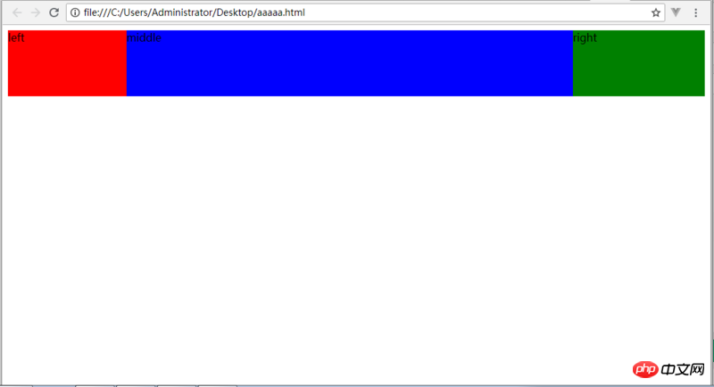
Rendering:

nbsp;html>


<title>圣杯</title>
<style>
.container{
    padding:0 200px 0 180px;
    height:100px;
}
.left{
    float:left;
    width:180px;
    height:100px;
    margin-left:-100%;
    background:red;
    position:relative;
    left:-180px;
}
.main{
    float:left;
    width:100%;
    height:100px;
    background:blue;
}

.right{
    float:left;
    width:200px;
    height:100px;
    margin-left:-200px;
    background:green;
    position:relative;
    right:-200px;
}

</style>


<div>
  <div>middle</div>
  <div>left</div>
  <div>right</div>
Double Flying Wing Layout<h3><pre class="brush:php;toolbar:false">nbsp;html>


    <meta>
    <title>双飞翼</title>
    <style>
.main{
    float:left;
    width:100%;/*左栏上去到第一行*/
    height:100px;
    background:blue;
}
.left{
    float:left;
    width:180px;
    height:100px;
    margin-left:-100%;
    background:red;
}
.right{
    float:left;
    width:200px;
    height:100px;
    margin-left:-200px;
    background:green;
}
</style>


  <div></div>
  <div>left</div>
  <div>right</div>
Flex Layoutnbsp;html>
<meta>
<title>Flex</title>
<style>
.flex {
display: flex;
flex-flow: row;
}
.left{
width: 180px;
height: 100px;
background-color: red;
}
.main{
flex: 1;
height: 100px;
background-color: blue;
}
.right {
width: 200px;
height: 100px;
background-color: green;
}
</style>
<div>
<div>left</div>
<div>middle</div>
<div>right</div>
</div>
If the main wants to give a certain width to both the left module on the left and the right module on the right, there are only two ways: padding: 0 100px 0 200px; or margin: 0 100px 0 200px;! These two routes:
If you take the margin route, keep going all the way, you will find that the final code you write is a double flying wing;
If you take the padding route, it is the Holy Grail!
Three ways to implement three-column layout with css (with code)
How to use CSS to implement a roller coaster loader Animation effect
The above is the detailed content of Three implementation methods of CSS three-column layout (Holy Grail layout, double flying wing layout, Flex layout). For more information, please follow other related articles on the PHP Chinese website!

