


This article mainly introduces in detail the techniques of beautifying form controls with CSS3, beautifying drop-down controls, radio buttons, and check boxes. Interested friends can refer to the default controls of
The styles are different in different browsers and the user experience is poor. CSS3 can be used to beautify form controls and provide a better user experience. The downside is browser compatibility issues.
1. Drop-down control
Rendering:

The layout structure of the drop-down control:
<p class="container">
        <p class="select">
            <p>所有选项</p>
            <ul>
                <li class="selected" data-value="所有选项">所有选项</li>
                <li data-value="Python">Python</li>
                <li data-value="Javascript">Javascript</li>
                <li data-value="Java">Java</li>
                <li data-value="Ruby">Ruby</li>
            </ul>
        </p>
    </p>
ul is used to simulate a drop-down list. During actual use, it can be dynamically generated based on the data returned from the background. The p element is used to render the selected option.
Core style:
.container .select{
    width: 300px;
    height: 40px;
    font-size: 14px;
    background-color:#fff;
    margin-left: auto;
    margin-right: auto;
    position: relative;
}
/*下拉箭头的样式*/
.container .select:after{
    content: "";
    display: block;
    width: 10px;
    height: 10px;
    position: absolute;
    top: 11px;
    rightright: 12px;
    border-left: 1px solid #ccc;
    border-bottom: 1px solid #ccc;
    -webkit-transform: rotate(-45deg);
    transform: rotate(-45deg);
    -webkit-transition: transform .2s ease-in, top .2s ease-in;
    transition: transform .2s ease-in, top .2s ease-in;
}
/*
    被选中的列表项显示的区域
*/
.container .select p{
    padding: 0 15px;
    line-height: 40px;
    cursor: pointer;
}
/*
    下拉列表的样式
    默认高度为0
*/
.container .select ul{
    list-style: none;
    background-color: #fff;
    width: 100%;
    overflow-y: auto;
    position: absolute;
    top: 40px;
    left: 0;
    max-height:0;
    -webkit-transition: max-height .3s ease-in;
    transition: max-height .3s ease-in;
}
.container .select ul li{
    padding: 0 15px;
    line-height: 40px;
    cursor: pointer;
}

.container .select ul li:hover{
    background-color: #e0e0e0;
}
.container .select ul li.selected{
    background-color: #39f;
    color: #fff;

}
/*下拉控件动画*/
@-webkit-keyframes slide-down{
    0%{
        -webkit-transform: scale(1, 0);
        transform: scale(1, 0);
    }
    25%{
        -webkit-transform: scale(1, 1.2);
        transform: scale(1, 1.2);
    }
    50%{
        -webkit-transform: scale(1, .85);
        transform: scale(1, .85);
    }
    75%{
        -webkit-transform: scale(1, 1.05);
        transform: scale(1, 1.05);
    }
    100%{
        -webkit-transform: scale(1, 1);
        transform: scale(1, 1);
    }
}
@keyframes slide-down{
    0%{
        -webkit-transform: scale(1, 0);
        transform: scale(1, 0);
    }
    25%{
        -webkit-transform: scale(1, 1.2);
        transform: scale(1, 1.2);
    }
    50%{
        -webkit-transform: scale(1, .85);
        transform: scale(1, .85);
    }
    75%{
        -webkit-transform: scale(1, 1.05);
        transform: scale(1, 1.05);
    }
    100%{
        -webkit-transform: scale(1, 1);
        transform: scale(1, 1);
    }
}
.container .select.on ul{
    /*
        默认情况下,ul的高度为0,当点击控控件的时候,
        设置下拉列表的高度。
    */
    max-height: 300px;
    -webkit-transform-origin: 50% 0;
    transform-origin: 50% 0;
    -webkit-animation: slide-down .5s ease-in;
    animation: slide-down .5s ease-in;
}
/*下拉选项被选中后控制箭头的方向*/
.container .select.on:after{
    -webkit-transform: rotate(-225deg);
    transform: rotate(-225deg);
    top: 18px;
}
This is just a static style. If you want to implement the "selection" process, you need to use JavaScript to achieve it.
$(function(){
    var selected  = $('.select > p');
    //控制列表显隐
    selected.on('click', function(event){
        $(this).parent('.select').toggleClass('on');
        event.stopPropagation();
    });
    //点击列表项,将列表项的值添加到p标签中
    $('.select li').on('click', function(event){
        var self = $(this);
        selected.text(self.data('value'));
    });
    //点击文档其他区域隐藏列表
    $(document).on('click', function(){
        $('.select').removeClass('on');
    });
});
2. Beautify the radio button box
lable tag can be linked with the radio button box through the for attribute. We use this feature to beautify the radio button, which is also the principle. Also, don’t forget to hide the real radio button (type="radio").
/*用过label标签来模拟radio 的样式*/
.radio-block label{
display: inline-block;
position: relative;
width: 28px;
height: 28px;
border: 1px solid #cccccc;
background-color: #fff;
border-radius: 28px;
cursor: pointer;
margin-right:10px;
}
input[type="radio"]{
display: none;
}
.radio-block label:after{
content: '';
display: block;
position: absolute;
width: 20px;
height: 20px;
left: 4px;
top: 4px;
background-color: #28bd12;
border-radius: 20px;
/*通过scale属性来控制中心点*/
-webkit-transform: scale(0);
transform: scale(0);
}
/*选中样式*/
input[type="radio"]:checked + label{
background-color :#eee;
-webkit-transition: background-color .3s ease-in;
transition: background-color .3s ease-in;
}
/*选中之后的样式*/
input[type="radio"]:checked + label:after{
-webkit-transform: scale(1);
transform: scale(1);
-webkit-transition: transform .2s ease-in;
transition: transform .2s ease-in;
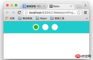
}Final effect:
##3. Beautify the check box

.switch-block{
    width: 980px;
    padding: 3% 0;
    margin: 0 auto;
    text-align: center;
    background-color: #fc9;
}
.switch-block label{
    display: inline-block;
    width: 62px;
    height: 30px;
    background-color:#fafafa;
    border:1px solid #eee;
    border-radius: 16px;
    position: relative;
    margin-right: 10px;
    cursor: pointer;
    -webkit-transition: background .2s ease-in;
    transition :background .2s ease-in;
}
input[type="checkbox"]{
    display: none;
}
.switch-block label:after{
    content: '';
    position: absolute;
    width: 28px;
    height: 28px;
    border: 1px solid #eee;
    border-radius: 14px;
    left: 1px;
    background-color:#fff;
    -webkit-transition: left .2s ease-in;
    transition: left .2s ease-in;
}
.switch-block input[type="checkbox"]:checked + label{
    background-color:#3c6;
    -webkit-transition: background .2s ease-in;
    transition :background .2s ease-in;
}
.switch-block input[type="checkbox"]:checked + label:after{
    left: 32px;
    -webkit-transition: left .2s ease-in;
    transition: left .2s ease-in;
}
The above is the entire content of this article. I hope it will be helpful to everyone's study. For more related content, please pay attention to the PHP Chinese website! Related recommendations:
Three ways to verify CSS control styles through priority comparison
About CSS banner image response Method for centered display
How to use negative margin values in CSS to adjust the center position
The above is the detailed content of About CSS3 controls for beautifying forms. For more information, please follow other related articles on the PHP Chinese website!

 Iterating a React Design with Styled ComponentsApr 21, 2025 am 11:29 AM
In a perfect world, our projects would have unlimited resources and time. Our teams would begin coding with well thought out and highly refined UX designs.
 Oh, the Many Ways to Make Triangular Breadcrumb Ribbons!Apr 21, 2025 am 11:26 AM
Oh, the Many Ways to Make Triangular Breadcrumb Ribbons
 SVG Properties in CSS GuideApr 21, 2025 am 11:21 AM
SVG has its own set of elements, attributes and properties to the extent that inline SVG code can get long and complex. By leveraging CSS and some of the forthcoming features of the SVG 2 specification, we can reduce that code for cleaner markup.
 A Few Functional Uses for Intersection Observer to Know When an Element is in ViewApr 21, 2025 am 11:19 AM
You might not know this, but JavaScript has stealthily accumulated quite a number of observers in recent times, and Intersection Observer is a part of that
 Revisting prefers-reduced-motionApr 21, 2025 am 11:18 AM
We may not need to throw out all CSS animations. Remember, it’s prefers-reduced-motion, not prefers-no-motion.
 How to Get a Progressive Web App into the Google Play StoreApr 21, 2025 am 11:10 AM
PWA (Progressive Web Apps) have been with us for some time now. Yet, each time I try explaining it to clients, the same question pops up: "Will my users be
 The Simplest Ways to Handle HTML IncludesApr 21, 2025 am 11:09 AM
It's extremely surprising to me that HTML has never had any way to include other HTML files within it. Nor does there seem to be anything on the horizon that
 Change Color of SVG on HoverApr 21, 2025 am 11:04 AM
There are a lot of different ways to use SVG. Depending on which way, the tactic for recoloring that SVG in different states or conditions — :hover,


Hot AI Tools

Undresser.AI Undress
AI-powered app for creating realistic nude photos

AI Clothes Remover
Online AI tool for removing clothes from photos.

Undress AI Tool
Undress images for free

Clothoff.io
AI clothes remover

Video Face Swap
Swap faces in any video effortlessly with our completely free AI face swap tool!

Hot Article
Hot Tools

SecLists
SecLists is the ultimate security tester's companion. It is a collection of various types of lists that are frequently used during security assessments, all in one place. SecLists helps make security testing more efficient and productive by conveniently providing all the lists a security tester might need. List types include usernames, passwords, URLs, fuzzing payloads, sensitive data patterns, web shells, and more. The tester can simply pull this repository onto a new test machine and he will have access to every type of list he needs.

DVWA
Damn Vulnerable Web App (DVWA) is a PHP/MySQL web application that is very vulnerable. Its main goals are to be an aid for security professionals to test their skills and tools in a legal environment, to help web developers better understand the process of securing web applications, and to help teachers/students teach/learn in a classroom environment Web application security. The goal of DVWA is to practice some of the most common web vulnerabilities through a simple and straightforward interface, with varying degrees of difficulty. Please note that this software

SAP NetWeaver Server Adapter for Eclipse
Integrate Eclipse with SAP NetWeaver application server.

MinGW - Minimalist GNU for Windows
This project is in the process of being migrated to osdn.net/projects/mingw, you can continue to follow us there. MinGW: A native Windows port of the GNU Compiler Collection (GCC), freely distributable import libraries and header files for building native Windows applications; includes extensions to the MSVC runtime to support C99 functionality. All MinGW software can run on 64-bit Windows platforms.

Safe Exam Browser
Safe Exam Browser is a secure browser environment for taking online exams securely. This software turns any computer into a secure workstation. It controls access to any utility and prevents students from using unauthorized resources.

