 WeChat Applet
 Mini Program Development
 About the development of the navigation bar at the bottom of the WeChat mini program
About the development of the navigation bar at the bottom of the WeChat mini program
This article mainly introduces the relevant information on the development of the navigation column at the bottom of the WeChat applet. I wanted to have a beautiful navigation column at the bottom of the WeChat applet, but I didn’t know how to make it, so Baidu found this article and shared it with everyone. , Friends in need can refer to
Development of the bottom navigation column of WeChat applet
Let’s take a look at the renderings first

Here, we have added three navigation icons, because we have three pages, and the WeChat applet can add up to 5.
Then how do they appear and how are they colored? Done in two steps!
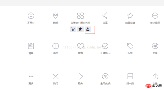
1. Icon preparation
Alibaba icon library http://www.iconfont.cn/collections/show/29
We enter the website, slide the mouse over an icon you like and click the download button below

Select two icons of different colors in the pop-up box Just select the 64px size, I chose png and then download it and give it an alias

Save the icon with the above name to the mini program project directory. In the created images folder, preparations are done

2. Change the configuration file
We found Add the following configuration information to the configuration file app.json in the project root directory
"tabBar": {
  "color": "#a9b7b7",
  "selectedColor": "#11cd6e",
  "borderStyle":"white",
  "list": [{
   "selectedIconPath": "images/111.png",
   "iconPath": "images/11.png",
   "pagePath": "pages/index/index",
   "text": "首页"
  }, {
   "selectedIconPath": "images/221.png",
   "iconPath": "images/22.png",
   "pagePath": "pages/logs/logs",
   "text": "日志"
  }, {
   "selectedIconPath": "images/331.png",
   "iconPath": "images/33.png",
   "pagePath": "pages/test/test",
   "text": "开心测试"
  }]
 },
Explain the corresponding attribute information
tabBar refers to the navigation at the bottom Configuration properties
color The color of the bottom navigation text when not selected
selectedColor The color of the bottom navigation text when selected
borderStyle The sample color of the bottom navigation border (note that if there is no writing here Entering the style will cause the default light gray line to appear on the upper border of the navigation box)
list Navigation configuration array
selectedIconPath Icon path when selected
iconPath Icon path when not selected
pagePath Page access address
text Text below the navigation icon
If you want to change the more detailed style, please refer to
https://mp.weixin.qq .com/debug/wxadoc/dev/framework/config.html#tabBar
The above is the entire content of this article. I hope it will be helpful to everyone’s study. For more related content, please pay attention to the PHP Chinese website !
Related recommendations:
WeChat applet implements MUI number input box effect
About WeChat applet implementing top tab Introduction to (swiper)
The use of input forms, redio and drop-down lists in WeChat mini programs
The above is the detailed content of About the development of the navigation bar at the bottom of the WeChat mini program. For more information, please follow other related articles on the PHP Chinese website!

Hot AI Tools

Undresser.AI Undress
AI-powered app for creating realistic nude photos

AI Clothes Remover
Online AI tool for removing clothes from photos.

Undress AI Tool
Undress images for free

Clothoff.io
AI clothes remover

Video Face Swap
Swap faces in any video effortlessly with our completely free AI face swap tool!

Hot Article

Hot Tools

SecLists
SecLists is the ultimate security tester's companion. It is a collection of various types of lists that are frequently used during security assessments, all in one place. SecLists helps make security testing more efficient and productive by conveniently providing all the lists a security tester might need. List types include usernames, passwords, URLs, fuzzing payloads, sensitive data patterns, web shells, and more. The tester can simply pull this repository onto a new test machine and he will have access to every type of list he needs.

WebStorm Mac version
Useful JavaScript development tools

Atom editor mac version download
The most popular open source editor

EditPlus Chinese cracked version
Small size, syntax highlighting, does not support code prompt function

DVWA
Damn Vulnerable Web App (DVWA) is a PHP/MySQL web application that is very vulnerable. Its main goals are to be an aid for security professionals to test their skills and tools in a legal environment, to help web developers better understand the process of securing web applications, and to help teachers/students teach/learn in a classroom environment Web application security. The goal of DVWA is to practice some of the most common web vulnerabilities through a simple and straightforward interface, with varying degrees of difficulty. Please note that this software


