
Home >Web Front-end >CSS Tutorial >Introduction to css3 flexible box model
Introduction to css3 flexible box model

- 不言Original
- 2018-06-26 13:43:521673browse
This article mainly introduces the introduction of the css3 flexible box model. It has a certain reference value. Now I share it with you. Friends in need can refer to it.
Css3 introduces a new box model—— The flexbox model determines how a box is distributed among other boxes and how to handle the available space. Using this model, you can easily create a fluid layout that adapts to the browser window or a flexible layout that adapts to the font size
Css3 introduces a new box model - the flexbox model, which determines how a box is distributed among other boxes and how the available space is handled. This is similar to XUL (the user interaction language used by Firefox), and other languages also use the same box model, such as XAML and GladeXML. Using this model, you can easily create a fluid layout that adapts to the browser window or a flexible layout that adapts to the font size. The examples in this article use the following HTML code:
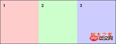
<body>
<p id="box1">1</p>
<p id="box2">2</p>
<p id="box3">3</p>
</body>
The traditional box model arranges boxes in the vertical direction based on HTML flow. Using the flexbox model you can specify a specific order and reverse it. To enable the flexible box model, just set the display attribute value of the box with child boxes to box (or inline-box).
display: box;
Horizontal or vertical distribution
"box-orient" defines the coordinate axis of the distribution: vertical and horizional. These two values define how the box is displayed.
body{
display: box;
box-orient: horizontal;
}
Reverse distribution
"box-direction" can set the order in which the boxes appear. By default, you only need to define the distribution axis - the boxes are distributed with the html flow. If it is a horizontal axis, it is distributed from left to right; if it is a vertical axis, it is distributed from top to bottom. Define the attribute value of "box-direction" as "reverse" to reverse the order of the boxes.
body {
display: box;
box-orient: vertical;
box-direction: reverse;
}
Specific distribution
The attribute "box-ordinal-group" defines the order of box distribution. The order of distribution can be controlled at will. The groups are defined with a number starting from "1" and the box model will distribute these groups first and all these boxes will be in each group. The distribution will be arranged from small to large.
body {
display: box;
box-orient: vertical;
box-direction : reverse;
}
#box1 {box-flex:1;box-ordinal-group: 2;}
#box2 {box-flex:2;box-ordinal-group: 2;}
#box3 {box-flex:2;box-ordinal-group: 1;}
Box size
By default, the box is not elastic. If the property value of box-flex is at least 1, it becomes elastic. How box-flex divides the width of the parent container. The three sub-blocks are set to 1, 2, and 2 respectively. That is to say, the parent container is divided into 5 parts, occupying 1/5 (100px) and 2/ of the width of the parent structure respectively. 5(200px), 2/5(200px). If the box is not elastic, it will be as wide as possible so that its contents are visible without any overflow, and its size is determined by "width" and "height" (or min-height, min-width, max-width, max- height).
The above is the entire content of this article. I hope it will be helpful to everyone's study. For more related content, please pay attention to the PHP Chinese website!
Related recommendations:
The above is the detailed content of Introduction to css3 flexible box model. For more information, please follow other related articles on the PHP Chinese website!