


1. Button (button group)
The use of a single button in a web page sometimes does not meet our business needs. We often see multiple buttons used together, such as a set of small icon buttons in a rich text editor. So in this section, we mainly introduce to you the button group components provided by the Bootstrap framework.
Source code query:
The button group is also an independent component, so you can find the corresponding source code file:
☑ LESS version: The corresponding source file is buttons.less
☑ Sass version: The corresponding source file is _buttons.scss
☑ CSS version: Corresponds to lines 3131 ~ 3291 of the bootstrap.css file
Usage:
Button groups, like drop-down menu components, need to rely on the button.js plug-in to function properly. However, we can also directly call only the bootstrap.js file. Because this file has integrated the button.js plug-in function.
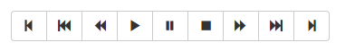
As for the structure, it is very simple. Use a container named "btn-group" and put multiple buttons into this container. As shown below:
<div class="btn-group">
 <button type="button" class="btn btn-default"><span class="glyphicon glyphicon-step-backward"></span></button>
 <button type="button" class="btn btn-default"><span class="glyphicon glyphicon-fast-backward"></span></button>
 <button type="button" class="btn btn-default"><span class="glyphicon glyphicon-backward"></span></button>
 <button type="button" class="btn btn-default"><span class="glyphicon glyphicon-play"></span></button>
 <button type="button" class="btn btn-default"><span class="glyphicon glyphicon-pause"></span></button>
 <button type="button" class="btn btn-default"><span class="glyphicon glyphicon-stop"></span></button>
 <button type="button" class="btn btn-default"><span class="glyphicon glyphicon-forward "></span></button>
 <button type="button" class="btn btn-default"><span class="glyphicon glyphicon-fast-forward"></span></button>
 <button type="button" class="btn btn-default"><span class="glyphicon glyphicon-step-forward"></span></button>
</div>
The operation effect is as follows:
In addition to the
Button group implementation source code is as follows:
/查看bootstrap.css文件第3131行~第3161行/

.btn-group,
.btn-group-vertical {
 position: relative;
 display: inline-block;
 vertical-align: middle;
}
.btn-group > .btn,
.btn-group-vertical > .btn {
 position: relative;
 float: left;
}
.btn-group > .btn:hover,
.btn-group-vertical > .btn:hover,
.btn-group > .btn:focus,
.btn-group-vertical > .btn:focus,
.btn-group > .btn:active,
.btn-group-vertical > .btn:active,
.btn-group > .btn.active,
.btn-group-vertical > .btn.active {
 z-index: 2;
}
.btn-group > .btn:focus,
.btn-group-vertical > .btn:focus {
 outline: none;
}
.btn-group .btn + .btn,
.btn-group .btn + .btn-group,
.btn-group .btn-group + .btn,
.btn-group .btn-group + .btn-group {
 margin-left: -1px;
}
From the renderings, we can see that the four corners of the button group are rounded (browsers that support CSS3), but some friends will ask, when we usually make web pages, each button has rounded corners. However, except for the first and last buttons in the button group, which have rounded corners, the other buttons do not have rounded corners. How is this achieved? In fact, the implementation method is very simple:
- 1. All buttons have rounded corners by default
- 2. Except for the first button and the last button (except the drop-down button), all other buttons cancel the rounded corner effect
- 3. Only the upper left corner and lower left corner of the first button are rounded
- 4. Only the upper right corner and lower right corner of the last button are rounded
The corresponding source code is as follows:
/View lines 3174~3203 of the bootstrap.css file/
.btn-group > .btn:not(:first-child):not(:last-child):not(.dropdown-toggle) {
 border-radius: 0;
}
.btn-group > .btn:first-child {
 margin-left: 0;
}
.btn-group > .btn:first-child:not(:last-child):not(.dropdown-toggle) {
 border-top-right-radius: 0;
 border-bottom-right-radius: 0;
}
.btn-group > .btn:last-child:not(:first-child),
.btn-group > .dropdown-toggle:not(:first-child) {
 border-top-left-radius: 0;
 border-bottom-left-radius: 0;
}
.btn-group > .btn-group {
 float: left;
}
.btn-group > .btn-group:not(:first-child):not(:last-child) > .btn {
 border-radius: 0;
}
.btn-group > .btn-group:first-child> .btn:last-child,
.btn-group > .btn-group:first-child> .dropdown-toggle {
 border-top-right-radius: 0;
 border-bottom-right-radius: 0;
}
.btn-group > .btn-group:last-child> .btn:first-child {
 border-top-left-radius: 0;
 border-bottom-left-radius: 0;
}
2. Button (button toolbar)
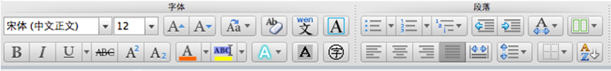
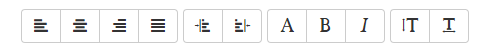
In the rich text editor, arrange button groups together, such as copy, cut and paste a group; left-aligned, middle-aligned, right-aligned and justified as a group, as shown in the following figure:
Then the Bootstrap framework button toolbar also provides such a production method. You only need to put the button group "btn-group" in a large container "btn-toolbar" as a group, as shown below:
<div class="btn-toolbar">
 <div class="btn-group">
 …
 </div>
 <div class="btn-group">
 …
 </div>
 <div class="btn-group">
 …
 </div>
 <div class="btn-group">
 …
 </div>
</div>
The implementation principle is mainly to float the multiple group "btn-group" elements of the container, and maintain a left margin of 5px between the groups. The code is as follows:
/For the source code, please refer to lines 3162~3173 of the bootstrap.css file/
.btn-toolbar {
 margin-left: -5px;
}
.btn-toolbar .btn-group,
.btn-toolbar .input-group {
 float: left;
}
.btn-toolbar > .btn,
.btn-toolbar > .btn-group,
.btn-toolbar > .input-group {
 margin-left: 5px;
}
Pay attention to clear the float on "btn-toolbar".
/For the source code, please refer to line 5062 of the bootstrap.css file/
.btn-toolbar:before,
.btn-toolbar:after{
 display: table;
content: " ";
}
.btn-toolbar:after{
 clear: both;
}
The operation effect is as follows:
Button group size settings
In the section introducing buttons, we know that buttons use the three class names of btn-lg, btn-sm and btn-xs to adjust the padding, font-size, line-height and border-radius attribute values to change the button size. Then we can also use a similar method to determine the size of the button group:
☑ .btn-group-lg:——Large Button Group
☑ .btn-group-sm:——Small button group
☑ .btn-group-xs:——Super small button group
You only need to append the corresponding class name to the ".btn-group" class name to get button groups of different sizes. As shown below:
<div class="btn-toolbar">
 <div class="btn-group btn-group-lg">
 …
 </div>
 <div class="btn-group">
 …
 </div>
 <div class="btn-group btn-group-sm">
 …
 </div>
 <div class="btn-group btn-group-xs">
 …
 </div>
</div>
The code to implement the button group size effect style code is as follows:
/For the source code, please refer to lines 2320~2340 of the bootstrap.css file/
.btn-lg,
.btn-group-lg> .btn{
 padding: 10px 16px;
 font-size: 18px;
 line-height: 1.33;
 border-radius: 6px;
}
.btn-sm,
.btn-group-sm> .btn {
 padding: 5px 10px;
 font-size: 12px;
 line-height: 1.5;
 border-radius: 3px;
}
.btn-xs,
.btn-group-xs> .btn{
 padding: 1px 5px;
 font-size: 12px;
 line-height: 1.5;
 border-radius: 3px;
}
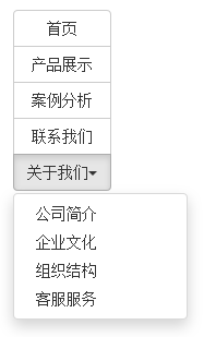
3、按钮(嵌套分组)
很多时候,我们常把下拉菜单和普通的按钮组排列在一起,实现类似于导航菜单的效果。如下所示:
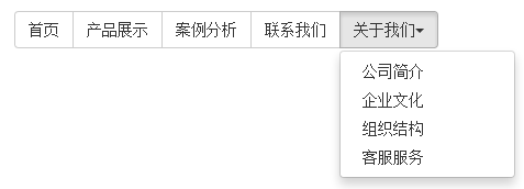
使用的时候,只需要把当初制作下拉菜单的“dropdown”的容器换成“btn-group”,并且和普通的按钮放在同一级。如下所示:
<div class="btn-group">
 <button class="btnbtn-default" type="button">首页</button>
 <button class="btnbtn-default" type="button">产品展示</button>
 <button class="btnbtn-default" type="button">案例分析</button>
 <button class="btnbtn-default" type="button">联系我们</button>
 <div class="btn-group">
 <button class="btnbtn-default dropdown-toggle" data-toggle="dropdown" type="button">关于我们<span class="caret"></span></button>
 <ul class="dropdown-menu">
  <li><a href="##">公司简介</a></li>
  <li><a href="##">企业文化</a></li>
  <li><a href="##">组织结构</a></li>
  <li><a href="##">客服服务</a></li>
 </ul>
 </div>
</div>
实现的样式代码:
/查看bootstrap.css文件第3192行~第3223行/
.btn-group > .btn-group {
 float: left;
}
.btn-group > .btn-group:not(:first-child):not(:last-child) > .btn {
 border-radius: 0;
}
.btn-group > .btn-group:first-child> .btn:last-child,
.btn-group > .btn-group:first-child> .dropdown-toggle {
 border-top-right-radius: 0;
 border-bottom-right-radius: 0;
}
.btn-group > .btn-group:last-child> .btn:first-child {
 border-top-left-radius: 0;
 border-bottom-left-radius: 0;
}
.btn-group .dropdown-toggle:active,
.btn-group.open .dropdown-toggle {
 outline: 0;
}
.btn-group > .btn + .dropdown-toggle {
 padding-right: 8px;
 padding-left: 8px;
}
.btn-group > .btn-lg + .dropdown-toggle {
 padding-right: 12px;
 padding-left: 12px;
}
.btn-group.open .dropdown-toggle {
 -webkit-box-shadow: inset 0 3px 5px rgba(0, 0, 0, .125);
 box-shadow: inset 0 3px 5px rgba(0, 0, 0, .125);
}
.btn-group.open .dropdown-toggle.btn-link {
 -webkit-box-shadow: none;
 box-shadow: none;
}
4、按钮(垂直分组)
前面看到的示例,按钮组都是水平显示的。但在实际运用当中,总会碰到垂直显示的效果。在Bootstrap框架中也提供了这样的风格。我们只需要把水平分组的“btn-group”类名换成“btn-group-vertical”即可。
运行的效果如下:
实现垂直分组的样式代码:
/请查看bootstrap.css文件第3234行~第3276行/
.btn-group-vertical > .btn,
.btn-group-vertical > .btn-group,
.btn-group-vertical > .btn-group > .btn {
 display: block;
 float: none;
 width: 100%;
 max-width: 100%;
}
.btn-group-vertical > .btn-group > .btn {
 float: none;
}
.btn-group-vertical > .btn + .btn,
.btn-group-vertical > .btn + .btn-group,
.btn-group-vertical > .btn-group + .btn,
.btn-group-vertical > .btn-group + .btn-group {
 margin-top: -1px;
 margin-left: 0;
}
.btn-group-vertical > .btn:not(:first-child):not(:last-child) {
 border-radius: 0;
}
.btn-group-vertical > .btn:first-child:not(:last-child) {
 border-top-right-radius: 4px;
 border-bottom-right-radius: 0;
 border-bottom-left-radius: 0;
}
.btn-group-vertical > .btn:last-child:not(:first-child) {
 border-top-left-radius: 0;
 border-top-right-radius: 0;
 border-bottom-left-radius: 4px;
}
.btn-group-vertical > .btn-group:not(:first-child):not(:last-child) > .btn {
 border-radius: 0;
}
.btn-group-vertical > .btn-group:first-child:not(:last-child) > .btn:last-child,
.btn-group-vertical > .btn-group:first-child:not(:last-child) > .dropdown-toggle {
 border-bottom-right-radius: 0;
 border-bottom-left-radius: 0;
}
.btn-group-vertical > .btn-group:last-child:not(:first-child) > .btn:first-child {
 border-top-left-radius: 0;
 border-top-right-radius: 0;
}
和水平分组按钮不一样的是:
☑ 水平分组按钮第一个按钮左上角和左下角具有圆角以及最后一个按钮右上角和右下角具有圆角
☑ 垂直分组按钮第一个按钮左上角和右上角具有圆角以及最后一个按钮左下角和右下角具有圆角
5、按钮(等分按钮)
等分按钮的效果在移动端上特别的实用。整个按钮组宽度是容器的100%,而按钮组里面的每个按钮平分整个容器宽度。例如,如果你按钮组里面有五个按钮,那么每个按钮是20%的宽度,如果有四个按钮,那么每个按钮是25%宽度,以此类推。
等分按钮也常被称为是自适应分组按钮,其实现方法也非常的简单,只需要在按钮组“btn-group”上追加一个“btn-group-justified”类名,如下所示:
运行效果如下:

实现原理非常简单,把“btn-group-justified”模拟成表格(display:table),而且把里面的按钮模拟成表格单元格(display:table-cell)。具体样式代码如下:
/源码请查看bootstrap.css文件第3277行~第3291行/
.btn-group-justified {
 display: table;
 width: 100%;
 table-layout: fixed;
 border-collapse: separate;
}
.btn-group-justified > .btn,
.btn-group-justified > .btn-group {
 display: table-cell;
 float: none;
 width: 1%;
}
.btn-group-justified > .btn-group .btn {
 width: 100%;
}
特别声明:在制作等分按钮组时,请尽量使用标签元素来制作按钮,因为使用
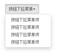
6、按钮下拉菜单
按钮下拉菜单仅从外观上看和上一节介绍的下拉菜单效果基本上是一样的。不同的是在普通的下拉菜单的基础上封装了按钮(.btn)样式效果。简单点说就是点击一个按钮,会显示隐藏的下拉菜单。
按钮下拉菜单其实就是普通的下拉菜单,只不过把“”标签元素换成了“
<div class="btn-group">
 <button class="btn btn-default dropdown-toggle" data-toggle="dropdown" type="button">按钮下拉菜单<span class="caret"></span></button>
 <ul class="dropdown-menu">
  <li><a href="##">按钮下拉菜单项</a></li>
  <li><a href="##">按钮下拉菜单项</a></li>
  <li><a href="##">按钮下拉菜单项</a></li>
  <li><a href="##">按钮下拉菜单项</a></li>
 </ul>
</div>
实现样式代码如下:
/查看bootstrap.css文件第3204行~第3223行/
.btn-group .dropdown-toggle:active,
.btn-group.open .dropdown-toggle {
 outline: 0;
}
.btn-group > .btn + .dropdown-toggle {
 padding-right: 8px;
 padding-left: 8px;
}
.btn-group > .btn-lg + .dropdown-toggle {
 padding-right: 12px;
 padding-left: 12px;
}
.btn-group.open .dropdown-toggle {
 -webkit-box-shadow: inset 0 3px 5px rgba(0, 0, 0, .125);
  box-shadow: inset 0 3px 5px rgba(0, 0, 0, .125);
}
.btn-group.open .dropdown-toggle.btn-link {
 -webkit-box-shadow: none;
  box-shadow: none;
}
运行的效果如下:
7、按钮的向下向上三角形
按钮的向下三角形,我们是通过在
这个三角形完全是通过CSS代码来实现的:
/源码请查看bootstrap.css文件第2994行~第3003行/
.caret {
 display: inline-block;
 width: 0;
 height: 0;
 margin-left: 2px;
 vertical-align: middle;
 border-top: 4px solid;
 border-right: 4px solid transparent;
 border-left: 4px solid transparent;
}
另外在按钮中的三角形“caret”做了一定的样式处理:
/源码查看bootstrap.css文件第3224行~第3233行/
.btn .caret {
 margin-left: 0;
}
.btn-lg .caret {
 border-width: 5px 5px 0;
 border-bottom-width: 0;
}
.dropup .btn-lg .caret {
 border-width: 0 5px 5px;
}
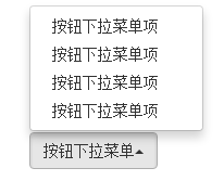
有的时候我们的下拉菜单会向上弹起,这个时候我们的三角方向需要朝上显示,实现方法:需要在“.btn-group”类上追加“dropup”类名(这也是做向上弹起下拉菜单要用的类名)。
/源码请查看bootstrap.css文件第3109行~第3114行/
.dropup .caret,
.navbar-fixed-bottom .dropdown .caret {
 content: "";
 border-top: 0;
 border-bottom: 4px solid;
}
上面代码中可以看出,向上三角与向下三角的区别:其实就是改变了一个border-bottom的值。
下面是向上弹起菜单的例子:
<div class="btn-group dropup">
 <button class="btn btn-default dropdown-toggle" data-toggle="dropdown" type="button">按钮下拉菜单<span class="caret"></span></button>
 <ul class="dropdown-menu">
 <li><a href="##">按钮下拉菜单项</a></li>
 <li><a href="##">按钮下拉菜单项</a></li>
 <li><a href="##">按钮下拉菜单项</a></li>
 <li><a href="##">按钮下拉菜单项</a></li>
 </ul>
</div>
运行效果如下:
以上就是关于Bootstrap按钮组工具栏的全部内容,希望对大家的学习有所帮助。

 JavaScript in Action: Real-World Examples and ProjectsApr 19, 2025 am 12:13 AM
JavaScript's application in the real world includes front-end and back-end development. 1) Display front-end applications by building a TODO list application, involving DOM operations and event processing. 2) Build RESTfulAPI through Node.js and Express to demonstrate back-end applications.
 JavaScript and the Web: Core Functionality and Use CasesApr 18, 2025 am 12:19 AM
The main uses of JavaScript in web development include client interaction, form verification and asynchronous communication. 1) Dynamic content update and user interaction through DOM operations; 2) Client verification is carried out before the user submits data to improve the user experience; 3) Refreshless communication with the server is achieved through AJAX technology.
 Understanding the JavaScript Engine: Implementation DetailsApr 17, 2025 am 12:05 AM
Understanding how JavaScript engine works internally is important to developers because it helps write more efficient code and understand performance bottlenecks and optimization strategies. 1) The engine's workflow includes three stages: parsing, compiling and execution; 2) During the execution process, the engine will perform dynamic optimization, such as inline cache and hidden classes; 3) Best practices include avoiding global variables, optimizing loops, using const and lets, and avoiding excessive use of closures.
 Python vs. JavaScript: The Learning Curve and Ease of UseApr 16, 2025 am 12:12 AM
Python is more suitable for beginners, with a smooth learning curve and concise syntax; JavaScript is suitable for front-end development, with a steep learning curve and flexible syntax. 1. Python syntax is intuitive and suitable for data science and back-end development. 2. JavaScript is flexible and widely used in front-end and server-side programming.
 Python vs. JavaScript: Community, Libraries, and ResourcesApr 15, 2025 am 12:16 AM
Python and JavaScript have their own advantages and disadvantages in terms of community, libraries and resources. 1) The Python community is friendly and suitable for beginners, but the front-end development resources are not as rich as JavaScript. 2) Python is powerful in data science and machine learning libraries, while JavaScript is better in front-end development libraries and frameworks. 3) Both have rich learning resources, but Python is suitable for starting with official documents, while JavaScript is better with MDNWebDocs. The choice should be based on project needs and personal interests.
 From C/C to JavaScript: How It All WorksApr 14, 2025 am 12:05 AM
The shift from C/C to JavaScript requires adapting to dynamic typing, garbage collection and asynchronous programming. 1) C/C is a statically typed language that requires manual memory management, while JavaScript is dynamically typed and garbage collection is automatically processed. 2) C/C needs to be compiled into machine code, while JavaScript is an interpreted language. 3) JavaScript introduces concepts such as closures, prototype chains and Promise, which enhances flexibility and asynchronous programming capabilities.
 JavaScript Engines: Comparing ImplementationsApr 13, 2025 am 12:05 AM
Different JavaScript engines have different effects when parsing and executing JavaScript code, because the implementation principles and optimization strategies of each engine differ. 1. Lexical analysis: convert source code into lexical unit. 2. Grammar analysis: Generate an abstract syntax tree. 3. Optimization and compilation: Generate machine code through the JIT compiler. 4. Execute: Run the machine code. V8 engine optimizes through instant compilation and hidden class, SpiderMonkey uses a type inference system, resulting in different performance performance on the same code.
 Beyond the Browser: JavaScript in the Real WorldApr 12, 2025 am 12:06 AM
JavaScript's applications in the real world include server-side programming, mobile application development and Internet of Things control: 1. Server-side programming is realized through Node.js, suitable for high concurrent request processing. 2. Mobile application development is carried out through ReactNative and supports cross-platform deployment. 3. Used for IoT device control through Johnny-Five library, suitable for hardware interaction.


Hot AI Tools

Undresser.AI Undress
AI-powered app for creating realistic nude photos

AI Clothes Remover
Online AI tool for removing clothes from photos.

Undress AI Tool
Undress images for free

Clothoff.io
AI clothes remover

Video Face Swap
Swap faces in any video effortlessly with our completely free AI face swap tool!

Hot Article
Hot Tools

MantisBT
Mantis is an easy-to-deploy web-based defect tracking tool designed to aid in product defect tracking. It requires PHP, MySQL and a web server. Check out our demo and hosting services.

VSCode Windows 64-bit Download
A free and powerful IDE editor launched by Microsoft

SublimeText3 Linux new version
SublimeText3 Linux latest version

SAP NetWeaver Server Adapter for Eclipse
Integrate Eclipse with SAP NetWeaver application server.

Dreamweaver CS6
Visual web development tools

