
Home >Web Front-end >CSS Tutorial >Implement fan-shaped animated menu using CSS3
Implement fan-shaped animated menu using CSS3

- 不言Original
- 2018-06-20 17:37:021719browse
This article mainly introduces you to the example source code of using pure CSS3 to implement fan-shaped animated menu (simplified version). The article gives the complete example source code. The effect after implementation is very dynamic, beautiful and fashionable. Friends in need can refer to it. Let’s take a look below.
A previous article introduced the implementation of this effect, but the implementation code is too cumbersome, so I share the following simplified version of the implementation method here. If you need it, you can refer to it.
Please click here for the original article
Simplified version of the complete example
<!DOCTYPE html>
<html>
<head>
<meta charset="UTF-8">
<title>CSS3扇形动画菜单</title>
<style>
*{padding: 0; margin: 0;}
body{background:#b1b1b1;margin:0px;padding:0px;font-size:14px;color:#000;}
.menuHolder {width:100px; height:100px; margin:0 0 250px 0; position:relative;z-index:100;}
.menuHolder ul {padding:0px; margin:0; list-style:none; position:absolute; left:0; top:0; width:0; height:0;}
/*.menuHolder ul li {border-radius:0 0 300px 0; width:0; height:0;}*/
.menuHolder ul li a {color:#000; text-decoration:none; font:bold 13px/30px arial, sans-serif; text-align:center;
box-shadow:-5px 5px 5px rgba(0,0,0,0.4);transform-origin:0 0;}
.menuHolder ul.p1 li {position:absolute; left:0; top:0;}
.menuHolder ul.p2 {z-index:-1;}
.menuHolder ul.p3 {z-index:-1;}
/*画第一个圆圈*/
.menuHolder li.s1 > a {position:absolute; display:block; width:100px; height:100px; background:#c8c8c8; border-radius:0 0 100px 0;}
/*画第二个圆圈*/
.menuHolder li.s2 > a {position:absolute; display:block; width:100px; padding-left:100px; height:200px; background:#ddd; border-radius:0 0 200px 0;}
/*画第三个圆圈*/
.menuHolder ul.p3 li a {position:absolute; display:block; width:100px; padding-left:200px; height:300px; background:#999; border-radius:0 0 300px 0;}
/*把第二第三个圆隐藏到角落里去,让视角看不到*/
.menuHolder ul ul {transform-origin:0 0;transform:rotate(90deg);transition:1s;}
/*绘制第二层的菜单*/
.menuHolder li.s2:nth-of-type(6) > a {background:#888;
transform:rotate(75deg);
}
.menuHolder li.s2:nth-of-type(5) > a {background:#999;
transform:rotate(60deg);
}
.menuHolder li.s2:nth-of-type(4) > a {background:#aaa;
transform:rotate(45deg);
}
.menuHolder li.s2:nth-of-type(3) > a {background:#bbb;
transform:rotate(30deg);
}
.menuHolder li.s2:nth-of-type(2) > a {background:#ccc;
transform:rotate(15deg);
}
/*绘制联系的子菜单*/
.menuHolder .a6 li:nth-of-type(6) > a {background:#444;
transform:rotate(75deg);
}
.menuHolder .a6 li:nth-of-type(5) > a {background:#555;
transform:rotate(60deg);
}
.menuHolder .a6 li:nth-of-type(4) > a {background:#666;
transform:rotate(45deg);
}
.menuHolder .a6 li:nth-of-type(3) > a {background:#777;
transform:rotate(30deg);
}
.menuHolder .a6 li:nth-of-type(2) > a {background:#888;
transform:rotate(15deg);
}
/*绘制销量的子菜单*/
.menuHolder .a5 li:nth-of-type(5) > a {background:#555;
transform:rotate(72deg);
}
.menuHolder .a5 li:nth-of-type(4) > a {background:#666;
transform:rotate(54deg);
}
.menuHolder .a5 li:nth-of-type(3) > a {background:#777;
transform:rotate(36deg);
}
.menuHolder .a5 li:nth-of-type(2) > a {background:#888;
transform:rotate(18deg);
}
/*绘制服务、商店、联系我们的子菜单*/
.menuHolder .a3 li:nth-of-type(3) > a {background:#777;
transform:rotate(60deg);
}
.menuHolder .a3 li:nth-of-type(2) > a {background:#888;
transform:rotate(30deg);
}
/*鼠标滑过第一层菜单展开第二层菜单*/
.menuHolder li.s1:hover ul.p2 {
transform:rotate(0deg);
}
/*鼠标滑过第二层菜单展开第三层菜单*/
.menuHolder li.s2:hover ul.p3 {
transform:rotate(0deg);
}
/*鼠标滑过改变背景颜色和文字颜色*/
.menuHolder ul li:hover > a {background:#f00; color:#fff;}
.menuHolder li.s2:hover > a {background:#d00; color:#fff;}
.menuHolder .a6 li:hover > a {background:#b00; color:#fff;}
.menuHolder .a5 li:hover > a {background:#b00; color:#fff;}
.menuHolder .a3 li:hover > a {background:#b00; color:#fff;}
</style>
</head>
<body>
<p class="menuHolder">
<p class="menuWindow">
<ul class="p1">
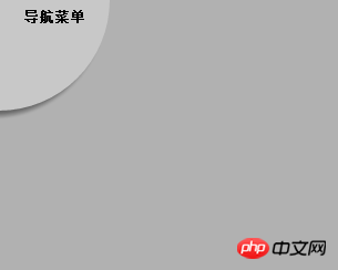
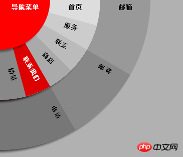
<li class="s1"><a href="#url">导航菜单</a>
<ul class="p2">
<li class="s2"><a href="#"><span>首页</span></a></li>
<li class="s2"><a href="#url"><span>服务</span></a>
<ul class="p3 a3">
<li><a href="#">打印</a></li>
<li><a href="#">编辑</a></li>
<li><a href="#">保管</a></li>
</ul>
</li>
<li class="s2"><a href="#url"><span>联系</span></a>
<ul class="p3 a6">
<li><a href="#">支持</a></li>
<li><a href="#">销售</a></li>
<li><a href="#">购买</a></li>
<li><a href="#">摄影师</a></li>
<li><a href="#">零售商</a></li>
<li><a href="#">常规</a></li>
</ul>
</li>
<li class="s2"><a href="#url"><span>商店</span></a>
<ul class="p3 a3">
<li><a href="#">南区</a></li>
<li><a href="#">北区</a></li>
<li><a href="#">中心区</a></li>
</ul>
</li>
<li class="s2"><a href="#url"><span>联系我们</span></a>
<ul class="p3 a3">
<li><a href="#">邮箱</a></li>
<li><a href="#">邮递</a></li>
<li><a href="#">电话</a></li>
</ul>
</li>
<li class="s2 b6"><a href="#url"><span>销量</span></a>
<ul class="p3 a5">
<li><a href="#">数码单反机身</a></li>
<li><a href="#">镜头</a></li>
<li><a href="#">闪光枪</a></li>
<li><a href="#">三角架</a></li>
<li><a href="#">过滤器</a></li>
</ul>
</li>
</ul>
</li>
</ul>
</p>
</p>
</body>
</html>
The renderings are as follows:
The above is the entire content of this article. I hope it will be helpful to everyone’s study. For more related content, please pay attention to the PHP Chinese website!
Related recommendations:
About how to use CSS3 to create animations
How to use CSS3 to implement waterfall flow layout
The above is the detailed content of Implement fan-shaped animated menu using CSS3. For more information, please follow other related articles on the PHP Chinese website!