
Home >Web Front-end >CSS Tutorial >How to draw basic cartoon patterns using HTML and CSS3
How to draw basic cartoon patterns using HTML and CSS3

- 不言Original
- 2018-06-20 17:30:082813browse
This article mainly introduces the sharing of examples of using CSS3 to draw basic cartoon patterns, but it must be admitted that the amount of code required to do so is not very small...well, friends in need can refer to it
Pure HTML CSS realizes the wooden statue of Astro Boy
First, the final rendering: 
In it, several properties in CSS are mainly used: position—positioning; border-radius—circle Angle; box-shadow—shadow; background (linear-gradient)—gradient; transform—rotation and transformation; animation—animation, not many technical points, mainly care and patience. Let’s go directly to the final source code. Due to the consideration of browser CSS compatibility, there is a lot of code.
<!DOCTYPE html>
<html xmlns="http://www.w3.org/1999/xhtml">
<head>
<meta content="text/html; charset=utf-8" http-equiv="Content-Type" />
<title>纯CSS漫画</title>
<style type="text/css">
* {
margin: 0;
padding: 0;
}
.outer-circle {
position: absolute;
top: 32px;
left: 44px;
width: 289px;
height: 289px;
border: 4px solid #75BD4F;
-moz-border-radius: 50%;
-webkit-border-radius: 50%;
border-radius: 50%;
}
.inner-circle {
position: relative;
width: 269px;
height: 269px;
border: 10px solid #F5F910;
-moz-border-radius: 50%;
-webkit-border-radius: 50%;
border-radius: 50%;
background-color: #73BF43;
}
.inner-circle p {
position: absolute;
}
.inner-circle-light {
top: 41px;
left: 35px;
-moz-box-shadow: 26px 26px 29px 37px #fff;
-webkit-box-shadow: 26px 26px 29px 37px #fff;
box-shadow: 26px 26px 29px 37px #fff;
}
.header-top {
top: 11px;
rightright: 2px;
z-index: 100;
width: 180px;
height: 90px;
-moz-border-radius: 90px 90px 0 0;
-webkit-border-radius: 90px 90px 0 0;
border-radius: 90px 90px 0 0;
background-color: #000;
-moz-transform: rotate(32deg);
-ms-transform: rotate(32deg);
-o-transform: rotate(32deg);
-webkit-transform: rotate(32deg);
transform: rotate(32deg);
}
.header-left {
top: -20px;
left: 37px;
width: 114px;
height: 228px;
-moz-border-radius: 228px 0 0 228px;
-webkit-border-radius: 228px 0 0 228px;
border-radius: 228px 0 0 228px;
background-color: #000;
-moz-transform: rotate(26deg);
-ms-transform: rotate(26deg);
-o-transform: rotate(26deg);
-webkit-transform: rotate(26deg);
transform: rotate(26deg);
}
.hair-left-1 {
top: 15px;
left: 53px;
z-index: 55;
width: 85px;
height: 23px;
-webkit-border-top-left-radius: 30px 180px;
border-top-left-radius: 30px 180px;
-webkit-border-bottom-left-radius: 30px 80px;
border-bottom-left-radius: 30px 80px;
background-color: #000;
-moz-transform: rotate(-74deg) skew(-42deg, 23deg);
-ms-transform: rotate(-74deg) skew(-42deg, 23deg);
-o-transform: rotate(-74deg) skew(-42deg, 23deg);
-webkit-transform: rotate(-74deg) skew(-42deg, 23deg);
transform: rotate(-74deg) skew(-42deg, 23deg);
}
.hair-left-2 {
top: -20px;
left: 99px;
z-index: 60;
width: 49px;
height: 37px;
background-color: #000;
-moz-transform: rotate(-51deg) skew(-43deg, 0deg);
-ms-transform: rotate(-51deg) skew(-43deg, 0deg);
-o-transform: rotate(-51deg) skew(-43deg, 0deg);
-webkit-transform: rotate(-51deg) skew(-43deg, 0deg);
transform: rotate(-51deg) skew(-43deg, 0deg);
}
.hair-rightright-1 {
top: 70px;
rightright: 1px;
z-index: 60;
width: 81px;
height: 85px;
-webkit-border-top-rightright-radius: 26px 120px;
border-top-rightright-radius: 26px 120px;
background-color: black;
-moz-transform: rotate(1deg) skew(-51deg, 0deg);
-ms-transform: rotate(1deg) skew(-51deg, 0deg);
-o-transform: rotate(1deg) skew(-51deg, 0deg);
-webkit-transform: rotate(1deg) skew(-51deg, 0deg);
transform: rotate(1deg) skew(-51deg, 0deg);
}
.hair-rightright-2 {
width: 60px;
height: 10px;
-webkit-border-bottom-left-radius: 100%;
border-bottom-left-radius: 100%;
background-color: rgba(0,0,0,0.2);
}
.hair-light-1 {
top: 30px;
rightright: 45px;
z-index: 105;
width: 57px;
height: 17px;
-moz-border-radius: 100%;
-webkit-border-radius: 100%;
border-radius: 100%;
background-color: white;
-moz-transform: rotate(39deg);
-ms-transform: rotate(39deg);
-o-transform: rotate(39deg);
-webkit-transform: rotate(39deg);
transform: rotate(39deg);
}
.hair-light-1-over {
top: 32px;
rightright: 38px;
z-index: 105;
width: 83px;
height: 21px;
-moz-border-radius: 100%;
-webkit-border-radius: 100%;
border-radius: 100%;
background-color: black;
-moz-transform: rotate(41deg);
-ms-transform: rotate(41deg);
-o-transform: rotate(41deg);
-webkit-transform: rotate(41deg);
transform: rotate(41deg);
}
.hair-light-2 {
top: 16px;
rightright: 104px;
z-index: 105;
width: 4px;
height: 2px;
-moz-border-radius: 2px;
-webkit-border-radius: 2px;
border-radius: 2px;
background-color: white;
-moz-transform: rotate(10deg);
-ms-transform: rotate(10deg);
-o-transform: rotate(10deg);
-webkit-transform: rotate(10deg);
transform: rotate(10deg);
}
.ear {
top: 141px;
rightright: 36px;
z-index: 110;
width: 49px;
height: 48px;
border: 2px solid #000;
border-bottom-width: 1px;
-moz-border-radius: 50%;
-webkit-border-radius: 50%;
border-radius: 50%;
background-color: #F6C6B0;
-moz-box-shadow: -4px 0 0 0 #de9876 inset;
-webkit-box-shadow: -4px 0 0 0 #de9876 inset;
box-shadow: -4px 0 0 0 #de9876 inset;
-moz-transform: rotate(56deg) scaleY(1.4);
-ms-transform: rotate(56deg) scaleY(1.4);
-o-transform: rotate(56deg) scaleY(1.4);
-webkit-transform: rotate(56deg) scaleY(1.4);
transform: rotate(56deg) scaleY(1.4);
}
.ear-inner-1 {
top: 22px;
left: 22px;
z-index: 70;
width: 9px;
height: 5px;
border-top: 1px solid #110b00;
-moz-border-radius: 50%;
-webkit-border-radius: 50%;
border-radius: 50%;
-moz-transform: rotate(-6deg);
-ms-transform: rotate(-6deg);
-o-transform: rotate(-6deg);
-webkit-transform: rotate(-6deg);
transform: rotate(-6deg);
}
.ear-inner-2 {
top: 19px;
left: 18px;
width: 14px;
height: 7px;
border-top: 2px solid #110b00;
-moz-border-radius: 50%;
-webkit-border-radius: 50%;
border-radius: 50%;
-moz-box-shadow: 0px 2px 0 0 #de9876 inset;
-webkit-box-shadow: 0px 2px 0 0 #de9876 inset;
box-shadow: 0px 2px 0 0 #de9876 inset;
-moz-transform: rotate(-91deg);
-ms-transform: rotate(-91deg);
-o-transform: rotate(-91deg);
-webkit-transform: rotate(-91deg);
transform: rotate(-91deg);
}
.ear-light {
top: 21px;
rightright: 34px;
z-index: 105;
width: 17px;
height: 6px;
-moz-border-radius: 100%;
-webkit-border-radius: 100%;
border-radius: 100%;
background-color: #FFF;
-moz-transform: rotate(89deg);
-ms-transform: rotate(89deg);
-o-transform: rotate(89deg);
-webkit-transform: rotate(89deg);
transform: rotate(89deg);
}
.ear-over {
bottombottom: -44px;
left: -33px;
z-index: 55;
width: 69px;
height: 59px;
-moz-border-radius: 50%;
-webkit-border-radius: 50%;
border-radius: 50%;
background-color: #f6c6b0;
-moz-transform: rotate(26deg);
-ms-transform: rotate(26deg);
-o-transform: rotate(26deg);
-webkit-transform: rotate(26deg);
transform: rotate(26deg);
}
.face-main {
top: 30px;
left: 35px;
z-index: 50;
width: 180px;
height: 188px;
-moz-border-radius: 90px;
-webkit-border-radius: 90px;
border-radius: 90px;
background-color: #F6C6B0;
-moz-box-shadow: 3px -3px 0 0 #fff inset;
-webkit-box-shadow: 3px -3px 0 0 #fff inset;
box-shadow: 3px -3px 0 0 #fff inset;
}
.face-top {
top: 61px;
rightright: 75px;
z-index: 105;
width: 111px;
height: 46px;
-moz-border-radius: 50% 50% 26px 0;
-webkit-border-radius: 50% 50% 26px 0;
border-radius: 50% 50% 26px 0;
background-color: #f6c6b0;
-moz-transform: rotate(37deg);
-ms-transform: rotate(37deg);
-o-transform: rotate(37deg);
-webkit-transform: rotate(37deg);
transform: rotate(37deg);
}
.face-rightright-1 {
top: 115px;
rightright: 71px;
z-index: 105;
width: 68px;
height: 62px;
-moz-border-radius: 100% 0 0;
-webkit-border-radius: 100% 0 0;
border-radius: 100% 0 0;
background-color: #f6c6b0;
-moz-transform: rotate(99deg);
-ms-transform: rotate(99deg);
-o-transform: rotate(99deg);
-webkit-transform: rotate(99deg);
transform: rotate(99deg);
}
.face-bottombottom-1 {
bottombottom: 42px;
left: 45px;
z-index: 40;
width: 72px;
height: 52px;
-webkit-border-bottom-left-radius: 70px 40px;
-webkit-border-top-left-radius: 14px 11px;
border-top-left-radius: 14px 11px;
border-bottom-left-radius: 70px 40px;
background-color: #000;
}
.face-bottombottom-1-over {
bottombottom: 45px;
left: 48px;
z-index: 55;
width: 69px;
height: 47px;
-webkit-border-bottom-left-radius: 70px 40px;
-webkit-border-top-left-radius: 14px 11px;
border-top-left-radius: 14px 11px;
border-bottom-left-radius: 70px 40px;
background-color: #f6c6b0;
-moz-box-shadow: 3px 0px 0 0 #fff inset;
-webkit-box-shadow: 3px 0px 0 0 #fff inset;
box-shadow: 3px 0px 0 0 #fff inset;
}
.face-bottombottom-2 {
rightright: 97px;
bottombottom: 44px;
z-index: 55;
width: 43px;
height: 31px;
-webkit-border-bottom-rightright-radius: 70px 40px;
border-bottom-rightright-radius: 70px 40px;
background-color: #000;
-moz-transform: rotate(-4deg) skew(-49deg, 0deg);
-ms-transform: rotate(-4deg) skew(-49deg, 0deg);
-o-transform: rotate(-4deg) skew(-49deg, 0deg);
-webkit-transform: rotate(-4deg) skew(-49deg, 0deg);
transform: rotate(-4deg) skew(-49deg, 0deg);
}
.face-bottombottom-2-over {
rightright: 99px;
bottombottom: 46px;
z-index: 56;
width: 43px;
height: 31px;
-webkit-border-bottom-rightright-radius: 70px 40px;
border-bottom-rightright-radius: 70px 40px;
background-color: #f6c6b0;
-moz-box-shadow: -6px 2px 0 0 #de9876 inset;
-webkit-box-shadow: -6px 2px 0 0 #de9876 inset;
box-shadow: -6px 2px 0 0 #de9876 inset;
-moz-transform: rotate(-3deg) skew(-49deg, 0deg);
-ms-transform: rotate(-3deg) skew(-49deg, 0deg);
-o-transform: rotate(-3deg) skew(-49deg, 0deg);
-webkit-transform: rotate(-3deg) skew(-49deg, 0deg);
transform: rotate(-3deg) skew(-49deg, 0deg);
}
.face-light-1 {
rightright: 127px;
bottombottom: 95px;
z-index: 150;
width: 6px;
height: 6px;
-moz-border-radius: 50%;
-webkit-border-radius: 50%;
border-radius: 50%;
background-color: #fff;
}
.face-light-2 {
bottombottom: 82px;
left: 58px;
z-index: 150;
width: 4px;
height: 4px;
-moz-border-radius: 50%;
-webkit-border-radius: 50%;
border-radius: 50%;
background-color: #fff;
}
.chin {
bottombottom: 39px;
left: 111px;
z-index: 70;
width: 11px;
height: 12px;
border: 2px solid #000;
border-top-color: #f6c6b0;
border-left-color: #f6c6b0;
-webkit-border-bottom-rightright-radius: 6px;
border-bottom-rightright-radius: 6px;
background-color: #f6c6b0;
-moz-transform: rotate(34deg) skew(-9deg, 0deg);
-ms-transform: rotate(34deg) skew(-9deg, 0deg);
-o-transform: rotate(34deg) skew(-9deg, 0deg);
-webkit-transform: rotate(34deg) skew(-9deg, 0deg);
transform: rotate(34deg) skew(-9deg, 0deg);
}
.eye-rightright {
top: 97px;
left: 103px;
z-index: 110;
width: 39px;
height: 67px;
border: 1px solid #000;
border-top-width: 2px;
-moz-border-radius: 24px 43px 34px 28px / 34px 71px 34px 81px;
-webkit-border-radius: 24px 43px 34px 28px / 34px 71px 34px 81px;
border-radius: 24px 43px 34px 28px / 34px 71px 34px 81px;
background-color: #F8FAF7;
-moz-box-shadow: 0px 5px 0 0 #d5d9e2 inset;
-webkit-box-shadow: 0px 5px 0 0 #d5d9e2 inset;
box-shadow: 0px 5px 0 0 #d5d9e2 inset;
}
.eye-rightright-inner {
rightright: 0;
bottombottom: 3px;
z-index: 115;
width: 30px;
height: 52px;
-moz-border-radius: 32px 43px 28px 48px / 47px 55px 45px 75px;
-webkit-border-radius: 32px 43px 28px 48px / 47px 55px 45px 75px;
border-radius: 32px 43px 28px 48px / 47px 55px 45px 75px;
background-color: #000;
}
.eye-rightright-light1 {
top: 19px;
rightright: 0;
z-index: 120;
width: 19px;
height: 10px;
-moz-border-radius: 100%;
-webkit-border-radius: 100%;
border-radius: 100%;
background-color: #FFF;
-moz-animation: eye-flash 0.2s linear 0.1s infinite normal;
-o-animation: eye-flash 0.2s linear 0.1s infinite normal;
-webkit-animation: eye-flash 0.2s linear 0.1s infinite normal;
-moz-transform: rotate(41deg);
-ms-transform: rotate(41deg);
-o-transform: rotate(41deg);
-webkit-transform: rotate(41deg);
transform: rotate(41deg);
animation: eye-flash 0.2s linear 0.1s infinite normal;
}
@-webkit-keyframes eye-flash {
0% {
top: 19px;
}
100% {
top: 21px;
}
}
@-moz-keyframes eye-flash {
0% {
top: 19px;
}
100% {
top: 20px;
}
}
@-ms-keyframes eye-flash {
0% {
top: 19px;
}
100% {
top: 20px;
}
}
@keyframes eye-flash {
0% {
top: 19px;
}
100% {
top: 20px;
}
}
.eye-rightright-light2 {
bottombottom: 8px;
left: 9px;
z-index: 120;
width: 14px;
height: 7px;
-webkit-border-bottom-rightright-radius: 100%;
border-bottom-rightright-radius: 100%;
background-color: #FFF;
-moz-transform: rotate(-39deg);
-ms-transform: rotate(-39deg);
-o-transform: rotate(-39deg);
-webkit-transform: rotate(-39deg);
transform: rotate(-39deg);
}
.eye-rightright-eyelash1 {
top: 9px;
left: -3px;
width: 2px;
height: 4px;
background-color: #000;
-moz-transform: rotate(-54deg);
-ms-transform: rotate(-54deg);
-o-transform: rotate(-54deg);
-webkit-transform: rotate(-54deg);
transform: rotate(-54deg);
}
.eye-rightright-eyelash2 {
top: 1px;
left: 1px;
width: 2px;
height: 5px;
background-color: #000;
-moz-transform: rotate(-33deg);
-ms-transform: rotate(-33deg);
-o-transform: rotate(-33deg);
-webkit-transform: rotate(-33deg);
transform: rotate(-33deg);
}
.eye-rightright-eyelash3 {
top: -8px;
left: 8px;
width: 2px;
height: 7px;
background-color: #000;
-moz-transform: rotate(-21deg);
-ms-transform: rotate(-21deg);
-o-transform: rotate(-21deg);
-webkit-transform: rotate(-21deg);
transform: rotate(-21deg);
}
.eye-rightright-eyelash4 {
top: -6px;
left: 21px;
width: 2px;
height: 6px;
background-color: #000;
-moz-transform: rotate(11deg);
-ms-transform: rotate(11deg);
-o-transform: rotate(11deg);
-webkit-transform: rotate(11deg);
transform: rotate(11deg);
}
.eye-rightright-eyelash5 {
top: 1px;
rightright: 8px;
width: 2px;
height: 6px;
background-color: #000;
-moz-transform: rotate(14deg);
-ms-transform: rotate(14deg);
-o-transform: rotate(14deg);
-webkit-transform: rotate(14deg);
transform: rotate(14deg);
}
.eye-left {
top: 114px;
left: 45px;
z-index: 110;
width: 19px;
height: 63px;
border: 1px solid #000;
border-top-width: 2px;
-moz-border-radius: 29px 28px 33px / 97px 111px 40px 90px;
-webkit-border-radius: 29px 28px 33px / 97px 111px 40px 90px;
border-radius: 29px 28px 33px / 97px 111px 40px 90px;
background-color: #F8FAF7;
-moz-box-shadow: 0px 6px 0 0 #d5d9e2 inset;
-webkit-box-shadow: 0px 6px 0 0 #d5d9e2 inset;
box-shadow: 0px 6px 0 0 #d5d9e2 inset;
-moz-transform: rotate(-9deg);
-ms-transform: rotate(-9deg);
-o-transform: rotate(-9deg);
-webkit-transform: rotate(-9deg);
transform: rotate(-9deg);
}
.eye-left-inner {
rightright: 0;
bottombottom: 1px;
z-index: 115;
width: 15px;
height: 46px;
-moz-border-radius: 49px 44px 29px 58px / 143px 83px 45px 122px;
-webkit-border-radius: 49px 44px 29px 58px / 143px 83px 45px 122px;
border-radius: 49px 44px 29px 58px / 143px 83px 45px 122px;
background-color: #000;
}
.eye-left-light1 {
top: 19px;
rightright: 1px;
z-index: 120;
width: 7px;
height: 18px;
-moz-border-radius: 100%;
-webkit-border-radius: 100%;
border-radius: 100%;
background-color: #FFF;
-moz-animation: eye-flash 0.2s linear 0.1s infinite normal;
-o-animation: eye-flash 0.2s linear 0.1s infinite normal;
-webkit-animation: eye-flash 0.2s linear 0.1s infinite normal;
-moz-transform: rotate(-9deg);
-ms-transform: rotate(-9deg);
-o-transform: rotate(-9deg);
-webkit-transform: rotate(-9deg);
transform: rotate(-9deg);
animation: eye-flash 0.2s linear 0.1s infinite normal;
}
.eye-left-light2 {
bottombottom: 6px;
left: 4px;
z-index: 120;
width: 11px;
height: 4px;
-webkit-border-bottom-rightright-radius: 100%;
border-bottom-rightright-radius: 100%;
background-color: #FFF;
-moz-transform: rotate(-45deg);
-ms-transform: rotate(-45deg);
-o-transform: rotate(-45deg);
-webkit-transform: rotate(-45deg);
transform: rotate(-45deg);
}
.eye-left-eyelash1 {
top: 7px;
left: -1px;
width: 2px;
height: 4px;
background-color: #000;
-moz-transform: rotate(-49deg);
-ms-transform: rotate(-49deg);
-o-transform: rotate(-49deg);
-webkit-transform: rotate(-49deg);
transform: rotate(-49deg);
}
.eye-left-eyelash2 {
top: -1px;
left: 2px;
width: 2px;
height: 5px;
background-color: #000;
-moz-transform: rotate(-28deg);
-ms-transform: rotate(-28deg);
-o-transform: rotate(-28deg);
-webkit-transform: rotate(-28deg);
transform: rotate(-28deg);
}
.eye-left-eyelash3 {
top: -6px;
left: 7px;
width: 2px;
height: 5px;
background-color: #000;
-moz-transform: rotate(-4deg);
-ms-transform: rotate(-4deg);
-o-transform: rotate(-4deg);
-webkit-transform: rotate(-4deg);
transform: rotate(-4deg);
}
.eye-left-eyelash4 {
top: -4px;
left: 13px;
width: 2px;
height: 4px;
background-color: #000;
-moz-transform: rotate(25deg);
-ms-transform: rotate(25deg);
-o-transform: rotate(25deg);
-webkit-transform: rotate(25deg);
transform: rotate(25deg);
}
.eye-left-eyelash5 {
top: 3px;
rightright: 0;
width: 2px;
height: 4px;
background-color: #000;
-moz-transform: rotate(41deg);
-ms-transform: rotate(41deg);
-o-transform: rotate(41deg);
-webkit-transform: rotate(41deg);
transform: rotate(41deg);
}
.rightright-eyebrow {
top: 68px;
left: 92px;
z-index: 110;
width: 66px;
height: 36px;
border: 2px solid #000;
border-width: 2px 1px 0px 1px;
-moz-border-radius: 45px 51px 0 0;
-webkit-border-radius: 45px 51px 0 0;
border-radius: 45px 51px 0 0;
background-color: transparent;
-moz-transform: skew(-6deg, 16deg);
-ms-transform: skew(-6deg, 16deg);
-o-transform: skew(-6deg, 16deg);
-webkit-transform: skew(-6deg, 16deg);
transform: skew(-6deg, 16deg);
}
.rightright-eyebrow-over {
top: 21px;
rightright: -5px;
z-index: 115;
width: 13px;
height: 20px;
background-color: #f6c6b0;
}
.left-eyebrow {
top: 89px;
left: 36px;
z-index: 100;
width: 30px;
height: 68px;
border: 2px solid #000;
border-width: 2px 1px 0px 1px;
-moz-border-radius: 100%;
-webkit-border-radius: 100%;
border-radius: 100%;
background-color: transparent;
-moz-transform: rotate(-2deg);
-ms-transform: rotate(-2deg);
-o-transform: rotate(-2deg);
-webkit-transform: rotate(-2deg);
transform: rotate(-2deg);
}
.left-eyebrow-over {
top: 17px;
rightright: -9px;
z-index: 105;
width: 39px;
height: 55px;
-moz-border-radius: 21px 12px 0 17px;
-webkit-border-radius: 21px 12px 0 17px;
border-radius: 21px 12px 0 17px;
background-color: #f6c6b0;
-moz-transform: rotate(-13deg);
-ms-transform: rotate(-13deg);
-o-transform: rotate(-13deg);
-webkit-transform: rotate(-13deg);
transform: rotate(-13deg);
}
.nose {
top: 172px;
left: 63px;
z-index: 115;
width: 21px;
height: 16px;
border: 2px solid #000;
-moz-border-radius: 50%;
-webkit-border-radius: 50%;
border-radius: 50%;
-moz-box-shadow: 3px 1px 0 0 #fff inset;
-webkit-box-shadow: 3px 1px 0 0 #fff inset;
box-shadow: 3px 1px 0 0 #fff inset;
}
.nose-over {
top: -1px;
rightright: -11px;
z-index: 115;
width: 19px;
height: 14px;
background-color: #f6c6b0;
-moz-transform: rotate(31deg);
-ms-transform: rotate(31deg);
-o-transform: rotate(31deg);
-webkit-transform: rotate(31deg);
transform: rotate(31deg);
}
.nose-tip {
top: -7px;
left: 13px;
width: 2px;
height: 6px;
background-color: #000;
-moz-transform: rotate(14deg);
-ms-transform: rotate(14deg);
-o-transform: rotate(14deg);
-webkit-transform: rotate(14deg);
transform: rotate(14deg);
}
.mouth {
bottombottom: 61px;
left: 72px;
z-index: 110;
width: 46px;
height: 47px;
border: 2px solid #000;
border-width: 0 1px 2px 0;
-moz-border-radius: 32px 29px 23px 48px / 47px 82px 52px 75px;
-webkit-border-radius: 32px 29px 23px 48px / 47px 82px 52px 75px;
border-radius: 32px 29px 23px 48px / 47px 82px 52px 75px;
background-color: #92222E;
-moz-transform: rotate(1deg) skew(0deg, 39deg);
-ms-transform: rotate(1deg) skew(0deg, 39deg);
-o-transform: rotate(1deg) skew(0deg, 39deg);
-webkit-transform: rotate(1deg) skew(0deg, 39deg);
transform: rotate(1deg) skew(0deg, 39deg);
}
.mouth-over-1 {
bottombottom: 0;
left: -4px;
z-index: 115;
width: 37px;
height: 58px;
border-right: 1px solid #000;
-moz-border-radius: 38px 13px 10px 77px / 47px 82px 52px 73px;
-webkit-border-radius: 38px 13px 10px 77px / 47px 82px 52px 73px;
border-radius: 38px 13px 10px 77px / 47px 82px 52px 73px;
background-color: #f6c6b0;
-moz-transform: rotate(38deg) skew(0deg, 6deg);
-ms-transform: rotate(38deg) skew(0deg, 6deg);
-o-transform: rotate(38deg) skew(0deg, 6deg);
-webkit-transform: rotate(38deg) skew(0deg, 6deg);
transform: rotate(38deg) skew(0deg, 6deg);
}
.mouth-over-2 {
bottombottom: 38px;
left: 30px;
z-index: 150;
width: 7px;
height: 19px;
background-color: #f6c6b0;
-moz-transform: rotate(-233deg);
-ms-transform: rotate(-233deg);
-o-transform: rotate(-233deg);
-webkit-transform: rotate(-233deg);
transform: rotate(-233deg);
}
.mouth-over-3 {
bottombottom: -9px;
left: 11px;
z-index: 115;
width: 27px;
height: 9px;
border-top: 2px solid #000;
-moz-border-radius: 100%;
-webkit-border-radius: 100%;
border-radius: 100%;
background-color: #f6c6b0;
-moz-transform: rotate(-4deg);
-ms-transform: rotate(-4deg);
-o-transform: rotate(-4deg);
-webkit-transform: rotate(-4deg);
transform: rotate(-4deg);
}
.mouth-over-4 {
bottombottom: -6px;
left: -1px;
z-index: 150;
width: 7px;
height: 15px;
background-color: #f6c6b0;
-moz-transform: rotate(-226deg);
-ms-transform: rotate(-226deg);
-o-transform: rotate(-226deg);
-webkit-transform: rotate(-226deg);
transform: rotate(-226deg);
}
.mouth-tip {
bottombottom: 39px;
left: 41px;
z-index: 120;
width: 2px;
height: 3px;
background-color: #000;
-moz-transform: rotate(-51deg);
-ms-transform: rotate(-51deg);
-o-transform: rotate(-51deg);
-webkit-transform: rotate(-51deg);
transform: rotate(-51deg);
}
.mouth-inner {
bottombottom: 50px;
left: 107px;
z-index: 115;
width: 10px;
height: 18px;
-moz-border-radius: 10px 0 4px 6px / 8px 2px 8px 9px;
-webkit-border-radius: 10px 0 4px 6px / 8px 2px 8px 9px;
border-radius: 10px 0 4px 6px / 8px 2px 8px 9px;
background-color: #ed675c;
-moz-transform: rotate(6deg);
-ms-transform: rotate(6deg);
-o-transform: rotate(6deg);
-webkit-transform: rotate(6deg);
transform: rotate(6deg);
}
.name-lable {
bottombottom: -9px;
left: -8px;
z-index: 150;
width: 280px;
color: #005aa9;
text-align: center;
font-weight: bold;
font-style: italic;
font-size: 50px;
font-family: Times New Roman;
}
.name-lable-light {
top: 30px;
width: 100%;
height: 0;
-moz-box-shadow: 0 0 3px 3px #fff;
-webkit-box-shadow: 0 0 3px 3px #fff;
box-shadow: 0 0 3px 3px #fff;
}
@-webkit-keyframes input-flash {
0% {
border-color: #ccc;
-moz-box-shadow: inset 0 1px 1px rgba(0,0,0,0.075);
-webkit-box-shadow: inset 0 1px 1px rgba(0,0,0,0.075);
box-shadow: inset 0 1px 1px rgba(0,0,0,0.075);
}
100% {
border-color: rgba(82,168,236,0.8);
-moz-box-shadow: inset 0 1px 1px rgba(0,0,0,0.075), 0 0 10px rgba(82,168,236,0.6);
-webkit-box-shadow: inset 0 1px 1px rgba(0,0,0,0.075), 0 0 10px rgba(82,168,236,0.6);
box-shadow: inset 0 1px 1px rgba(0,0,0,0.075), 0 0 10px rgba(82,168,236,0.6);
}
}
@-moz-keyframes input-flash {
0% {
border-color: #ccc;
-moz-box-shadow: inset 0 1px 1px rgba(0,0,0,0.075);
-webkit-box-shadow: inset 0 1px 1px rgba(0,0,0,0.075);
box-shadow: inset 0 1px 1px rgba(0,0,0,0.075);
}
100% {
border-color: rgba(82,168,236,0.8);
-moz-box-shadow: inset 0 1px 1px rgba(0,0,0,0.075), 0 0 10px rgba(82,168,236,0.6);
-webkit-box-shadow: inset 0 1px 1px rgba(0,0,0,0.075), 0 0 10px rgba(82,168,236,0.6);
box-shadow: inset 0 1px 1px rgba(0,0,0,0.075), 0 0 10px rgba(82,168,236,0.6);
}
}
@-ms-keyframes input-flash {
0% {
border-color: #ccc;
-moz-box-shadow: inset 0 1px 1px rgba(0,0,0,0.075);
-webkit-box-shadow: inset 0 1px 1px rgba(0,0,0,0.075);
box-shadow: inset 0 1px 1px rgba(0,0,0,0.075);
}
100% {
border-color: rgba(82,168,236,0.8);
-moz-box-shadow: inset 0 1px 1px rgba(0,0,0,0.075), 0 0 10px rgba(82,168,236,0.6);
-webkit-box-shadow: inset 0 1px 1px rgba(0,0,0,0.075), 0 0 10px rgba(82,168,236,0.6);
box-shadow: inset 0 1px 1px rgba(0,0,0,0.075), 0 0 10px rgba(82,168,236,0.6);
}
}
@keyframes input-flash {
0% {
border-color: #ccc;
-moz-box-shadow: inset 0 1px 1px rgba(0,0,0,0.075);
-webkit-box-shadow: inset 0 1px 1px rgba(0,0,0,0.075);
box-shadow: inset 0 1px 1px rgba(0,0,0,0.075);
}
100% {
border-color: rgba(82,168,236,0.8);
-moz-box-shadow: inset 0 1px 1px rgba(0,0,0,0.075), 0 0 10px rgba(82,168,236,0.6);
-webkit-box-shadow: inset 0 1px 1px rgba(0,0,0,0.075), 0 0 10px rgba(82,168,236,0.6);
box-shadow: inset 0 1px 1px rgba(0,0,0,0.075), 0 0 10px rgba(82,168,236,0.6);
}
}
</style>
</head>
<body>
<p style="width: 400px; height: 359px; position: relative; margin: 50px auto;">
<p class="outer-circle">
<!--外圆-->
<p class="inner-circle">
<!--内圆-->
<p class="inner-circle-light"></p>
<p class="header-top"></p>
<!--头发-->
<p class="hair-left-1"></p>
<p class="hair-left-2"></p>
<p class="hair-light-1"></p>
<p class="hair-light-1-over"></p>
<p class="hair-light-2"></p>
<p class="hair-right-1">
<p class="hair-right-2">
</p>
</p>
<p class="header-left"></p>
<!--脸部-->
<p class="face-main"></p>
<p class="face-light-1"></p>
<p class="face-light-2"></p>
<p class="face-top"></p>
<p class="face-right-1"></p>
<p class="face-bottom-1"></p>
<p class="face-bottom-1-over"></p>
<p class="face-bottom-2"></p>
<p class="face-bottom-2-over"></p>
<p class="chin"></p>
<p class="ear">
<!--耳朵-->
<p class="ear-inner-1"></p>
<p class="ear-inner-2"></p>
<p class="ear-over"></p>
<p class="ear-light"></p>
</p>
<p class="eye-left">
<!--左眼-->
<p class="eye-left-inner"></p>
<p class="eye-left-light1"></p>
<p class="eye-left-light2"></p>
<p class="eye-left-eyelash1"></p>
<p class="eye-left-eyelash2"></p>
<p class="eye-left-eyelash3"></p>
<p class="eye-left-eyelash4"></p>
<p class="eye-left-eyelash5"></p>
</p>
<p class="eye-right">
<!--右眼-->
<p class="eye-right-inner"></p>
<p class="eye-right-light1"></p>
<p class="eye-right-light2"></p>
<p class="eye-right-eyelash1"></p>
<p class="eye-right-eyelash2"></p>
<p class="eye-right-eyelash3"></p>
<p class="eye-right-eyelash4"></p>
<p class="eye-right-eyelash5"></p>
</p>
<p class="right-eyebrow">
<!--右眼眉毛-->
<p class="right-eyebrow-over"></p>
</p>
<p class="left-eyebrow">
<!--左眼眉毛-->
<p class="left-eyebrow-over"></p>
</p>
<p class="nose">
<!--鼻子-->
<p class="nose-tip"></p>
<p class="nose-over"></p>
</p>
<p class="mouth">
<!--嘴巴-->
<p class="mouth-over-1"></p>
<p class="mouth-over-2"></p>
<p class="mouth-over-3"></p>
<p class="mouth-over-4"></p>
<p class="mouth-tip"></p>
</p>
<p class="mouth-inner"></p>
<p class="name-lable">
ASTRO BOY
<p class="name-lable-light"></p>
</p>
</p>
</p>
</p>
</body>
</html>Use CSS3 to draw a jingle cat
If you often use PS or Flash, you should know that it is very easy to draw a jingle cat, at least it is so for me feel. However, it is indeed my first time to draw with CSS3, so I am happy to try it. For a novice like me, it is really helpful. At least I know how to draw a simple character, plus some animation effects. , it’s alive, that’s even more fun! OK, before we start, let me show you the renderings: 
PS: To be honest, I think it’s quite cute. I often watched Doraemon when I was a kid, and suddenly I felt very friendly. , very childlike, and instantly looked much younger, haha! Warm smile
First of all, set up the HTML structure:
<p class="wrapper">
    <!--叮当猫整体-->
    <p class="doraemon">
        <!--头部-->
        <p class="head">
            <!--眼睛-->
            <p class="eyes">
                <p class="eye left">
                    <!--眼珠-->
                    <p class="black bleft"></p>
                </p>
                <p class="eye right">
                    <p class="black bright"></p>
                </p>
            </p>
            <!--脸部-->
            <p class="face">
                <!--白色脸底-->
                <p class="white"></p>
                <!--鼻子-->
                <p class="nose">
                    <!--鼻子高光部分-->
                    <p class="light"></p>
                </p>
                <!--鼻子的竖线-->
                <p class="nose_line"></p>
                <!--嘴巴-->
                <p class="mouth"></p>
                <!--胡须-->
                <p class="whiskers">
                    <p class="whisker rTop r160"></p>
                    <p class="whisker rMiddle"></p>
                    <p class="whisker rBottom r20"></p>
                    <p class="whisker lTop r20"></p>
                    <p class="whisker lMiddle"></p>
                    <p class="whisker lBottom r160"></p>
                </p>
            </p>
        </p>
        <!--脖子和铃铛-->
        <p class="choker">
            <!--铃铛-->
            <p class="bell">
                <p class="bell_line"></p>
                <p class="bell_circle"></p>
                <p class="bell_under"></p>
                <p class="bell_light"></p>
            </p>
        </p>
        <!--身体-->
        <p class="bodys">
            <!--肚子-->
            <p class="body"></p>
            <!--肚兜-->
            <p class="wraps"></p>
            <!--口袋-->
            <p class="pocket"></p>
            <!--遮住一半口袋,使其呈现半圆-->
            <p class="pocket_mask"></p>
        </p>
        <!--右手-->
        <p class="hand_right">
            <!--手臂-->
            <p class="arm"></p>
            <!--手掌-->
            <p class="circle"></p>
            <!--遮住手臂和身子交接处的线-->
            <p class="arm_rewrite"></p>
        </p>
        <!--左手-->
        <p class="hand_left">
            <p class="arm"></p>
            <p class="circle"></p>
            <p class="arm_rewrite"></p>
        </p>
        <!--脚-->
        <p class="foot">
            <p class="left"></p>
            <p class="right"></p>
             <!--双脚之间的缝隙-->
            <p class="foot_rewrite"></p>
        </p>
    </p>
</p>
It is best to study the overall structure of Jingle Cat carefully. If you want to draw it by yourself in the future, The characters are very helpful and the ideas will be clearer.
Next, we will demonstrate based on the head, neck, body, and feet. First, make some basic styles for the container wrapper and Doraemon as a whole. Doraemon as a whole Doraemon sets the position to relative, mainly to facilitate the positioning of child elements/descendant elements.
.wrapper{
    margin: 50px 0 0 500px;
}
.doraemon{
    position: relative;
}
The style of the head, because the head of Jingle Cat is not a perfect circle, so there is a slight deviation in width and height, then use border-radius to change the head from a rectangle to an oval, and then use radial Gradient: Give the background a radial gradient from the upper right corner, and then add a shadow to make it more three-dimensional. Background: #07bbee; is for compatibility with lower version browsers:
.doraemon .head {
            position:relative;
            width: 320px;
            height: 300px;
            border-radius: 150px;
            background: #07bbee;
            background: -webkit-radial-gradient(rightright top,#fff 10%,#07bbee 20%,#10a6ce 75%,#000);
            background: -moz-radial-gradient(rightright top,#fff 10%,#07bbee 20%,#10a6ce 75%,#000);
            background: -ms-radial-gradient(rightright top,#fff 10%,#07bbee 20%,#10a6ce 75%,#000);
            border:2px solid #555;
            box-shadow:-5px 10px 15px rgba(0,0,0,0.45);
}
Let’s see what the effect is like: 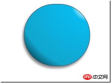
Surprised shenmgui is so ugly, don’t worry, let it come to life slowly:
/*脸部*/
         .doraemon .face {
             position: relative; /*让所有脸部元素可自由定位*/
             z-index: 2;    /*脸在头部背景上面*/
         }
        /*白色脸底*/
        .doraemon .face .white {
            width: 265px;       /*设置宽高*/
            height: 195px;
            border-radius: 150px;
            position: absolute; /*进行绝对定位*/
            top: 75px;
            left: 25px;
            background: #fff;
            /*此放射渐变也是使脸的左下角暗一些,看上去更真实*/
            background: -webkit-radial-gradient(rightright top,#fff 75%,#eee 80%,#999 90%,#444);
            background: -moz-radial-gradient(rightright top,#fff 75%,#eee 80%,#999 90%,#444);
            background: –ms-radial-gradient(rightright top,#fff 75%,#eee 80%,#999 90%,#444);
         }
        /*鼻子*/
         .doraemon .face .nose{
             width:30px;
             height:30px;
             border-radius:15px;
             background:#c93300;
             border:2px solid #000;
             position:absolute;
             top:110px;
             left:140px;
             z-index:3;   /*鼻子在白色脸底下面*/
         }
        /*鼻子上的高光*/
        .doraemon .face .nose .light {
            width:10px;
            height:10px;
            border-radius: 5px;
            box-shadow: 19px 8px 5px #fff;  /*通过阴影实现高光*/
        }
         /*鼻子下的线*/
         .doraemon .face .nose_line{
             width:3px;
             height:100px;
             background:#333;
             position:absolute;
             top:143px;
             left:155px;
             z-index:3;
         }
         /*嘴巴*/
         .doraemon .face .mouth{
             width:220px;
             height:400px;
             /*通过底边框加上圆角模拟微笑嘴巴*/
             border-bottom:3px solid #333;
             border-radius:120px;
             position:absolute;
             top:-160px;
             left:45px;
         }
         /*眼睛*/
        .doraemon .eyes {
            position: relative;
            z-index: 3; /*眼睛在白色脸底下面*/
        }
        /*眼睛共同的样式*/
        .doraemon .eyes .eye{
            width:72px;
            height:82px;
            background:#fff;
            border:2px solid #000;
            border-radius:35px 35px;
            position:absolute;
            top:40px;
        }
        /*眼珠*/
        .doraemon .eyes .eye .black{
            width:14px;
            height:14px;
            background:#000;
            border-radius:7px;
            position:absolute;
            top:40px;
        }
        .doraemon .eyes .left{
            left:82px;
        }
        .doraemon .eyes .rightright {
            left: 156px;
        }
        .doraemon .eyes .eye .bleft {
            left: 50px;
        }
        .doraemon .eyes .eye .bright {
            left: 7px;
        }
Written so many styles, what is the result: 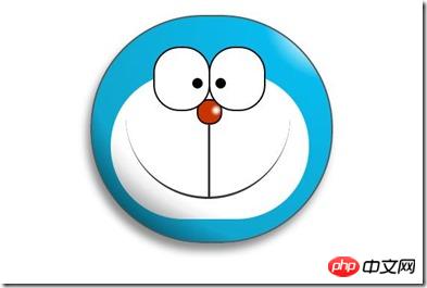
I feel awkward no matter how I look at it, oh! We still need a beard and a white border on the bottom of the face. Let’s add it:
/*胡须背景,主要用于挡住嘴巴的一部分,不要显得太长*/
        .doraemon .whiskers{
            width:220px;
            height:80px;
            background:#fff;
            border-radius:15px;
            position:absolute;
            top:120px;
            left:45px;
            z-index:2;   /*在鼻子和眼睛下面*/
        }
        /*所有胡子的公用样式*/
        .doraemon .whiskers .whisker {
            width: 60px;
            height: 2px;
            background: #333;
            position: absolute;
            z-index: 2;
        }
        /*右上胡子*/
        .doraemon .whiskers .rTop {
            left: 165px;
            top: 25px;
        }
        /*右中胡子*/
        .doraemon .whiskers .rMiddle {
            left: 167px;
            top: 45px;
        }
        /*右下胡子*/
        .doraemon .whiskers .rBottom {
            left: 165px;
            top: 65px;
        }
        /*左上胡子*/
        .doraemon .whiskers .lTop {
            left: 0;
            top: 25px;
        }
        /*左中胡子*/
        .doraemon .whiskers .lMiddle {
            left: -2px;
            top: 45px;
        }
        /*左下胡子*/
        .doraemon .whiskers .lBottom {
            left: 0;
            top: 65px;
        }
        /*胡子旋转角度*/
        .doraemon .whiskers .r160 {
            -webkit-transform: rotate(160deg);
            -moz-transform: rotate(160deg);
            -ms-transform: rotate(160deg);
            -o-transform: rotate(160deg);
            transform: rotate(160deg);
        }
        .doraemon .whiskers .r20 {
            -webkit-transform: rotate(200deg);
            -moz-transform: rotate(200deg);
            -ms-transform: rotate(200deg);
            -o-transform: rotate(200deg);
            transform: rotate(200deg);
        }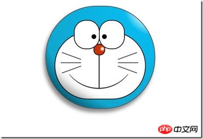
Smile, that’s it, look at it How comfortable! Strike while the iron is hot and do the neck and body:
/*围脖*/
        .doraemon .choker {
            width: 230px;
            height: 20px;
            background: #c40;
            /*线性渐变 让围巾看上去更自然*/
            background: -webkit-gradient(linear,left top,left bottombottom,from(#c40),to(#800400));
            background: -moz-linear-gradient(center top,#c40,#800400);
            background: -ms-linear-gradient(center top,#c40,#800400);
            border: 2px solid #000;
            border-radius: 10px;
            position: relative;
            top: -40px;
            left: 45px;
            z-index: 4;
        }
        /*铃铛*/
        .doraemon .choker .bell {
            width: 40px;
            height: 40px;
            _overflow: hidden; /*IE6 hack*/
            border: 2px solid #000;
            border-radius: 50px;
            background: #f9f12a;
            background: -webkit-gradient(linear, left top, left bottombottom, from(#f9f12a),color-stop(0.5, #e9e11a), to(#a9a100));
            background: -moz-linear-gradient(top, #f9f12a, #e9e11a 75%,#a9a100);
            background: -ms-linear-gradient(top, #f9f12a, #e9e11a 75%,#a9a100);
            box-shadow: -5px 5px 10px rgba(0,0,0,0.25);
            position: absolute;
            top: 5px;
            left: 90px;
        }
        /*双横线*/
        .doraemon .choker .bell_line {
            width: 36px;
            height: 2px;
            background: #f9f12a;
            border: 2px solid #333;
            border-radius: 3px 3px 0 0;
            position: absolute;
            top: 10px;
        }
        /*黑点*/
        .doraemon .choker .bell_circle{
            width:12px;
            height:10px;
            background:#000;
            border-radius:5px;
            position:absolute;
            top:20px;
            left:14px;
        }
        /*黑点下的线*/
        .doraemon .choker .bell_under{
            width: 3px;
            height:15px;
            background:#000;
            position:absolute;
            left: 18px;
            top:27px;
        }
        /*铃铛高光*/
        .doraemon .choker .bell_light{
            width:12px;
            height:12px;
            border-radius:10px;
            box-shadow:19px 8px 5px #fff;
            position:absolute;
            top:-5px;
            left:5px;
            opacity:0.7;
        }
        /*身子*/
        .doraemon .bodys {
            position: relative;
            top: -310px;
        }
        /*肚子*/
        .doraemon .bodys .body {
            width: 220px;
            height: 165px;
            background: #07beea;
            background: -webkit-gradient(linear,rightright top,left top,from(#07beea),color-stop(0.5, #0073b3),color-stop(0.75,#00b0e0), to(#0096be));
            background: -moz-linear-gradient(rightright center,#07beea,#0073b3 50%,#00b0e0 75%,#0096be 100%);
            background: -ms-linear-gradient(rightright center,#07beea,#0073b3 50%,#00b0e0 75%,#0096be 100%);
            border:2px solid #333;
            position:absolute;
            top:265px;
            left:50px;
        }
        /*白色肚兜*/
            .doraemon .bodys .wraps {
                width: 170px;
                height: 170px;
                background: #fff;
                background: -webkit-gradient(linear, rightright top, left bottombottom, from(#fff),color-stop(0.75,#fff),color-stop(0.83,#eee),color-stop(0.90,#999),color-stop(0.95,#444), to(#000));
                background: -moz-linear-gradient(rightright top,#fff,#fff 75%,#eee 83%,#999 90%,#444 95%,#000);
                background: -ms-linear-gradient(rightright top,#fff,#fff 75%,#eee 83%,#999 90%,#444 95%,#000);
                border: 2px solid #000;
                border-radius: 85px;
                position: absolute;
                left: 72px;
                top: 230px;
            }
            /*口袋*/
            .doraemon .bodys .pocket {
                width: 130px;
                height: 130px;
                border-radius: 65px;
                background: #fff;
                background: -webkit-gradient(linear, rightright top, left bottombottom, from(#fff),color-stop(0.70,#fff),color-stop(0.75,#f8f8f8),color-stop(0.80,#eee),color-stop(0.88,#ddd), to(#fff));
                background: -moz-linear-gradient(rightright top, #fff, #fff 70%,#f8f8f8 75%,#eee 80%,#ddd 88%, #fff);
                background: -ms-linear-gradient(rightright top, #fff, #fff 70%,#f8f8f8 75%,#eee 80%,#ddd 88%, #fff);
                border: 2px solid #000;
                position:absolute;
                top: 250px;
                left: 92px;
            }
            /*挡住口袋一半*/
            .doraemon .bodys .pocket_mask {
                width: 134px;
                height: 60px;
                background:#fff;
                border-bottom: 2px solid #000;
                position:absolute;
                top: 259px;
                left: 92px;
           }
Okay, you have the neck and body! Above picture: 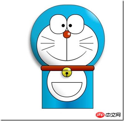
Now it looks a bit like a decoration, but the smile is still so innocent. Okay, let’s quickly make the hands and feet:
/*左右手*/
            .doraemon .hand_right, .doraemon .hand_left {
                height: 100px;
                width: 100px;
                position: absolute;
                top: 272px;
                left: 248px;
            }
            /*左手*/
            .doraemon .hand_left {
                left: -10px;
            }
            /*手臂公共部分*/
            .doraemon .arm {
                width:80px;
                height:50px;
                background: #07beea;
                background: -webkit-gradient(linear, left top, left bottombottom, from(#07beea),color-stop(0.85,#07beea), to(#555));
                background: -moz-linear-gradient(center top, #07BEEA, #07BEEA 85%, #555);
                background: -ms-linear-gradient(center top, #07BEEA, #07BEEA 85%, #555);
                border: 1px solid #000000;
                box-shadow: -10px 7px 10px rgba(0, 0, 0, 0.35);
                z-index: -1;
                position: relative;
            }
            /*右手手臂*/
            .doraemon .hand_right .arm {
                top: 17px;
                -webkit-transform: rotate(35deg);
                -moz-transform: rotate(35deg);
                -ms-transform: rotate(35deg);
                -o-transform: rotate(35deg);
                transform: rotate(35deg);
            }
            /*左手手臂*/
            .doraemon .hand_left .arm {
                top: 17px;
                background: #0096be;   /*背光一面使用纯色,使其有立体感*/
                box-shadow: 5px -7px 10px rgba(0, 0, 0, 0.25);
                -webkit-transform: rotate(145deg);
                -moz-transform: rotate(145deg);
                -ms-transform: rotate(145deg);
                -o-transform: rotate(145deg);
                transform: rotate(145deg);
            }
            /*圆形手掌公共部分*/
            .doraemon .circle {
                width: 60px;
                height: 60px;
                border-radius: 30px;
                border: 2px solid #000;
                background: #fff;
                background: -webkit-gradient(linear, rightright top, left bottombottom, from(#fff),color-stop(0.5,#fff),color-stop(0.70,#eee),color-stop(0.8,#ddd), to(#999));
                background: -moz-linear-gradient(rightright top, #fff, #fff 50%, #eee 70%, #ddd 80%,#999);
                background: -ms-linear-gradient(rightright top, #fff, #fff 50%, #eee 70%, #ddd 80%,#999);
                position: absolute;
            }
            /*右手手掌*/
            .doraemon .hand_right .circle {
                left: 40px;
                top: 32px;
            }
            /*左手手掌*/
            .doraemon .hand_left .circle {
                left: -20px;
                top: 32px;
            }
            /*手臂和身体结合处,使用背景遮住边框*/
            .doraemon .arm_rewrite {
                height: 45px;
                width: 5px;
                background: #07beea;
                position: relative;
            }
            /*右手结合处*/
            .doraemon .hand_right .arm_rewrite {
                top: -45px;
                left: 22px;
            }
            /*左手结合处*/
            .doraemon .hand_left .arm_rewrite {
                top: -45px;
                left: 60px;
                background: #0096be; /*同理,背光一面使用纯色,使其有立体感*/
            }
            /*脚部*/
            .doraemon .foot {
                width: 280px;
                height: 40px;
                position: relative;
                top: 55px;
                left: 20px;
            }
            /*左右脚共同样式*/
            .doraemon .foot .left, .doraemon .foot .rightright {
                width: 125px;
                height: 30px;
                background: #fff;
                background: -webkit-gradient(linear, rightright top, left bottombottom, from(#fff),color-stop(0.75,#fff),color-stop(0.85,#eee), to(#999));
                background: -moz-linear-gradient(rightright top, #fff, #fff 75%, #eee 85%, #999);
                background: -ms-linear-gradient(rightright top, #fff, #fff 75%, #eee 85%, #999);
                border: 2px solid #333;
                border-radius: 80px 60px 60px 40px;
                box-shadow: -6px 0 10px rgba(0, 0, 0, 0.35);
                position: relative;
            }
            .doraemon .foot .left {
                left: 8px;
                top: 65px;
            }
            .doraemon .foot .rightright {
                top: 31px;
                left: 141px;
            }
            /*双脚之间的缝隙,加阴影使用立体感*/
            .doraemon .foot .foot_rewrite {
                width: 20px;
                height: 10px;
                background: #fff;
                background: -webkit-gradient(linear, rightright top, left bottombottom, from(#666),color-stop(0.83,#fff), to(#fff));
                background: -moz-linear-gradient(rightright top, #666, #fff 83%, #fff);
                background: -ms-linear-gradient(rightright top, #666, #fff 83%, #fff);
                /*制作半圆效果*/
                border: 2px solid #000;
                border-bottom: none;
                border-radius: 40px 40px 0 0;
                position: relative;
                top: -11px;
                left: 130px;
                _left: 127px;
            }
Okay, the final complete result: 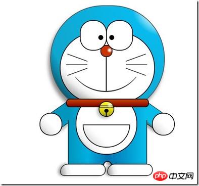
Let’s see if the effect is the same as the first one. Laughing, although it’s done well, it can still be done. If it moves, such as eyes, we can add an animation effect to it to make the eyes move:
/*眼珠*/
        .doraemon .eyes .eye .black {
            width: 14px;
            height: 14px;
            background: #000;
            border-radius: 7px;
            position: absolute;
            top: 40px;
            -webkit-animation: eyemove 3s linear infinite;
            -moz-animation: eyemove 3s linear infinite;
            -ms-animation: eyemove 3s linear infinite;
            -o-animation: eyemove 3s linear infinite;
            animation: eyemove 3s linear infinite;
        }
        /*让眼睛动起来*/
        @-webkit-keyframes eyemove {
            70%{
                margin:0 0 0 0;
            }
            80% {
                margin: -22px 0 0 0;
            }
            85% {
                margin: -22px 0 0 5px;
            }
            90% {
                margin: -22px 10px 0 0;
            }
            93% {
                margin: -22px 0 0 0;
            }
            96% {
                margin: 0 0 0 0;
            }
        }
        @-moz-keyframes eyemove {
            70% {
                margin: 0 0 0 0;
            }
            80% {
                margin: -22px 0 0 0;
            }
            85% {
                margin: -22px 0 0 5px;
            }
            90% {
                margin: -22px 10px 0 0;
            }
            93% {
                margin: -22px 0 0 0;
            }
            96% {
                margin: 0 0 0 0;
            }
        }
        @-o-keyframes eyemove {
            70% {
                margin: 0 0 0 0;
            }
            80% {
                margin: -22px 0 0 0;
            }
            85% {
                margin: -22px 0 0 5px;
            }
            90% {
                margin: -22px 10px 0 0;
            }
            93% {
                margin: -22px 0 0 0;
            }
            96% {
                margin: 0 0 0 0;
            }
        }
        @keyframes eyemove {
            70% {
                margin: 0 0 0 0;
            }
            80% {
                margin: -22px 0 0 0;
            }
            85% {
                margin: -22px 0 0 5px;
            }
            90% {
                margin: -22px 10px 0 0;
            }
            93% {
                margin: -22px 0 0 0;
            }
            96% {
                margin: 0 0 0 0;
            }
        }
OK. In this way, the eyes will move. If you are interested, you can try it. Suddenly, it can no longer be displayed here. But if you have any better animation effects you can try, then this case is over.
PS: Although this is just a case, it really helped me broaden my thinking. In fact, it may take a lot of time to create such an effect. At least for me, this is the case at the moment. Mainly The difficulty lies in the reasonable matching of layout positioning and colors to make the image more realistic and vivid!
The above is the entire content of this article. I hope it will be helpful to everyone's study. For more related content, please pay attention to the PHP Chinese website!
Related recommendations:
How to use the calc() attribute in CSS3 to express size
How to use CSS3 to make simple 3d translucent cube picture
The above is the detailed content of How to draw basic cartoon patterns using HTML and CSS3. For more information, please follow other related articles on the PHP Chinese website!
Related articles
See more- 10 recommended articles on experience exchange
- How many css application styles are there?
- How Do Absolute and Relative Position Affect Width, Height, and Placement in Web Layouts?
- How can I create a responsive skewed element with a rounded border using CSS?
- Can You Style the New Google reCAPTCHA API v2?