
Home >Web Front-end >CSS Tutorial >About the use of CSS display:inline-block attribute
About the use of CSS display:inline-block attribute

- 不言Original
- 2018-06-20 17:14:252331browse
This article mainly introduces the use of the display:inline-block attribute of CSS, and focuses on solving the gap problem caused when using it. Friends in need can refer to it
display:inline -block feels somewhat similar to display:table-cell, such as the wrapping of internal elements. However, the biggest difference of display:inline-block is that it does not have the anonymous wrapping feature of the parent element, which makes the use of the display:inline-block attribute very free. It can be mixed with text and pictures, and the block attribute element can be embedded. Can be placed inside inline horizontal elements. It can be said that black and white take both sides.
The elements with the inline-block attribute are suitable for the inline box model, so when the heights of the list elements are different, there will be no misalignment. All inline elements and inline-block elements in each row will together form a line box. The height of this line box is determined by the tallest element inside. Therefore, even if the height of the list element with the inline-block attribute is abnormal, the height of the entire line boxes is stretched, so it will not be misaligned with the list element of the next line. As shown in the poorly drawn schematic diagram below: 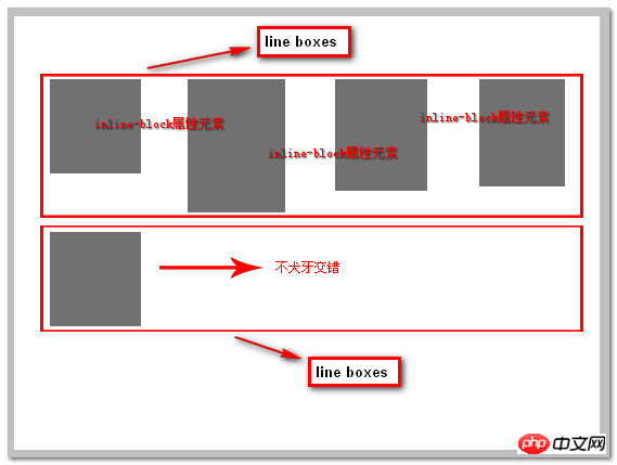
According to some seniors, IE6/7 does not support the display:inline-block attribute, but it can just make the label have something like As for the inline-block attribute, I accepted this statement at first, but later expressed doubts. Recently, some style performance during testing using text-align:justify; confirmed that IE6/7 does not support display. The :inline-block attribute just makes it behave the same as inline-block. Especially for inline horizontal elements, the expression can be described as perfect.
For IE8 and modern browsers, just use:
{display:inline-block;}, which supports any level of elements.
What should I do if IE6/7 browser is not supported? If it is an inline horizontal element (such as a tag, span tag, etc.), it is the same as above, just:
{display:inline-block;}
. For these two browsers, its effect is the same as *zoom:1; is the same.
If it is a block-level element, such as the li tag. It requires more code. Currently, there are two methods I know of, as follows:
li {display:inline-block;...}
li {display:inline;}
or:
CSS CodeCopy the content to clipboard Board
li{display:inline; zoom:1;...}There are differences in the presentation layer between inline-blocked elements at the block level and inline levels.
Inline-block problem
Observing the above example, careful students will definitely find that there is a small gap between each li, and in our code Margin and other related attributes are not set. Why is this?
Default inline element
First, let’s observe the performance of the default inline element:
HTML code
<a>首页</a>
<a>热点</a>
CSS Code
a { margin: 0; padding: 0; border: 1px solid #000; }Rendering
By default, there are gaps between inline elements, so the inline-block attribute that combines the inline and block attributes naturally also has this Features.
What are these gaps? They are whitespace characters!
Eliminate whitespace characters
In the browser, whitespace characters will not be ignored by the browser, and the browser will automatically merge multiple consecutive whitespace characters. into one. When we write code, spaces and newlines will produce whitespace characters. So naturally there will be white space between the two elements. If the a tag in the above example is written in one line, the white space will disappear and the menus will become compact.
Although whitespace characters are the normal behavior of browsers, usually, these gaps will not appear in the design drafts of designers. How can we remove these gaps when restoring the design draft.
To remove the gap caused by the whitespace character, you must first understand that the whitespace character is ultimately a character. The size of the gap generated can be controlled by setting the font-size attribute.
First, let’s try setting the font-size to 50px. Modify the CSS code as follows:
ul, li { padding: 0; margin: 0; list-style-type: none; font-size:50px}
li { display: inline-block; border: 1px solid #000; width: 100px; text-align: center;font-size:12px }
We modify the font-size of ul to 50px, and the font-size of li to 12px to maintain the original font size. , the effect is as follows: 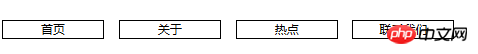
You can see that the gaps between the menus have become larger.
Then we set the font-site attribute to 0px, the code is as follows
ul, li { padding: 0; margin: 0; list-style-type: none; font-size:0px}
li { display: inline-block; border: 1px solid #000; width: 100px; text-align: center;font-size:12px }
The effect is as follows: 
Compatibility issues
In IE8, FF and Chrome browsers, inline-block can be perfectly compatible. Considering the occupancy rate of lower version browsers such as IE6 and IE7, although there are ways to be compatible, this article will not go into details. Those who are interested can find relevant information.
Application of inline-block
inline-block的应用什么场景有哪些呢?我们大家考虑一个技术的应用场景时,首先一定要思考的是技术的特性和需求是否符合。inline-block的特点是结合inline和block两种属性的特定,可以设置width和height,并且元素保持行内排列的特性,基于这一点,所有行内排列并且可以设置大小的场景都是我们可以考虑使用inline-block的应用场景。下面举例说明:
网页头部菜单
网页头部的菜单就是典型的横向排列并且需要设置大小的应用,在inline-block之前,实现菜单基本都是用float属性来实现,float属性会造成高度塌陷,需要清除浮动等问题,使用inline-block实现就不需要在意这样的问题。代码如下:
HTML代码
<p class="header">
    <ul>
        <li>
            <a href="javascript:;" target="_blank">服装城</a>
        </li>
        <li>
            <a href="javascript:;" target="_blank">美妆馆</a>
        </li>
        <li>
            <a href="javascript:;" target="_blank">超市</a>
        </li>
        <li>
            <a href="javascript:;" target="_blank">全球购</a>
        </li>
        <li>
            <a href="javascript:;" target="_blank">闪购</a>
        </li>
        <li>
            <a href="javascript:;" target="_blank">团购</a>
        </li>
        <li>
            <a href="javascript:;" target="_blank">拍卖</a>
        </li>
        <li>
            <a href="javascript:;" target="_blank">金融</a>
        </li>
        <li>
            <a href="javascript:;" target="_blank">智能</a>
        </li>
    </ul>
</p>
CSS代码:
a, ul, li { padding: 0; margin: 0; list-style-type: none; }
a { text-decoration: none; color: #333; }
.header ul { font-size: 0; text-align: center; }
.header li { display: inline-block; font-size: 16px; width: 80px; text-align: center; }
效果图
这是模仿京东首页头部导航菜单的实现,使用inline-block可以很简单的实现横向菜单列表
内联块元素
除了菜单之外,一切需要行内排列并且可设置大小的需求就可以用inline-block来实现。
例如使用a标签做按钮时,需要设置按钮的大小,我们就可以使用inline-block来实现。
HTML代码
<p>
    点击右边的按钮直接购买
    <a href="javascript:;" class="button">
        购买
    </a>
</p>
CSS代码
.button { display: inline-block; width: 150px; height: 45px; background: #b61d1d; color: #fff; text-align: center; line-height: 45px; font-size: 20px; }效果图
布局
inline-block也可以用于常见的布局,使用它就不需要去注意float属性布局带来的问题。
举例说明,创建一个常见的3列布局。
HTML代码
<p class="wrap">
    <p class="header">
        网页头部
    </p>
    <p class="content">
        <p class="left">
            左侧
        </p>
        <p class="center">
            中间
        </p>
        <p class="right">
            右侧
        </p>
    </p>
    <p class="footer">
        网页底部
    </p>
</p>
CSS代码
body, p { margin: 0; padding: 0; }
.header, .footer { width: 100%; background: #ccc; height: 120px; text-align: center; line-height: 120px; }
.content { margin: 0 auto; background: #ff6a00; width: 1000px; font-size: 0; }
    .content .left, .content .center, .content .rightright { display: inline-block; font-size: 16px; height: 400px; }
    .content .left, .content .rightright { width: 200px; }
    .content .center { width: 600px; background: #00ffff; }
效果图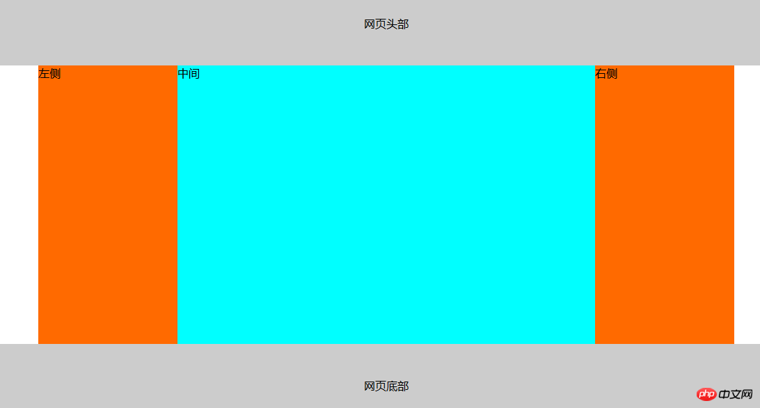
这个例子使用了inline-block做出了常见的网页布局。
关于inline-block的应用,只要是从左到右,从上到下,并且需要设置大小的列表都可以用它来实现,而这种需求是非常常见的,相比于float,我更推荐inline-block。inline-block的应用应该还有很多,大家可以多多挖掘出来。
总结
相比于使用float所带来的问题,使用inline-block所需要注意的点主要是空白符带来的问题,这一点也可以很方便的解决。
使用inline-block可以很方便的进行列表布局,更加符合我们的思维习惯,相信使用它的同学们也会越来越多,欢迎大家讨论。
以上就是本文的全部内容,希望对大家的学习有所帮助,更多相关内容请关注PHP中文网!
相关推荐:
CSS使用position:sticky 实现粘性布局的方法
The above is the detailed content of About the use of CSS display:inline-block attribute. For more information, please follow other related articles on the PHP Chinese website!