Home >Web Front-end >JS Tutorial >About Vue.JS's method of vertically expanding and contracting JS components of variable-height modules
About Vue.JS's method of vertically expanding and contracting JS components of variable-height modules
- 不言Original
- 2018-06-19 17:11:341952browse
This article mainly introduces the JS components of Vue.JS that implement vertical expansion and shrinking of modules with variable height. This article introduces you to it in great detail and has certain reference value. Friends who need it can refer to it
Requirement analysis:
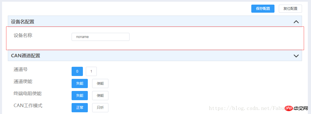
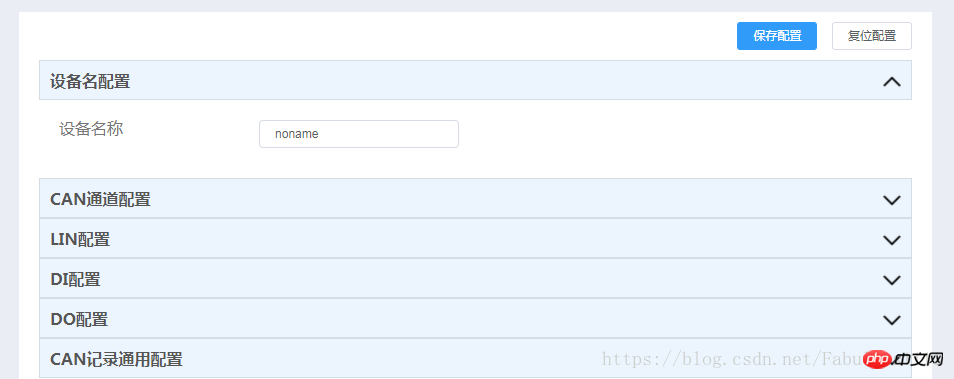
As shown in the picture, there are many modules with variable heights (only two are shown in the picture, and there are thirteen in my project), click Expand the corresponding module in the module title, and click this module again to hide it. How to realize this requirement and achieve reuse?
Before clicking the red box:

After clicking:

Difficulty Analysis:
The module height is not fixed. For example, the method I initially thought of is as follows:
<!DOCTYPE html>
<html lang="en">
<head>
<meta charset="UTF-8">
<title>Title</title>
<style>
.box{
height:500px;
background-color:black;
overflow: hidden;
}
.mybox-leave-active,.mybox-enter-active{
transition: all 1s ease;
}
.mybox-leave-active,.mybox-enter{
height:0px !important;
}
.mybox-leave,.mybox-enter-active{
height: 500px;
}
</style>
</head>
<body>
<p id="box">
<transition name="mybox">
<p class="box" v-show="boxshow"></p>
</transition>
<button @click="togglebox">按钮</button>
</p>
</body>
<script src="../bower_components/vue/dist/vue.js"></script>
<script>
new Vue({
el:'#box',
data:{
boxshow:false
},
methods:{
togglebox:function(){
this.boxshow = !this.boxshow;
}
}
});
</script>
</html>This method can indeed realize the need to click to expand and click to shrink again, but it has an obvious shortcoming: it limits the height of the container, that is, each module All require a fixed height and are not suitable for demand scenarios.
Solution:
1. Implement a functional component
本人命名为vertical-toggle.js
// Created by xiaoqiang on 17/04/2018.
const elTransition = '0.3s height ease-in-out, 0.3s padding-top ease-in-out, 0.3s padding-bottom ease-in-out'
const Transition = {
 'before-enter' (el) {
  el.style.transition = elTransition
  if (!el.dataset) el.dataset = {}
  el.dataset.oldPaddingTop = el.style.paddingTop
  el.dataset.oldPaddingBottom = el.style.paddingBottom
  el.style.height = 0
  el.style.paddingTop = 0
  el.style.paddingBottom = 0
 },
 'enter' (el) {
  el.dataset.oldOverflow = el.style.overflow
  if (el.scrollHeight !== 0) {
   el.style.height = el.scrollHeight + 'px'
   el.style.paddingTop = el.dataset.oldPaddingTop
   el.style.paddingBottom = el.dataset.oldPaddingBottom
  } else {
   el.style.height = ''
   el.style.paddingTop = el.dataset.oldPaddingTop
   el.style.paddingBottom = el.dataset.oldPaddingBottom
  }
  el.style.overflow = 'hidden'
 },
 'after-enter' (el) {
  el.style.transition = ''
  el.style.height = ''
  el.style.overflow = el.dataset.oldOverflow
 },
 'before-leave' (el) {
  if (!el.dataset) el.dataset = {}
  el.dataset.oldPaddingTop = el.style.paddingTop
  el.dataset.oldPaddingBottom = el.style.paddingBottom
  el.dataset.oldOverflow = el.style.overflow
  el.style.height = el.scrollHeight + 'px'
  el.style.overflow = 'hidden'
 },
 'leave' (el) {
  if (el.scrollHeight !== 0) {
   el.style.transition = elTransition
   el.style.height = 0
   el.style.paddingTop = 0
   el.style.paddingBottom = 0
  }
 },
 'after-leave' (el) {
  el.style.transition = ''
  el.style.height = ''
  el.style.overflow = el.dataset.oldOverflow
  el.style.paddingTop = el.dataset.oldPaddingTop
  el.style.paddingBottom = el.dataset.oldPaddingBottom
 }
}
export default {
 name: 'VerticalToggle',
 functional: true,
 render (h, { children }) {
  const data = {
   on: Transition
  }
  return h('transition', data, children)
 }
}
2. Reference this component

Register this component in components:

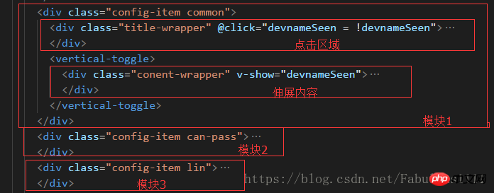
That is It can be quoted in teamplate, please pay attention to the text description in the red box.

At this point, the implementation and application of Vue.js's vertical expansion and contraction of variable-height module components have been completed.
Implementation effect:

The above is the entire content of this article. I hope it will be helpful to everyone’s study. More related content Please pay attention to PHP Chinese website!
Related recommendations:
How to make pictures black and white with JavaScript_javascript skills
vue single component to achieve unlimited levels Select menu function
The above is the detailed content of About Vue.JS's method of vertically expanding and contracting JS components of variable-height modules. For more information, please follow other related articles on the PHP Chinese website!
Related articles
See more- An in-depth analysis of the Bootstrap list group component
- Detailed explanation of JavaScript function currying
- Complete example of JS password generation and strength detection (with demo source code download)
- Angularjs integrates WeChat UI (weui)
- How to quickly switch between Traditional Chinese and Simplified Chinese with JavaScript and the trick for websites to support switching between Simplified and Traditional Chinese_javascript skills

