
Home >Web Front-end >CSS Tutorial >The use of CSS3 layer shadow and text shadow
The use of CSS3 layer shadow and text shadow

- 不言Original
- 2018-06-14 16:25:471859browse
This article mainly introduces the use of CSS3 layer shadows and text shadows. It has a certain reference value. Now I share it with you. Friends in need can refer to
box-shadow layer The shadow attribute and the text-shadow text shadow attribute are similar in usage. They both use the X-axis and Y-axis coordinate systems to control the shadow expansion. Here we will explain in detail the use of CSS3 layer shadow and text shadow effects:
box-shadow layer shadow
box-shadow: Shadow type X horizontal offset (can take positive and negative values) Y vertical offset (can take positive and negative values) Shadow size shadow extended shadow color value
The shadow type can be omitted, the default is outer shadow, when its value is inset, it is inner shadow effect.
X horizontal offset and Y vertical offset can take positive and negative values. When X is negative, it is projected on the left, and when it is positive, it is projected on the right. When Y is negative, it is projected on top, when it is positive, it is projected on the bottom.
The shadow size and expansion are the same as in ps.
Browser compatibility:
Different browsers have different compatibility. The mozilla kernel browser is written as follows (but the new version of Firefox does not need to be added):
-moz-box-shadow: Shadow type
-webkit-box-shadow:Shadow type :
<p class="shadow"></p>
.shadow{
 width:200px;
 height:50px;
 box-shadow:3px 3px 3px 3px #000;
 /*-moz-box-shadow:3px 3px 3px 3px #000;    //以火狐为代表的mozilla内核浏览器,火狐现在的版本已经支持这个属性,所以不用再加-moz*/
 -webkit-box-shadow:3px 3px 3px 3px #000;
}
Rendering:
Change the box-shadow projection type to inset, rendering: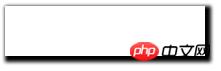
Example 2: 
<p class="shadow"></p>
.shadow{
 width:200px;
 height:50px;
 box-shadow:0 -5px 5px 0 red,5px 0 5px 0 yellow,0 5px 5px 0 green,-5px 0 5px 0 blue;
 /*-moz-box-shadow:0 -5px 5px 0 red,5px 0 5px 0 yellow,0 5px 5px 0 green,-5px 0 5px 0 blue;    //以火狐为代表的mozilla内核浏览器,火狐现在的版本已经支持这个属性,所以不用再加-moz*/
 -webkit-box-shadow:0 -5px 5px 0 red,5px 0 5px 0 yellow,0 5px 5px 0 green,-5px 0 5px 0 blue;
}
Rendering:
##text-shadow text-shadow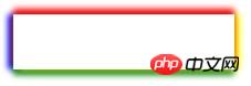
Above we discussed about css3 layer shadow box-shadow to achieve the effect of layer shadow. Today we will learn together how to achieve the effect of text shadow. We will use css3 in addition An attribute text-shadow, these two effects enhance the texture of the layer and text respectively, creating a three-dimensional effect. Syntax:
text-shadow : none | <length> none | [<shadow>, ] * <shadow> 或none | <color> [, <color> ]*text-shadow: displacement on the X-axis (both positive and negative), displacement on the Y-axis (both positive and negative), shadow The width, the color value of the shadow
Description:
is similar to the layer shadow. It can also apply one or more sets of shadow effects to the same object, separated by commas. The X-axis offset can be positive or negative. When X is positive, it is offset to the right, and when it is negative, it is offset to the left. The Y-axis offset can be positive or negative. When X is positive, it is offset downward, and when it is negative, it is offset upward. The color value of the shadow can be #xxx, rgb, or rgba transparent color.
Example: text-shadow
<h1 style="font-family:Microsoft Yahei; font-size:28px; color:#333; text-shadow:2px 2px 5px #f60;">雨打浮萍</h1>The display effect is as follows:
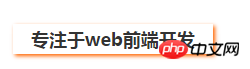
Compare box-shadow

<h2 style="font-family:Microsoft Yahei; font-size:18px; color:#333; width:200px; line-height:30px; text-align:center; box-shadow:2px 2px 5px #f60;">专注于web前端开发</h2>The effect is as follows:
The display effect is as follows:
Related recommendations: 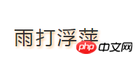
Analysis on the difference between using rgba and opacity to set transparency in css
##How to use css3 to achieve multiple Elements are displayed in sequence
How to use css to stretch and fill the background image to avoid repeated display
The above is the detailed content of The use of CSS3 layer shadow and text shadow. For more information, please follow other related articles on the PHP Chinese website!