Home >Web Front-end >JS Tutorial >How to implement process progress style in WeChat mini program?
How to implement process progress style in WeChat mini program?
- 亚连Original
- 2018-06-11 17:06:052026browse
I am working on a WeChat applet recently and need to implement a graph style of process progress. Below I have brought you the example code of the graph style function of the WeChat applet to implement process progress. Friends who need it can refer to it
I am currently working on a WeChat applet, and I need to implement a process progress diagram as shown below

Requirements:
Not completed Gray dots represent
Complete settings are represented by blue dots
The current status is represented by small dots with an outer ring
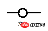
It is relatively simple to implement. The implementation idea is to use a list. The style of each item in the list is as shown below

Use The drawings in win10 drawing board are not good-looking
What the picture means is that there is a line in front of each item, a circle in the middle, and a line behind it. The reason for this is that the text below needs to be centered below the circle. If no text is needed, it would be simpler to have a circle followed by a straight line.
According to the above picture, the html layout is as follows
<view class='order_process'>
<view class='process_wrap' wx:for="{{processData}}" wx:key="">
<view class='process'>
<view class='process_line' style="background:{{item.start}}"></view>
<image class='process_icon' src="{{item.icon}}"></image>
<view class='process_line' style="background:{{item.end}}"></view>
</view>
<text class='process_name'>{{item.name}}</text>
</view>
</view>OK The list definitely needs an array. The array is as follows
processData: [{
  name: '提交工单',
  start: '#fff',
  end: '#EFF3F6',
  icon: '../../img/process_1.png'
 },
 {
  name: '已接单',
  start: '#EFF3F6',
  end: '#EFF3F6',
  icon: '../../img/process_1.png'
 },
 {
  name: '开始维修',
  start: '#EFF3F6',
  end: '#EFF3F6',
  icon: '../../img/process_1.png'
 },
 {
  name: '维修结束',
  start: '#EFF3F6',
  end: '#EFF3F6',
  icon: '../../img/process_1.png'
 },
 {
  name: '已确认',
  start: '#EFF3F6',
  end: '#fff',
  icon: '../../img/process_1.png'
 }],
 },
According to the above item picture we will see direct display If there will be an extra line on both sides, how can I remove these two lines? It is very simple. Just make the background color of the parent container the same as the previous color.
Change the background of the parent layout to white, then control the color of the front line segment in the first item in the list to white, and the color of the back line segment in the last item to white. This way it looks like the line segments on both sides have been removed
When the data changes, we only need to change the properties of the objects in the array. It is better to use the following as a reference
//进度条的状态
 setPeocessIcon: function () {
 var index = 0//记录状态为1的最后的位置
 var processArr = this.data.processData
 // console.log("progress", this.data.detailData.progress)
 for (var i = 0; i < this.data.detailData.progress.length; i++) {
  var item = this.data.detailData.progress[i]
  processArr[i].name = item.word
  if (item.state == 1) {
  index = i
  processArr[i].icon = "../../img/process_3.png"
  processArr[i].start = "#45B2FE"
  processArr[i].end = "#45B2FE"
  } else {
  processArr[i].icon = "../../img/process_1.png"
  processArr[i].start = "#EFF3F6"
  processArr[i].end = "#EFF3F6"
  }
 }
 processArr[index].icon = "../../img/process_2.png"
 processArr[index].end = "#EFF3F6"
 processArr[0].start = "#fff"
 processArr[this.data.detailData.progress.length - 1].end = "#fff"
 this.setData({
  processData: processArr
 })
 },
In the data of the above code, state is used to represent completion and incompleteness. We set the completed ones to blue and the unfinished ones to gray.
Use index to record whether it is the current point (the current point is the last one completed by state).
The code in the final css is also very simple
.order_process {
 display: flex;
 flex-wrap: nowrap;
 padding: 10rpx 10rpx 20rpx 10rpx;
 background-color: #fff;
}

.process_wrap {
 display: flex;
 flex-direction: column;
 flex: 1;
 align-items: center;
}

.process {
 display: flex;
 align-items: center;
 width: 100%;
}

.process_icon {
 width: 50rpx;
 height: 50rpx;
}

.process_line {
 background: #eff3f6;
 flex: 1;
 height: 5rpx;
}

.process_name {
 font-size: 24rpx;
}
The above is what I compiled for everyone. I hope it will be helpful to everyone in the future.
Related articles:
Using Elememt-UI to build the management backend in Vue (detailed tutorial)
Through WebView in react-native Handle return non-callback method
Method to read data through json file in Vue2.5
Use http request in vue2.5.2 How to get static json data
Use plugin owlcarousel in jQuery slideshow (detailed tutorial)
Use plugin owlcarousel in jQuery slideshow( Detailed tutorial)
The above is the detailed content of How to implement process progress style in WeChat mini program?. For more information, please follow other related articles on the PHP Chinese website!
Related articles
See more- An in-depth analysis of the Bootstrap list group component
- Detailed explanation of JavaScript function currying
- Complete example of JS password generation and strength detection (with demo source code download)
- Angularjs integrates WeChat UI (weui)
- How to quickly switch between Traditional Chinese and Simplified Chinese with JavaScript and the trick for websites to support switching between Simplified and Traditional Chinese_javascript skills

