
Home >Web Front-end >JS Tutorial >How to operate the calendar range selection plug-in
How to operate the calendar range selection plug-in
- php中世界最好的语言Original
- 2018-06-08 10:44:072432browse
This time I will show you how to operate the calendar range selection plug-in, and what are the precautions for operating the calendar range selection plug-in. The following is a practical case, let's take a look.
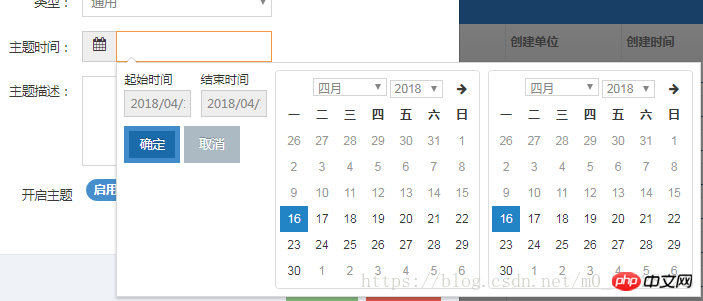
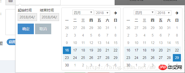
Daterangepicker is a calendar plug-in for bootstrap that is mainly used to select a time period. This plug-in is very easy to use and easy to operate.
Introducing related plug-ins
<!-- 需要引用的依赖库 -->、
<script></script>
<script></script>
<link>
<!-- 引用 daterangepicker 相关文件-->
<script></script>
<link>
Add the calling method of the plug-in to the required elements:
$('input[name="daterange"]').daterangepicker();
You can customize related configurations through parameters, and you can also use callback functions in the user Get notified when you select a new date.
$('input[name="daterange"]').daterangepicker({
    locale: {
     format: 'YYYY-MM-DD'
    },
    startDate: '2013-01-01',
    endDate: '2013-12-31'
  },
  function(start, end, label) {
    alert("A new date range was chosen: " + start.format    ('YYYY-MM-DD') + ' to ' + end.format('YYYY-MM-DD'));
  });
These configurations can be composed into a configuration file and then introduced in ()
$('input[name=dateStr]', '#themeAddPage').daterangepicker(dateRangePickerAfterTodayConfig);
Configuration file
var dateLongRangePickerOptionObj = {
  minDate: '2015/01/01 00:00:00',  //最小时间
  showDropdowns: true,
  showWeekNumbers: false, //是否显示第几周
  dateLimit: {days: 300}, //起止时间的最大间隔
  timePicker: true,
  timePickerIncrement: 1, //时间的增量,单位为分钟
  timePicker12Hour: false,
  opens: 'right', //日期选择框的弹出位置
  buttonClasses: ['btn btn-default'],
  applyClass: 'btn-small btn-primary blue',
  cancelClass: 'btn-small',
  format: 'YYYY/MM/DD HH:mm:ss', //控件中from和to 显示的日期格式MM/DD/YYYY
  separator: '-',
  defaultDate: new Date(),
  locale: {
    applyLabel: '确定',
    cancelLabel: '取消',
    fromLabel: '起始时间',
    toLabel: '结束时间',
    daysOfWeek: ['日', '一', '二', '三', '四', '五', '六'],
    monthNames: ['一月', '二月', '三月', '四月', '五月', '六月', '七月', '八月', '九月', '十月', '十一月', '十二月'],
    firstDay: 1
  }
}
Configuration options, methods and events
Configuration Options
startDate: (Date 对象, moment 对象或者string类型)初始化日期范围选中的开始时间。
endDate: (Date 对象, moment 对象或者string类型)初始化日期范围选中的结束时间。
minDate: (Date 对象, moment 对象或者string类型) 用户可以选择的最早时间。
maxDate: (Date 对象, moment 对象或者string类型) 用户可以选择的最晚时间。
dateLimit: (object类型) 选中的开始和结束日期之间最大时间间隔。可以是能够添加到moment对象(moment.add())中的任何属性(如:days, months)。
showDropdowns: (boolean类型) 在日历上面显示年和月的下拉框,选中后将跳到指定的年和月
showWeekNumbers: (boolean类型) 在日历上每周开始的地方显示本地化的周编号。
showISOWeekNumbers: (boolean类型) 在日历上每周开始的地方显示国际标准的周编号。
timePicker: (boolean类型) 允许选择日期和时间,而不是局限于日期。
timePickerIncrement: (number类型) 时间选择框中分钟列的增加步长(如:设置为30后只允许选择以0和30结束的时间)。
timePicker24Hour: (boolean类型) 使用24小时制来代替12小时制,同时删除AM/PM选择框。
timePickerSeconds: (boolean类型) 在时间选择框中显示秒选择列。
ranges: (object类型) 设置用户可以选择的预定义日期范围。每个键名即范围的标签名,对应值是两个日期组成的数组,来表示范围的界限。
showCustomRangeLabel: (boolean类型) 当使用范围选项时,在预定义范围列表的末尾显示标记为"Custom Range"的标签。当选择的日期范围与任何一个预定义的范围都不匹配时,该选项将被高亮显示。单击它显示日历可以选择新的范围。
alwaysShowCalendars: (boolean类型) 通常,如果使用范围选项指定了预定义日期范围,则用户除了单击 "Custom Range"之外,日期选择器都不会显示用于选择自定义日期范围的日历。当选项设置为true时,将始终显示用于选择自定义日期范围的日历。
opens: (string: 'left'/'right'/'center') 设置日期选择器以绑定元素左对齐、右对齐或者居中显示。
drops: (string: 'down' or 'up') 设置日期选择器在绑定元素的下面(默认)或者上面显示。
buttonClasses: (array类型)为日期选择器中的所有button元素添加CSS类。
applyClass: (string类型) 为日期选择器中的apply按钮添加类。
cancelClass: (string类型) 为日期选择器中的cancel按钮添加类。
locale: (object类型) 允许为按钮和标签提供本地化的字符串,自定义日期格式,并更改日历中周的第一天。 查看配置生成器中的“locale配置(包含设置示例)”,以了解如何自定义这些选项。
singleDatePicker: (boolean类型) 只显示一个日历来选择一个日期,而不是带有两个日历的范围选择器;回调函数中提供的开始和结束日期将和选择的单个日期相同。
autoApply: (boolean类型) 隐藏apply和cancel按钮。选择两个日期或预定义范围时,会自动应用新的日期范围。
linkedCalendars: (boolean类型) 启用时,显示的两个日历将始终为两个连续的月份(如:1月和2月),并且当单击日历上方的左侧或右侧箭头时,两个日历都将变化。 禁用时,两个日历可以单独变化并显示任何月/年。
isInvalidDate: (function类型) 在显示两个日历之前传递一个日期参数,然后通过返回true或false,标示该日期是否可供选择。
isCustomDate: (function类型) 在显示两个日历之前传递一个日期参数,然后将返回的CSS类名字符串传或者数组应用在日历中的该日期上。
autoUpdateInput: (boolean类型) 标示日期范围选择器是否应在初始化和所选日期改变时,自动更新绑定在<input>元素上的值。
parentEl: (string类型) 给日期选择器添加父元素的jQuery选择器,如果没有提供,body将被作为父元素。
Methods
You can update the date picker programmatically using the setStartDate and setEndDate methods startDate and endDate in . You can also access the date range selector object and its functions and properties via the data attribute bound to that element.
setStartDate(Date object, moment object or string type): Sets the currently selected start date in the date range selector to the provided date setEndDate(Date object, moment object or string type): Sets the date range selector The currently selected end date in is the provided date
Example usage:
// 创建一个新的日期范围选择器
$('#daterange').daterangepicker({ startDate: '03/05/2005', endDate: '03/06/2005' });
// 改变日期选择器中选中的日期范围
$('#daterange').data('daterangepicker').setStartDate('03/01/2014');
$('#daterange').data('daterangepicker').setEndDate('03/31/2014');
Event
Date Picker Binding The elements can trigger the following events, and you can listen to these events.
show.daterangepicker: The event is triggered after the date picker is displayed hide.daterangepicker: The event is triggered after the date picker is hidden showCalendar.daterangepicker: The event is triggered after the calendar is displayed hideCalendar.daterangepicker: The event is triggered after the calendar is hidden apply.daterangepicker: The event cancel.daterangepicker is triggered when the apply button is clicked, or the predefined range label is clicked:
Triggers the event when the cancel button is clicked
Some applications require "clear" instead of "cancel" function , this can be achieved by changing the button label and listening for the cancel event:
$('#daterange').daterangepicker({
 locale: { cancelLabel: 'Clear' }
});
$('#daterange').on('cancel.daterangepicker', function(ev, picker) {
 $('#daterange').val('');
});
Passing a callback function as a parameter to the constructor is the easiest way to listen for changes in the selected date range, even if the selection has not changed, each time the button is applied When clicked, you can also perform certain operations:
$('#daterange').daterangepicker();
$('#daterange').on('apply.daterangepicker', function(ev, picker) {
 console.log(picker.startDate.format('YYYY-MM-DD'));
 console.log(picker.endDate.format('YYYY-MM-DD'));
});
I believe you have mastered the method after reading the case in this article. For more exciting information, please pay attention to other related articles on the PHP Chinese website!
Recommended reading:
Operation Angularjs cross-domain setting whitelist
redux-thunk practical project case detailed explanation
The above is the detailed content of How to operate the calendar range selection plug-in. For more information, please follow other related articles on the PHP Chinese website!
Related articles
See more- An in-depth analysis of the Bootstrap list group component
- Detailed explanation of JavaScript function currying
- Complete example of JS password generation and strength detection (with demo source code download)
- Angularjs integrates WeChat UI (weui)
- How to quickly switch between Traditional Chinese and Simplified Chinese with JavaScript and the trick for websites to support switching between Simplified and Traditional Chinese_javascript skills