
Home >Web Front-end >JS Tutorial >Bootstrap streamlined tutorial_javascript skills
Bootstrap streamlined tutorial_javascript skills

- WBOYWBOYWBOYWBOYWBOYWBOYWBOYWBOYWBOYWBOYWBOYWBOYWBOriginal
- 2016-05-16 15:29:241181browse
Bootstrap, from Twitter, is a very popular front-end framework. Bootstrap is based on HTML, CSS, and JAVASCRIPT. It is simple and flexible, making web development faster. [1] It was developed by Twitter designers Mark Otto and Jacob Thornton and is a CSS/HTML framework. Bootstrap provides elegant HTML and CSS specifications, which are written in the dynamic CSS language Less. Bootstrap has been very popular since its launch and has been a popular open source project on GitHub, including NASA's MSNBC (Microsoft National Broadcasting Company) Breaking News. [2] Some frameworks that are familiar to domestic mobile developers, such as the WeX5 front-end open source framework, are also performance optimized based on the Bootstrap source code.
Features:
Bootstrap is developed based on HTML5 and CSS3. It is more personalized and user-friendly based on jQuery, forming its own unique website style and is compatible with most jQuery plug-ins.
Bootstrap is very easy to learn, and the styles it provides are very beautiful. With a little bit of learning, you can create beautiful pages.
bootstrap Chinese website: http://v3.bootcss.com/
bootstrap provides three types of downloads:
-------------------------------------------------- ---------------
Bootstrap for production
Compiled and compressed CSS, JavaScript and font files. Documentation and source code files are not included.
Bootstrap source code
Source code for Less, JavaScript and font files, with documentation. Requires Less compiler and some setup work.
Sass
This is a Bootstrap source code migration project from Less to Sass, used to quickly introduce it into Rails, Compass or Sass-only projects.
-------------------------------------------------- -------------
In fact, we can use bootstrap without downloading it:
Bootstrap Chinese website has specially built its own free CDN acceleration service for Bootstrap. Based on the CDN service of domestic cloud vendors, the access speed is faster, the acceleration effect is more obvious, there are no speed and bandwidth restrictions, and it is permanently free.
base.html
<!DOCTYPE html>
<html lang="zh-CN">
 <head>
  <meta charset="utf-8">
  <meta http-equiv="X-UA-Compatible" content="IE=edge">
  <meta name="viewport" content="width=device-width, initial-scale=1">
  <!-- 上述3个meta标签*必须*放在最前面,任何其他内容都*必须*跟随其后! -->
  <title>Bootstrap 101 Template</title>
  <!-- Bootstrap -->
  <link rel="stylesheet" href="http://cdn.bootcss.com/bootstrap/3.3.4/css/bootstrap.min.css">
 </head>
 <body>
  <h1>你好,bootstrap!</h1>
  <!-- jQuery (necessary for Bootstrap's JavaScript plugins) -->
  <script src="http://cdn.bootcss.com/jquery/1.11.2/jquery.min.js"></script>
  <!-- Include all compiled plugins (below), or include individual files as needed -->
  <script src="http://cdn.bootcss.com/bootstrap/3.3.4/js/bootstrap.min.js"></script>
 </body>
</html>
Bootstrap has been introduced in base.html. Save it and we can use the styles provided by bootstrap.
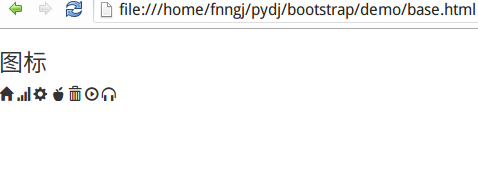
Font icon
Bootstrap provides more than 200 icons by default. We can use these icons through the span tag:
<h3>图标</h3>
  <span class="glyphicon glyphicon-home"></span>
  <span class="glyphicon glyphicon-signal"></span>
  <span class="glyphicon glyphicon-cog"></span>
  <span class="glyphicon glyphicon-apple"></span>
  <span class="glyphicon glyphicon-trash"></span>
  <span class="glyphicon glyphicon-play-circle"></span>
  <span class="glyphicon glyphicon-headphones"></span>
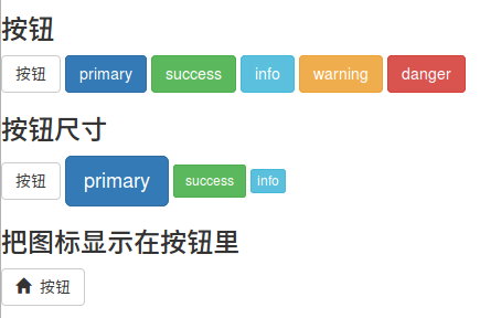
Button
bb9345e55eb71822850ff156dfde57c865281c5ac262bf6d81768915a4a77ac0 tag is used to create buttons, and bootstrap provides rich button styles.
<h3>按钮</h3>
  <button type="button" class="btn btn-default">按钮</button>
  <button type="button" class="btn btn-primary">primary</button>
  <button type="button" class="btn btn-success">success</button>
  <button type="button" class="btn btn-info">info</button>
  <button type="button" class="btn btn-warning">warning</button>
  <button type="button" class="btn btn-danger">danger</button>
  <h3>按钮尺寸</h3>
  <button type="button" class="btn btn-default">按钮</button>
  <button type="button" class="btn btn-primary btn-lg">primary</button>
  <button type="button" class="btn btn-success btn-sm">success</button>
  <button type="button" class="btn btn-info btn-xs">info</button>
  <h3>把图标显示在按钮里</h3>
  <button type="button" class="btn btn-default"><span class="glyphicon glyphicon-home"></span>  按钮</button>
button, bootstrap also provides three parameters to adjust the size of the button, namely: btn-lg, btn-sm and btn-xs.
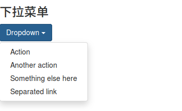
Drop-down menu
Drop-down menu is one of the most common interactions, and bootstrap provides beautiful styles.
 <h3>下拉菜单</h3>
  <div class="dropdown">
   <button class="btn btn-primary dropdown-toggle" type="button" id="dropdownMenu1" data-toggle="dropdown" aria-expanded="true">
    Dropdown
    <span class="caret"></span>
   </button>
   <ul class="dropdown-menu" role="menu" aria-labelledby="dropdownMenu1">
    <li role="presentation"><a role="menuitem" tabindex="-1" href="#">Action</a></li>
    <li role="presentation"><a role="menuitem" tabindex="-1" href="#">Another action</a></li>
    <li role="presentation"><a role="menuitem" tabindex="-1" href="#">Something else here</a></li>
    <li role="presentation"><a role="menuitem" tabindex="-1" href="#">Separated link</a></li>
   </ul>
  </div>
Input box
Use the d5fd7aea971a85678ba271703566ebfd96ac42c95369ad8c9dbbd274b6bcc83a tag to create an input box.
 <h3>输入框</h3>
  <div class="input-group">
   <span class="glyphicon glyphicon-user"></span>
   <input type="text" placeholder="username">
  </div>
  <div class="input-group">
   <span class="glyphicon glyphicon-lock"></span>
   <input type="password" placeholder="password">
  </div>

Navigation bar
The navigation bar is essential as a guide for the entire website.
 <h3>导航栏</h3>
  <nav class="navbar navbar-inverse navbar-fixed-top">
    <div id="navbar" class="navbar-collapse collapse">
     <ul class="nav navbar-nav">
      <li class="active"><a href="#">Home</a></li>
      <li><a href="#about">About</a></li>
      <li><a href="#contact">Contact</a></li>
      <li class="dropdown">
       <a href="#" class="dropdown-toggle" data-toggle="dropdown" role="button" aria-expanded="false">Dropdown <span class="caret"></span></a>
       <ul class="dropdown-menu" role="menu">
        <li><a href="#">Action</a></li>
        <li><a href="#">Another action</a></li>
        <li class="divider"></li>
        <li class="dropdown-header">Nav header</li>
        <li><a href="#">Separated link</a></li>
       </ul>
      </li>
     </ul>
    </div><!--/.nav-collapse -->
   </div>
  </nav>

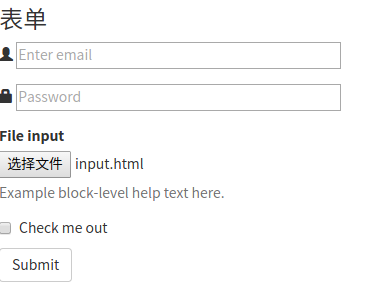
Form
The transfer of data between people and systems needs to rely on forms. For example, submission of registration/login information, submission of query conditions, etc. Use the ff9c23ada1bcecdd1a0fb5d5a0f18437f5a47148e367a6035fd7a2faa965022e tag to create a form.
 <h3>表单</h3>
  <form>
  <div class="form-group">
   <span class="glyphicon glyphicon-user"></span>
   <input type="email" id="exampleInputEmail1" placeholder="Enter email">
  </div>
  <div class="form-group">
   <span class="glyphicon glyphicon-lock"></span>
   <input type="password" id="exampleInputPassword1" placeholder="Password">
  </div>
  <div class="form-group">
   <label for="exampleInputFile">File input</label>
   <input type="file" id="exampleInputFile">
   <p class="help-block">Example block-level help text here.</p>
  </div>
  <div class="checkbox">
   <label>
    <input type="checkbox"> Check me out
   </label>
  </div>
  <button type="submit" class="btn btn-default">Submit</button>
 </form>
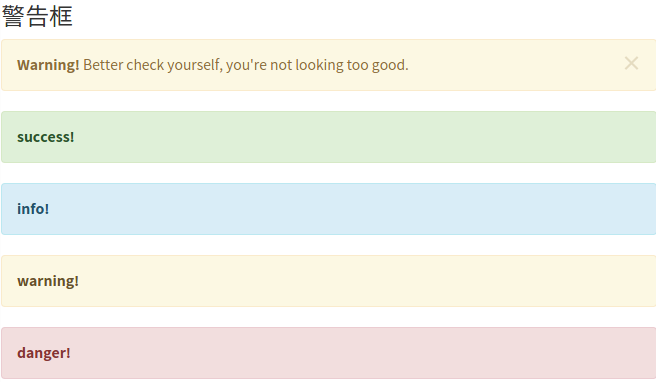
Warning box
The warning box is an important means for the system to convey information and provide guidance to users. There is no tag for the warning box. You can create a beautiful warning box instantly through the styles provided by bootstrap.
<h3>警告框</h3>
<div class="alert alert-warning alert-dismissible" role="alert">
<button type="button" class="close" data-dismiss="alert" aria-label="Close"><span aria-hidden="true">×</span></button>
<strong>Warning!</strong> Better check yourself, you're not looking too good.
</div>
<div class="alert alert-success" role="alert">
<a href="#" class="alert-link">success!</a>
</div>
<div class="alert alert-info" role="alert">
<a href="#" class="alert-link">info!</a>
</div>
<div class="alert alert-warning" role="alert">
<a href="#" class="alert-link">warning!</a>
</div>
<div class="alert alert-danger" role="alert">
<a href="#" class="alert-link">danger!</a>
</div>
Progress bar
The system’s processing often requires users to wait. The progress bar allows users to perceive the system’s processing, thereby increasing tolerance.
 <h3>进度条</h3>
  <div class="progress">
   <div class="progress-bar" role="progressbar" aria-valuenow="70" aria-valuemin="0" aria-valuemax="100" style="width: 60%;">
    70%
   </div>
  </div>
Related articles
See more- An in-depth analysis of the Bootstrap list group component
- Detailed explanation of JavaScript function currying
- Complete example of JS password generation and strength detection (with demo source code download)
- Angularjs integrates WeChat UI (weui)
- How to quickly switch between Traditional Chinese and Simplified Chinese with JavaScript and the trick for websites to support switching between Simplified and Traditional Chinese_javascript skills