Media objects that Bootstrap must learn every day_javascript skills
In the production of web pages or mobile pages, we often see this effect, with the left side on the left (or right) and the content on the right (or left), as shown in the figure below:

We often call such effects media objects. It can be said that it is an abstract style that can be used to build different types of components. These components all have the style mentioned at the beginning. Then some parts are specially extracted from the Bootstrap framework to introduce a component. Its corresponding version file:
☑ LESS version: The corresponding source file is media.less
☑ Sass version: The corresponding source file is _media.scss
☑ Compiled version: corresponds to lines 4792 ~ 4819 of the bootstrap.css file
1. Media object – default media object
Media objects generally appear in groups, and a group of media objects often includes the following parts:
☑ Container of media objects: often represented by the "media" class name, used to accommodate all contents of media objects
☑ The object of the media object: often expressed by "media-object", it is the object in the media object, often a picture
☑ The body of the media object: often expressed as "media-body", it is the main content in the media object, which can be any element, often the side content of the image
☑ The title of the media object: often expressed by "media-heading", which is a title used to describe the object. This part is optional
As shown below:
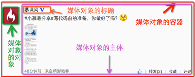
In addition to the above four parts, "pull-left" or "pull-right" are often used in the Bootstrap framework to control the floating mode of objects in media objects.
In specific use, it is as follows:
<div class="media">
  <a class="pull-left" href="#">
    <img class="media-object lazy"  src="/static/imghwm/default1.png"  data-src="imgs/1.jpg"  alt="Media objects that Bootstrap must learn every day_javascript skills">
  </a>
  <div class="media-body">
    <h4 id="系列-十天精通CSS">系列:十天精通CSS3</h4>
    <div>全方位深刻详解CSS3模块知识,经典案例分析,代码同步调试,让网页穿上绚丽装备!</div>
  </div>
</div>
The operation effect is as follows:

Principle analysis:
Media object styles are relatively simple, just set the spacing between them, as shown below:
/Line 4792~Line 4815 of the bootstrap.css file/
.media,
.media-body {
 overflow: hidden;
 zoom: 1;
}
.media,
.media .media {
 margin-top: 15px;
}
.media:first-child {
 margin-top: 0;
}
.media-object {
 display: block;
}
.media-heading {
 margin: 0 0 5px;
}
.media > .pull-left {
 margin-right: 10px;
}
.media > .pull-right {
 margin-left: 10px;
}
2. Media objects – nesting of media objects
In the comment system, you can often see the following effect:

Looking from the outside in, there are three media objects here, but one is nested inside the other. Then the media object in the Bootstrap framework also has such a function. You only need to place another media object structure within the body of the media object "media-body", as shown below:
<div class="media">
  <a class="pull-left" href="#">
    <img class="media-object lazy"  src="/static/imghwm/default1.png"  data-src="…"  alt="Media objects that Bootstrap must learn every day_javascript skills">
  </a>
  <div class="media-body">
    <h4 id="Media-Heading">Media Heading</h4>
    <div>…</div>
    <div class="media">
      <a class="pull-left" href="#">
        <img class="media-object lazy"  src="/static/imghwm/default1.png"  data-src="…"  alt="Media objects that Bootstrap must learn every day_javascript skills">
      </a>
      <div class="media-body">
        <h4 id="Media-Heading">Media Heading</h4>
        <div>…</div>
        <div class="media">
          <a class="pull-left" href="#">
            <img class="media-object lazy"  src="/static/imghwm/default1.png"  data-src="…"  alt="Media objects that Bootstrap must learn every day_javascript skills">
          </a>
          <div class="media-body">
            <h4 id="Media-Heading">Media Heading</h4>
            <div>Media objects that Bootstrap must learn every day_javascript skills</div>
          </div>
        </div>
      </div>
    </div>
  </div>
</div>
When ensuring that your structure is not nested incorrectly, you can directly see the effect as shown below:

3. Media objects – media object list
The nesting of media objects is only one of the simple application effects in media objects. In many cases, we will also encounter a list, and each list item looks similar to the media object. The same is said in the comment system. Thing:

Usage:
For the media object list effect in the above picture, the Bootstrap framework provides a list display effect. You can use ul when writing the structure, and add the class name "media-list" to ul, and use " media", the sample code is as follows:
<ul class="media-list">
<li class="media">
<a class="pull-left" href="#">
<img class="media-object lazy" src="/static/imghwm/default1.png" data-src="http://files.jb51.net/file_images/article/201511/20151130100003233.jpg?2015103010012?x-oss-process=image/resize,p_40" alt="Media objects that Bootstrap must learn every day_javascript skills">
</a>
<div>
<h4 id="Media-Header">Media Header</h4>
<div>…</div>
</div>
</li>
<li>…</li>
<li>…</li>
</ul>
The operation effect is as follows:

Principle analysis:
The media object list does not have too much special processing in terms of style. It just sets the left spacing of the list to 0 and removes the bullet list symbol:
/Line 4816~Line 4819 of the bootstrap.css file/
.media-list {
 padding-left: 0;
 list-style: none;
}
The above is the entire content of this article to help you learn Bootstrap media objects. I hope it will be helpful to your learning.
 From Websites to Apps: The Diverse Applications of JavaScriptApr 22, 2025 am 12:02 AM
JavaScript is widely used in websites, mobile applications, desktop applications and server-side programming. 1) In website development, JavaScript operates DOM together with HTML and CSS to achieve dynamic effects and supports frameworks such as jQuery and React. 2) Through ReactNative and Ionic, JavaScript is used to develop cross-platform mobile applications. 3) The Electron framework enables JavaScript to build desktop applications. 4) Node.js allows JavaScript to run on the server side and supports high concurrent requests.
 Python vs. JavaScript: Use Cases and Applications ComparedApr 21, 2025 am 12:01 AM
Python is more suitable for data science and automation, while JavaScript is more suitable for front-end and full-stack development. 1. Python performs well in data science and machine learning, using libraries such as NumPy and Pandas for data processing and modeling. 2. Python is concise and efficient in automation and scripting. 3. JavaScript is indispensable in front-end development and is used to build dynamic web pages and single-page applications. 4. JavaScript plays a role in back-end development through Node.js and supports full-stack development.
 The Role of C/C in JavaScript Interpreters and CompilersApr 20, 2025 am 12:01 AM
C and C play a vital role in the JavaScript engine, mainly used to implement interpreters and JIT compilers. 1) C is used to parse JavaScript source code and generate an abstract syntax tree. 2) C is responsible for generating and executing bytecode. 3) C implements the JIT compiler, optimizes and compiles hot-spot code at runtime, and significantly improves the execution efficiency of JavaScript.
 JavaScript in Action: Real-World Examples and ProjectsApr 19, 2025 am 12:13 AM
JavaScript's application in the real world includes front-end and back-end development. 1) Display front-end applications by building a TODO list application, involving DOM operations and event processing. 2) Build RESTfulAPI through Node.js and Express to demonstrate back-end applications.
 JavaScript and the Web: Core Functionality and Use CasesApr 18, 2025 am 12:19 AM
The main uses of JavaScript in web development include client interaction, form verification and asynchronous communication. 1) Dynamic content update and user interaction through DOM operations; 2) Client verification is carried out before the user submits data to improve the user experience; 3) Refreshless communication with the server is achieved through AJAX technology.
 Understanding the JavaScript Engine: Implementation DetailsApr 17, 2025 am 12:05 AM
Understanding how JavaScript engine works internally is important to developers because it helps write more efficient code and understand performance bottlenecks and optimization strategies. 1) The engine's workflow includes three stages: parsing, compiling and execution; 2) During the execution process, the engine will perform dynamic optimization, such as inline cache and hidden classes; 3) Best practices include avoiding global variables, optimizing loops, using const and lets, and avoiding excessive use of closures.
 Python vs. JavaScript: The Learning Curve and Ease of UseApr 16, 2025 am 12:12 AM
Python is more suitable for beginners, with a smooth learning curve and concise syntax; JavaScript is suitable for front-end development, with a steep learning curve and flexible syntax. 1. Python syntax is intuitive and suitable for data science and back-end development. 2. JavaScript is flexible and widely used in front-end and server-side programming.
 Python vs. JavaScript: Community, Libraries, and ResourcesApr 15, 2025 am 12:16 AM
Python and JavaScript have their own advantages and disadvantages in terms of community, libraries and resources. 1) The Python community is friendly and suitable for beginners, but the front-end development resources are not as rich as JavaScript. 2) Python is powerful in data science and machine learning libraries, while JavaScript is better in front-end development libraries and frameworks. 3) Both have rich learning resources, but Python is suitable for starting with official documents, while JavaScript is better with MDNWebDocs. The choice should be based on project needs and personal interests.


Hot AI Tools

Undresser.AI Undress
AI-powered app for creating realistic nude photos

AI Clothes Remover
Online AI tool for removing clothes from photos.

Undress AI Tool
Undress images for free

Clothoff.io
AI clothes remover

Video Face Swap
Swap faces in any video effortlessly with our completely free AI face swap tool!

Hot Article

Hot Tools

MantisBT
Mantis is an easy-to-deploy web-based defect tracking tool designed to aid in product defect tracking. It requires PHP, MySQL and a web server. Check out our demo and hosting services.

Dreamweaver Mac version
Visual web development tools

SublimeText3 Mac version
God-level code editing software (SublimeText3)

PhpStorm Mac version
The latest (2018.2.1) professional PHP integrated development tool

WebStorm Mac version
Useful JavaScript development tools


