Home >Web Front-end >JS Tutorial >Practical development of JavaScript using DeviceOne (3) Imitating WeChat applications_javascript skills
Practical development of JavaScript using DeviceOne (3) Imitating WeChat applications_javascript skills
- WBOYWBOYWBOYWBOYWBOYWBOYWBOYWBOYWBOYWBOYWBOYWBOYWBOriginal
- 2016-05-16 15:28:201205browse
This is a series of documents. The long-term goal is to use DeviceOne to develop some high-quality mobile applications that are currently widely used. We will maximize every function and detail of these applications, not just stay in the simple UI imitation and demo stage. , but a practical App that can be basically used.
During the implementation process, there will be many difficulties. You will also find that some functions currently lack component support and cannot be implemented. You will also encounter common technical problems that are encountered in various mobile development. The step-by-step operation and problem solving can allow developers to intuitively understand how to develop an actual App through DeviceOne, and can also understand many technical details of mobile development itself, which can help App developers avoid many detours.
This document mainly introduces WeChat imitation.
The first part is the construction of the framework
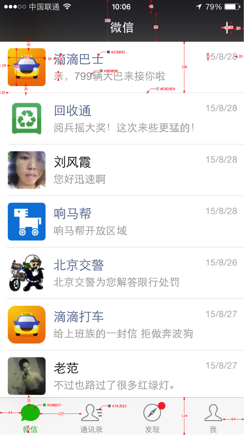
UE and UI design. Usually App development requires UE design by product staff and UI design by art staff. Function implementation can only begin after these two steps are completed. We are now imitating the existing WeChat, and these steps can be omitted. The picture below is the main interface UI design provided by the artist, and the sizes of the elements inside are marked.
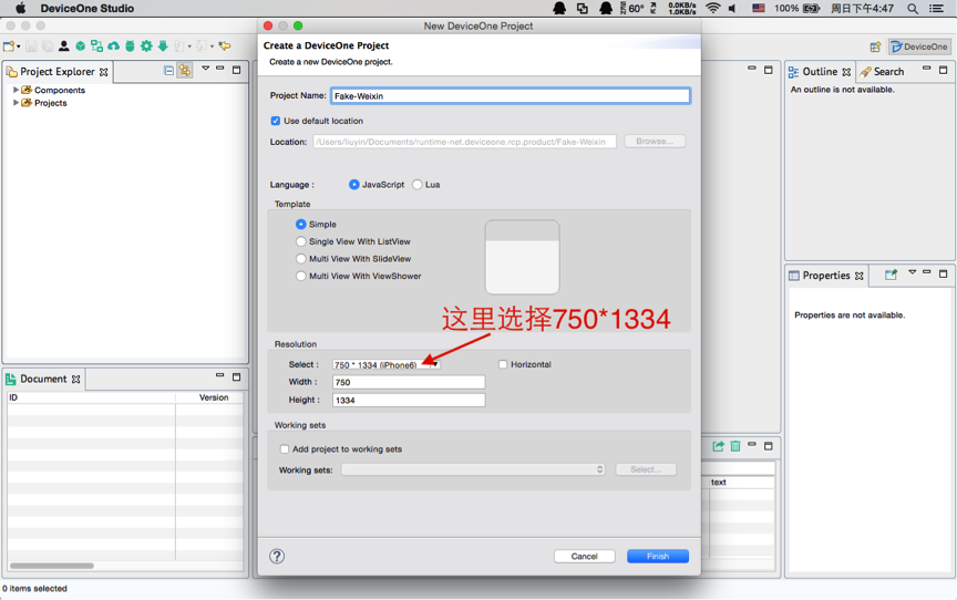
1. New project: We chose Simple template. We chose the empty template because we can explain the development process in more detail. In fact, for this project, it is more appropriate to choose the Multi View with ViewShower template.
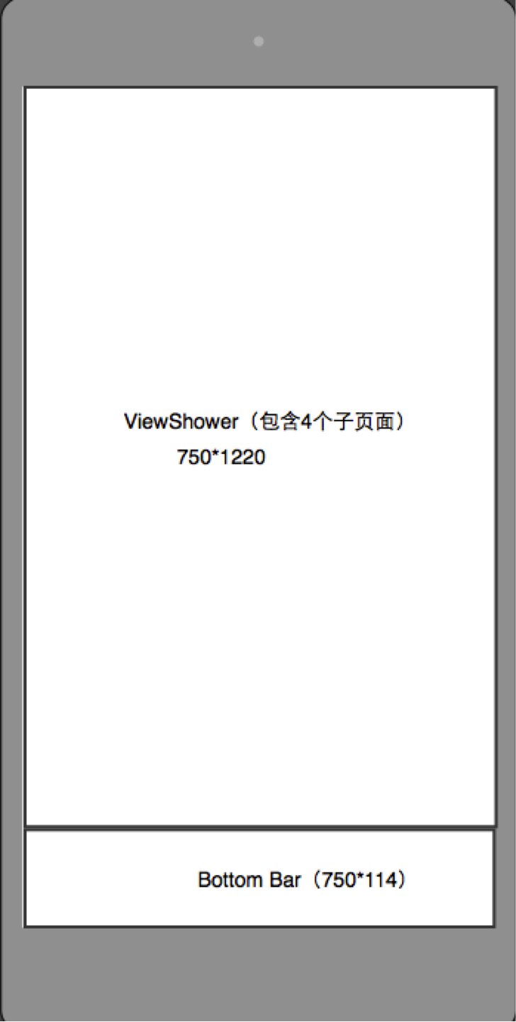
2. A brief analysis of the main interface. The size of the entire main interface is the size of an iPhone 6, 750*1334. It is divided into two parts, the upper and lower parts. The bottom is a Bottom Bar navigation bar, and the top is 4 independent interfaces. These 4 interfaces Only one interface is always displayed. The other three interfaces are in memory and can be switched by the navigation at the bottom. This is suitable for using do_ViewShower as the main body of the frame as shown below:
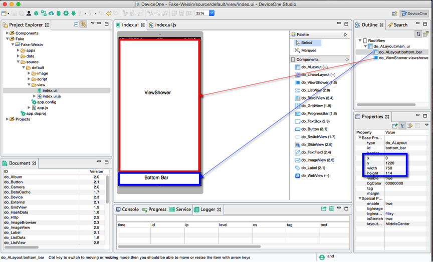
Corresponding to this design, we delete the automatically generated button on the newly created project, add a do_ALayout component and do_ViewShower component, and set their height, width, x, and y coordinates:
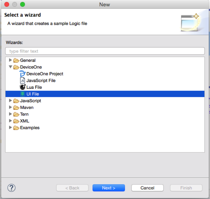
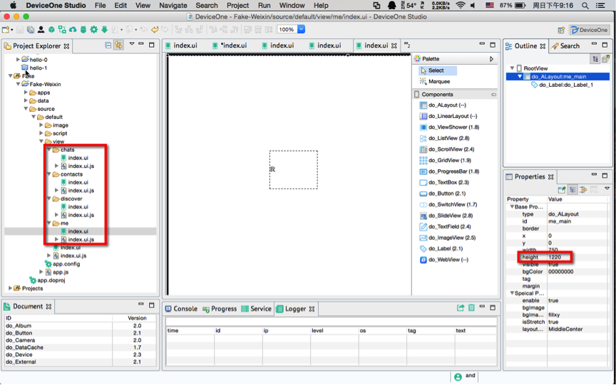
3. Next, we add 4 pages to the ViewShower. I would also like to emphasize here that the actual App will involve multiple people. Our code structure must be clear and easy to read. Try to use English when naming. If it is not possible, use the full Chinese spelling. Including creating multi-level subdirectories and not mixing them all together. Here we add 4 subdirectories: chats, contacts, discover, me. Right-click each subdirectory, select New--Other--DeviceOne--UI File, create 4 index.ui, and the corresponding index.ui.js will automatically generate.
Be careful here to set the height of the root node ALayout corresponding to these 4 ui files to 1220, because these 4 ui files are all subviews of the ViewShower of the main interface and should not exceed the size of the ViewShower.
In addition, add a label to each UI to mark the Chinese name. You can debug it later to see the real effect more clearly.
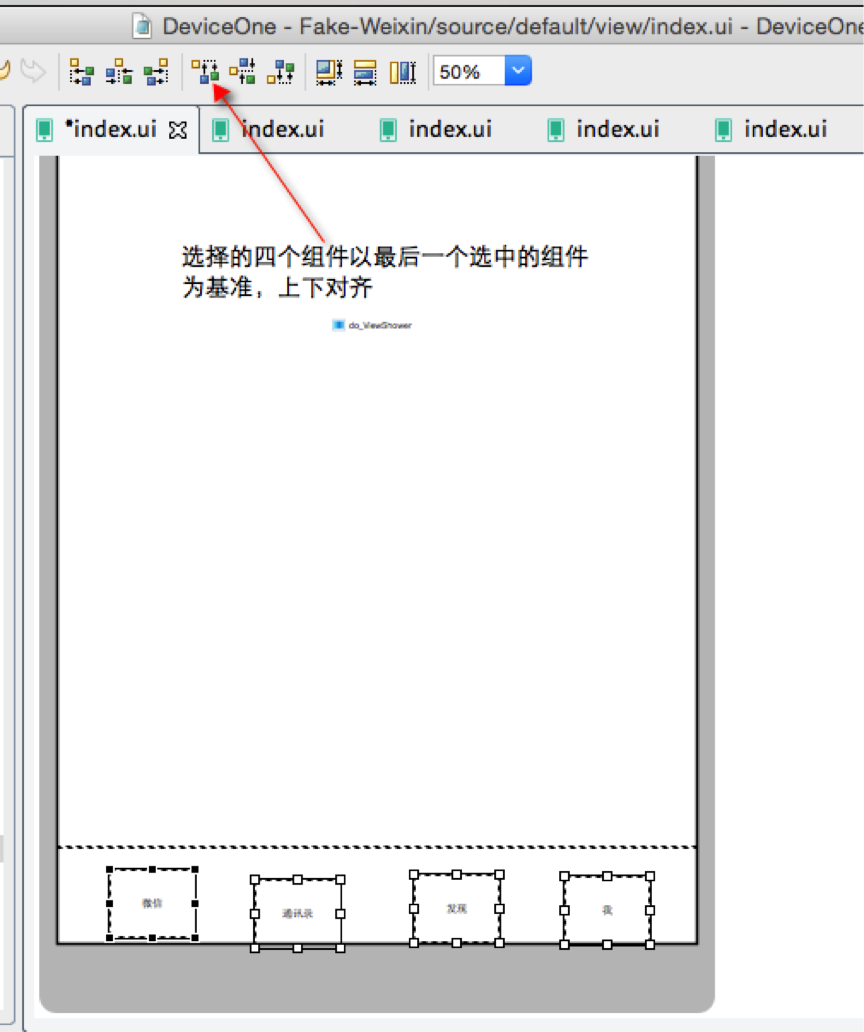
4. Simply add 4 buttons in the Bottom Bar, and then add the corresponding js code to implement the page switching function of ViewShower. Here is a tip. Select 2 or more components and you can use various alignment functions, as shown below:
5. Add the ViewShower initialization code and button click event in index.ui.js.
var viewshower = ui("viewshower");
var page = sm("do_Page");
// 为viewshower增加4个子页面
viewshower.addViews([ {
    id : "chats",// 页面的标示
    path : "source://view/chats/index.ui"// 页面的路径
}, {
    id : "contacts",
    path : "source://view/contacts/index.ui"
}, {
    id : "discover",
    path : "source://view/discover/index.ui"
}, {
    id : "me",
    path : "source://view/me/index.ui"
} ]);
// 初始化先显示第一个页面
viewshower.showView("chats");
var button1 = ui("do_Button_1");
button1.on("touch", function() {
    viewshower.showView("chats");
});
var button2 = ui("do_Button_2");
button2.on("touch", function() {
    viewshower.showView("contacts");
});
var button3 = ui("do_Button_3");
button3.on("touch", function() {
    viewshower.showView("discover");
});
var button4 = ui("do_Button_4");
button4.on("touch", function() {
    viewshower.showView("me");
});
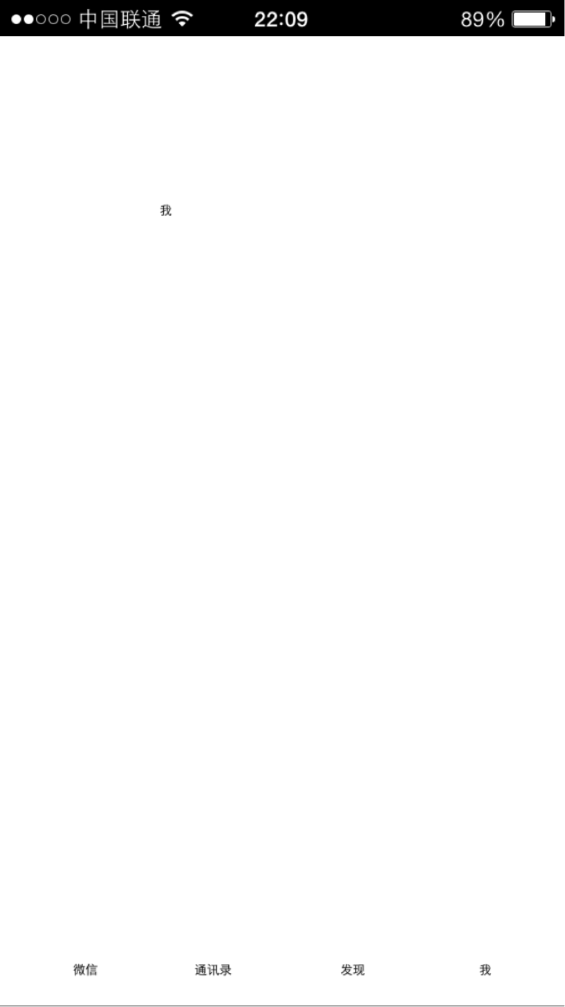
6. Let’s take a look at the running effect on a real machine, start the debugging service of the designer, and start the debugging program on the mobile phone. The final rendering we see is as follows. The iOS and Android interfaces are exactly the same. Click the 4 buttons at the bottom, and the switching effects are all good:
7. That’s it for this section. Is the framework work completed? It can only be said that the first step of the framework is completed. If we have many colleagues developing this App together, we can start to separate the work in parallel, and then divide it into 5 parts:
* Completion of Bottom Bar
* Completion of /chats/index.ui
* Completion of /contacts/index.ui
* Completion of /discover/index.ui
* Completion of /me/index.ui
The prerequisite for multiple people to work in parallel is code version management such as SVN and GIT. We use GIT here. The address is https://github.com/do-project/Fake-Weixin. After each section, we The GIT service will be submitted. You can download the code reference of this node. We will also attach the project code for this section in the attachment.
In the next section we complete the first subtask, the implementation of BottomBar.
-------------------------------------------------- ---------------
This section is mainly about completing the implementation of the bottom navigation bar.
0. Let’s first analyze the interface renderings and design drawings


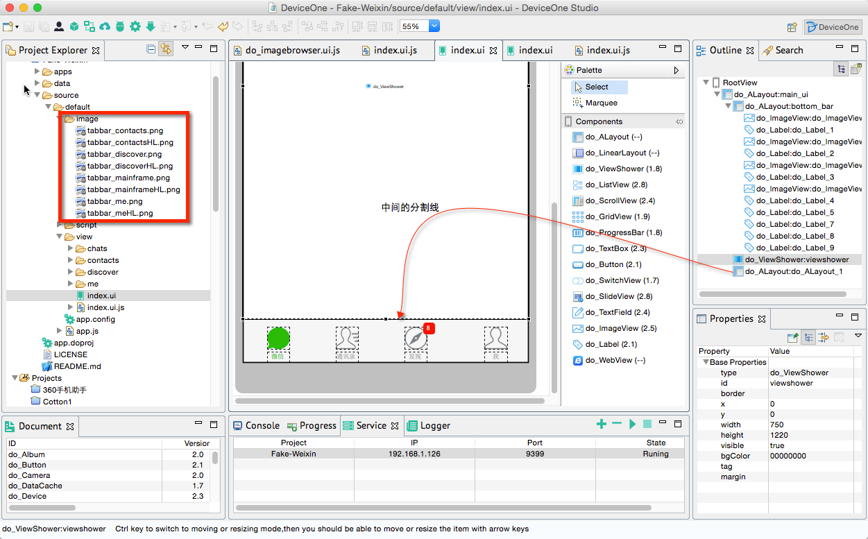
The entire bottom navigation is divided into 4 repeated parts. Each part consists of an ImageView, a bottom title Label, and a label in the upper right corner. This label can be implemented with a rounded corner Label. This label should be hidden by default. .
1. The first step is to find the corresponding picture resources. Usually these resources are provided by artists. Now we are imitating WeChat. The best way is to get them from the WeChat native installation package. You cannot directly rely on screenshots, but open them. WeChat ios, android installation package, the ios installation package is ipa and the android installation package apk are both compressed files, which can be unzipped to obtain some image resources. At present, I only need the 8 icons at the bottom, including the highlighted icons that are not clicked and those that are clicked. I put these icons in the image directory

2. First delete the 4 temporary buttons added previously, and then lay out the new components according to the size data provided by the artist, including 4 do_ImageView components, 4 Label components and 4 Labels in the upper right corner
A simple calculation can show that the size of ImageView is 60*60. Here is a little trick. After setting up a set of ImageView and Label, select 2 components, then right-click "Copy", and then "Paste" three times. You can also select multiple components for various alignments.

Tune it again and set the image and text. The image setting is to set the source attribute of ImageView. Label needs to set the text to be centered, set the textAlign attribute to center, set the font, set the background color, foreground color, etc., set the upper right The visibility of the three Labels in the corner is false. Add an ALayout in the middle and set the background to gray as the dividing line between the ViewShower and the Bottom Bar. Note here that the perfect circular Label in the upper right corner is implemented by setting the border attribute. The border is set to FF0000FF,1,15 to represent the border line. The color is red, the width is 1, and the fillet radius is 15 (the width and height of the Label are both 30), thus achieving a perfect circle.
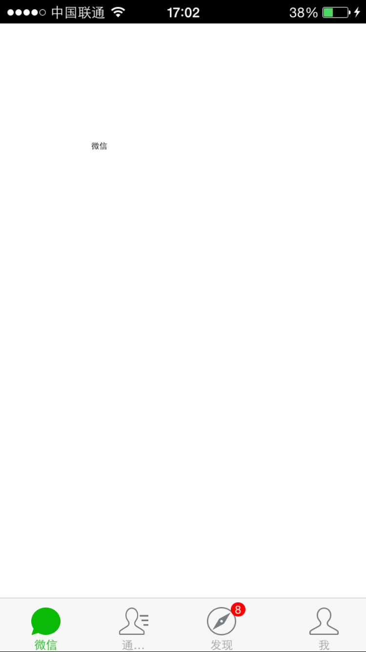
Test the effect on a real device. The renderings of real iPhone and Android phones are as follows:
 e09233e72a88913c4fbff7920f86497b
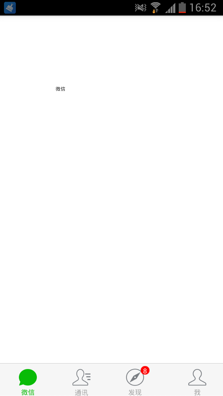
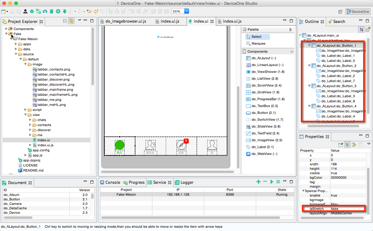
3. There will be two problems at this time. If you add a click event to the ImageView, the user must click on the image to trigger the click, which is not a good experience. The second problem is that the picture is slightly deformed on Android. If it is on an iPhone 4, for example, the circle may become an ellipse. This problem is due to the difference in the aspect ratio of different mobile phones.
The solution is:
* Add 4 sub-ALayouts of the same size to the ALayout where the Bottom Bar is located, then place the imageview and label on the corresponding sub-ALayout, and then add a click event to the sub-ALayout so that the user's finger only needs to touch the same position Events can be triggered
* Change the isStretch attribute of the above four sub-ALayouts to false. For this principle, please refer to the document ALayout example demo
4. 修改index.ui.js,添加代码主要是在底部bottom bar切换按钮的时候修改所有图标的颜色和字的前景色。
var button = ui("do_Button_");
var imageview = ui("do_ImageView_");
var label = ui("do_Label_");
button.on("touch", function() {
    showView("chats");
});
var button = ui("do_Button_");
var imageview = ui("do_ImageView_");
var label = ui("do_Label_");
button.on("touch", function() {
    showView("contacts");
});
var button = ui("do_Button_");
var imageview = ui("do_ImageView_");
var label = ui("do_Label_");
button.on("touch", function() {
    showView("discover");
});
var button = ui("do_Button_");
var imageview = ui("do_ImageView_");
var label = ui("do_Label_");
button.on("touch", function() {
    showView("me");
});
function showView(name) {
    viewshower.showView(name);
    if (name == "chats") {
        imageview.source = "source://image/tabbar_mainframeHL.png";
        label.fontColor = "BBFF";
    } else {
        imageview.source = "source://image/tabbar_mainframe.png";
        label.fontColor = "FFFFF";
    }
    if (name == "contacts") {
        imageview.source = "source://image/tabbar_contactsHL.png";
        label.fontColor = "BBFF";
    } else {
        imageview.source = "source://image/tabbar_contacts.png";
        label.fontColor = "FFFFF";
    }
    if (name == "discover") {
        imageview.source = "source://image/tabbar_discoverHL.png";
        label.fontColor = "BBFF";
    } else {
        imageview.source = "source://image/tabbar_discover.png";
        label.fontColor = "FFFFF";
    }
    if (name == "me") {
        imageview.source = "source://image/tabbar_meHL.png";
        label.fontColor = "BBFF";
    } else {
        imageview.source = "source://image/tabbar_me.png";
        label.fontColor = "FFFFF";
    }
}
到此为止,底部导航栏基本实现完成,这一节比较简单,主要是一些细致的ui拖拽调整。我们用调试版本看一下Android,iOS的效果都非常不错。
我们开始实现ViewShower的第一页主体内容.
---------------------------------------------------------------------------------------
接上一节 底部导航 ,我们这一节主要是完成微信4个主页面的第一个页面“微信”页面,这一节内容比较多,我们分多个跟帖来完成
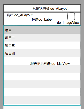
0 老规矩,先分析一下UI,由三个大部分组成,系统状态栏,工具栏和微信聊天记录列表。
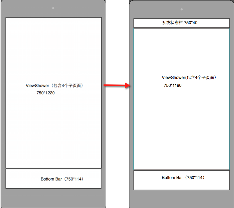
1. 系统状态栏高度40,背景黑色,我们注意到微信的首页4个子页面都有这个系统状态栏,这样我们需要做一个整体框架的调整,没有必要为4个子页面都添加一个状态栏,只需要在ViewShower上添加一个就可以,对应的ViewShower和子页面的高度都变成1180.
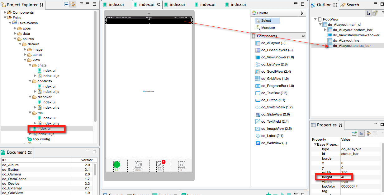
对应设计器里index.ui, chats/index.ui, contacts/index.ui, discover/index.ui, me/index.ui 都要作相应的height,y属性值的变化。效果如下:
2. 我们回到chats/index.ui ,先增加工具导航栏(高度80)和里面的标题和工具按钮,这个需要增加加号的资源文件,因为这个文件是chats页面专有的,所以存在image/chats/bar_add.png下。
我们看看真机效果,我们注意到顶部多出一块黑色区域,这是设计器里的增加的状态栏,因为这个页面是从系统状态栏开始往下绘制的,所以会把设计器里这一部分多出来,
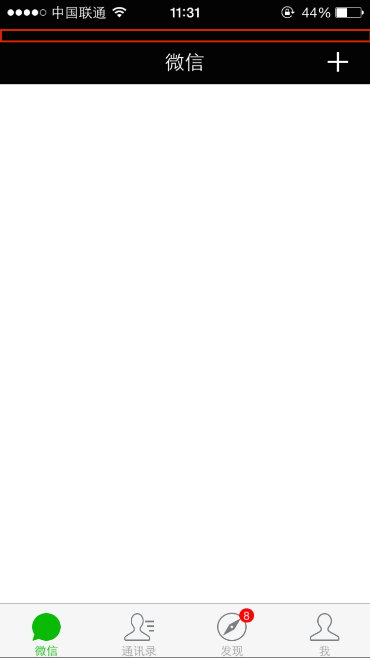
要解决的方法是修改app.js,openPage增加一个statusBarState参数(API文档),设置为transparent表示页面从屏幕最顶端开始绘制。
var d1 = require("deviceone");
var app = d1.sm("do_App");
app.on("loaded", function() {
    this.openPage({
        source : "source://view/index.ui",
        statusBarState : "transparent"
    });
});
再来看看真机效果图:
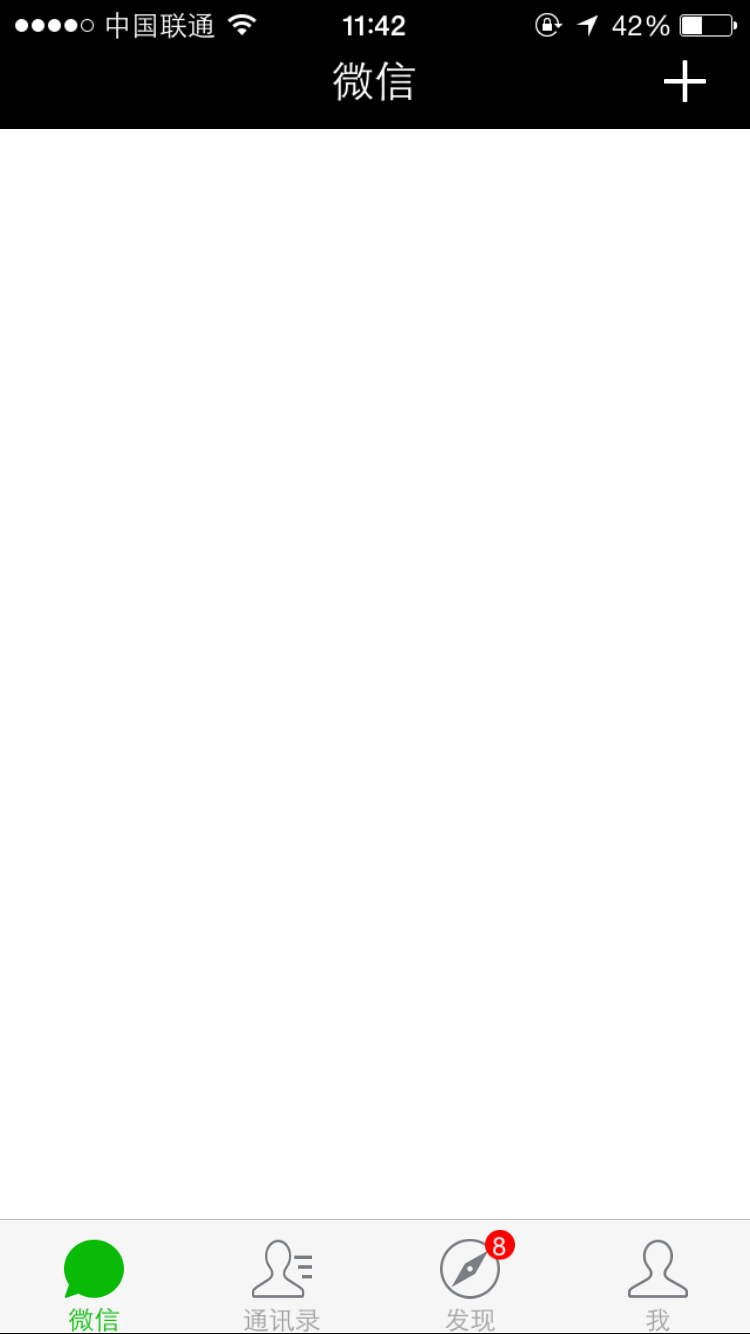
3. 主体部分是一个do_ListView,接下来设置ListView的cell和数据。
ListView的cell指列表框的每一行,比如ListView有100行数据,实际上可见的屏幕永远只能看到8,9行左右,所以我们手势上下滑动的时候并没有创建100行,而是重复使用这8,9行,只不过替换里面的数据而已。我们称之为行模板,在DeviceOne里这种模板也是一个ui文件,比如这里我们在chats子目录下新建一个chat_cell.ui,这个ui基本界面如下:

按照美工的设计尺寸我们来拖拽UI

这里同样需要考虑纯圆变形问题,需要设置好文字大小,前景色等属性,大家可以看到里面有多个do_Label,do_ImageView组件,由于模板ui是靠后期绑定数据的,所以在设计阶段都是空白的。

接下来我们需要设计chat_cell.ui对应的数据,通常为了用户体验,需要尽可能的减少网络交互,页面打开的时候通常先读取本地的数据文件,把界面显示出来,然后再考虑是否要进行网络连接来获取最新数据,所以App开发需要仔细考虑数据的本地化读写和数据的时效性的平衡。
DeviceOne的传递数据基本上都是标准的JSON格式。如下图,chat_cell.ui里的组件属性和JSON数据结构对应的关系
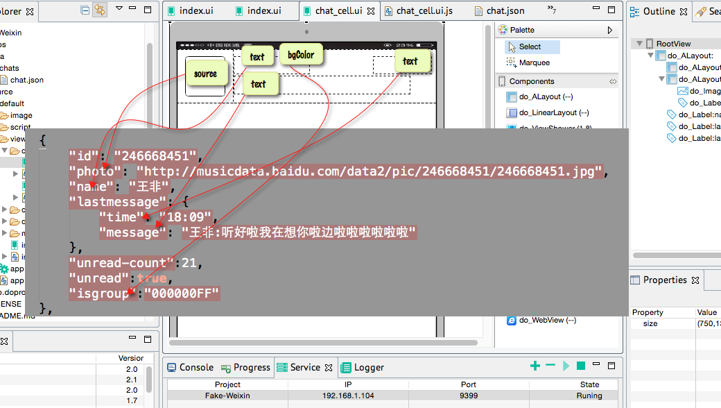
对应的映射关系的代码在chat_cell.ui.js如下,我们可以看到映射关系的左边是组件id.组件属性名,右边是数据JSON的key名称:
//related to chat_cell.ui
var root = ui("$");;//$是这个ui文件根节点组件的通配符,如果指定组件的id,也可以用id来获取对象
root.setMapping({
    "photo_imageview.source" : "photo",
    "name_label.text" : "name",
    "lastmessage_label.text" : "lastmessage.message",
    "lasttime_label.text" : "lastmessage.time",
    "unread_label.visible" : "unread",
    "unread_label.text" : "unread-count",
    "name_label.fontColor" : "isgroup",
});
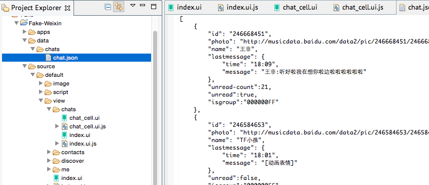
对应的数据本应该是第一次运行从网络上获取之后再缓存到本地的,我们是模拟,所以先手动生成一个文件到data/chats/chat.json
4. 我们回到chats/index.ui,我们需要给这里ui文件里的listview设置模板,绑定数据。
设置index.ui 里的listview的templates属性为 source://view/chats/chat_cell.ui
注意:chat_cell.ui存储在source/default/view/chats/chat_cell.ui,但是source://的根节点指的是 source/default/目录
在index.ui.js里添加绑定数据的代码
//related to index.ui
var storage = sm("do_Storage");
var listdata = mm("do_ListData");
var listview = ui("listview");
var json_path = "data://chats/chat.json";//本地缓存的数据
if (storage.fileExist(json_path)) {
    storage.readFile(json_path, function(data, e) {
        //deviceone.print(JSON.stringify(data));
        listdata.addData(data);
        listview.bindItems(listdata);
        listview.refreshItems();
    })
}
var page = sm("do_Page");
page.on("loaded",function(){
    //这个页面加载完显示出来后触发这个事件
    //我们可以在这个事件里去获取最新的网络数据,来更新listview和data/chats/chat.json
});
我们在真机上看看效果
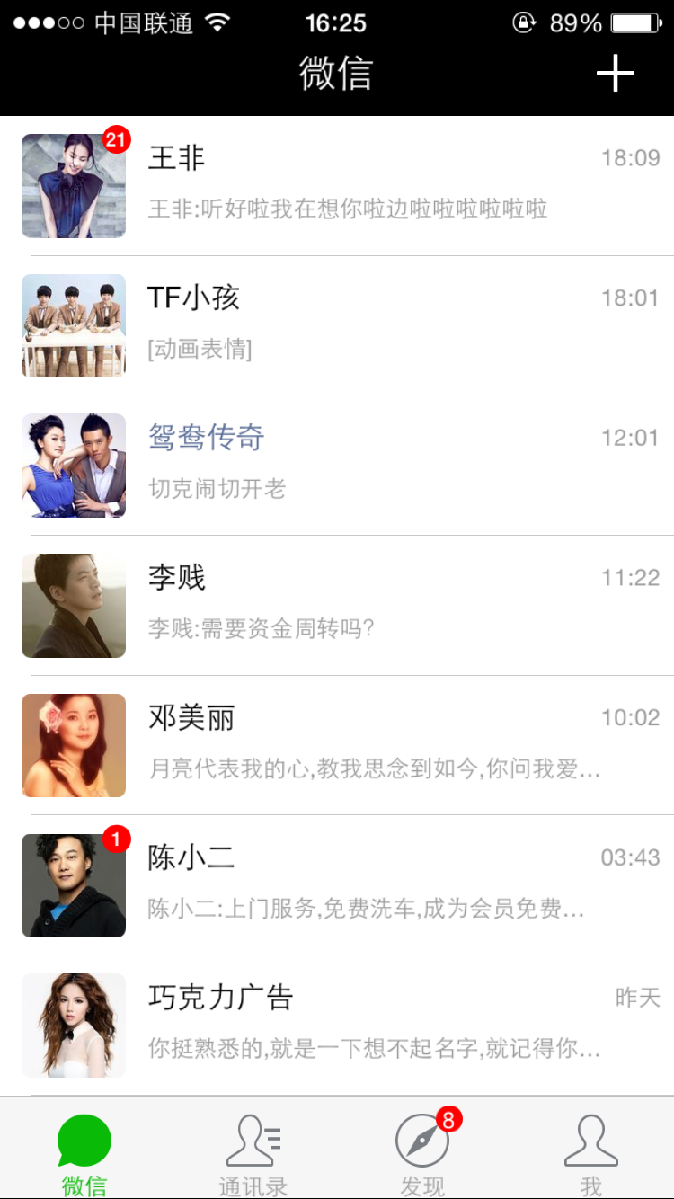
在运行中有几个细节:
* 上下滑动的时候,图片不断的刷新,原因是我们的ImageView的source是网络图片,每次显示的时候都是从网络上获取的,所以这里需要把chat_cell.ui里的ImageView的cacheType属性换成"always" 意思是只从网络上读取一次就会缓存到本地,下一次不会再从网络上读取了。关于cacheType属性参考API文档
* ImageView也是圆角的,圆角通常可以使用border属性来设置,但是android只有ImageView不能通过border来设置圆角,ImageView还有一个专有属性radius来设置Android才有效,这个我们以后可以改进
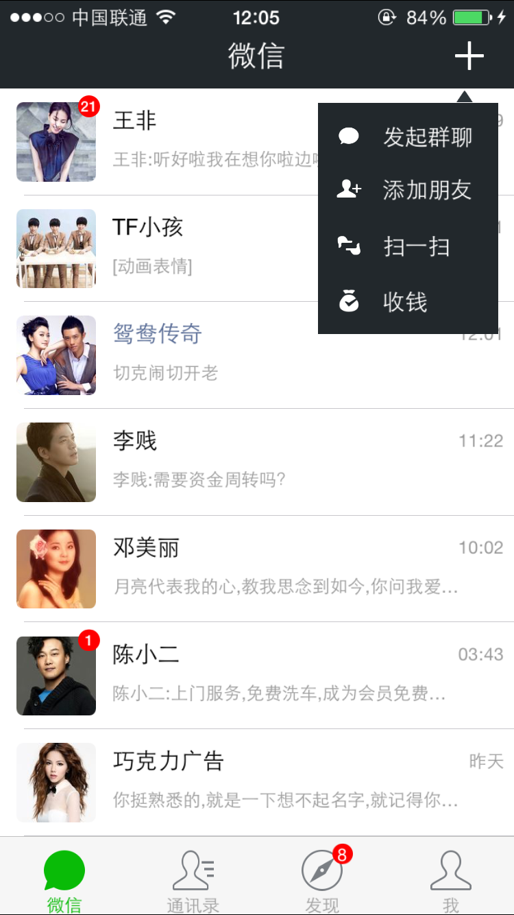
5. 处理右上角的add按钮,点击弹出菜单
先给右上角ImageView的enable属性设置为true,才可以处理点击事件,在chats/index.ui.js里添加代码
var add_button = ui("add_imageview");
add_button.on("touch", function() {
    var menu = ui("menu_id");
    if (menu) {//如果已经add过,就只是让这个view显示,而不是add一个新的
        if (menu.visible == false)
            menu.visible = true;
    } else {
        main.add("menu_id", "source://view/chats/chat_add_menu.ui");
    }
});
其中chat_add_menu.ui 是弹出的菜单对应的ui文件,这个ui文件的根节点大小和chat/index.ui一样,这样确保我点击任何空白处都可以关闭这个菜单(实际上是隐藏这个菜单),我们在这个ui文件里把对应的布局都拖拽好,其中需要添加4个资源png文件。
这里有个小技巧,顶部的三角形标记只能通过一个ImageView加载一个三角形图标来实现。

我们再给chat_add_menu的根节点添加点击事件,点击的时候把自己隐藏,在chat_add_menu.js
var root = ui("$");
root.on("touch",function(){
    root.visible = false;
});
最后我们先看看真机效果,点击加号弹出菜单,点击任何地方都把菜单隐藏。
这一节暂时先到这里,我们先开始拖拽后几个主页面,那几个页面基本完成后再重新回到这一个页面来细琢。
Related articles
See more- An in-depth analysis of the Bootstrap list group component
- Detailed explanation of JavaScript function currying
- Complete example of JS password generation and strength detection (with demo source code download)
- Angularjs integrates WeChat UI (weui)
- How to quickly switch between Traditional Chinese and Simplified Chinese with JavaScript and the trick for websites to support switching between Simplified and Traditional Chinese_javascript skills

