This article mainly introduces to you the relevant information about the sample code of CSS implementation of triangles with rounded corners. The editor thinks it is quite good, so I will share it with you now and give it as a reference. Let’s follow the editor to take a look, I hope it can help everyone.
Preface
The target realization renderings are as follows:

Achievement
<i class="triangle triangle-up"></i>
<i class="triangle triangle-right"></i>
<i class="triangle triangle-down"></i>
<i class="triangle triangle-left"></i>
.triangle{
  display: inline-block;
  font-size: 0;
  overflow: hidden;
}

.triangle:before{
  content: "";
  position: relative;
  display: inline-block;
  border: 25px solid transparent;
}

.triangle-up{
  position: relative;
  top: 2px;
  border-top-left-radius: 50%;
  border-top-right-radius: 50%;
}
.triangle-up:before{
  bottom: 2px;
  border-top-width: 0;
  border-bottom-width: 50px;
  border-bottom-color: rgb(181, 181, 181);
}

.triangle-right{
  position: relative;
  right: 2px;
  border-top-right-radius: 50%;
  border-bottom-right-radius: 50%;
}
.triangle-right:before{
  left: 2px;
  border-right-width: 0;
  border-left-width: 50px;
  border-left-color: rgb(181, 181, 181);
}

.triangle-down{
  position: relative;
  bottom: 2px;
  border-bottom-right-radius: 50%;
  border-bottom-left-radius: 50%;
}
.triangle-down:before{
  top: 2px;
  border-bottom-width: 0;
  border-top-width: 50px;
  border-top-color: rgb(181, 181, 181);
}

.triangle-left{
  position: relative;
  left: 2px;
  border-top-left-radius: 50%;
  border-bottom-left-radius: 50%;
}
.triangle-left:before{
  right: 2px;
  border-left-width: 0;
  border-right-width: 50px;
  border-right-color: rgba(181, 181, 181, 1);
}
Analysis
Extract a triangle from the above code to analyze, take triangle-down as an example.
Generally, slashes cannot be drawn in CSS, so we have to find another way. Looking at the above implementation code, you will find that border is used extensively. In fact, this is the core and it is not complicated. A picture can illustrate

Adjusting the size or shape of the triangle can This is achieved by adjusting the size of border-width in different directions, for example, adjusting the size of triangle-down:
Adjusting height: border-top-width: 100px;;
Adjust the width: border-right-width: 50px; border-left-width: 50px;
Adjust the size of the triangle in other directions by analogy.
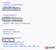
Look at the triangle-down in the "Preface" and you will find that the downward angle is not sharp, but has a little "small arc".
It is not difficult to realize this "small arc". In fact, it is not a radian, but uses overflow: hidden to "cut off" a little bit of the corner. When you zoom in, you can find that the transition is not harmonious, but because of this type of triangle In actual use, the size will be very small, so the naked eye will not perceive this disharmony and will mistakenly think it is a small rounded corner. In the above example, 2px is cut off.
Another idea that can achieve a more harmonious transition is to draw a large enough circular overflow: hidden area, and then put the triangle in it, and the three corners will be cut more harmoniously, but at this time The triangle is already quite large, so you can use transform: scale() to reduce it. It’s troublesome, isn’t it? It’s half the result with twice the effort, so I forget it...


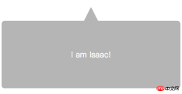
<p class="bubble-box">
  <p class="bubble-box-hat">
    <i class="triangle triangle-up"></i>
  </p>
  <p class="bubble-box-body">i am isaac!</p>
</p>
.bubble-box{
  font-size: 0;
  margin-top: 50px;
}

.bubble-box-hat{
  text-align: center;
}

.bubble-box-body{
  color: #FFFFFF;
  background: rgb(181, 181, 181);
  font-size: 28px;
  border-radius: 10px;
  padding: 100px;
  text-align: center;
}
Related recommendations: How to draw triangles and parallelograms with CSS
JavaScript loop practice printing triangles, Factorial and multiplication table methods
Use css to implement a transparent triangle special effect code
The above is the detailed content of How to implement rounded triangles in css. For more information, please follow other related articles on the PHP Chinese website!
 All About mailto: LinksApr 22, 2025 am 11:04 AM
You can make a garden variety anchor link () open up a new email. Let's take a little journey into this feature. It's pretty easy to use, but as with anything
 It's pretty cool how Netlify CMS works with any flat file site generatorApr 22, 2025 am 11:03 AM
Little confession here: when I first saw Netlify CMS at a glance, I thought: cool, maybe I'll try that someday when I'm exploring CMSs for a new project. Then
 Edge Goes Chromium: What Does it Mean for Front-End Developers?Apr 22, 2025 am 10:58 AM
In December 2018, Microsoft announced that Edge would adopt Chromium, the open source project that powers Google Chrome. Many within the industry reacted with
 A Gutenburg-Powered NewsletterApr 22, 2025 am 10:57 AM
I like Gutenberg, the new WordPress editor. I'm not oblivious to all the conversation around accessibility, UX, and readiness, but I know how hard it is to
 Using for Menus and Dialogs is an Interesting IdeaApr 22, 2025 am 10:56 AM
Using for a menu may be an interesting idea, but perhaps not something to actually ship in production. See "More Details on "
 Automated Visual Regression Testing With PlaywrightApr 22, 2025 am 10:54 AM
With visual regression testing, we can update a page, take screenshots before and after the fact, and compare the results for unintended changes. In this article, learn how to set up visual regression testing using Playwright.
 CSS Houdini Could Change the Way We Write and Manage CSSApr 22, 2025 am 10:45 AM
CSS Houdini may be the most exciting development in CSS. Houdini is comprised of a number of separate APIs, each shipping to browsers separately, and some


Hot AI Tools

Undresser.AI Undress
AI-powered app for creating realistic nude photos

AI Clothes Remover
Online AI tool for removing clothes from photos.

Undress AI Tool
Undress images for free

Clothoff.io
AI clothes remover

Video Face Swap
Swap faces in any video effortlessly with our completely free AI face swap tool!

Hot Article

Hot Tools

MantisBT
Mantis is an easy-to-deploy web-based defect tracking tool designed to aid in product defect tracking. It requires PHP, MySQL and a web server. Check out our demo and hosting services.

mPDF
mPDF is a PHP library that can generate PDF files from UTF-8 encoded HTML. The original author, Ian Back, wrote mPDF to output PDF files "on the fly" from his website and handle different languages. It is slower than original scripts like HTML2FPDF and produces larger files when using Unicode fonts, but supports CSS styles etc. and has a lot of enhancements. Supports almost all languages, including RTL (Arabic and Hebrew) and CJK (Chinese, Japanese and Korean). Supports nested block-level elements (such as P, DIV),

Dreamweaver CS6
Visual web development tools

DVWA
Damn Vulnerable Web App (DVWA) is a PHP/MySQL web application that is very vulnerable. Its main goals are to be an aid for security professionals to test their skills and tools in a legal environment, to help web developers better understand the process of securing web applications, and to help teachers/students teach/learn in a classroom environment Web application security. The goal of DVWA is to practice some of the most common web vulnerabilities through a simple and straightforward interface, with varying degrees of difficulty. Please note that this software

ZendStudio 13.5.1 Mac
Powerful PHP integrated development environment


