
Home >Web Front-end >CSS Tutorial >CSS layout grid area
CSS layout grid area

- 零到壹度Original
- 2018-03-24 10:51:212076browse
So far, grid items have been placed in independent cells, but we should break this limitation so that grid items can go beyond the cell interface to achieve more useful layouts. In this section we will see how to implement it.
Defining Grid Areas
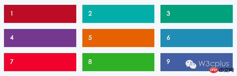
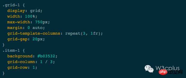
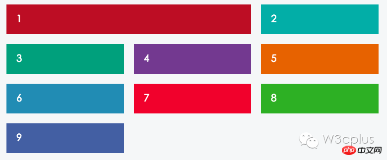
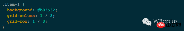
Here is a grid we have been trying to achieve: nine grid items divided into three equal In a grid of columns and equal rows, there is a 20px spacing between columns and rows.
Currently, only some color styles have been set for the grid items, but according to the content in the first tutorial, we can add grid-column and grid on this basis -Row style rules:
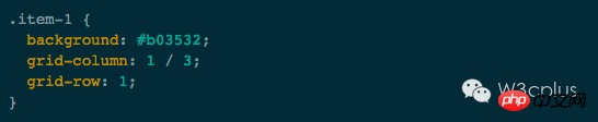
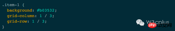
grid-column is actually the abbreviation of grid-column-start and grid-column-end, telling the grid item.item-1 from the network Starts at grid line 1 and ends at grid line 3.
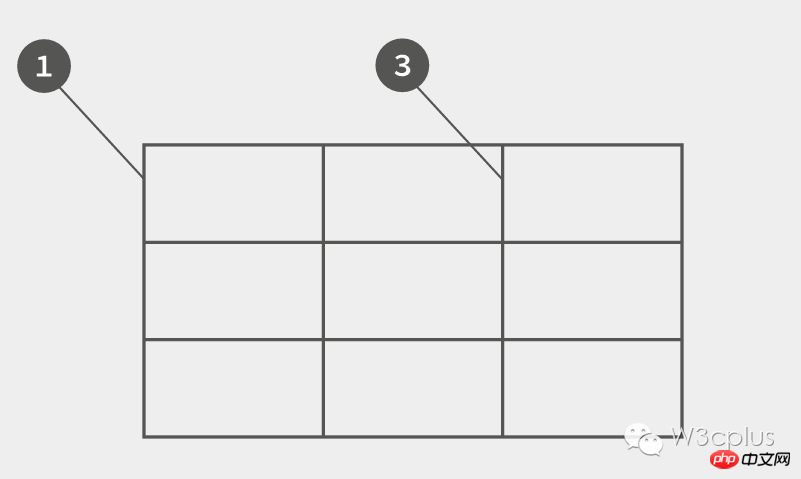
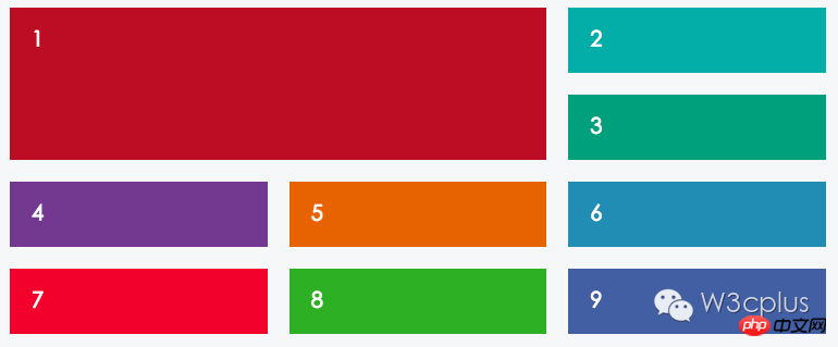
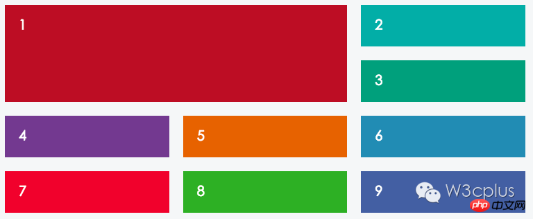
The following example demonstrates that the first grid item spans two cells, and the other grid items will automatically be arranged to the right and downward. The entire process is automatically calculated by the grid.
Can also be applied to grid-row, so that cells span several rows:
Cross-cell
You can use a simpler syntax and use a keyword span in grid-column-end. span tells us the number of cells spanned without specifying the ending grid line.
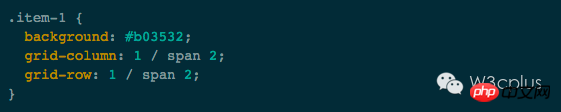
The effect obtained in this way is the same as the effect obtained by using
.
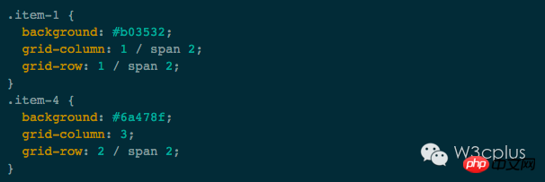
In the example below, we have deleted four grid items. Position processing was done for two grid items. The first grid item's row and column span 2 cells, while the fourth grid item is in the third column, second row, and the row spans two cells.
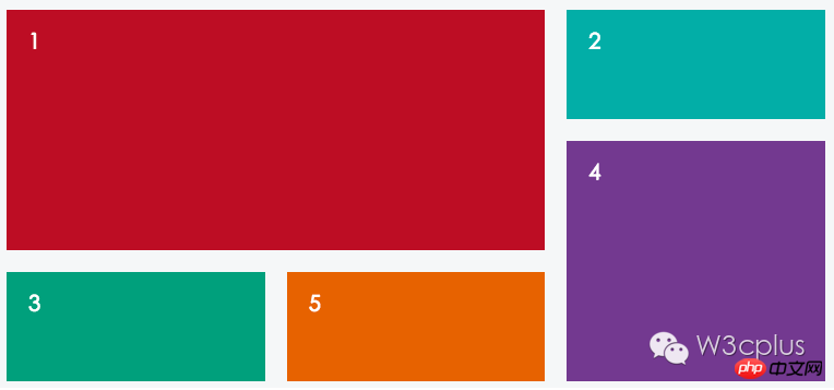
Other grid items will automatically fill the available space. This only highlights the advantages of grid layout and does not reflect the source order of elements.
Note: In some cases, it is also very important to reflect the order of sources. Let us not forget that your web page may still be accessed by many people with disabilities, so in many cases accessibility needs to be considered. design.
The cell span in the grid is actually similar to the merged cells in the table, such as colspan to merge columns and rowspan to merge rows.
Declaration area
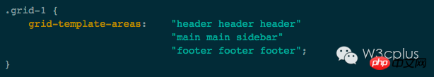
So far, we have used numerical description to make the grid work very well, but Grid Template Areas can make layout more intuitive.
Specifically, you can name the grid area. Use these named grid areas (numbers that replace grid lines) to position grid items. The following example uses the names of the grid areas to create a rough page layout. This layout mainly includes:
header
-
main content(main content)
sidebar(sidebar)
footer(footer)
We need to define the names of these grid areas on the grid container, just like drawing a layout here:
##Grid project positioning
Now we want to focus on the grid project, where grid-area is used instead of the grid used previously -column and grid-row rules: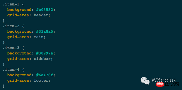
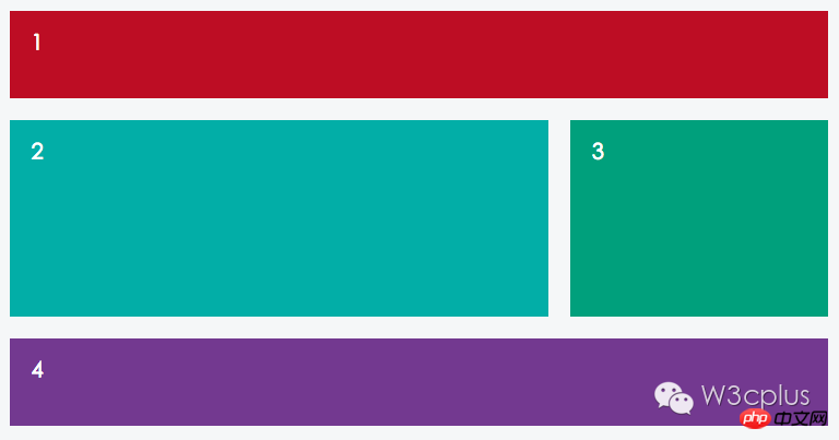
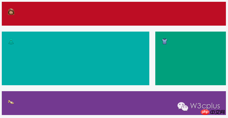
As you can see, this makes the layout of the network much easier. In fact, the above example intuitively expresses the name of the grid area we need. In fact, we can go further and use some emoticons to declare the grid area.

The effect is as follows:
Grid area nesting
Many times, Web pages have various nestings, so let’s take a look at how to use grids to achieve this nested layout.
When we use display:grid, we have declared a grid container, and its descendant elements will automatically become grid items. Adding content to these child elements will not affect the grid at all unless we explicitly reset it.
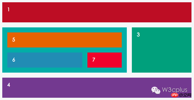
In the following example, .item-5, .item-6 and .item-7 are placed inside .item-2:
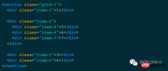
So we only need to declare .item-2 as a grid container, and it is a grid with two rows and two columns:
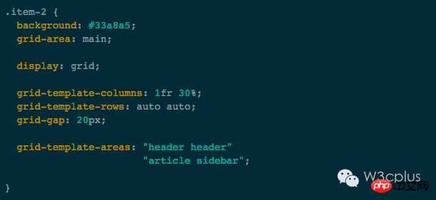
We can continue to use the header here , article and sidebar to name the grid area. It won't cause unnecessary trouble, because it all depends on its context. These grid areas only apply to the .item-2 grid.
Summary
A brief summary of what was discussed earlier:
grid-column is grid-column-start and grid-column- The abbreviation of end, a convenient way to define the start and end of a grid project
You can use the span keyword to merge grids to make the rules more flexible
Use grid-template-areas to declare the grid area name, you can even use emoticons to declare the grid area
Possibly use display in the grid project :grid to declare that the grid item is a grid container to implement grid nesting
Through this article , we have learned some specifications about CSS Grid layout, which brings us closer and closer to using CSS Grid for layout in reality. In the next tutorials we will look at some complex layouts.
The above is the detailed content of CSS layout grid area. For more information, please follow other related articles on the PHP Chinese website!