Home >Web Front-end >CSS Tutorial >Graphical tutorial on the box-sizing property of CSS3
Graphical tutorial on the box-sizing property of CSS3
- php中世界最好的语言Original
- 2018-03-22 16:08:321880browse
This time I will bring you a graphic tutorial on the box-sizing attribute of CSS3. Using the box-sizing attribute of CSS3What are the precautions?The following is a practical case, let’s take a look.
##The box-sizing properties include content-box (default), border-box,padding-box.
1. Content-box, border and padding are not calculated into width
2. Padding-box, padding are calculated into width
3. Border-box, border and padding are calculated into width, which is actually a weird mode~
Note:
ie8+ browser supports content-box and border-box; ff supports all three values.When used:
-webkit-box-sizing: 100px; // for ios-safari, -moz-box-sizing:100px; //for ffbox-sizing:100px; //for otherExamples are as follows:
<style type="text/css">
    .content-box{
        box-sizing:content-box;
        -moz-box-sizing:content-box;
        width: 100px;
        height: 100px;
        padding: 20px;
        border: 5px solid #E6A43F;
        background: blue;
    }
    .padding-box{
        box-sizing:padding-box;
        -moz-box-sizing:padding-box;
        width: 100px;
        height: 100px;
        padding: 20px;
        border: 5px solid #186645;
        background: red;
    }
    .border-box{
        box-sizing:border-box;
        -moz-box-sizing:border-box;
        width: 100px;
        height: 100px;
        padding: 20px;
        border: 5px solid #3DA3EF;
        background: yellow;
    }
</style>
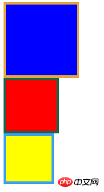
Screenshot (ff):

I believe you have mastered the method after reading the case in this article. For more exciting information, please pay attention to other related articles on the php Chinese website! Recommended reading:
How to deal with the disappearance of CSS border lines
Realize multiple background simulation dynamic borders
The above is the detailed content of Graphical tutorial on the box-sizing property of CSS3. For more information, please follow other related articles on the PHP Chinese website!

