
Home >Web Front-end >CSS Tutorial >How can absolute positioning in css be compatible with all resolutions?
How can absolute positioning in css be compatible with all resolutions?
- php中世界最好的语言Original
- 2018-03-21 14:57:233534browse
This time I will bring you the css absolute positioningHow to be compatible with all resolutions, css absolute positioning is compatible with all resolutionsWhat are the precautions, the following is a practical case, Let’s take a look.
Sometimes when we are writing a page, we will find that the absolutely positioned parent element has been relatively positioned, but on computers with different resolutions, the absolute positioning will still be confused. It seems that the relative positioning of the parent is not It worked. First of all, you must understand the following principles:1. The resolution of laptops is generally around 1366*768, and the resolution of PCs is generally 1920*1080 ;
The following are common computer resolutions: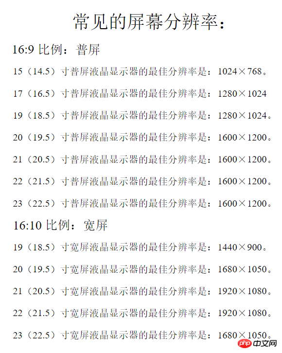
2, In order for the page to display normally under different resolutions, the page must be given a safe width. Generally, when making a 1920px wide page, there must be A safe width of about 1200px and centered. All content must be written in a box of this width. If there is a background image or carousel image that must cover the entire page, it must be set to center alignment so that when the resolution is reduced , the 1200-width boxes on the left and right and in the middle of the background image or Banner image are still centered and aligned, and will not deviate to the left or right.
Small boxes such as p in the box can be expressed as percentages to achieve page adaptation.Use of absolute positioning:
When using absolute positioning, the parent element of the element must be set to relative positioning, so that it can be used in different The positioning will not be messed up under the resolution, but the premise is that the parent element is within a safe width. If the parent element itself is an element that will change due to the lowering of the resolution, the positioning will definitely be messed up. When laying out the page structure, some box frames are essential, such as p with a safe width of 1200px. For example: Make an event page, where the background of this page is a large picture. Some small pictures should be placed on the big picture to position it with the big picture. The big picture must not be used directly as the background! Instead, continue to put a safe width p in the p of the background of the enlarged image, then use it as a parent element for relative positioning, and absolute positioning for the child elements inside, so that it will not appear under different resolutions. The absolute positioning problem is confusing. By summarizing the experience of netizens, by adding the zoomattribute, a certain section of the page can be automatically zoomed to the appropriate area according to different resolutions, but there is a bug, which is Firefox Browsers don't support this attribute even if they use the transform: scale (x, y); attribute. There is also a small problem. When the page is slow to load, refreshing the page will first display the enlarged effect, and then change to the reduced effect, which will flash for a while. I have not found a solution to this, and I hope friends who know more can share it.
zoom code is as follows:$(function(){ var w=window.screen.width; var zoom=w/1920;
$("#container").css({
"zoom",zoom,
"-moz-transform":"scale("+zoom+")",
"-moz-transform-origin":"top left"
});
});zoom: current screen resolution width/1920;
Browser support for zoom attribute: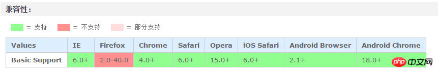
Recommended reading:
How to make a 0.5 pixel line in css
css3 Transition smooth transition menu bar implementation
The above is the detailed content of How can absolute positioning in css be compatible with all resolutions?. For more information, please follow other related articles on the PHP Chinese website!