

This time I will bring you a detailed explanation of the transform function in CSS3. What are the precautions of the transform function in CSS3. The following is a practical case, let's take a look.
Deformation function in CSS3: In CSS3, you can use the transform function to realize four types of deformation functions: rotation, scaling, tilting, and movement of text or images.
1. How to use the transform function:
(1) Implement the transform function through the transform attribute in CSS3:
(2) Transform function Usage:
transform:function;
-ms-transform:function;/*IE9*/
-moz-transform:function;/*Firefox*/
-webkit-transform:function; /*Safari and chrome*/
-o-transform: function;/*Opera*/
2. rotate, specify the angle in the parameter (rotate means clockwise rotation, deg is the angle unit in CSS3):
(1) How to use:
-ms-transform:rotate(angle);/*IE9*/
-moz-transform: rotate(angle);/*Firefox*/
-webkit-transform:rotate(angle);/*Safari and chrome*/
-o-transform:rotate(angle);/*Opera*/
(2) Rotate application:
1) HTML code:
<p></p>
2) CSS code:
p{
    width: 300px;
    height: 300px;
    background-color: lightblue;
    -ms-transform:rotate(45deg);/*IE9*/
    -moz-transform:rotate(45deg);/*Firefox*/
    -webkit-transform:rotate(45deg);/*Safari和chrome*/
    -o-transform:rotate(45deg);/*Opera*/
}
3) The rendering is as follows:

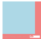
3. Scale scaling conversion:
(1) Usage method: transform:scale(value), its value is specified Zoom ratio, for example, 0.5 means zooming by 50%, 1 means zooming by 100%, and 1.5 means zooming by 150%;
-ms-transform:scale(value);/*IE9*/
-moz-transform :scale(value);/*Firefox*/
-webkit-transform:scale(value);/*Safari and chrome*/
-o-transform:scale(value);/*Opera*/
(2) Possible values:
1) scale(x,y) causes the element to scale on both the X and Y axes at the same time;
2) scale(x) causes the element to scale only on the X axis Scaling;
3) scale(y) makes the element scale only on the Y axis;
(3) Application of scale scaling transformation:
1) HTML code:
<p></p>
2) CSS code:
p{
    width: 300px;
    height: 300px;
    background-color: lightblue;
    /*缩放值X与Y为正整数时*/
    -ms-transform:scale(2,2);/*IE9*/
    -moz-transform:scale(2,2);/*Firefox*/
    -webkit-transform:scale(2,2);/*Safari和chrome*/
    -o-transform:scale(2,2);/*Opera*/

    /*缩放值X与Y均为小于1的浮点数时*/
    /*-ms-transform:scale(0.5,0.5);*//*IE9*/
    /*-moz-transform:scale(0.5,0.5);*//*Firefox*/
    /*-webkit-transform:scale(0.5,0.5);*//*Safari和chrome*/
    /*-o-transform:scale(0.5,0.5);*//*Opera*/

    /*缩放值仅X为小于1的浮点数时*/
    /*-ms-transform:scaleX(0.5);*//*IE9*/
    /*-moz-transform:scaleX(0.5);*//*Firefox*/
    /*-webkit-transform:scaleX(0.5);*//*Safari和chrome*/
    /*-o-transform:scaleX(0.5);*//*Opera*/

    /*缩放值仅Y为小于1的浮点数时*/
    /*-ms-transform:scaleY(0.5);*//*IE9*/
    /*-moz-transform:scaleY(0.5);*//*Firefox*/
    /*-webkit-transform:scaleY(0.5);*//*Safari和chrome*/
    /*-o-transform:scaleY(0.5);*//*Opera*/
}
3) The rendering is as follows:
①The rendering without scaling:

②Zoom The rendering when the values X and Y are positive integers:

③ The rendering when the scaling values X and Y are both floating point numbers less than 1:

④The rendering when the scaling value is only when X is a floating point number less than 1:

⑤The scaling value is only when Y is less than 1 Rendering of floating point numbers:

4. Skew:
(1) Usage:
transform:skew(angle); Its value is the angle;
-ms-transform:skew(angle);/*IE9*/
-moz-transform:skew(angle);/*Firefox*/
-webkit-transform:skew(angle);/*Safari and chrome*/
-o-transform:skew(angle);/*Opera*/
(2) Possible values :
1) skew(x,y) causes the element to twist in the horizontal and vertical directions at the same time (the X-axis and the Y-axis are twisted and deformed according to a certain angle value at the same time). When there is only one parameter, it is only horizontal Slant in the direction;
2) skewX(x) only causes the element to distort in the horizontal direction (X-axis distortion)
3) skewY(y) only causes the element to distort in the vertical direction (Y-axis distortion) Deformation)
(3) Application of skew:
1) HTML code:
<p></p>
2) CSS code:
p{
    width: 300px;
    height: 300px;
    background-color: lightblue;

    /*X轴与Y轴均倾斜*/
    -ms-transform:skew(30deg,30deg);
    -moz-transform:skew(30deg,30deg);
    -webkit-transform:skew(30deg,30deg);
    -o-transform:skew(30deg,30deg);

    /*设置一个值相当于仅X轴倾斜*/
    /*-ms-transform:skew(30deg);*//*IE9*/
    /*-moz-transform:skew(30deg);*//*Firefox*/
    /*-webkit-transform:skew(30deg);*//*Safari和chrome*/
    /*-o-transform:skew(30deg);*//*Opera*/

    /*仅X轴倾斜*/
    /*-ms-transform:skewX(30deg);*//*IE9*/
    /*-moz-transform:skewX(30deg);*//*Firefox*/
    /*-webkit-transform:skewX(30deg);*//*Safari和chrome*/
    /*-o-transform:skewX(30deg);*//*Opera*/

    /*仅Y轴倾斜*/
    /*-ms-transform:skewY(30deg);*//*IE9*/
    /*-moz-transform:skewY(30deg);*//*Firefox*/
    /*-webkit-transform:skewY(30deg);*//*Safari和chrome*/
    /*-o-transform:skewY(30deg);*//*Opera*/
}
3) Rendering As follows:
① Untilted rendering:

② Rendering with both X-axis and Y-axis tilted:

③设置一个值相当于仅X轴倾斜的效果图:

④仅X轴倾斜的效果图:

⑤仅Y轴倾斜的效果图:

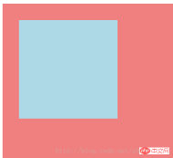
5、移动translate:
(1)使用方法:
transform:translate(值);它的值是指定移动的距离;
-ms-transform:translate(值);/*IE9*/
-moz-transform:translate(值);/*Firefox*/
-webkit-transform:translate(值);/*Safari和chrome*/
-o-transform:translate(值);/*Opera*/
(2)可能的值:
1)translate(x,y)水平方向与垂直方向同时移动(也就是X轴和Y轴同时移动)只有一个参数的时候,只在水平方向上移动;
2)translateX(x)仅水平方向(X轴移动)
3)translateY(y)仅垂直方向(Y轴移动)
(3)移动translate的应用:
1)HTML代码:
<p></p>
2)CSS代码:
.main{
    width: 100%;
    height: 500px;
    background-color: lightcoral;
}
.p{
    width: 300px;
    height: 300px;
    background-color: lightblue;

    /*在X轴与Y轴上均移动*/
    -ms-transform:translate(50px,50px);/*IE9*/
    -moz-transform:translate(50px,50px);/*Firefox*/
    -webkit-transform:translate(50px,50px);/*Safari和chrome*/
    -o-transform:translate(50px,50px);/*Opera*/

    /*设置一个值相当于仅在X轴上移动*/
    /*-ms-transform:translate(50px);*//*IE9*/
    /*-moz-transform:translate(50px);*//*Firefox*/
    /*-webkit-transform:translate(50px);*//*Safari和chrome*/
    /*-o-transform:translate(50px);*//*Opera*/

    /*仅在X轴上移动*/
    /*-ms-transform:translateX(50px);*//*IE9*/
    /*-moz-transform:translateX(50px);*//*Firefox*/
    /*-webkit-transform:translateX(50px);*//*Safari和chrome*/
    /*-o-transform:translateX(50px);*//*Opera*/

    /*仅在Y轴上移动*/
    /*-ms-transform:translateY(50px);*//*IE9*/
    /*-moz-transform:translateY(50px);*//*Firefox*/
    /*-webkit-transform:translateY(50px);*//*Safari和chrome*/
    /*-o-transform:translateY(50px);*//*Opera*/
}
3)效果图如下:
①未移动的效果图:

②在X轴与Y轴上均移动时的效果图:
③设置一个值相当于仅在X轴上移动时的效果图:

④仅在X轴上移动时的效果图:

⑤仅在Y轴上移动时的效果图:

6、对一个元素使用多种变形方法:(同样的方法只能使用一次)
(1)使用方法:
transform:方法1 方法2 方法3 方法4;
-ms-transform:方法1 方法2 方法3 方法4;/*IE9*/
-moz-transform:方法1 方法2 方法3 方法4;/*Firefox*/
-webkit-transform:方法1 方法2 方法3 方法4;/*Safari和chrome*/
-o-transform:方法1 方法2 方法3 方法4;/*Opera*/
(2)对一个元素使用多种变形方法的应用:
1)HTML代码:
<p></p>
2)CSS代码:
.main{
    width: 100%;
    height: 500px;
    background-color: lightcoral;
}
.p{
    width: 300px;
    height: 300px;
    background-color: lightblue;
    -ms-transform:translateX(200px) rotate(30deg) skew(30deg,30deg) scaleY(0.5);/*IE9*/
    -moz-transform:translateX(200px) rotate(30deg) skew(30deg,30deg) scaleY(0.5);/*Firefox*/
    -webkit-transform:translateX(200px) rotate(30deg) skew(30deg,30deg) scaleY(0.5);/*Safari和chrome*/
    -o-transform:translateX(200px) rotate(30deg) skew(30deg,30deg) scaleY(0.5);/*Opera*/
}
3)效果图如下:
①未添加方法时的效果图:

②添加了多种方法时的效果图:

7、改变元素基点transform-origin:
(1)可能的值:
| top left | top | right top |
| left | center | right |
| bottom left | bottom | bottom right |
(2)默认情况下transform属性变化的基点是center,但是可以通过transform-origin改变transform属性变化的基点;
(3)改变元素基点transform-origin的应用:
1)HTML代码:
<p></p>
2)CSS代码:
.main{
    width: 100%;
    height: 500px;
    background-color: lightcoral;
    margin-left: 140px;
    margin-top: 180px;
}
.p{
    width: 300px;
    height: 300px;
    background-color: lightblue;
    -ms-transform:rotate(30deg);/*IE9*/
    -moz-transform:rotate(30deg);/*Firefox*/
    -webkit-transform:rotate(30deg);/*Safari和chrome*/
    -o-transform:rotate(30deg);/*Opera*/

    transform-origin: center;
    /*transform-origin: top;*/
    /*transform-origin: top left;*/
    /*transform-origin: right top;*/
    /*transform-origin: left;*/
    /*transform-origin: right;*/
    /*transform-origin: bottom left;*/
    /*transform-origin: bottom;*/
    /*transform-origin: bottom right;*/
}
3)效果图如下:
①未添加变形功能的效果图:
②添加旋转功能的效果图:

③以center为基点旋转的效果图:
④以top为基点旋转的效果图:

⑤以top left为基点旋转的效果图:

⑥以right top为基点旋转的效果图:

⑦以left为基点旋转的效果图:

⑧以right为基点旋转的效果图:

⑨以bottom left为基点旋转的效果图:

⑩以bottom为基点旋转的效果图:

⑪以bottom right为基点旋转的效果图:

相信看了本文案例你已经掌握了方法,更多精彩请关注php中文网其它相关文章!
推荐阅读:
The above is the detailed content of Detailed explanation of transform function in CSS3. For more information, please follow other related articles on the PHP Chinese website!

 How much specificity do @rules have, like @keyframes and @media?Apr 18, 2025 am 11:34 AM
I got this question the other day. My first thought is: weird question! Specificity is about selectors, and at-rules are not selectors, so... irrelevant?
 Can you nest @media and @support queries?Apr 18, 2025 am 11:32 AM
Yes, you can, and it doesn't really matter in what order. A CSS preprocessor is not required. It works in regular CSS.
 Quick Gulp Cache BustingApr 18, 2025 am 11:23 AM
You should for sure be setting far-out cache headers on your assets like CSS and JavaScript (and images and fonts and whatever else). That tells the browser
 In Search of a Stack That Monitors the Quality and Complexity of CSSApr 18, 2025 am 11:22 AM
Many developers write about how to maintain a CSS codebase, yet not a lot of them write about how they measure the quality of that codebase. Sure, we have
 Datalist is for suggesting values without enforcing valuesApr 18, 2025 am 11:08 AM
Have you ever had a form that needed to accept a short, arbitrary bit of text? Like a name or whatever. That's exactly what is for. There are lots of
 Front Conference in ZürichApr 18, 2025 am 11:03 AM
I'm so excited to be heading to Zürich, Switzerland for Front Conference (Love that name and URL!). I've never been to Switzerland before, so I'm excited
 Building a Full-Stack Serverless Application with Cloudflare WorkersApr 18, 2025 am 10:58 AM
One of my favorite developments in software development has been the advent of serverless. As a developer who has a tendency to get bogged down in the details
 Creating Dynamic Routes in a Nuxt ApplicationApr 18, 2025 am 10:53 AM
In this post, we’ll be using an ecommerce store demo I built and deployed to Netlify to show how we can make dynamic routes for incoming data. It’s a fairly


Hot AI Tools

Undresser.AI Undress
AI-powered app for creating realistic nude photos

AI Clothes Remover
Online AI tool for removing clothes from photos.

Undress AI Tool
Undress images for free

Clothoff.io
AI clothes remover

AI Hentai Generator
Generate AI Hentai for free.

Hot Article
Hot Tools

WebStorm Mac version
Useful JavaScript development tools

Atom editor mac version download
The most popular open source editor

DVWA
Damn Vulnerable Web App (DVWA) is a PHP/MySQL web application that is very vulnerable. Its main goals are to be an aid for security professionals to test their skills and tools in a legal environment, to help web developers better understand the process of securing web applications, and to help teachers/students teach/learn in a classroom environment Web application security. The goal of DVWA is to practice some of the most common web vulnerabilities through a simple and straightforward interface, with varying degrees of difficulty. Please note that this software

SublimeText3 English version
Recommended: Win version, supports code prompts!

SublimeText3 Mac version
God-level code editing software (SublimeText3)

