
Home >Web Front-end >CSS Tutorial >A brief discussion on the layout of css web pages
A brief discussion on the layout of css web pages
- php中世界最好的语言Original
- 2018-03-20 14:28:211871browse
This time I will briefly talk about the layout issues of css web pages. What are the precautions for the layout issues of css web pages? The following is a practical case, let’s take a look.
1. Two implementation methods of fixed left and adaptive layout on the right
The renderings are as follows:
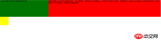
Large screen Display:
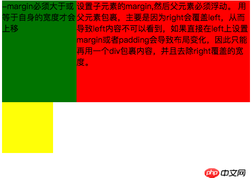
Small screen display:
The first implementation method achieves left fixation through negative margins and floating , adaptive layout on the right. The main code is as follows:
<style type="text/css">
	.left{
		float: left;
		width: 100%;
		height: 200px;
		background-color: red;
	}
	.left-content{
		margin-left: 30%;
	}
	.right{
		float: left;
		width: 30%;
		margin-left: -100%;
		height: 200px;
		background-color: green;
	}
	.layout0{
		clear: both;
		width: 100px;
		height: 100px;
		background-color: yellow;
	}
</style>
<body>
	<p id="body">
		<p class="left">
			<p class="left-content">
				设置子元素的margin,然后父元素必须浮动。
				用父元素包裹,主要是因为right会覆盖left,从而导致left内容不可以看到,如果直接在left上设置margin或者padding会导致布局变化,因此只能再用一个p包裹内容,并且去除right覆盖的宽度。
			</p>
		</p>
		<p class="right">-margin必须大于或等于自身的宽度才会上移</p>
		<p class="layout0"></p>
	</p>
</body>
Things to note during the implementation process are:
1. The adaptive container needs to be wrapped by the container, otherwise the content in the container will be overwritten.
2. The negative margin of the right container must be greater than or equal to its own width before it can move up.
3. If the negative margin of the right container is equal to its own width, it will be aligned to the right. If the negative margin is equal to -100%, it will be aligned to the left.
The second type uses floating layout to achieve fixed left and adaptive layout on the right
The main code is as follows:
<style type="text/css">
	.left{
		float: left;
		width: 200px;
		height: 200px;
		background-color: yellow;
	}
	.right{
		padding-left: 200px;
		height: 200px;
		background-color: red;
	}
	@media (min-width: 650px) and (max-width: 1000px){
		.left{
			width: 150px;
		}
		.right{
			margin-left: 150px;
		}
	}
	@media (max-width: 640px){
		.left{
			width: 100px;
		}
		.right{
			margin-left: 100px;
		}
	}
</style>
<body>
	<p id="main">
		<p class="left">左边固定宽度,右边自适应</p>
		<p class="right"></p>
	</p>
</body>
Required during the implementation process Note that: 1. left needs to be separated from the document flow, while right only needs to be displayed normally.
2.left just covers the right, so if you want the right content to be fully displayed, you need to give right padding-left or margin-left.
Large screen display:
Small screen display:
The main code is as follows :
<style type="text/css">
#head{
height: 200px;
background-color: yellow;
}
#body{
width: 100%;
float: left;
}
.main{
background-color: green;
min-height: 200px;
margin: 0 210px;
}
.left{
float: left;
background-color: red;
width: 200px;
height: 200px;
margin-left: -100%;
}
.right{
float: right;
background-color: blue;
width: 200px;
height: 200px;
margin-left: -200px;
}
#footer{
clear: both;
height: 200px;
background-color: orange;
}
</style>
<body>
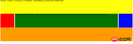
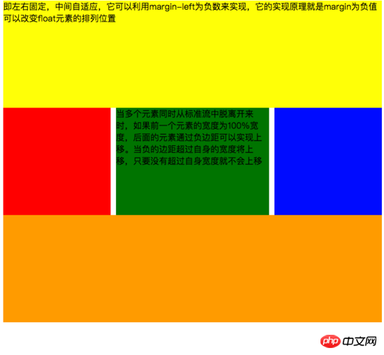
<p id="head">即左右固定,中间自适应,它可以利用margin-left为负数来实现,它的实现原理就是margin为负值可以改变float元素的排列位置</p>
<p id="body">
<p class="main">当多个元素同时从标准流中脱离开来时,如果前一个元素的宽度为100%宽度,后面的元素通过负边距可以实现上移。当负的边距超过自身的宽度将上移,只要没有超过自身宽度就不会上移</p>
</p>
<p class="left"></p>
<p class="right"></p>
<p id="footer"></p>
</body>
Need to pay attention during the implementation process:
1. The middle adaptive p needs to be placed in front of the left and right containers and the content p needs to be wrapped in the parent container
2 The .left and right containers float in the same direction.
The main code is as follows:
<style type="text/css">
	#head{
		height: 200px;
		background-color: yellow;
	}
	#body{
		overflow: hidden;
	}
	.left{
		float: left;
		background-color: red;
		width: 200px;
		height: 200px;
	}
	.right{
		float: right;
		background-color: blue;
		width: 200px;
		height: 200px;
	}
	.main{
		background-color: green;
		height: 200px;
		margin: 0 210px;
	}
	#footer{
		clear: both;
		height: 200px;
		background-color: orange;
	}
</style>
<body>
	<p id="head">左右固定宽度并且向两边浮动,中间的p设置两边的margin</p>
	<p id="body">
		<p class="left"></p>
		<p class="right"></p>
		<p class="main">该方案有一个缺陷,在小屏幕情况下回导致right被挤下去,main没有了</p>
	</p>
	<p id="footer"></p>
</body>
Need to pay attention to during the implementation process:
1. In this method, you only need to pay attention to the middle adaptive p that needs to be placed behind the left and right containers. .
2. The left and right containers float to both sides.
The main code is as follows:
<!DOCTYPE html>
<html>
<meta charset="utf-8">
<head>
	<title>使用flex 实现“双飞翼布局”</title>
</head>
<style type="text/css">
	#main{
		display: flex;
		display: -webkit-flex;//谷歌浏览器加前缀
		flex-flow: row nowrap;
		justify-content: flex-start;
		align-items: center;
	}
	.left{
		flex: 0 0 auto;
		width:100px;
		height: 200px;
		background-color: red;
		word-wrap: break-word;
		overflow: hidden;
	}
	.main{
		flex: 1 1 auto;
		height: 200px;
		background-color: green;
	}
	.right{
		flex: 0 0 auto;
		width: 100px;
		height: 200px;
		background-color: yellow;
	}
</style>
<body>
	<p id="main">
		<p class="left">flex 语法我参照了阮一峰关于flex语法介绍 http://www.ruanyifeng.com/blog/2015/07/flex-grammar.html</p>
		<p class="main"></p>
		<p class="right"></p>
	</p>
</body>
</html>
If you have not learned about flex layout, please move to the end of the article and click on the link to view the flex syntax written by Ruan Yifeng
3. Positioning Layout
I won’t go into details about some basic CSS positioning knowledge here (ps: if you don’t know how, please check it out on the w3c official website). I will mainly explain the pitfalls encountered in the work. . Lest others fall into the same trap as me.
First: When using multiple fixed, pay attention to what positioning you need to base on, because if the parent has a transform attribute, it may cause the fixed of the child element to be positioned based on the parent element container instead of the body positioning. The effect is as follows:
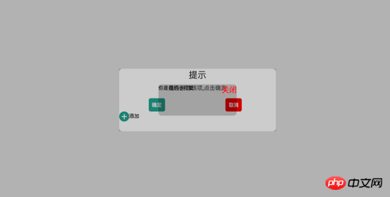
#In the picture above, I can find that the small black box in the middle is positioned based on the parent, and the width is also based on 50% of the parent container. Please see the following code for details:
<!DOCTYPE html>
<html>
<head>
    <title>关于position的定位的坑</title>
</head>
<style type="text/css">
    body{
        margin: 0;
        padding: 0;
    }
    i{
        font-style: normal;
        cursor: pointer;
    }
    #delete-button{
        position: absolute;
        left: 45%;
        top: 45%;
        text-align: center;
        vertical-align: middle;
        height: 50px;
        margin: auto;
        cursor: pointer;
    }
    #delete-button > i{
        display: inline-block;
        width: 32px;
        height: 32px;
        border-radius: 16px;
        background-color: orange;
        color: red;
        font-size: 32px;
        vertical-align: middle;
        line-height: 28px;
    }
    /*第一个模态框的样式*/
    #layout{
        display: none;
        width: 100%;
        height: 100%;
    }
    /*使用flex布局水平竖直居中*/
    /*#layout-box{
        position: fixed;
        width: 100%;
        height: 100%;
        left: 0;
        top: 0;
        display: flex;
        display: -webkit-flex;
        flex-flow: column nowrap;
        justify-content: center;
        align-items: center;
        background-color: rgba(0,0,0,0.3);
    }*/
    /*使用postion 和 transform 水平垂直居中*/
    #layout-box{
        position: fixed;
        width: 100%;
        height: 100%;
        background-color: rgba(0,0,0,0.3);
    }
    .modal-dialog{
        position: absolute;
        left: 50%;
        top: 50%;
        width: 500px;
        height: 200px;
        border-radius: 10px;
        transform: translate(-50%, -50%);
        -webkit-transform: translate(-50%, -50%);
        -moz-transform: translate(-50%, -50%);
        -o-transform: translate(-50%, -50%);
        background-color: #fff;
    }
    .dialog-title{
        text-align: center;
        color: #333;
        font-size: 28px;
        margin-bottom: 10px;
    }
    .dialog-content{
        text-align: center;
        color: #666;
        font-size: 18px;
    }
    .dialog-button{
        margin-top: 20px;
        width: 100%;
        color: #333;
    }
    .dialog-button >.button-box{
        display: inline-block;
        width: 48%;
        text-align: center;
    }
    .button-box span{
        display: inline-block;
        padding: 10px;
        color: #fff;
        border-radius: 6px;
        cursor: pointer;
    }
    #confirm{
        background-color: #27ad9a;
    }
    #cancel{
        background-color: red;
    }
    /*添加按钮的样式*/
    #add-button > i{
        display: inline-block;
        width: 32px;
        height: 32px;
        border-radius: 16px;
        background-color: #27ad9a;
        color: #fff;
        font-size: 32px;
        vertical-align: middle;
        line-height: 28px;
        text-align: center;
    }
    #add-button{
        display: inline-block;
        cursor: pointer;
    }
    /*第二个模态框的样式*/
    .layout2{
        display: none;
        position: fixed;
        width: 100%;
        height: 100%;
        left: 0;
        top: 0;
        background-color: rgba(0,0,0,0.2);
    }
    .modal-dialog2{
        position: fixed;
        left: 50%;
        top: 50%;
        width: 50%;
        height: 50%;
        border-radius: 10px;
        transform: translate(-50%, -50%);
        -webkit-transform: translate(-50%, -50%);
        -moz-transform: translate(-50%, -50%);
        -o-transform: translate(-50%, -50%);
        background-color: rgba(0,0,0,0.2);
    }
    .modal-dialog2 > span{
        display: block;
    }
    .modal-text{
        float: left;
    }
    #close{
        color: red;
        font-size: 24px;
        float: right;
        cursor: pointer;
    }
</style>
<body>
    <p id="delete-button"><i>-</i>删除</p>
    <p id="layout">
        <p id="layout-box">
            <p class="modal-dialog">
                <p class="dialog-title">提示</p>
                <p class="dialog-content">是否删除该项,点击确定</p>
                <p class="dialog-button">
                    <p class="button-box">
                        <span id="confirm">确定</span>
                    </p>
                    <p class="button-box">
                        <span id="cancel">取消</span>
                    </p>
                </p>
                <p id="add-button"><i>+</i>添加</p>
                <p class="layout2">
                    <p class="modal-dialog2">
                        <span class="modal-text">你是我的小可爱</span>
                        <span id="close">关闭</span>
                    </p>
                </p>
            </p>
        </p>
    </p>
</body>
<script type="text/javascript">
    document.getElementById("delete-button").onclick= function(){
        var layout = document.getElementById("layout")
        layout.style.display = "block"
    }
    document.getElementById("confirm").onclick=function(){
        var layout = document.getElementById("layout")
        layout.style.display = "none"
    }
    document.getElementById("cancel").onclick=function(){
        var layout = document.getElementById("layout")
        layout.style.display = "none"
    }
    document.getElementById("add-button").onclick=function(){
        var layout = document.getElementsByClassName("layout2")
        layout[0].style.display = "block"
    }
    document.getElementById("close").onclick=function(){
        var layout = document.getElementsByClassName("layout2")
        layout[0].style.display = "none"
    }
</script>
</html>
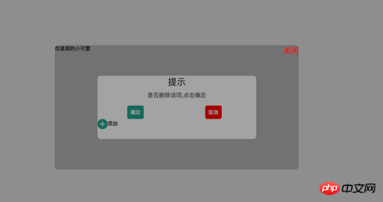
If we try to remove the transform attribute on the parent container, we can see that the child container is not positioned based on the parent container, but is positioned based on the body, and the width is also based on the body. 50% width. The rendering is as follows:
Please see the code for details:
<!DOCTYPE html>
<html>
<head>
    <title>关于position的定位的坑</title>
</head>
<style type="text/css">
    body{
        margin: 0;
        padding: 0;
    }
    i{
        font-style: normal;
        cursor: pointer;
    }
    #delete-button{
        position: absolute;
        left: 45%;
        top: 45%;
        text-align: center;
        vertical-align: middle;
        height: 50px;
        margin: auto;
        cursor: pointer;
    }
    #delete-button > i{
        display: inline-block;
        width: 32px;
        height: 32px;
        border-radius: 16px;
        background-color: orange;
        color: red;
        font-size: 32px;
        vertical-align: middle;
        line-height: 28px;
    }
    /*第一个模态框的样式*/
    #layout{
        display: none;
        width: 100%;
        height: 100%;
    }
    /*使用flex布局水平竖直居中*/
    #layout-box{
        position: fixed;
        width: 100%;
        height: 100%;
        left: 0;
        top: 0;
        display: flex;
        display: -webkit-flex;
        flex-flow: column nowrap;
        justify-content: center;
        align-items: center;
        background-color: rgba(0,0,0,0.3);
    }
    /*使用postion 和 transform 水平垂直居中*/
    .modal-dialog{
        width: 500px;
        height: 200px;
        border-radius: 10px;
        background-color: #fff;
    }
    .dialog-title{
        text-align: center;
        color: #333;
        font-size: 28px;
        margin-bottom: 10px;
    }
    .dialog-content{
        text-align: center;
        color: #666;
        font-size: 18px;
    }
    .dialog-button{
        margin-top: 20px;
        width: 100%;
        color: #333;
    }
    .dialog-button >.button-box{
        display: inline-block;
        width: 48%;
        text-align: center;
    }
    .button-box span{
        display: inline-block;
        padding: 10px;
        color: #fff;
        border-radius: 6px;
        cursor: pointer;
    }
    #confirm{
        background-color: #27ad9a;
    }
    #cancel{
        background-color: red;
    }
    /*添加按钮的样式*/
    #add-button > i{
        display: inline-block;
        width: 32px;
        height: 32px;
        border-radius: 16px;
        background-color: #27ad9a;
        color: #fff;
        font-size: 32px;
        vertical-align: middle;
        line-height: 28px;
        text-align: center;
    }
    #add-button{
        display: inline-block;
        cursor: pointer;
    }
    /*第二个模态框的样式*/
    .layout2{
        display: none;
        position: fixed;
        width: 100%;
        height: 100%;
        left: 0;
        top: 0;
        background-color: rgba(0,0,0,0.2);
    }
    .modal-dialog2{
        position: fixed;
        left: 50%;
        top: 50%;
        width: 50%;
        height: 50%;
        border-radius: 10px;
        transform: translate(-50%, -50%);
        -webkit-transform: translate(-50%, -50%);
        -moz-transform: translate(-50%, -50%);
        -o-transform: translate(-50%, -50%);
        background-color: rgba(0,0,0,0.2);
    }
    .modal-dialog2 > span{
        display: block;
    }
    .modal-text{
        float: left;
    }
    #close{
        color: red;
        font-size: 24px;
        float: right;
        cursor: pointer;
    }
</style>
<body>
    <p id="delete-button"><i>-</i>删除</p>
    <p id="layout">
        <p id="layout-box">
            <p class="modal-dialog">
                <p class="dialog-title">提示</p>
                <p class="dialog-content">是否删除该项,点击确定</p>
                <p class="dialog-button">
                    <p class="button-box">
                        <span id="confirm">确定</span>
                    </p>
                    <p class="button-box">
                        <span id="cancel">取消</span>
                    </p>
                </p>
                <p id="add-button"><i>+</i>添加</p>
                <p class="layout2">
                    <p class="modal-dialog2">
                        <span class="modal-text">你是我的小可爱</span>
                        <span id="close">关闭</span>
                    </p>
                </p>
            </p>
        </p>
    </p>
</body>
<script type="text/javascript">
    document.getElementById("delete-button").onclick= function(){
        var layout = document.getElementById("layout")
        layout.style.display = "block"
    }
    document.getElementById("confirm").onclick=function(){
        var layout = document.getElementById("layout")
        layout.style.display = "none"
    }
    document.getElementById("cancel").onclick=function(){
        var layout = document.getElementById("layout")
        layout.style.display = "none"
    }
    document.getElementById("add-button").onclick=function(){
        var layout = document.getElementsByClassName("layout2")
        layout[0].style.display = "block"
    }
    document.getElementById("close").onclick=function(){
        var layout = document.getElementsByClassName("layout2")
        layout[0].style.display = "none"
    }
</script>
</html>
Second: Solve the jitter problem on mobile phones (ps: I refer to this problem online Please move to the end of the article to view a blog written by a master)
**1. **Add an anti-shake style to fixed in the webkit kernel browser - webkit - transform: translateZ(0);
**2. **Set the css of html and body {height:100%;overflow:auto;margin:0;}. This affects the global style and is not recommended.
三、在fiexd内设置position:absolute,如下:
<p style="position:fiexd;bottom:0px;">
  <p style="position:absolute;">
  </p>
</p>
4、百分比布局 主要通过设置元素的宽度为百分比或者高度为百分比。比如:width:50%; height:50%; 这样的写法。
5、响应式布局(主要使用媒体查询来实现响应式设计) 主要使用CSS3 @media 来做不同终端的响应式设计
主要在css文件中写入
@media screen and (max-width:600px){
    写入当屏幕小于或等于600px时的样式
}
@media screen and (min-width:900px){
    写入当屏幕大于或等于900px时的样式
}
@media screen and (min-width:600px) and (max-width:900px){
    写入当屏幕在600px-900px之间的样式
}
@media screen and (max-device-width: 480px){
    写入最大设备宽度为480px,比如说iPhone上的显示,这里的max-device-width所指的是设备的实际分辨率,也就是指可视面积分辨率
}
@media only screen and (-webkit-min-device-pixel-ratio: 2){
    写入专门针对iPhone4的移动设备样式
}
@media all and (orientation:portrait){
    写入设备在纵向时的样式
}
@media all and (orientation:landscape){
    写入设备在横向时的样式
}
@media not print and (max-width: 1200px){
    not是用来排除某种制定的媒体类型
    写入在除打印设备和设备宽度小于1200px下的所有设备的样式
}
@media only screen and (max-device-width:240px){
    only用来定某种特定的媒体类型,可以用来排除不支持媒体查询的浏览器。
    写入只能在最大设备宽度为240px的屏幕下使用的样式
}
相信看了本文案例你已经掌握了方法,更多精彩请关注php中文网其它相关文章!
推荐阅读:
The above is the detailed content of A brief discussion on the layout of css web pages. For more information, please follow other related articles on the PHP Chinese website!