Home >Web Front-end >JS Tutorial >Detailed explanation of css3 shadow
Detailed explanation of css3 shadow
- php中世界最好的语言Original
- 2018-03-14 10:29:472160browse
This time I will bring you a detailed explanation of css3 shadows. What are the precautions when using css3 shadows? The following is a practical case, let’s take a look.
box-shadow
Parameters:
h-shadow (required): The position of the horizontal shadow, negative values are allowed
v-shadow (required): The position of the vertical shadow, negative values are allowed
blur (optional): blur distance
spread (optional): size of shadow
color (optional): color of shadow
inset (optional): outer shadow (outset) Change to internal shadow
eg:

<style>
.effect{
position: relative;
width: 800px;
height: 200px;
background-color: #fff;
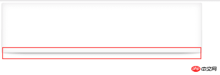
box-shadow: 0px 1px 4px rgba(0,0,0,0.3)
,0px 0px 40px rgba(0,0,0,0.1) inset; //水平和垂直阴影的值都设置为0,阴影会从中间发散至四周。
}
.effect:after,.effect:before{
position: absolute;
content: '';
background: #fff;
top:50%;
bottom:0;
left: 10px;
right: 10px;
box-shadow: 0px 0px 20px rgba(0,0,0,0.3);
z-index: -999;
border-radius: 100px/10px;
}</style><div class="effect"></div>I believe you have mastered the method after reading the case in this article. For more exciting information, please pay attention to other related articles on the PHP Chinese website!
Recommended reading:
Detailed explanation of Require.js
##Using JS to implement the sorting algorithm
How to use regular expressions in JS
The above is the detailed content of Detailed explanation of css3 shadow. For more information, please follow other related articles on the PHP Chinese website!
Related articles
See more- An in-depth analysis of the Bootstrap list group component
- Detailed explanation of JavaScript function currying
- Complete example of JS password generation and strength detection (with demo source code download)
- Angularjs integrates WeChat UI (weui)
- How to quickly switch between Traditional Chinese and Simplified Chinese with JavaScript and the trick for websites to support switching between Simplified and Traditional Chinese_javascript skills

