
Home >Web Front-end >CSS Tutorial >CSS3 imitation Alibaba Cloud water pattern effect code sharing
CSS3 imitation Alibaba Cloud water pattern effect code sharing

- 小云云Original
- 2018-02-23 09:34:081808browse
This article mainly introduces to you the relevant information about the sample code of css3 imitation of Alibaba Cloud's water pattern effect. The editor thinks it is quite good, so I will share it with you now and give it as a reference. Let’s follow the editor to take a look, I hope it can help everyone.
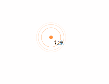
Rendering
I won’t say anything anymore, let’s get to the code.
<!DOCTYPE html>
<html>
<head>
    <title>css3 水纹效果</title>
    <style type="text/css">
        .point_area {
            text-align: center;
            position: relative;
            width: 150px;
            height: 150px;
            transition: opacity .5s ease-out;
        }
        .point_area .point {
            position: absolute;
            top: 0;
            left: 0;
            right: 0;
            bottom: 0;
            width: 10px;
            height: 10px;
            margin: auto;
            -webkit-border-radius: 50%;
            -webkit-background-clip: padding-box;
            -moz-border-radius: 50%;
            -moz-background-clip: padding;
            border-radius: 50%;
            background-clip: padding-box;
            background: transparent;
        }
        .point_area .point_dot {
            z-index: 1;
            background-color: #ff903d;
            border: 1px solid rgba(255,144,61,.37);
        }
        .point_area .point_10 {
            width: 100%;
            height: 100%;
        }
        .point_area .point_10:after {
            content: "";
            display: block;
            position: absolute;
            top: 0;
            right: 0;
            bottom: 0;
            left: 0;
            border-radius: 50%;
            border: 2px solid #ff903d;
            opacity: 0;
            -webkit-animation: ripple 4.5s ease-out 225ms infinite;
            animation: ripple 4.5s ease-out 225ms infinite;
        }
        .point_area .point_40 {
            width: 100%;
            height: 100%;
        }
        .point_area .point_40:after {
            content: "";
            display: block;
            position: absolute;
            top: 0;
            right: 0;
            bottom: 0;
            left: 0;
            border-radius: 50%;
            border: 2px solid #ff903d;
            opacity: 0;
            -webkit-animation: ripple 4.5s ease-out .9s infinite;
            animation: ripple 4.5s ease-out .9s infinite;
        }
        .point_area .point_80 {
            width: 100%;
            height: 100%;
        }
        .point_area .point_80:after {
            content: "";
            display: block;
            position: absolute;
            top: 0;
            right: 0;
            bottom: 0;
            left: 0;
            border-radius: 50%;
            border: 2px solid #ff903d;
            opacity: 0;
            -webkit-animation: ripple 4.5s ease-out 1.8s infinite;
            animation: ripple 4.5s ease-out 1.8s infinite;
        }
        @-webkit-keyframes ripple{
            0%{
                opacity:0;-webkit-transform:scale(.1)
            }
            5%{
                opacity:1
            }
            to{
                opacity:0;
                -webkit-transform:scale(1)
            }
        }
        @keyframes ripple{
            0%{
                opacity:0;
                -webkit-transform:scale(.1);
                transform:scale(.1)
            }
            5%{
                opacity:1
            }
            to{
                opacity:0;
                -webkit-transform:scale(1);
                transform:scale(1)
            }
        }
    </style>
</head>
<body style="position: relative;">
    <p class="point_area" style="top: 158px; left: 661px; position: absolute; width: 110px; height: 110px; visibility: visible; opacity: 1;">
        <p class="point_name" style="position: absolute; top: 45px; left: 65px;">北京</p>
        <a href="#" target="_blank" class="point point_dot"></a>
        <p class="point point_10"></p>
        <p class="point point_40"></p>
        <p class="point point_shadow point_80"></p>
    </p>
</body>
</html>
Related recommendations:
jQuery realizes click water ripple animation_jquery
The above is the detailed content of CSS3 imitation Alibaba Cloud water pattern effect code sharing. For more information, please follow other related articles on the PHP Chinese website!
Statement:
The content of this article is voluntarily contributed by netizens, and the copyright belongs to the original author. This site does not assume corresponding legal responsibility. If you find any content suspected of plagiarism or infringement, please contact admin@php.cn
Previous article:6 CSS Horizontal and Vertical Centering SolutionsNext article:6 CSS Horizontal and Vertical Centering Solutions