
Home >Web Front-end >JS Tutorial >Basic explanation of Bootstrap framework
Basic explanation of Bootstrap framework

- PHPzOriginal
- 2018-02-06 09:25:055263browse
This article mainly brings you an introductory tutorial for beginners based on the Bootstrap framework (recommended). The editor thinks it is quite good, so I will share it with you now and give it as a reference for everyone. Let’s follow the editor and take a look. I hope everyone can have a clearer understanding of boostrap.
Bootstrap novice tutorial

Bootstrap introduction
Bootstrap, from Twitter, is currently the most popular Front-end framework. Bootstrap is based on HTML, CSS, and JAVASCRIPT. It is simple and flexible, making web development faster.
【Related video recommendation: Bootstrap tutorial】
1. Grid system
The working principle of the grid system:
"Row" must be contained in a .container (fixed width) or .container-fluid (100% width) in order to give it proper alignment and padding.
Create a group of "columns" in the horizontal direction through "rows".
Your content should be placed within "column", and only "column" can be a direct child element of row.
Similar to .row Predefined classes like .col-xs-4 can be used to quickly create grid layouts. The mixins defined in the Bootstrap source code can also be used to create semantic layouts by adding columns ( column)" sets the padding attribute to create a gap (gutter) between columns. By setting a negative margin for the .row element to offset the padding set for the .container element, it is indirectly "row" The included "column" offsets the padding.
The negative margin is why the following example lines up the content in the grid column.
Columns in the grid system are represented by the range they span by specifying a value from 1 to 12. For example, three equal-width columns can be created using three .col-xs-4. #If the "column" contained in a "row" is greater than 12, the elements of the extra "column" will be arranged as a whole in another row Grid. Grid classes apply to devices with screen widths greater than or equal to the breakpoint size, and grid classes are overridden for small screen devices. Therefore, any .col-md-* grid classes applied on an element apply to devices with screen widths greater than or equal to the breakpoint size. Breakpoint sized devices, and overriding the grid class for small screen devices. Therefore, applying any .col-lg-* on the element does not affect large screen devices as well. Media queries:Media queries are very fancy "conditional CSS rules". They only apply the corresponding style to some CSS based on certain specified conditions. Media queries allow you to move, show and hide content based on the viewport size. The following media queries are used in LESS files to create critical breakpoint thresholds in the Bootstrap grid system
/* 超小屏幕(手机,小于 768px) */
/* 没有任何媒体查询相关的代码,因为这在 Bootstrap 中是默认的(还记得 Bootstrap 是移动设备优先的吗?) */

/* 小屏幕(平板,大于等于 768px) */
@media (min-width: @screen-sm-min) { ... }

/* 中等屏幕(桌面显示器,大于等于 992px) */
@media (min-width: @screen-md-min) { ... }

/* 大屏幕(大桌面显示器,大于等于 1200px) */
@media (min-width: @screen-lg-min) { ... }
Sometimes. Will include max-width in the media query code to limit the impact of CSS to a smaller range of screen sizes
@media (max-width: @screen-xs-max) { ... }
@media (min-width: @screen-sm-min) and (max-width: @screen-sm-max) { ... }
@media (min-width: @screen-md-min) and (max-width: @screen-md-max) { ... }
@media (min-width: @screen-lg-min) { ... }
Media queries have two parts, first a device specification and then a size. Rules. In the above case, the following rules are set:
@media (min-width: @screen-sm-min) and (max-width: @screen-sm-max) { ... }For all devices with min-width: @screen-sm-min, if the width of the screen is smaller than @screen-sm-max, Some processing will be done. Grid ParametersThe following table provides a detailed look at how Bootstrap's grid system works on various screen devices.
The following table summarizes how the Bootstrap grid system works across multiple devices:

Responsive column weighting Setting
The following example contains 4 grids, but we cannot determine the position of the grid display when browsing on a small device. 
<p class="container">
 <p class="row" >
  <p class="col-xs-6 col-sm-3"
   style="background-color: #dedef8;
   box-shadow: inset 1px -1px 1px #444, inset -1px 1px 1px #444;">
   <p>Lorem ipsum dolor sit amet, consectetur adipisicing elit.</p>
  </p>
  <p class="col-xs-6 col-sm-3"
  style="background-color: #dedef8;box-shadow:
  inset 1px -1px 1px #444, inset -1px 1px 1px #444;">
   <p>Lorem ipsum dolor sit amet, consectetur adipisicing elit, sed do
   eiusmod tempor incididunt ut labore et dolore magna aliqua. Ut
   enim ad minim veniam, quis nostrud exercitation ullamco laboris
   nisi ut aliquip ex ea commodo consequat.
   </p>
   <p>Lorem ipsum dolor sit amet, consectetur adipisicing elit, sed do
   eiusmod tempor incididunt ut.
   </p>
  </p>

  <p class="clearfix visible-xs"></p>

  <p class="col-xs-6 col-sm-3"
  style="background-color: #dedef8;
  box-shadow:inset 1px -1px 1px #444, inset -1px 1px 1px #444;">
   <p>Ut enim ad minim veniam, quis nostrud exercitation ullamco
   laboris nisi ut aliquip ex ea commodo consequat.
   </p>
  </p>
  <p class="col-xs-6 col-sm-3"
  style="background-color: #dedef8;box-shadow:
  inset 1px -1px 1px #444, inset -1px 1px 1px #444;">
   <p>Lorem ipsum dolor sit amet, consectetur adipisicing elit, sed do
   eiusmod tempor incididunt ut labore et dolore magna aliqua. Ut
   enim ad minim
   </p>
  </p>
 </p>
</p>
Offset column
Offset is a useful feature for more professional layouts. They can be used to make more space for columns. For example, the .col-xs-* classes do not support offsets, but they can achieve the effect simply by using an empty cell. 
..
, we will use .col-md-offset-3 class to center This p.<p class="container"> <h1>Hello, world!</h1> <p class="row" > <p class="col-xs-6 col-md-offset-3" style="background-color: #dedef8;box-shadow: inset 1px -1px 1px #444, inset -1px 1px 1px #444;"> <p>Lorem ipsum dolor sit amet, consectetur adipisicing elit. </p> </p> </p> </p>
Nested columns
为了在内容中嵌套默认的网格,请添加一个新的 .row,并在一个已有的 .col-md-* 列内添加一组 .col-md-* 列。被嵌套的行应包含一组列,这组列个数不能超过12(其实,没有要求你必须占满12列)。
在下面的实例中,布局有两个列,第二列被分为两行四个盒子。
<p class="container">
 <h1>Hello, world!</h1>
 <p class="row">
  <p class="col-md-3" >
   <h4>第一列</h4>
   <p>
    Lorem ipsum dolor sit amet, consectetur adipisicing elit.
   </p>
  </p>
  <p class="col-md-9" >
   <h4>第二列 - 分为四个盒子</h4>
   <p class="row">
    <p class="col-md-6" >
     <p>
      Consectetur art party Tonx culpa semiotics. Pinterest
  assumenda minim organic quis.
     </p>
    </p>
    <p class="col-md-6" >
     <p>
       sed do eiusmod tempor incididunt ut labore et dolore magna
  aliqua. Ut enim ad minim veniam, quis nostrud exercitation
  ullamco laboris nisi ut aliquip ex ea commodo consequat.
     </p>
    </p>
   </p>
   <p class="row">
    <p class="col-md-6" >
     <p>
      quis nostrud exercitation ullamco laboris nisi ut
  aliquip ex ea commodo consequat.
     </p>
    </p>
    <p class="col-md-6" >
     <p>
      Lorem ipsum dolor sit amet, consectetur adipisicing elit,
  sed do eiusmod tempor incididunt ut labore et dolore magna
  aliqua. Ut enim ad minim.
     </p>
    </p>
   </p>
  </p>
 </p>
</p>

列排序
Bootstrap 网格系统另一个完美的特性,就是您可以很容易地以一种顺序编写列,然后以另一种顺序显示列。
您可以很轻易地改变带有 .col-md-push-* 和 .col-md-pull-* 类的内置网格列的顺序,其中 * 范围是从 1 到 11。
在下面的实例中,我们有两列布局,左列很窄,作为侧边栏。我们将使用 .col-md-push-* 和 .col-md-pull-* 类来互换这两列的顺序。
<p class="container">
 <h1>Hello, world!</h1>
 <p class="row">
  <p>
   排序前
  </p>
  <p class="col-md-4" >
   我在左边
  </p>
  <p class="col-md-8" >
   我在右边
  </p>
 </p>
 <br>
 <p class="row">
  <p>
   排序后
  </p>
  <p class="col-md-4 col-md-push-8" >
   我在左边
  </p>
  <p class="col-md-8 col-md-pull-4" >
   我在右边
  </p>
 </p>
</p>

二、Bootstrap 排版
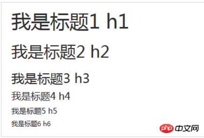
HTML 中的所有标题标签,
到 均可使用。另外,还提供了 .h1 到 .h6 类,为的是给内联(inline)属性的文本赋予标题的样式。
<h1>我是标题1 h1</h1>
<h2>我是标题2 h2</h2>
<h3>我是标题3 h3</h3>
<h4>我是标题4 h4</h4>
<h5>我是标题5 h5</h5>
<h6>我是标题6 h6</h6>
<h1>我是标题1 h1</h1> <h2>我是标题2 h2</h2> <h3>我是标题3 h3</h3> <h4>我是标题4 h4</h4> <h5>我是标题5 h5</h5> <h6>我是标题6 h6</h6>
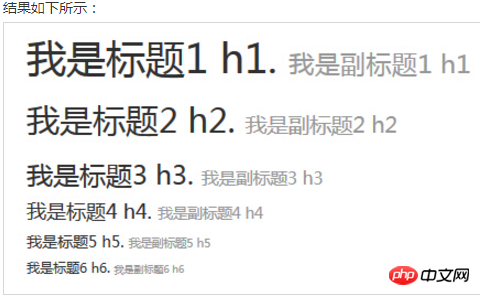
在标题内还可以包含 标签或赋予 .small 类的元素,可以用来标记副标题。
如果需要向任何标题添加一个内联子标题,只需要简单地在元素两旁添加 ,或者添加 .small class,这样子您就能得到一个字号更小的颜色更浅的文本,如下面实例所示:
<h1>我是标题1 h1. <small>我是副标题1 h1</small></h1>
<h2>我是标题2 h2. <small>我是副标题2 h2</small></h2>
<h3>我是标题3 h3. <small>我是副标题3 h3</small></h3>
<h4>我是标题4 h4. <small>我是副标题4 h4</small></h4>
<h5>我是标题5 h5. <small>我是副标题5 h5</small></h5>
<h6>我是标题6 h6. <small>我是副标题6 h6</small></h6>
页面主体:Bootstrap 将全局 font-size 设置为 14px,line-height 设置为 1.428。这些属性直接赋予
元素和所有段落元素。另外,(段落)元素还被设置了等于 1/2 行高(即 10px)的底部外边距(margin)。
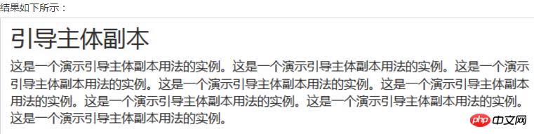
<h2>引导主体副本</h2>
<p class="lead">这是一个演示引导主体副本用法的实例。这是一个演示引导主体副本用法的实例。这是一个演示引导主体副本用法的实例。这是一个演示引导主体副本用法的实例。这是一个演示引导主体副本用法的实例。这是一个演示引导主体副本用法的实例。这是一个演示引导主体副本用法的实例。这是一个演示引导主体副本用法的实例。</p>
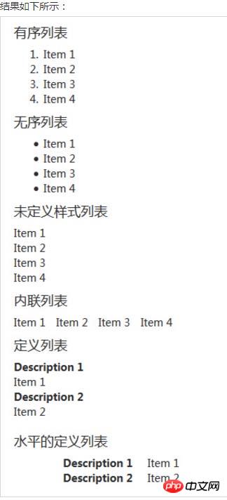
列表:
Bootstrap 支持有序列表、无序列表和定义列表。
有序列表:有序列表是指以数字或其他有序字符开头的列表。
无序列表:无序列表是指没有特定顺序的列表,是以传统风格的着重号开头的列表。如果您不想显示这些着重号,您可以使用 class .list-unstyled 来移除样式。您也可以通过使用 class .list-inline 把所有的列表项放在同一行中。
定义列表:在这种类型的列表中,每个列表项可以包含
- 行中的属于与描述并排显示。
下面的实例演示了这些类型的列表:
<h4>有序列表</h4>
<ol>
 <li>Item 1</li>
 <li>Item 2</li>
 <li>Item 3</li>
 <li>Item 4</li>
</ol>
<h4>无序列表</h4>
<ul>
 <li>Item 1</li>
 <li>Item 2</li>
 <li>Item 3</li>
 <li>Item 4</li>
</ul>
<h4>未定义样式列表</h4>
<ul class="list-unstyled">
 <li>Item 1</li>
 <li>Item 2</li>
 <li>Item 3</li>
 <li>Item 4</li>
</ul>
<h4>内联列表</h4>
<ul class="list-inline">
 <li>Item 1</li>
 <li>Item 2</li>
 <li>Item 3</li>
 <li>Item 4</li>
</ul>
<h4>定义列表</h4>
<dl>
 <dt>Description 1</dt>
 <dd>Item 1</dd>
 <dt>Description 2</dt>
 <dd>Item 2</dd>
</dl>
<h4>水平的定义列表</h4>
<dl class="dl-horizontal">
 <dt>Description 1</dt>
 <dd>Item 1</dd>
 <dt>Description 2</dt>
 <dd>Item 2</dd>
</dl>
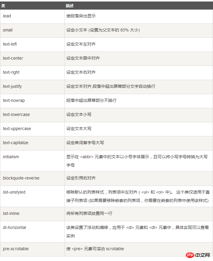
下表提供了 Bootstrap 更多排版类的实例:
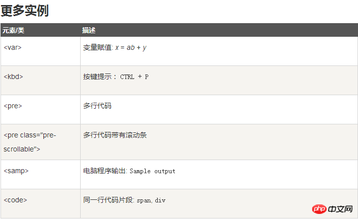
三、Bootstrap 代码
Bootstrap 允许您以两种方式显示代码:
第一种是 标签。如果您想要内联显示代码,那么您应该使用 标签。
For example, <code><section></code> should be wrapped as inline.

第二种是
 标签。如果代码需要被显示为一个独立的块元素或者代码有多行,那么您应该使用 <pre class="brush:php;toolbar:false"> 标签。</p>
<pre class="brush:php;toolbar:false"><pre class="brush:php;toolbar:false"><p>Sample text here...</p>

还可以使用 .pre-scrollable 类,其作用是设置 max-height 为 350px ,并在垂直方向展示滚动条。
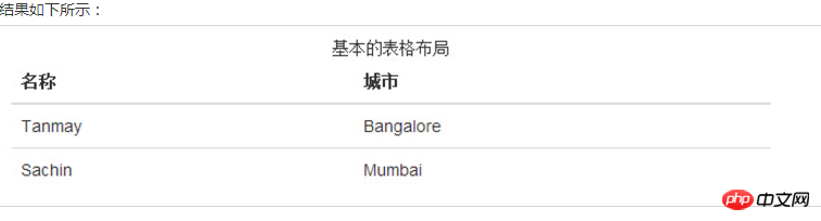
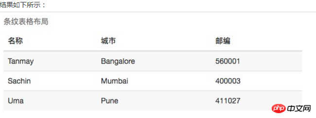
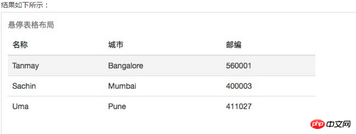
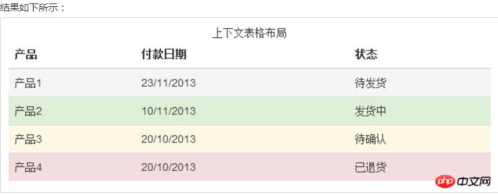
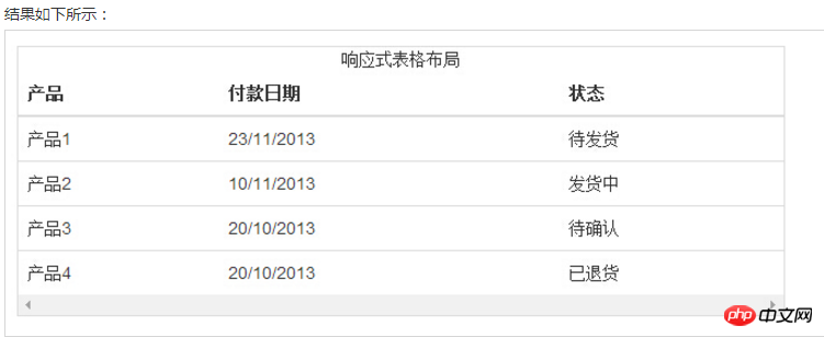
四、Bootstrap 表格
Bootstrap 支持的一些表格元素:

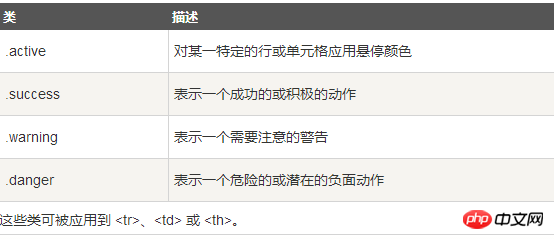
用于表格的样式
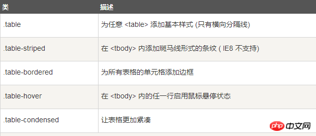
用于表格的行或者单元格

基本实例
为任意