Home >Web Front-end >CSS Tutorial >Analysis of usage examples of BFC and IFC in CSS
Analysis of usage examples of BFC and IFC in CSS
- 小云云Original
- 2018-02-02 10:44:381923browse
I have heard someone mention BFC in CSS before. I happened to encounter the problem of margin folding during the IFE practice, so I just happened to figure out the mechanism of BFC. (See Reference at the end of the article for reference source)
This article mainly introduces to you the relevant information on the usage of BFC and IFC in CSS. The editor thinks it is quite good, so I will share it with you now and give it as a reference. Let’s follow the editor to take a look, I hope it can help everyone.
1 What is BFC
Like all previous blog posts, let’s start with the introduction from the perspective of What, and understand BFC from the shallower to the deeper.
The so-called Formatting context (formatting context) is a concept in the W3C CSS2.1 specification.
It is a rendering area on the page and has a set of rendering rules.
It determines how its sub-elements will be positioned, as well as their relationship and interaction with other elements.
The Block Formatting Contexts (BFC, block-level formatting context) are the rendering and display rules of a block-level element. In layman's terms, BFC can be understood as a large closed box. The sub-elements inside the container will not affect the elements outside, and vice versa.
The layout rules of BFC are as follows:
1 Internal boxes will be placed one by one in the vertical direction;
2 BFC is an isolated independent container on the page;
3 The upper and lower margins of two adjacent Boxes belonging to the same BFC will overlap;
4 When calculating the height of the BFC, floating elements also participate in the calculation
5 The left side of each element, and the contained box are in contact with the left side of the float, even if there is a float;
6 The area of BFC will not overlap with float;
So how to trigger BFC? The BFC feature can be triggered as long as the element meets any of the following conditions:
body root element;
Floating element: float attribute that is not none Value;
Absolutely positioned element: position (absolute, fixed)
display is: inline-block, table-cells, flex
overflow Values other than visible (hidden, auto, scroll)
The characteristics and applications of BFC
Next introduction Common features and applications of BFC. When explaining the reasons in this section, the above layout rules and trigger conditions will be used, so you need to pay attention to them.
1 The margins in the vertical direction of two adjacent block elements in ordinary flows will collapse
<head>
.p {
  width:200px;
  height:50px;
  margin:50px 0;
  background-color:red;
}
</head>

<body>
   <p class="p"></p>
   <p class="p"></p>
</body>
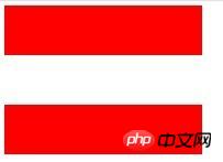
The rendering is:

According to Article 3 of the BFC rules:
The vertical distance of the box is determined by the margin.
Belonging to the same BFC + the upper and lower margins of two adjacent Boxes will overlap.
The reason why the margins are collapsed in the above example is because they belong to the root element of body, so we need to make them not belong to the same BFC to avoid margin collapse:
<p class="p"></p>
<p class="wrap">
  <p class="p"></p>
</p>
.wrap {
  overflow:hidden;

.p {
  width:200px;
  height:50px;
  margin:50px 0;
  background-color:red;
The rendering is:

2 BFC can contain floating elements (clear floating)
Under normal circumstances, floating elements will break away from the ordinary document flow , so in the following code:
<p style="border: 1px solid #000;">
    <p style="width: 50px; height: 50px; background: #eee;
               float: left;">
    </p>
</p>
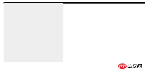
The outer p will not be able to contain the internal floating p. The effect is shown in the figure below:

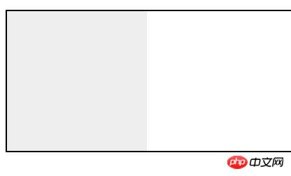
But if we trigger The BFC of the external container, according to Article 4 of the BFC specification: When calculating the height of the BFC, floating elements also participate in the calculation, then the external p container can wrap the floating elements, so just modify the code as follows:
<p style="border: 1px solid #000;overflow: hidden">
    <p style="width: 100px;height: 100px;background: #eee;float: left;"></p>
</p>
The following effects can be achieved:

3 BFC can prevent elements from being covered by floating elements
Let’s look at an example first:
<p class="aside"></p>
<p class="main"></p>

p {
  width:300px;
}
.aside {
  width: 100px;
  height: 150px;
  float: left;
  background: black;
}
.main {
  height:200px;
  background-color:red;
}
Effect The picture is:

The reason why this is so is because of rule 5 above: The left side of each element touches the left side of the containing box, even if there is a float. So;
So if you want to change the effect to make it complementary interference, you have to use rule 6: the BFC area will not overlap with float, so that
can also trigger BFC Properties, that is:
.main {
  overflow:hidden;
  height:200px;
  background-color:red;
}
Through this method, it can be used to implement adaptive layout of two columns.
3 Brief introduction to IFC
IFC layout rules:
1 The boxes will be placed horizontally one after another starting from the top of the containing block.
2 When placing these boxes, the space occupied by their inner and outer margins + borders in the horizontal direction will be considered; in the vertical direction, these boxes may be aligned in different forms: horizontal margin, Padding and border are valid, but vertical is invalid. The width and height cannot be specified;
3 The width of the line box is determined by the containing block and the existing float; the height of the line box is determined by the line height.
Related recommendations:
Detailed explanation of the important BFC in CSS
About the issue of BFC and height collapse
What is BFC? A simple understanding of bfc
The above is the detailed content of Analysis of usage examples of BFC and IFC in CSS. For more information, please follow other related articles on the PHP Chinese website!

