

 Web Front-endCSS TutorialDetailed explanation of CSS using position:sticky to implement sticky layout examples
Detailed explanation of CSS using position:sticky to implement sticky layout examples

This article mainly introduces to you the relevant information on the method of using CSS position:sticky to achieve sticky layout. The editor thinks it is quite good, so I will share it with you now and give it as a reference. Let’s follow the editor to take a look, I hope it can help everyone.
Introduction
I wrote an article earlier to explain several commonly used attributes of position: "CSS Basics - Position Attribute Explanation"
Generally, we all know the following commonly used ones:
{
position: static;
position: relative;
position: absolute;
position: fixed;
}
also said at https://developer.mozilla.org/zh-CN/docs/Web/CSS/position The following three values:
/* 全局值 */
position: inherit;
position: initial;
position: unset;
It is estimated that most of them have never used position:sticky. This attribute value is still in the experimental stage. How to describe it?
First look at position:sticky
sticky literally means sticky in English, so let’s call it sticky positioning. Let’s learn about the specific functions and practical scenarios of this experimental value.
This is a special positioning that combines the two positioning functions of position:relative and position:fixed, and is suitable for some special scenarios.
What is the combination of two positioning functions in one?
The element is first positioned according to the normal document flow, and then positioned relative to the flow root (BFC) and containing block (nearest block-level ancestor element) of the element in the flow.
Then, element positioning is relative positioning before crossing a specific threshold, and fixed positioning thereafter.
This specific threshold refers to one of top, right, bottom or left. In other words, sticky positioning can only take effect by specifying one of the four thresholds top, right, bottom or left. Otherwise the behavior is the same as relative positioning.
sticky: Object follows normal flow when normal. It is like a combination of relative and fixed. When it is on the screen, it is typed according to the normal flow. When it is scrolled out of the screen, it behaves like fixed. The performance of this attribute is the adsorption effect you see in reality.
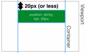
Common scenarios: When the distance between the element and the top of the page viewport (Viewport, which is the reference for fixed positioning) is greater than 0px, the element is positioned in a relative position, and when the distance between the element and the page viewport is greater than 0px When it is less than 0px, the element behaves as fixed positioning and will be fixed at the top.
Code:
{
    position: -webkit-sticky;
    position: sticky;
    top: 0;
}
It is expressed as shown below:
is greater than 20px from the top of the page, expressed as position:relative;
 ## The distance
x, which appears as position:fixed;
 Use
Use
to achieve head navigation bar fixationhtml code:
<p class="con">
    <p class="samecon">
        <h2 id="标题一">标题一</h2>
        <p>这是一段文本</p>
        <p>这是一段文本</p>
        <p>这是一段文本</p>
    </p>
    <p class="samecon">
        <h2 id="标题二">标题二</h2>
        <p>这是一段文本</p>
        <p>这是一段文本</p>
        <p>这是一段文本</p>
    </p>
    <p class="samecon">
        <h2 id="标题三">标题三</h2>
        <p>这是一段文本</p>
        <p>这是一段文本</p>
        <p>这是一段文本</p>
    </p>
    <p class="samecon">
        <h2 id="标题四">标题四</h2>
        <p>这是一段文本</p>
        <p>这是一段文本</p>
        <p>这是一段文本</p>
    </p>
    <p class="samecon">
        <h2 id="标题五">标题五</h2>
        <p>这是一段文本</p>
        <p>这是一段文本</p>
        <p>这是一段文本</p>
    </p>
    <p class="samecon">
        <h2 id="标题五六">标题五六</h2>
        <p>这是一段文本</p>
        <p>这是一段文本</p>
        <p>这是一段文本</p>
    </p>
</p>
CSS code:
.samecon h2{
    position: -webkit-sticky;
    position: sticky;
    top: 0;
    background:#ccc;
    padding:10px 0;
}
Similarly, the side navigation bar can also be exceeded and fixed. Effective rules
- Must specify one of the four thresholds
- top, right, bottom or left
Enable sticky positioning. Otherwise the behavior is the same as relative positioning.
- top
and
bottomare set at the same time,toptakes effect with higher priority, ## When #leftandrightare set at the same time,lefthas higher priority.Set to - The
overflow
attribute of any parent node of the element must bevisible, otherwiseposition:sticky will not take effect. An explanation is needed here:If any parent node positioning of the - element is set to
overflow:hidden
If the positioning of any parent node of the, then the parent The container cannot be scrolled, so theposition:stickyelement will not be scrolled and then fixed.position:sticky - element is set to
position:relative | absolute | fixed
, the element will be positioned relative to the parent element Positioning, rather than relativeviewprotpositioning. reaches the set threshold. This is fairly easy to understand, that is, whether an element with - is set to behave as
relative
orfixedis determined based on whether the element reaches the set threshold. of. Compatibility
- And
- position:sticky
The compatibility of this attribute is not very good. It is still an experimental attribute and is not a standard recommended by W3C. 
CSS Sticky Footer Implementation Example Tutorial
JS method to solve position:sticky compatibility problem
The above is the detailed content of Detailed explanation of CSS using position:sticky to implement sticky layout examples. For more information, please follow other related articles on the PHP Chinese website!

 What is CSS Grid?Apr 30, 2025 pm 03:21 PM
CSS Grid is a powerful tool for creating complex, responsive web layouts. It simplifies design, improves accessibility, and offers more control than older methods.
 What is CSS flexbox?Apr 30, 2025 pm 03:20 PM
Article discusses CSS Flexbox, a layout method for efficient alignment and distribution of space in responsive designs. It explains Flexbox usage, compares it with CSS Grid, and details browser support.
 How can we make our website responsive using CSS?Apr 30, 2025 pm 03:19 PM
The article discusses techniques for creating responsive websites using CSS, including viewport meta tags, flexible grids, fluid media, media queries, and relative units. It also covers using CSS Grid and Flexbox together and recommends CSS framework
 What does the CSS box-sizing property do?Apr 30, 2025 pm 03:18 PM
The article discusses the CSS box-sizing property, which controls how element dimensions are calculated. It explains values like content-box, border-box, and padding-box, and their impact on layout design and form alignment.
 How can we animate using CSS?Apr 30, 2025 pm 03:17 PM
Article discusses creating animations using CSS, key properties, and combining with JavaScript. Main issue is browser compatibility.
 Can we add 3D transformations to our project using CSS?Apr 30, 2025 pm 03:16 PM
Article discusses using CSS for 3D transformations, key properties, browser compatibility, and performance considerations for web projects.(Character count: 159)
 How can we add gradients in CSS?Apr 30, 2025 pm 03:15 PM
The article discusses using CSS gradients (linear, radial, repeating) to enhance website visuals, adding depth, focus, and modern aesthetics.
 What are pseudo-elements in CSS?Apr 30, 2025 pm 03:14 PM
Article discusses pseudo-elements in CSS, their use in enhancing HTML styling, and differences from pseudo-classes. Provides practical examples.


Hot AI Tools

Undresser.AI Undress
AI-powered app for creating realistic nude photos

AI Clothes Remover
Online AI tool for removing clothes from photos.

Undress AI Tool
Undress images for free

Clothoff.io
AI clothes remover

Video Face Swap
Swap faces in any video effortlessly with our completely free AI face swap tool!

Hot Article
Hot Tools

SecLists
SecLists is the ultimate security tester's companion. It is a collection of various types of lists that are frequently used during security assessments, all in one place. SecLists helps make security testing more efficient and productive by conveniently providing all the lists a security tester might need. List types include usernames, passwords, URLs, fuzzing payloads, sensitive data patterns, web shells, and more. The tester can simply pull this repository onto a new test machine and he will have access to every type of list he needs.

SAP NetWeaver Server Adapter for Eclipse
Integrate Eclipse with SAP NetWeaver application server.

Atom editor mac version download
The most popular open source editor

SublimeText3 Chinese version
Chinese version, very easy to use

ZendStudio 13.5.1 Mac
Powerful PHP integrated development environment

