
Home >Web Front-end >CSS Tutorial >CSS Gird layout example tutorial sharing
CSS Gird layout example tutorial sharing

- 小云云Original
- 2018-01-17 17:10:481986browse
This article mainly introduces the relevant information of the CSS Gird layout tutorial guide. The editor thinks it is quite good, so I will share it with you now and give it as a reference. Let’s follow the editor to take a look, I hope it can help everyone.
CSS Grid Layout is a two-dimensional grid-based layout system that aims to completely change the way we design web-based user interfaces. CSS has always been used to lay out our web pages, but it never did a good job. First we used tables, then float, position and inline-block. But these are essentially CSS hacks, and miss many important features (such as vertical centering). Later, flexbox appeared, but its purpose was only for a simpler one-dimensional layout, not a complex two-dimensional layout. Grid was the first CSS module created specifically to solve layout problems. In terms of browser compatibility, you can take a look at caniuse's data

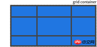
Grid Container
Apply display: grid to the element. This is the direct parent element for all grid layouts, in this case container is the grid container
<p class="container">
  <p class="item item-1"></p>
  <p class="item item-2"></p>
  <p class="item item-3"></p>
</p>
GridItem
Children of the grid container (such as direct child elements), the item element here is a grid item, but the sub-item is not
<p class="container">
  <p class="item"></p>
  <p class="item">
    <p class="sub-item"></p>
  </p>
  <p class="item"></p>
</p>
Grid lines
constitute the dividing lines of the grid structure. They can be either vertical (columns) or horizontal (rows). ). The yellow line here is an example of a column of grid lines

Grid track
Between two adjacent grid lines the space between. You can think of them as columns or rows of a grid. This is the grid track between the second and third row of grid lines

Grid cells
two The space between two adjacent rows and two adjacent column grid lines, that is, a cell in the grid, which is the grid cell between row grid lines 1 and 2, and the column grid line 2 and 3

Grid space
The total space surrounded by four grid lines, the grid space can be composed of any number composed of grid cells. Here is the grid space between row grid lines 1 and 3, and column grid lines 1 and 3

Properties of the grid container
display
Defines the element as a grid container and creates a new grid format context value for its content:
gird: Generate block-level grid
inline-grid: Generate inline grid
subgrid: If your grid itself Is a grid item (i.e. nested grid), you can use this attribute to indicate that you want to inherit its parent's rows/columns instead of its own.
.container{
  display: grid | inline-grid | subgrid
}
grid-template-columns, grid-template-rows
Use space separated values List to define the columns and rows of the grid. These values represent the track size, and the space between them represents the grid line values:
: Can be the length, percentage, or fraction of the free space in the grid
: The name of the line e.g. , when empty space flows out between grid tracks, the grid lines are automatically assigned numeric names
.container{
  display: grid;
  grid-template-columns: 40px 50px auto 50px;
  grid-template-rows: 25% 100px auto;
}
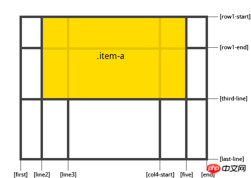
but you can choose to specify Name the rows, please note the bracket syntax for row names
.container{
  grid-template-columns: [first] 40px [line2] 50px [line2] auto [line3] auto [col4-start] 50px [five] 5px;
  grid-template-rows: [row1-start] 25% [row1-end] 100px [thrid-line] auto [last-line];
}
.contaienr{
  grid-template-rows: [row1-start] 25% [row1-end row2-start] 25% [row2-end]
}
If your definition contains repeated parts, you can use the repeat() notation to simplify
.container{
  grid-template-columns: repeat(3, 20px [col-start]) 5%;
}
Equivalent to this
.container{
  grid-template-columns: 20px [col-start] 20px [col-start] 20px [col-start] 5%;
}
Setting the units to fr grid will allow you to set the grid track size to grid A fraction of the container's free space, for example this would set each item to one third of the container's width
.container {
  grid-template-columns: 1fr 1fr 1fr;
}
The free space is within any non-flexible item Calculated later, in this example, the total amount of space available for fr cells does not include 50px
##
.container{
  grid-template-columns: 1fr 50px 1fr 1fr;
}
grid-template-areas
Define the grid template by specifying the name of the grid space by applying the
grid-area attribute. value:<ol class=" list-paddingleft-2">
<li><p>: 指定的网格空间的名称 <code>grid-area
: 表示一个空的网格单元
none: 没有定义网格空间
.container{
  grid-template-areas: "<grid-area-name> | . | none | ...";
}
例子
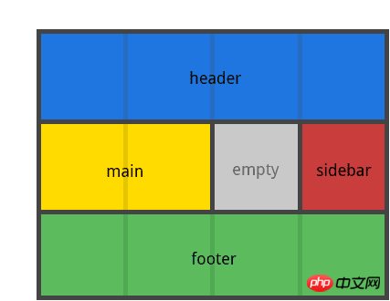
.container{
  display: grid;
  grid-template-columns: repeat(4, 50px);
  grid-template-rows: auto;
  grid-template-areas:
    "header header header header"
    "main main . slidebar"
    "footer footer footer footer"
}
.item-a{
  grid-area: header;
}
.item-b{
  grid-area: main;
}
.item-c{
  grid-area: slidebar;
}
.item-d{
  grid-area: footer;
}
注意: 你不是用这个语法命名行只是空间, 当你使用这种语法时, 空间两端的行实际上是自动命名的,如果你的网格空间名字是foo,那么这个空间的起始行和起始列的名字就是foo-start,最后一列和最后一行就是foo-end;
grid-template
一个简短设置 grid-template-rows , grid-template-columns 和 grid-template-areas 在一起的声明
.container {
  grid-template: none | subgrid | <grid-template-rows> <grid-area-name>/ <grid-template-columns>;
}
由于 grid-template 不会重置隐式网格属性( grid-auto-columns , grid-auto-rows , grid-auto-flow ),这可能是您在大多数情况下所要做的,所以建议使用 grid 属而不是 grid-template 。
grid-column-gap grid-row-gap
指定网格线的大小 值:
: 长度值
.container{
  grid-column-gap: <line-size>;
  grid-row-gap: <line-size>;
}
.container{
display: grid;
grid-template-columns: repeat(4, 50px);
grid-template-rows: repeat(4, 80px);
grid-column-gap: 10px;
grid-row-gap: 15px;
}
grid-gap
一种速记 grid-row-gap 和 grid-column-gap 值:
: 长度值
.container {
  grid-gap: <grid-row-gap><grid-column-gap>
}
justify-items
沿着行轴对齐网格内的内容(而不是 align-items 沿着列轴对齐),适用于所有网格容器内的网格项目 值:
start: 将内容对齐到网格区域的左端
end: 将内容对齐到网格区域的右端
center: 将网格区域中心的内容对齐
stretch: 填充网格区域的整个宽度
.container{
  justify-items: start | end | center | stretch
}
例子
.container{
  justify-items: start;
}
.container{
  justify-items: end;
}
.container{
  justify-items: center;
}
.container{
  justify-items: stretch;
}
此行为也可以通过 justify-self 在个别网格项目上设置
align-items
沿列轴对齐网格的内容(而不是 justify-items 沿着行轴对齐)。该值适用于容器内的所有网格项目 值:
start: 将内容对齐到网格空间的顶部
end: 将内容对齐到网格空间的底部
center: 将内容对齐到网格空间的中心
stretch: 填充网格空间的整个高度
.container {
  align-items: start | end | center | stretch;
}
例子
.container {
  align-items: start;
}
.container {
  align-items: end;
}
.container {
  align-items: center;
}
.container {
  align-items: stretch;
}
此行为也可以通过 align-self
属性在个别网格项目上设置
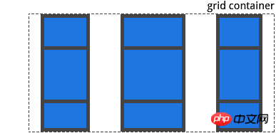
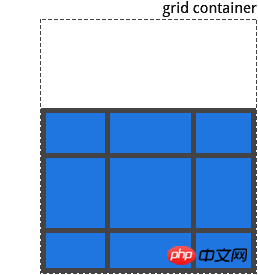
justify-content
有时,网格的总大小可能小于其网格容器的大小, 如果您的所有网格项目都是用非灵活单位进行大小调整,就可能发生这种情况。这时候可以设置网格容器内的网格的对齐方式,此属性沿着行轴对齐网络 值:
start: 将网格对齐到网格容器的左端
end: 将网格对齐到网格容器的右端
center: 将网格对齐到网格容器的中心
stretch: 调整网格的大小以允许网格填充网格容器的整个宽度
space-around: 在每个网格项目之间分配一个均匀的空间,在两个端分配一半的空间
space-between: 在每个网格项目之间分配一个均匀的空间,在两个端没有分配空间
space-evenly:在每个网格项目之间分配一个均匀的空间,包括两个远端 例子
.container{
  justify-content: start;
}
.container{
  justify-content: end;
}
.container{
  justify-content: center;
}
.container{
  justify-content: stretch
}
.container{
  justify-content: space-around;
}
.container{
  justify-content: space-between;
}
.container{
  justify-content: space-evenly;
}
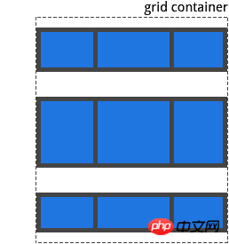
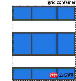
align-content
此属性和 justify-content 一样,只不过是沿着列轴对齐网格 值:
start: 将网格对齐到网格容器的顶部
end: 将网格对齐到网格容器的底部
cneter: 将网格对齐到网格容器的中心
stretch: 调整网格项目的大小, 以允许网格项目填充网格容器的整个高度
space-around: 在每个网格项目之间分配均匀的空间,在两端分配一半的空间
sapce-between: 在每个网格项目之间分配一个均匀的空间,在两端没有空间
space-evenly: 在每个项目之间分配一个均匀的空间, 包括两端 例子:
.container{
  align-content: start;
}
.container{
  align-content: end
}
.container{
  align-content: center;
}
.container{
  align-content: stretch;
}
.container{
  align-content: space-around;
}
.container{
  align-content: space-between;
}
.container{
  align-content: space-evenly;
}
grid-auto-columns grid-auto-rows
指定任何自动生成的网格轨道的大小,当你明确声明超出定义的网格空间的行或列(通过grid-template-rows / grid-template-columns)时间,会创建隐式网格轨道 值:
: 可以长度, 百分比, 或分数(使用 fr 单位) 如何创建隐式网格轨道, 例子:
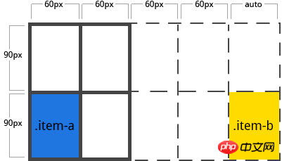
.contaienr{
  display: grid;
  grid-template-columns: repeat(2, 60px);
  grid-template-rows: repeat(2, 90px);
}
这样会创建一个2 X 2的网格

但现在如果你使用 grid-column 和 grid-row 定位你的网格项目是这样的
.item-a {
  grid-column: 1 / 2;
  grid-row: 2 / 3;
}
.item-b {
  grid-column: 5 / 6;
  grid-row: 2 / 3;
}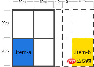
我们告诉 item-b 从第5行开始, 到第6行结束, 但是我们没有定义第5行或第6行, 因为我们引用了不存在的行,所以创建了宽度为0的隐式轨道来填补空白,我们可以使用 grid-auto-columns 和 grid-auto-rows 来指定这些隐式轨道的宽度
.container{
  grid-auto-columns: 60px;
}
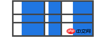
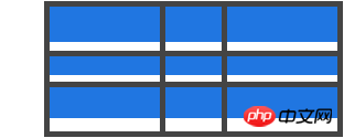
grid-auto-flow
如果您没有明确放置在网格上的网格项目,则自动分配算法会自动分配这些项目。该属性控制自动分配算法的原理 值:
column: 告诉自动分配算法依次填充每行,根据需要添加新行
row: 告诉自动分配算法一次填充每列,根据需要添加新列
dense: 告诉自动分配算法,如果之后出现较小的项目,则尝试在网格中尽早填充空间
dense 可能导致您的项目出现乱序 例子:
<section class="container">
  <p class="item-a">item-a</p>
  <p class="item-b">item-b</p>
  <p class="item-c">item-c</p>
  <p class="item-d">item-d</p>
  <p class="item-e">item-e</p>
</section>
你定义了一个五行两列的网格,并设置 grid-auto-flow 为 row
.container{
  display: grid;
  grid-template-columns: repeat(5, 60px);
  grid-template-rows: repeat(2, 30px);
  grid-auto-flow: row;
}
将项目分配在网格容器上,只能为其中的两个项目分配空间
.item-a {
  grid-column: 1;
  grid-row: 1 / 3;
}
.item-e {
  grid-column: 5;
  grid-row: 1 / 3;
}
如果将 grid-auto-flow 设置为 column

grid
简写为所有设置下列属性的单一声明: grid-template-rows , grid-template-columns , grid-template-areas , grid-auto-rows , grid-auto-columns 和 grid-flow 。
网格项目的属性
grid-column-start, grid-column-end, grid-row-start,grid-row-end
通过引用特定的网格线来确定网格内项目的位置。 值:
: 可以是一个数字来引用一个编号的网格线,或者一个名称来引用一个命名的网格线
span : 项目将跨越提供的网格轨道数量
span : 项目将跨越, 直到与它提供的名称命中
auto: 自动分配
.item-a {
  grid-column-start: 2;
  grid-column-end: five;
  grid-row-start: row1-start
  grid-row-end: 3
}
.item-b {
  grid-column-start: 1;
  grid-column-end: span col4-start;
  grid-row-start: 2
  grid-row-end: span 2
}
如果没有 grid-column-end / grid-row-end 声明, 该项目将默认跨越一个项目,项目可以相互重叠,您可以使用 z-index 来控制堆叠顺序
grid-column, grid-row
简写为 grid-column-start + grid-column-end 和 grid-row-start + grid-row-end 值:
.item-c {
  grid-column: 3 / span 2;
  grid-row: third-line / 4;
}
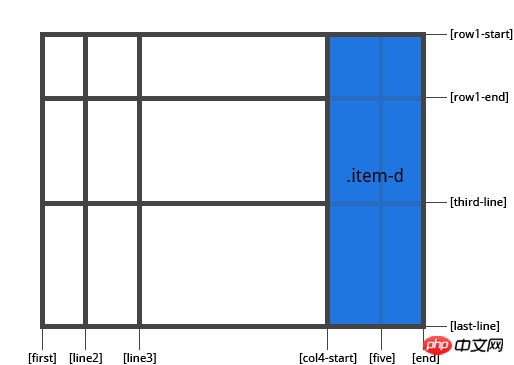
grid-area
为项目提供一个名称,以便可以通过使用 grid-template-areas 属性创建的模板来引用他。或者属性可以用作 grid-row-start + grid-column-start + grid-row-end + grid-column-end 值:
: 你选择的名称
/ / / :可以是数字或命名行
.item {
  grid-area:  <name> | <row-start> / <column-start> / <row-end> / <column-end>;
}
例子: 作为项目分配名称的一种方法
.item-d{
  grid-area: header;
}
作为 grid-row-start + grid-column-start + grid-row-end + grid-column-end 的简写:
.item-d {
  grid-area: 1 / col4-start / last-line / 6
}
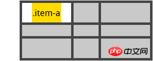
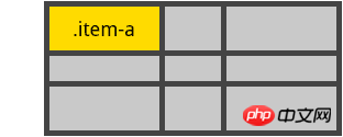
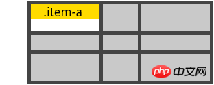
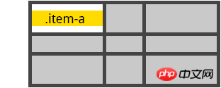
justify-self
沿着行轴对齐网格的内容,此属性适用与单个网格项目的内容 值:
start: 将内容对齐到网格空间的左端
end: 将内容对齐到网格空间的右端
center: 将网格空间中心的内容对齐
stretch: 填充网格空间的整个宽度
.item {
  justify-self: start | end | center | stretch;
}
例子:
.item-a {
  justify-self: start;
}
.item-a {
  justify-self: end;
}
.item-a {
  justify-self: center;
}
.item-a {
  justify-self: stretch;
}
align-self
沿列轴对齐网格内的内容,此值适用与单个网格项目内的内容 值
start: 将内容对齐到网格空间的顶部
end: 将内容对齐到网格空间的底部
center: 将网格空间中心的内容对齐
stretch: 填充网格空间的整个高度
.item {
  align-self: start | end | center | stretch;
}
例子:
.item-a {
  align-self: start;
}
.item-a {
  align-self: end;
}
.item-a {
  align-self: center;
}
.item-a {
  align-self: stretch;
}
相关推荐:
The above is the detailed content of CSS Gird layout example tutorial sharing. For more information, please follow other related articles on the PHP Chinese website!