

 Web Front-endJS TutorialDetailed explanation of the use of ui-grid grid layout in jQuery mobile page development_jquery
Detailed explanation of the use of ui-grid grid layout in jQuery mobile page development_jquery

On mobile devices, the screen width is narrow, so multi-column layouts are not usually used, but sometimes you may need to arrange small elements (like buttons or side-by-side navigation labels, for example) in multiple columns. The Jquery Mobile framework provides a simple method to build a CSS-based column layout called ui-grid
Jquery Mobile provides four preset layouts, which can be used in any situation where columns are needed
- Two columns (using ui-grid-a class)
- Three columns (using ui-grid-b class)
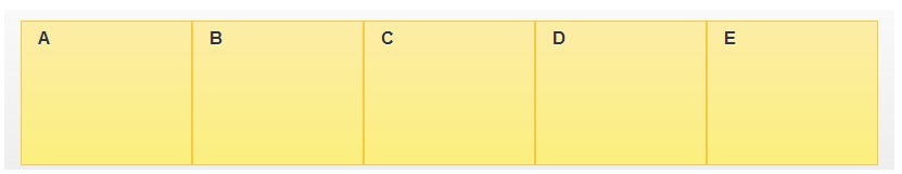
- Four columns (using ui-grid-c class)
- Five columns (using ui-grid-d class)
Grids are 100% width, completely invisible (no borders or background) and have no margin or padding, so they don't interfere with the styling of elements placed inside them. In a grid container, child elements are assigned ui-block-a / b / c / d in a continuous manner, making each "block" element float and juxtapose, forming a grid. The ui-block-a class basically clears the float and will start a new row (see multi-row grid, below).
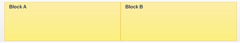
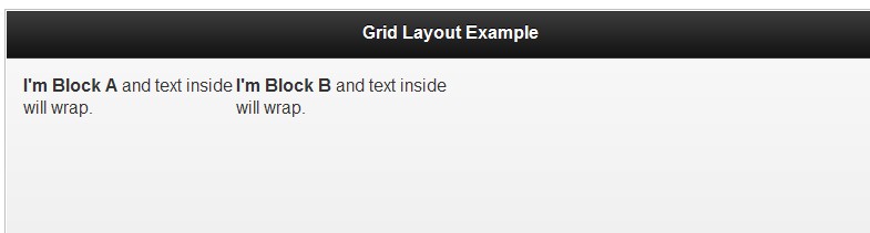
ui-grid-a two-column layout
Create a two-column (50 / 50%) layout. Add the ui-grid-a attribute to the first layer (parent container), and add ui-block-a and ui-block to the second layer (two sub-containers). -b:
<div class="ui-grid-a">
 <div class="ui-block-a"><strong>I'm Block A</strong> and text inside will wrap</div>
 <div class="ui-block-b"><strong>I'm Block B</strong> and text inside will wrap</div>
</div><!-- /grid-a -->
The above tag produces the following content layout:

As you can see, grids have no visual styling by default; they just render content side by side.
Grid classes can be applied to any container. In the next example, we add a ui-grid-a, apply ui-block, and both buttons extend to 50% of the screen width
<fieldset class="ui-grid-a">
 <div class="ui-block-a"><button type="submit" data-theme="c">Cancel</button></div>
 <div class="ui-block-b"><button type="submit" data-theme="b">Submit</button></div>
</fieldset>
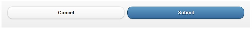
Please note that this framework adds left and right margin to the buttons in the grid. For a single button you can use class ui-grid-solo and button class ui-block-a, like the example below for a div. Such buttons will get the same margin
<div class="ui-grid-a">
 <div class="ui-block-a"><button type="button" data-theme="c">Previous</button></div>
 <div class="ui-block-b"><button type="button" data-theme="c">Next</button></div>
</div>
<div class="ui-grid-solo">
 <div class="ui-block-a"><button type="v" data-theme="b">More</button></div>
</div>

Theme classes (without data theme attributes) from the theme system can be added to an element, including grids. In the following block, we added two classes: ui-bar to add the default bar and ui-bar-e to apply the background gradient and font style to the "E" toolbar theme sample. For illustration purposes, an inline style="height:120px" attribute is also added to each grid to set each standard height.
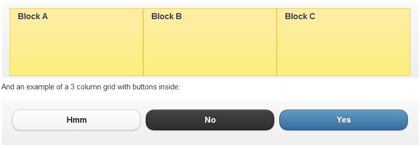
ui-block-b three-column layout
Grid layout configuration uses class=ui-grid-b on parent and 3 child container elements, each with its respective ui-block-a/a/c class, creating a one-row three-column layout (33/ 33/33%). Note: These blocks share the same style theme as the course, with the grid layout clearly visible.
<div class="ui-grid-b">
 <div class="ui-block-a">Block A</div>
 <div class="ui-block-b">Block B</div>
 <div class="ui-block-c">Block C</div>
</div><!-- /grid-b -->
This will produce a 33 / 33 / 33% grid layout for our content
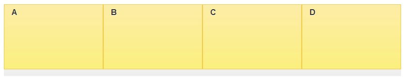
ui-block-c four-column layout
A row of four columns, 25/25/25/25% grid, is achieved by specifying class=ui-grid-c in the parent container and adding quarter blocks. Note: These blocks have the same style of theme courses, the grid layout is clearly visible
ui-block-c five-column layout
One row and five columns, 20/20/20/20/20% grid, is specified by class= ui-grid-d
in the parent container
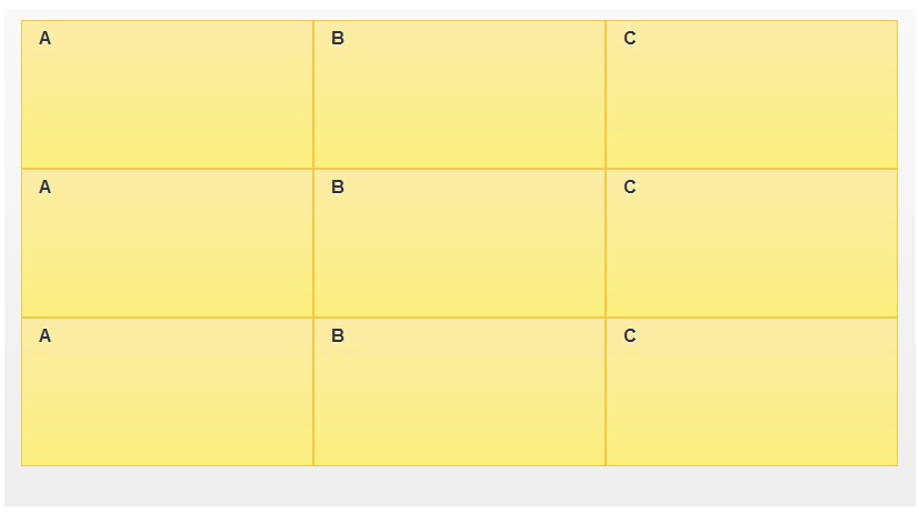
Multi-row and multi-column layout
Grid design wraps items in multiple rows. For example, if you specify a three-row, three-column grid (ui-grid-b) in a container that has nine sub-blocks, it will be swapped to 3 rows of 3 items each. Having a CSS rule clear for floats and starting a new line when class=ui-block-a is to ensure that a repeating sequence of assigned blocks (A,B,C,A,B,C,etc) maps to the grid type. You can set the first container of each row to class=ui-block-a to clear the float, so the classes of the 9 sub-containers should be: class=ui-block-(a,b,c,a,b,c, a,b,c).
<div id="grid" class="ui-grid-b">
<div class="ui-block-a"><div class="ui-bar ui-bar-e">A</div></div>
<div class="ui-block-b"><div class="ui-bar ui-bar-e">B</div></div>
<div class="ui-block-c"><div class="ui-bar ui-bar-e">C</div></div>
<div class="ui-block-a"><div class="ui-bar ui-bar-e">A</div></div>
<div class="ui-block-b"><div class="ui-bar ui-bar-e">B</div></div>
<div class="ui-block-c"><div class="ui-bar ui-bar-e">C</div></div>
<div class="ui-block-a"><div class="ui-bar ui-bar-e">A</div></div>
<div class="ui-block-b"><div class="ui-bar ui-bar-e">B</div></div>
<div class="ui-block-c"><div class="ui-bar ui-bar-e">C</div></div>
</div>
<!doctype html>
<html lang="en">
<head>
 <meta charset="utf-8">
 <meta name="viewport" content="width=device-width, initial-scale=1">
 <title>grid-layout demo</title>
 <link rel="stylesheet" href="http://code.jquery.com/mobile/1.3.0/jquery.mobile-1.3.0.min.css">
 <script src="http://code.jquery.com/jquery-1.9.1.min.js"></script>
 <!-- The script below can be omitted -->
 <script src="/resources/turnOffPushState.js"></script>
 <script src="http://code.jquery.com/mobile/1.3.0/jquery.mobile-1.3.0.min.js"></script>
</head>
<body>

<div data-role="page">
 <div data-role="header">
  <h1 id="Grid-Layout-Example">Grid Layout Example</h1>
 </div>
 <div data-role="content">
  <div class="ui-grid-a">
   <div class="ui-block-a"><strong>I'm Block A</strong> and text inside will wrap.</div>
   <div class="ui-block-b"><strong>I'm Block B</strong> and text inside will wrap.</div>
  </div><!-- /grid-a -->
 </div>
</div>

</body>
</html>

 From Websites to Apps: The Diverse Applications of JavaScriptApr 22, 2025 am 12:02 AM
JavaScript is widely used in websites, mobile applications, desktop applications and server-side programming. 1) In website development, JavaScript operates DOM together with HTML and CSS to achieve dynamic effects and supports frameworks such as jQuery and React. 2) Through ReactNative and Ionic, JavaScript is used to develop cross-platform mobile applications. 3) The Electron framework enables JavaScript to build desktop applications. 4) Node.js allows JavaScript to run on the server side and supports high concurrent requests.
 Python vs. JavaScript: Use Cases and Applications ComparedApr 21, 2025 am 12:01 AM
Python is more suitable for data science and automation, while JavaScript is more suitable for front-end and full-stack development. 1. Python performs well in data science and machine learning, using libraries such as NumPy and Pandas for data processing and modeling. 2. Python is concise and efficient in automation and scripting. 3. JavaScript is indispensable in front-end development and is used to build dynamic web pages and single-page applications. 4. JavaScript plays a role in back-end development through Node.js and supports full-stack development.
 The Role of C/C in JavaScript Interpreters and CompilersApr 20, 2025 am 12:01 AM
C and C play a vital role in the JavaScript engine, mainly used to implement interpreters and JIT compilers. 1) C is used to parse JavaScript source code and generate an abstract syntax tree. 2) C is responsible for generating and executing bytecode. 3) C implements the JIT compiler, optimizes and compiles hot-spot code at runtime, and significantly improves the execution efficiency of JavaScript.
 JavaScript in Action: Real-World Examples and ProjectsApr 19, 2025 am 12:13 AM
JavaScript's application in the real world includes front-end and back-end development. 1) Display front-end applications by building a TODO list application, involving DOM operations and event processing. 2) Build RESTfulAPI through Node.js and Express to demonstrate back-end applications.
 JavaScript and the Web: Core Functionality and Use CasesApr 18, 2025 am 12:19 AM
The main uses of JavaScript in web development include client interaction, form verification and asynchronous communication. 1) Dynamic content update and user interaction through DOM operations; 2) Client verification is carried out before the user submits data to improve the user experience; 3) Refreshless communication with the server is achieved through AJAX technology.
 Understanding the JavaScript Engine: Implementation DetailsApr 17, 2025 am 12:05 AM
Understanding how JavaScript engine works internally is important to developers because it helps write more efficient code and understand performance bottlenecks and optimization strategies. 1) The engine's workflow includes three stages: parsing, compiling and execution; 2) During the execution process, the engine will perform dynamic optimization, such as inline cache and hidden classes; 3) Best practices include avoiding global variables, optimizing loops, using const and lets, and avoiding excessive use of closures.
 Python vs. JavaScript: The Learning Curve and Ease of UseApr 16, 2025 am 12:12 AM
Python is more suitable for beginners, with a smooth learning curve and concise syntax; JavaScript is suitable for front-end development, with a steep learning curve and flexible syntax. 1. Python syntax is intuitive and suitable for data science and back-end development. 2. JavaScript is flexible and widely used in front-end and server-side programming.
 Python vs. JavaScript: Community, Libraries, and ResourcesApr 15, 2025 am 12:16 AM
Python and JavaScript have their own advantages and disadvantages in terms of community, libraries and resources. 1) The Python community is friendly and suitable for beginners, but the front-end development resources are not as rich as JavaScript. 2) Python is powerful in data science and machine learning libraries, while JavaScript is better in front-end development libraries and frameworks. 3) Both have rich learning resources, but Python is suitable for starting with official documents, while JavaScript is better with MDNWebDocs. The choice should be based on project needs and personal interests.


Hot AI Tools

Undresser.AI Undress
AI-powered app for creating realistic nude photos

AI Clothes Remover
Online AI tool for removing clothes from photos.

Undress AI Tool
Undress images for free

Clothoff.io
AI clothes remover

Video Face Swap
Swap faces in any video effortlessly with our completely free AI face swap tool!

Hot Article
Hot Tools

SecLists
SecLists is the ultimate security tester's companion. It is a collection of various types of lists that are frequently used during security assessments, all in one place. SecLists helps make security testing more efficient and productive by conveniently providing all the lists a security tester might need. List types include usernames, passwords, URLs, fuzzing payloads, sensitive data patterns, web shells, and more. The tester can simply pull this repository onto a new test machine and he will have access to every type of list he needs.

WebStorm Mac version
Useful JavaScript development tools

Atom editor mac version download
The most popular open source editor

EditPlus Chinese cracked version
Small size, syntax highlighting, does not support code prompt function

DVWA
Damn Vulnerable Web App (DVWA) is a PHP/MySQL web application that is very vulnerable. Its main goals are to be an aid for security professionals to test their skills and tools in a legal environment, to help web developers better understand the process of securing web applications, and to help teachers/students teach/learn in a classroom environment Web application security. The goal of DVWA is to practice some of the most common web vulnerabilities through a simple and straightforward interface, with varying degrees of difficulty. Please note that this software

