
Home >Web Front-end >JS Tutorial >Detailed explanation of CSS percentage padding to create image adaptive layout
Detailed explanation of CSS percentage padding to create image adaptive layout

- 小云云Original
- 2017-12-26 09:39:002361browse
This article mainly shares with you a detailed explanation of CSS percentage padding to create an adaptive image layout. CSS knowledge point: When padding/margin takes a value in the form of a percentage, whether it is left/right or top/bottom, it is based on the parent element. The width is the reference!
1. CSS percentage padding is calculated relative to the width
In the default horizontal document flow direction, the CSS margin and padding attributes The percentage values in the vertical direction are calculated relative to the width, which is different from the percentage values of attributes such as top and bottom.
The reasons for this design will be explained in my new book (which should be published in a few months), so I won’t go into it here.
For the padding attribute, the percentage in any direction padding is calculated for the width, allowing us to easily implement a fixed-proportion block-level container. For example, Suppose there is now a e388a4556c0f65e1904146cc1a846bee element:
p { padding: 50%; }
or:
p { padding: 100% 0 0; }
Or:
p { padding-bottom: 100%; }
Then the size of this e388a4556c0f65e1904146cc1a846bee element is a square with a width and height of 1:1 , no matter what the width of its parent container is, this e388a4556c0f65e1904146cc1a846bee element can always maintain the same proportion.
What is the function of this feature that can fix the proportion?
For most layouts, we do not require that the ratio must be fixed, but there is one exception, and that is the picture, because the original size of the picture is fixed. In the traditional fixed-width layout, we will set specific width and height values for the image to ensure that our image occupies a stable area; but on the mobile terminal or in the case of responsive development, the final width of the image is very small It may be uncertain. For example, for a banner advertisement on the mobile phone, the width is 375 under iPhone 7, 414 under iPhone 7 Plus, and 360. In this case, what is needed is not a fixed size setting for the image, but a proportion setting.
Usually have the following implementations:
1. Fix a height, and then use the background-size attribute to control, As follows:
.banner {
 height: 40px;
 background-size: cover;
}
The real-time effect is as follows:
You can see that as the width changes, there will always be part of the picture area (width or height ) cannot be displayed, which is not a perfect approach.
2. Use the viewport width unit vw, as follows:
.banner {
 height: 15.15vw;
 background-size: cover;
}
If the compatibility requirements are not very high , using vw is also a good idea, at least it will be easier to understand.
However, if our image is not a banner, but needs to be 1rem distance from the left and right sides, at this time, our CSS code will be a bit verbose, and if we want to maintain perfect proportions, Just use CSS3 calc() to calculate:
.banner {
 height: calc(0.1515 * (100vw - 2rem));
 background-size: cover;
}
If the width of the image from both sides is dynamically uncertain, then, At this time calc() is also stretched, but it is just the ordinary padding attribute that has great compatibility and adaptability.
3. Use percentage padding, as follows:
.banner {
 padding: 15.15% 0 0;
 background-size: cover;
}
At this time, no matter how the external elements of the picture change, the proportion All are constant.
2. CSS percentage padding and width adaptive image layout
But sometimes our images are not convenient to be presented as background images, but inlinea1f02c36ba31691bcfe87b2722de723b , percentagepadding can also be easily dealt with. The search routine is relatively fixed. A fixed-proportion container element is required outside the picture element, such as the following HTML structure:
<br>
# The ##
<p class="banner">
 <img src=""banner.jpg>
</p>
.banner element is also responsible for controlling the proportion, and then the image is filled with the .banner element. The CSS code is as follows:
.banner {
 padding: 15.15% 0 0;
 position: relative;
}
.banner > img {
 position: absolute;
 width: 100%; height: 100%;
 left: 0; top: 0;
}
The effect is achieved! Seeing is believing. Last year, the banner advertisements on many pages of the Qidian Chinese website mobile version were implemented in this way. For the final effect, please see the gif screenshot below (if the picture cannot be displayed, you can leave a comment and give feedback):
padding, because of the existence of vw units, after all Understanding vw seems to be simpler, so I haven’t introduced related techniques. However, as more and more image-related layouts are processed, I found that the practical value of percentage padding is greater than imagined, and it is applicable to more scenes than vw units, and is more compatible. Better (percentage feature IE6+ support, pictures 100% coverage IE8+ support).
img { width: 100%; }
此时浏览器默认会保持图片比例显示,图片宽度大了,高度也跟着一起变大;图片宽度小了,高度也跟着一起变小。开发人员似乎无需关心图片真实比例是怎样的。
然而这种技巧有一个非常不好的体验问题,那就是随着页面加载的进行,图片占据的高度会有一个从0到计算高度的图片变化,视觉上会有明显的元素跳动,代码层面会有布局重计算。
所以对图片高宽进行同时约定还是有必要的,但是同时要保证宽度自适应,似乎有点难度。记住,如果遇到这种需求场景,没有比百分比padding布局更好的做法!
缩小浏览器宽度可以看到不同宽度下的布局效果,Gif效果截图如下:
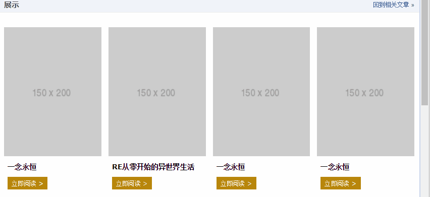
此demo难点就是图片自适应同时保持比例,以及页面刷新的时候没有布局稳固不晃动,其核心HTML和CSS代码如下:
<br>
<p class="works-item-t">
  <img src="./150x200.png">
</p>
.works-item-t {
 padding-bottom: 133%;
 position: relative;
}
.works-item-t > img {
 position: absolute;
 width: 100%; height: 100%;
}
可以看到,当把垂直方向padding值只使用padding-bottom表示的时候,如果没有text-align属性干扰,a1f02c36ba31691bcfe87b2722de723b元素的left:0;top:0是可以省略的。
对于这种图片宽度100%容器,高度按比例的场景,padding-bottom的百分比值大小就是图片元素的高宽比,就这么简单。
但,有时候,图片宽度并不是100%容器的,例如,图片宽度50%容器宽度,图片高宽比4:3,此时,CSS垂直方向百分比就666了,如下:
.img-box {
 padding: 0 50% 66.66% 0;
}
相关推荐:<br>
一个CSS+div高度自适应布局模型_html/css_WEB-ITnose
The above is the detailed content of Detailed explanation of CSS percentage padding to create image adaptive layout. For more information, please follow other related articles on the PHP Chinese website!
Related articles
See more- An in-depth analysis of the Bootstrap list group component
- Detailed explanation of JavaScript function currying
- Complete example of JS password generation and strength detection (with demo source code download)
- Angularjs integrates WeChat UI (weui)
- How to quickly switch between Traditional Chinese and Simplified Chinese with JavaScript and the trick for websites to support switching between Simplified and Traditional Chinese_javascript skills