
Home >Web Front-end >CSS Tutorial >Detailed examples of HTML5 and CSS3 to achieve 3D conversion effects
Detailed examples of HTML5 and CSS3 to achieve 3D conversion effects

- 小云云Original
- 2017-12-19 11:33:013149browse
In the two-dimensional world of CSS, we can set the width, height, position, rotation, background, etc. of the element. In the CSS three-dimensional world, a z-axis is expanded, which is perpendicular to the screen and points outward. The following article mainly introduces you to the relevant information on using HTML5+CSS3 to achieve 3D conversion effects. Friends in need can refer to it. I hope it can help you.
First, let’s understand the 3D coordinate system. The x-axis is the horizontal direction on the screen, the y-axis is the vertical direction, and the z-axis is the direction perpendicular to the screen.
If you don’t understand, you can refer to the z-index attribute of the positioning attribute, which in a sense allows the element to move on the z-axis.
In the 2d conversion module, we studied the rotateX() and rotateY() methods, which are to rotate around the x-axis and y-axis. This is actually a manifestation of the 3d module. Of course, we must see the near and far sizes. For the 3D effect, you also need to add the perspective attribute on the parent element: transform:perspective (500px); the value is the distance from the perspective point to the element. For specific concepts, please see Art Perspective Tutorial. . . .
It’s useless to say more, here’s the code:
<!DOCTYPE html>
<html lang="en">
<head>
    <meta charset="UTF-8">
    <title>Title</title>
    <style>
        p{
            width: 200px;
            height: 200px;
            margin: 0 auto;
        }
        .p1{
            margin-top: 100px;
            transform:perspective(500px) rotatey(0deg);
            position: relative;
            border:1px solid #000000;
            background-color: #ff0000;
        }
        .p1 p{
       transform:rotatey(45deg);

            position: absolute;
            font-size: 80px;
            line-height: 200px;
            text-align: center;
            top: 0;
            left: 0;
        }
    </style>
</head>
<body>
<p class="p1">
    <p class="p1_1">1</p>
</p>
</body>

</html>
Rendering:
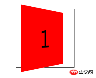
However, you will find that when the parent element changes When it reaches 90 degrees, the element disappears, which means that the element has no thickness. It shows that although the element has the perspective attribute of near, large and far, it is still 2D in nature.
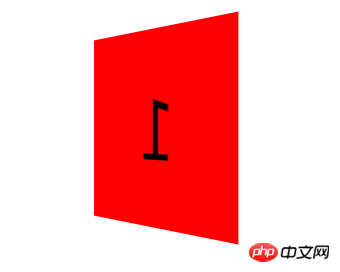
This is where you need to add the transform-style:preserve-3d; style to allow the element to transform in 3d space. In this way, the element is in a 3-dimensional space. When the parent element is rotated 90 degrees, the child elements inside can still be seen.
Sample code:
<!DOCTYPE html>
<html lang="en">
<head>
    <meta charset="UTF-8">
    <title>Title</title>
    <style>
        p{
            width: 200px;
            height: 200px;
            margin: 0 auto;
        }
        .p1{
            margin-top: 100px;
            transform:perspective(500px) rotatey(0deg);
            transform-style:preserve-3d;
            position: relative;
            border:1px solid #000000;
        }
        .p1 p{
            background-color: #ff0000;
            transform:rotatey(45deg);
            position: absolute;
            font-size: 80px;
            line-height: 200px;
            text-align: center;
            top: 0;
            left: 0;
        }
    </style>
</head>
<body>
<p class="p1">
    <p class="p1_1">1</p>
</p>
</body>

</html>
Rendering:
Above, we have a preliminary understanding of the 3d conversion module , let’s make a cube together to sort out the knowledge of 3D modules.
It is too troublesome to write step by step, so I will write the process in the comments of the code. Friends, please forgive me.
Code:
<!DOCTYPE html>
<html lang="en">
<head>
    <meta charset="UTF-8">
    <title>转换模块-正方体</title>
    <style>

    *{
        margin: 0;
        padding: 0;
        /*去除默认边距*/
    }

    ul{
        width: 200px;
        height: 200px;
        border: 1px solid #000;
        box-sizing: border-box;
        margin: 100px auto;
        position: relative;
        /*修改基本样式*/
        transform: rotateY(45deg) rotateX(45deg);
        /*旋转看看效果*/
        transform-style: preserve-3d;
        /*将父元素设置为3d空间*/
    }
    ul li{
        list-style: none;
        width: 200px;
        height: 200px;
        font-size: 60px;
        text-align: center;
        line-height: 200px;
        position: absolute;
        left: 0;
        top: 0;
        /*修改基本样式*/
    }
    ul li:nth-child(1){
        background-color: red;
        transform: translateX(-100px) rotateY(90deg);
        /*将第一个l向左移动100像素,然后绕y轴旋转90度,形成左边的面*/
    }
    ul li:nth-child(2){
        background-color: green;
        transform: translateX(100px) rotateY(90deg);
        /*将第一个2向右移动100像素,然后绕y轴旋转90度*,形成右边的面*/
    }
    ul li:nth-child(3){
        background-color: blue;
        transform: translateY(-100px) rotateX(90deg);
        /*将第一个3向上移动100像素,然后绕x轴旋转90度,形成上面的面*/
    }
    ul li:nth-child(4){
        background-color: yellow;
        transform: translateY(100px) rotateX(90deg);
        /*将第一个4向下移动100像素,然后绕x轴旋转90度*/
    }
    ul li:nth-child(5){
        background-color: purple;
        transform: translateZ(-100px);
        /*将第一个5向后移动100像素,形成后面的面*/
    }
    ul li:nth-child(6){
        background-color: pink;
        transform: translateZ(100px);
        /*将第一个l向前移动100像素,形成前面的面*/
    }

</style>
</head>
<body>
<ul>
    <!--首先做好html布局,正方体有6个面,所以写了6个li-->
    <li>1</li>
    <li>2</li>
    <li>3</li>
    <li>4</li>
    <li>5</li>
    <li>6</li>
</ul>
</body>
</html>
Rendering:

This method is easier to understand. After understanding, please look at the next one.
The code is below:
<!DOCTYPE html>
<html lang="en">
<head>
    <meta charset="UTF-8">
    <title>Title</title>
    <style>
        p{
            width: 200px;
            height: 200px;
            margin: 0 auto;
            /*修改基本样式*/
        }
        .p1{
            margin-top: 100px;
            transform: perspective(400px) rotatex(0deg) rotatey(0deg);
            /*拥有近大远小透视效果*/
            transform-style: preserve-3d;
            /*设置为3d空间*/
            position: relative;
            border:1px solid #000000;
            animation: xuanzhuan 5s cubic-bezier(0.0,0.0,0.0,0.0) infinite forwards;
            /*旋转动画*/
        }
        .p1 p{
            position: absolute;
            font-size: 80px;
            line-height: 200px;
            text-align: center;
            top: 0;
            left: 0;
            /*内部样式*/
        }
        .p1_1{
            transform: translatez(100px);
            background-color: red;
            /*向前移动100像素,作为最前面的面*/
        }
        .p1_2{
            transform: rotatex(90deg) translatez(100px);
            background-color:green;
            /*绕x轴旋转90度,在z轴正方向移动100像素,作为上面的面*/
            /*注:旋转时坐标系会跟着一起旋转,z轴原来是垂直屏幕向外的,绕x轴旋转90度以后就是在屏幕上向上的方向*/
        }
        .p1_3{
            transform: rotatex(180deg) translatez(100px);
            background-color: blue;
            /*绕x轴旋转180度,这时z轴垂直屏幕向内,在z轴正方向移动100像素,作为后面的面*/
        }
        .p1_4{
            transform: rotatex(270deg) translatez(100px);
            background-color: purple;
            /*绕x轴旋转270度,这时z轴向下,在z轴正方向移动100像素,作为下面的面*/
        }
        .p1_5{
            transform: rotatey(90deg) translatez(100px);
            background-color: pink;
            /*绕y轴旋转90度,这时z轴向右,在z轴正方向移动100像素,作为右面的面*/
        }
        .p1_6{
            transform: rotatey(270deg) translatez(100px);
            background-color: yellow;
            /*绕y轴旋转90度,这时z轴向左,在z轴正方向移动100像素,作为左面的面*/
        }
        @-webkit-keyframes xuanzhuan{
            from{
                transform:perspective(400px) rotatex(0deg);
            }
            to{
                transform:perspective(400px) rotatex(360deg);
            }
        }
        .p1:hover{
            transform: perspective(400px) scale(1.5);
            animation: xuanzhuan 5s cubic-bezier(0.0,0.0,0.0,0.0) infinite paused forwards;
            /*有hover事件是动画暂停*/
        }

    </style>
</head>
<body>
<p class="p1">
    <p class="p1_1">1</p>
    <p class="p1_2">2</p>
    <p class="p1_3">3</p>
    <p class="p1_4">4</p>
    <p class="p1_5">5</p>
    <p class="p1_6">6</p>
</p>
<!--html标签布局-->
</body>
</html>
Rendering:

As long as you understand this writing method, it will be more convenient to write, and It is not necessary to consider that incorrect conversion angle will cause the content to be reversed, so this writing method is recommended. Of course, this way of writing will also cause the content to be reversed when the x-axis and y-axis rotate together.
Related recommendations:
How to convert 2D and 3D CSS3 animation
Detailed introduction to the 3D conversion effect of CSS3_html/css_WEB-ITnose
The above is the detailed content of Detailed examples of HTML5 and CSS3 to achieve 3D conversion effects. For more information, please follow other related articles on the PHP Chinese website!