
 Web Front-endCSS TutorialA complete list of methods for customizing text omission using pure CSS
A complete list of methods for customizing text omission using pure CSS

This article mainly introduces a complete method of customizing text omission in pure CSS. The editor thinks it is quite good. Now I will share it with you and give you a reference. Let’s follow the editor to take a look, I hope it can help everyone.
WeTest Introduction
I got the design draft from Design MM, Oh NO, I started adding more content after a little bit, it’s such a small space, so much trouble! ! Poor UI developer GG, we always say sincerely that Wei Chen is not not doing it, but it is impossible to do it! Very guilty. But now, since I have used customized multi-line omission, my waist is no longer sore, my hands are no longer hurting, and I can answer requests effortlessly!
1. What is multi-line omission?

When the number of words reaches a certain level, ellipsis dots will be displayed. At first it was just a simple dot, dot, dot, then more and more tricks, dot dot plus down arrow, dot dot add more, dot dot add more plus arrow... Multi-line omission is a fancy dot after a long paragraph of text.
Peers do this:

1. Google Plus uses a gradient mask from transparent to white. The gradient mask is only displayed when the text exceeds it, but The text cannot be extruded, and the background can only be a solid color, which is not ideal.
2. Wandoujia is more simple and crude to display in line breaks. When displaying in line breaks, the text will still be displayed when the text does not exceed...xxx, which is even less ideal!
We do this:

We use an original mod-more UI component on the QQ browser page to achieve customized multi-line omission. It’s still pure CSS, a long way ahead of its peers, thumbs up! Thumbs up! Thumbs up! Unfortunately, the height of the mod-more component is fixed. Further evolution of mod-more, perfect adaptive height, and the code is simplified and easy to use.
2. How to do it?

Customized multi-line omission = display on demand...more + text overflow truncation, display on demand...more is implemented using the floating feature, The text overflow stage can be realized by front-floating and line-clamp. The existing solution of QQ browser is front-floating, but the disadvantage is that the height is fixed. Using line-clamp can adapt the height, perfect! Due to space limitations, only the implementation plan of line-clamp is mentioned here. QQ browser will be upgraded to this plan in the next stage.
Detailed explanation of the principle!
Display on demand...more

<!doctype html>
<html>
<body>
<style>
@-webkit-keyframes width-change {0%,100%{width: 320px} 50%{width:260px}}
</style>
<p style="font-size:12px;line-height: 18px;-webkit-animation: width-change 8s ease infinite;background: rgb(230, 230, 230);">
<p style="float:right;margin-left: -50px;width:100%;position:relative;background: hsla(229, 100%, 75%, 0.5);">
腾讯成立于1998年11月,是目前中国领先的互联网增值服务提供商之一。成立10多年来,腾讯一直秉承“一切以用户价值为依归”的经营理念,为亿级海量用户提供稳定优质的各类服务,始终处于稳健发展状态。2004年6月16日,腾讯控股有限公司在香港联交所主板公开上市(股票代号700)。
</p>
<p style="float:right;position:relative;width:50px;height: 108px;color:transparent;background: hsla(334, 100%, 75%, 0.5);">placeholder</p>
<p style="float:right;width:50px;height:18px;position: relative;background: hsla(27, 100%, 75%, 0.5);">...更多</p>
</p>
</body>
</html>
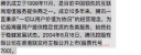
Use the right floating principle - right floating The elements are arranged from right to left, and if there is not enough space, they are wrapped. The blue block, pink block, and orange block float to the right in sequence. When the height of the blue block is less than 6 lines of text, the orange block is on the right. When the height of the blue block is greater than 6 lines of text, the lower left corner is just enough space for the orange blocks to be arranged, so the orange block The block is on the left

<!doctype html>
<html>
<body>
<style>
@-webkit-keyframes width-change {0%,100%{width: 320px} 50%{width:260px}}
</style>
<p style="font-size:12px;line-height: 18px;-webkit-animation: width-change 8s ease infinite;background: rgb(230, 230, 230);">
<p style="float:right;margin-left: -50px;width:100%;position:relative;background: hsla(229, 100%, 75%, 0.5);">
腾讯成立于1998年11月,是目前中国领先的互联网增值服务提供商之一。成立10多年来,腾讯一直秉承“一切以用户价值为依归”的经营理念,为亿级海量用户提供稳定优质的各类服务,始终处于稳健发展状态。2004年6月16日,腾讯控股有限公司在香港联交所主板公开上市(股票代号700)。
</p>
<p style="float:right;position:relative;width:50px;height: 108px;color:transparent;background: hsla(334, 100%, 75%, 0.5);">placeholder</p>
<p style="float:right;width:50px;height:18px;position: relative;background: hsla(27, 100%, 75%, 0.5);left: 100%;-webkit-transform: translate(-100%,-100%);">...更多</p>
</p>
</body>
</html>
Further offset the orange block to the correct position and you're done! Careful students will find that adding orange blocks with a gradient base is the solution used by Google Plus.
Text overflow truncation
<!DOCTYPE html>
<html>
<body>
<style>
@-webkit-keyframes width-change {0%,100%{width: 320px} 50%{width:260px}}
</style>
<p style="font-size: 12px;display: -webkit-box;-webkit-box-orient: vertical;-webkit-line-clamp: 6;color: red;line-height: 18px;position: relative;-webkit-animation: width-change 8s ease infinite;background: rgb(230, 230, 230);">
<p style="color:#000;display: inline;vertical-align: top;background: rgb(204, 204, 204);">
腾讯成立于1998年11月,是目前中国领先的互联网增值服务提供商之一。成立10多年来,腾讯一直秉承“一切以用户价值为依归”的经营理念,为亿级海量用户提供稳定优质的各类服务,始终处于稳健发展状态。2004年6月16日,腾讯控股有限公司在香港联交所主板公开上市(股票代号700)。</p>
</p>
</body>
</html>
-webkit-line-clamp is Private css attribute of webkit kernel, used for multi-line omission, fully supported on Android and iOS. But it uses ellipses fixedly and cannot be expanded directly. And it comes with overflow truncation logic, which acts on the height of the container. Careful inspection shows that the ellipsis it uses is a single character... and can be controlled using text css attributes such as font-size, letter-spacing, color, etc.
<!DOCTYPE html><html><body>
<style>@-webkit-keyframes width-change {0%,100%{width: 320px} 50%{width:260px}}/*测试*/</style>
<p style="font-size: 36px;letter-spacing: 28px;display: -webkit-box;-webkit-box-orient: vertical;-webkit-line-clamp: 6;color: red;line-height: 18px;position: relative;-webkit-animation: width-change 8s ease infinite;background: rgb(230, 230, 230);">
<p style="color:#000;display: inline;font-size: 12px;vertical-align: top;letter-spacing: 0;background: rgb(204, 204, 204);">
腾讯成立于1998年11月,是目前中国领先的互联网增值服务提供商之一。成立10多年来,腾讯一直秉承“一切以用户价值为依归”的经营理念,为亿级海量用户提供稳定优质的各类服务,始终处于稳健发展状态。2004年6月16日,腾讯控股有限公司在香港联交所主板公开上市(股票代号700)。
</p>
</p>
</body>
</html>
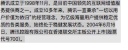
Just set the font-size, letter-spacing, and color of the outer container and restore it in the sub-container Set the ellipses individually. Here, the value of font-size set in the outer container is equal to 2 times the line height (the remaining width to be stretched can be filled with letter-spacing, or only font-size can be used to stretch the entire width). If the color is transparent, line-clamp can be used It extrudes the text without cutting off the container height. The height of the outer container reaches 7 lines instead of the default 6 lines, thus achieving the required overflow truncation effect
fit! Customized multi-line omission

<!DOCTYPE html><html><body>
<style>@-webkit-keyframes width-change {0%,100%{width: 320px} 50%{width:260px}}/*测试*/</style>
<p style="position: relative;line-height:18px;-webkit-animation: width-change 8s ease infinite;max-height: 108px;">
    <p style="font-size: 36px;letter-spacing: 28px;display: -webkit-box;-webkit-box-orient: vertical;-webkit-line-clamp: 6;color: transparent;line-height: 18px;position: relative;">
        <p style="font-size:12px;color: #000;display: inline;vertical-align: top;letter-spacing: 0;">
        腾讯成立于1998年11月,是目前中国领先的互联网增值服务提供商之一。成立10多年来,腾讯一直秉承“一切以用户价值为依归”的经营理念,为亿级海量用户提供稳定优质的各类服务,始终处于稳健发展状态。2004年6月16日,腾讯控股有限公司在香港联交所主板公开上市(股票代号700)。
        </p>
        <p style="position:absolute;top: 0;left: 50%;width: 100%;height: 100%;letter-spacing: 0;color: #000;font-size: 12px;background: rgba(173, 216, 230, 0.5);">
            <p style="float: right;width: 50%;height: 100%;background: rgba(255, 192, 203, 0.5);"></p>
            <p style="float: right;width: 50%;height: 108px;background: hsla(223, 100%, 50%, 0.19);"></p>
            <p style="float: right;width: 50px;height: 18px;position: relative;background: rgba(255, 165, 0, 0.5);" class="">... 更多</p>
        </p>
    </p>
</p>
</body></html>
将-webkit-line-clamp实现的文字溢出截断代码为主体,叠加绝对定位同步的按需显示...更多结构。因为绝对定位,这里使用百分比简化代码。最外包一层结构限制最大高度。

<!DOCTYPE html><html><body>
<style>
/*
 * 行高 h
 * 最大行数 n
 * ...更多容器的宽 w
 * 字号 f
 */

@-webkit-keyframes width-change {0%,100%{width: 320px} 50%{width:260px}}
.ellipsis {
    position: relative;
    background: rgb(230, 230, 230);
    width: 260px;
    max-height: 108px; /* h*n */
    line-height: 18px; /* h */
    overflow: hidden;
    -webkit-animation: width-change 8s ease infinite;
}
.ellipsis-container {
    position: relative;
    display: -webkit-box;
    -webkit-box-orient: vertical;
    -webkit-line-clamp: 6; /* n */
    font-size: 50px; /* w */
    color: transparent;
}
.ellipsis-content {
    color: #000;
    display: inline;
    vertical-align: top;
    font-size: 12px; /* f */
}
.ellipsis-ghost {
    position:absolute;
    z-index: 1;
    top: 0;
    left: 50%;
    width: 100%;
    height: 100%;
    color: #000;
}
.ellipsis-ghost:before {
    content: "";
    display: block;
    float: right;
    width: 50%;
    height: 100%;
}
.ellipsis-placeholder {
    content: "";
    display: block;
    float: right;
    width: 50%;
    height: 108px; /* h*n */
}
.ellipsis-more {
    position: relative;
    float: right;
    font-size: 12px; /* f */
    width: 50px; /* w */
    height: 18px; /* h */
    margin-top: -18px; /* -h */
}
</style>
<p class="ellipsis">
    <p class="ellipsis-container">
        <p class="ellipsis-content">
 腾讯成立于1998年11月,是目前中国领先的互联网增值服务提供商之一。成立10多年来,腾讯一直秉承“一切以用户价值为依归”的经营理念,为亿级海量用户提供稳定优质的各类服务,始终处于稳健发展状态。2004年6月16日,腾讯控股有限公司在香港联交所主板公开上市(股票代号700)。</p>
        <p class="ellipsis-ghost">
            <p class="ellipsis-placeholder"></p>
            <p class="ellipsis-more">...更多</p>
        </p>
    </p>
</p>
</body></html>
将橙色块偏移到正确位置,梳理了下代码,最终实现了自适应高度的定制多行省略,完美!从此妈妈再也不担心我在省略号后面加东西改东西了!恭喜你击败99%的同行了!
三、为什么这么做?
line-clamp有3宗罪

和 text-align:justify 一起用会使省略号和文字相叠

超出截断后会截掉部分行高

省略号出现在单词中间
定制省略当然某问题啦

ext-align:justify时如期所示,没问题!

截断时如期所示,也没问题!

省略号在有单词时如期显示,依然没问题!
更别说点点点花样增改

简单增改文字加链接只是小case

用折角还是其他图片表示文本溢出可以增添趣味

溢出时显示溢出字数增加了实用用途
相关推荐:
The above is the detailed content of A complete list of methods for customizing text omission using pure CSS. For more information, please follow other related articles on the PHP Chinese website!

 Two Images and an API: Everything We Need for Recoloring ProductsApr 15, 2025 am 11:27 AM
I recently found a solution to dynamically update the color of any product image. So with just one of a product, we can colorize it in different ways to show
 Weekly Platform News: Impact of Third-Party Code, Passive Mixed Content, Countries with the Slowest ConnectionsApr 15, 2025 am 11:19 AM
In this week's roundup, Lighthouse sheds light on third-party scripts, insecure resources will get blocked on secure sites, and many country connection speeds
 Options for Hosting Your Own Non-JavaScript-Based AnalyticsApr 15, 2025 am 11:09 AM
There are loads of analytics platforms to help you track visitor and usage data on your sites. Perhaps most notably Google Analytics, which is widely used
 It's All In the Head: Managing the Document Head of a React Powered Site With React HelmetApr 15, 2025 am 11:01 AM
The document head might not be the most glamorous part of a website, but what goes into it is arguably just as important to the success of your website as its
 What is super() in JavaScript?Apr 15, 2025 am 10:59 AM
What's happening when you see some JavaScript that calls super()?.In a child class, you use super() to call its parent’s constructor and super. to access its
 Comparing the Different Types of Native JavaScript PopupsApr 15, 2025 am 10:48 AM
JavaScript has a variety of built-in popup APIs that display special UI for user interaction. Famously:
 Why Are Accessible Websites so Hard to Build?Apr 15, 2025 am 10:45 AM
I was chatting with some front-end folks the other day about why so many companies struggle at making accessible websites. Why are accessible websites so hard
 The `hidden` Attribute is Visibly WeakApr 15, 2025 am 10:43 AM
There is an HTML attribute that does exactly what you think it should do:


Hot AI Tools

Undresser.AI Undress
AI-powered app for creating realistic nude photos

AI Clothes Remover
Online AI tool for removing clothes from photos.

Undress AI Tool
Undress images for free

Clothoff.io
AI clothes remover

AI Hentai Generator
Generate AI Hentai for free.

Hot Article
Hot Tools

MinGW - Minimalist GNU for Windows
This project is in the process of being migrated to osdn.net/projects/mingw, you can continue to follow us there. MinGW: A native Windows port of the GNU Compiler Collection (GCC), freely distributable import libraries and header files for building native Windows applications; includes extensions to the MSVC runtime to support C99 functionality. All MinGW software can run on 64-bit Windows platforms.

mPDF
mPDF is a PHP library that can generate PDF files from UTF-8 encoded HTML. The original author, Ian Back, wrote mPDF to output PDF files "on the fly" from his website and handle different languages. It is slower than original scripts like HTML2FPDF and produces larger files when using Unicode fonts, but supports CSS styles etc. and has a lot of enhancements. Supports almost all languages, including RTL (Arabic and Hebrew) and CJK (Chinese, Japanese and Korean). Supports nested block-level elements (such as P, DIV),

Safe Exam Browser
Safe Exam Browser is a secure browser environment for taking online exams securely. This software turns any computer into a secure workstation. It controls access to any utility and prevents students from using unauthorized resources.

SublimeText3 English version
Recommended: Win version, supports code prompts!

SublimeText3 Mac version
God-level code editing software (SublimeText3)

