Home >Web Front-end >CSS Tutorial >Create animated effect buttons with pure CSS
Create animated effect buttons with pure CSS
- 小云云Original
- 2017-11-21 15:36:272364browse
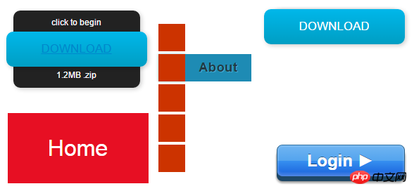
We know that CSS3 is an upgraded version of CSS technology, and CSS3 language development is developing towards modularity. The previous specification was too large and complex as a module, so it was broken down into smaller modules and more new modules were added. These modules include: box model, list module, hyperlink method, language module, background and border, text effects, multi-column layout, etc. In this article, the editor will share with you a very good CSS3 button animation. This CSS3 button has a total of 5 animation methods, each of which is a mouse-over animation. Although these animated buttons are not very gorgeous, the editor I don't think it is as difficult to expand as other buttons. We can modify the CSS code to change the color style we like at will.
HTML code:
<div class="button01">
      <a href="#">Download</a>
      <p class="top">click to begin</p>
      <p class="bottom">1.2MB .zip</p></div>
CSS code:
.button01 {
 width: 200px;
 margin: 50px auto 20px auto;}.button01 a {
 display: block;
 height: 50px;
 width: 200px;

 /*TYPE*/
 color: white;
 font: 17px/50px Helvetica, Verdana, sans-serif;
 text-decoration: none;
 text-align: center;
 text-transform: uppercase;

 /*GRADIENT*/
 background: #00b7ea; /* Old browsers */
 background: -moz-linear-gradient(top, #00b7ea 0%, #009ec3 100%); /* FF3.6+ */
 background: -webkit-gradient(linear, left top, left bottom, color-stop(0%,#00b7ea), color-stop(100%,#009ec3)); /* Chrome,Safari4+ */
 background: -webkit-linear-gradient(top, #00b7ea 0%,#009ec3 100%); /* Chrome10+,Safari5.1+ */
 background: -o-linear-gradient(top, #00b7ea 0%,#009ec3 100%); /* Opera 11.10+ */
 background: -ms-linear-gradient(top, #00b7ea 0%,#009ec3 100%); /* IE10+ */
 background: linear-gradient(top, #00b7ea 0%,#009ec3 100%); /* W3C */
 filter: progid:DXImageTransform.Microsoft.gradient( startColorstr='#00b7ea', endColorstr='#009ec3',GradientType=0 ); /* IE6-9 */}.button01 a, p {
   -webkit-border-radius: 10px;
    -moz-border-radius: 10px;
         border-radius: 10px;

 -webkit-box-shadow: 2px 2px 8px rgba(0,0,0,0.2);
    -moz-box-shadow: 2px 2px 8px rgba(0,0,0,0.2);
         box-shadow: 2px 2px 8px rgba(0,0,0,0.2);}p {
 background: #222;
 display: block;
 height: 40px;
 width: 180px;
 margin: -50px 0 0 10px;

 /*TYPE*/
 text-align: center;
 font: 12px/45px Helvetica, Verdana, sans-serif;
 color: #fff;

 /*POSITION*/
 position: absolute;
 z-index: -1;

 /*TRANSITION*/
 -webkit-transition: margin 0.5s ease;
    -moz-transition: margin 0.5s ease;
      -o-transition: margin 0.5s ease;
     -ms-transition: margin 0.5s ease;
         transition: margin 0.5s ease;}/*HOVER*/.button01:hover .bottom {
 margin: -10px 0 0 10px;}.button01:hover .top {
 margin: -80px 0 0 10px;
 line-height: 35px;}/*ACTIVE*/.button01 a:active {
 background: #00b7ea; /* Old browsers */
 background: -moz-linear-gradient(top,  #00b7ea 36%, #009ec3 100%); /* FF3.6+ */
 background: -webkit-gradient(linear, left top, left bottom, color-stop(36%,#00b7ea), color-stop(100%,#009ec3)); /* Chrome,Safari4+ */
 background: -webkit-linear-gradient(top,  #00b7ea 36%,#009ec3 100%); /* Chrome10+,Safari5.1+ */
 background: -o-linear-gradient(top,  #00b7ea 36%,#009ec3 100%); /* Opera 11.10+ */
 background: -ms-linear-gradient(top,  #00b7ea 36%,#009ec3 100%); /* IE10+ */
 background: linear-gradient(top,  #00b7ea 36%,#009ec3 100%); /* W3C */
 filter: progid:DXImageTransform.Microsoft.gradient( startColorstr='#00b7ea', endColorstr='#009ec3',GradientType=0 ); /* IE6-9 */}.button01:active .bottom {
 margin: -20px 0 0 10px;}.button01:active .top {
 margin: -70px 0 0 10px;
Style display:

CSS animation techniques and details
Detailed explanation of CSS animation properties
Introduction to the implementation method of making three-dimensional navigation bar with CSS
The above is the detailed content of Create animated effect buttons with pure CSS. For more information, please follow other related articles on the PHP Chinese website!

