Home >Web Front-end >CSS Tutorial >How to use flex layout to center multiple rows and multiple divs horizontally and vertically
How to use flex layout to center multiple rows and multiple divs horizontally and vertically
- 一个新手Original
- 2017-09-14 10:57:5611237browse
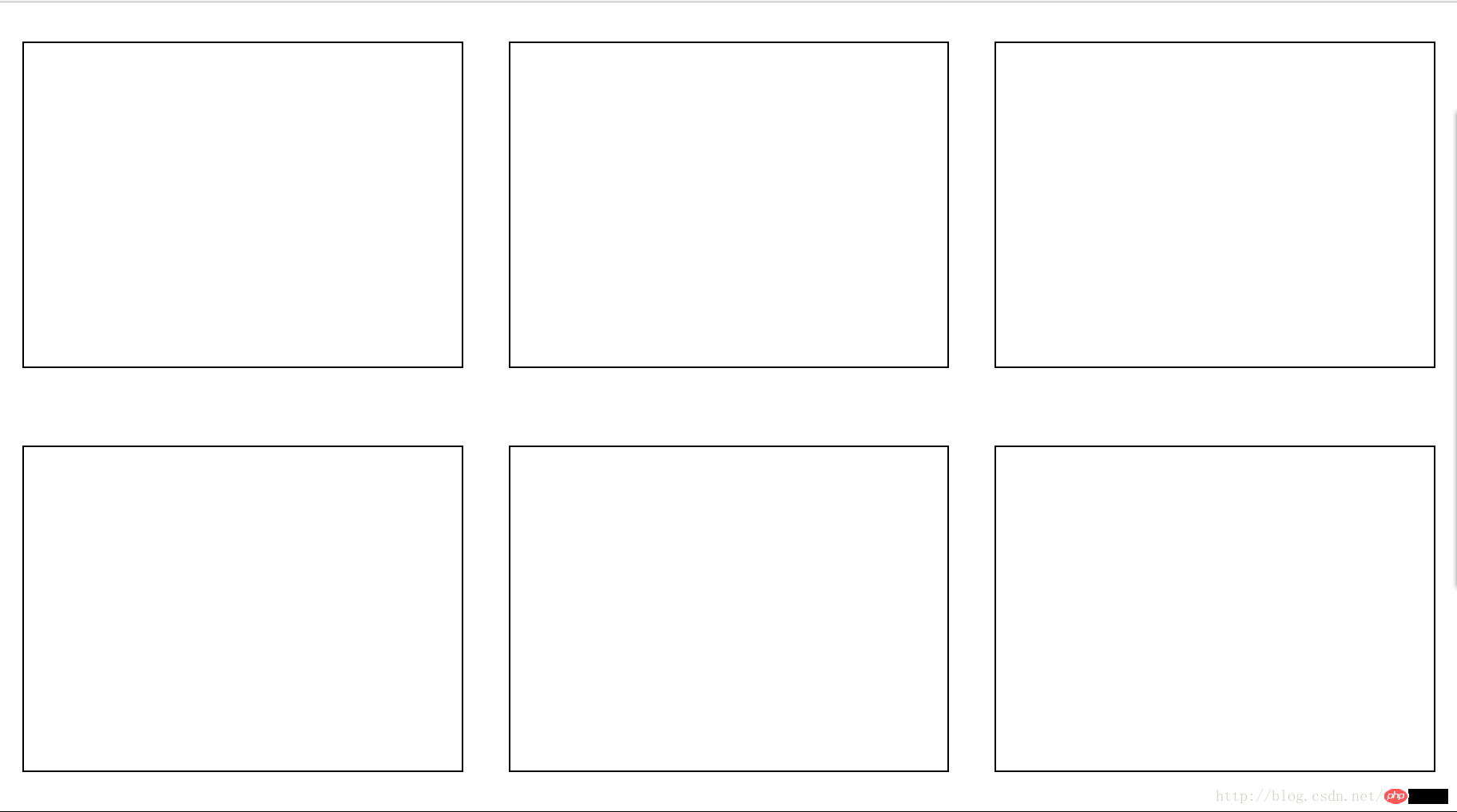
Horizontal and vertical has always been a classic problem. I encountered this problem recently when I was writing a page style. This time, what needs to be horizontally and vertically centered are multiple rows and multiple p blocks. The code is as follows:
<p class="content" >
   <p class="chart"></p>
   <p class="chart"></p>
   <p class="chart"></p>
   <p class="chart"></p>
   <p class="chart"></p>
   <p class="chart"></p>
</p>
This time we use flex layout, because if we use flex layout, the browser will calculate it for us. The parent element here needs to be flex layout. There will be a main axis and a vertical cross axis under the flex layout. The main axis is horizontal by default. The cross axis is vertical by default and can be changed through the flex-direction attribute. For specific flex layout, please refer to teacher Ruan Yifeng’s tutorial: http://www.ruanyifeng.com/blog/2015/07/flex-grammar.htmlcss
CSS code is as follows:
.content {
  display: flex;
  flex-wrap: wrap;
  align-items: center;
  width: 100%;
  height: 100%;
  }
The flex-wrap attribute refers to whether elements under flex layout need to be wrapped. This attribute can take on three values, namely nowrap, wrap, and wrap-reverse. The default value is nowwrap (no line wrapping), wrap means that the child elements are wrapped, and the first line is at the top, wrap-reverse means that the child elements are wrapped, and the first line is at the bottom.
The align-items attribute defines how the items are aligned on the cross axis. The default direction of the cross axis here is the vertical direction. The value we choose is center, which is aligned with the midpoint of the cross axis. This attribute has the following Several values:
flex-start:交叉轴的起点对齐。flex-end:交叉轴的终点对齐。center:交叉轴的中点对齐。baseline: 项目的第一行文字的基线对齐。
stretch(默认值):如果项目未设置高度或设为auto,将占满整个容器的高度。
In this way, we achieve the purpose of vertical centering, but also need to center horizontally.
The style code for sub-elements that need to be vertically centered is as follows:
.chart {
    display: inline-block;
    width: 30%;
   height: 40%;
   margin: 0 auto;
   border: 1px solid #000;
   }
display: inline-block In order to allow p to be displayed on the same line, the width and height here determine how many p's can be displayed in one line block.
margin: 0 auto is to center the child elements horizontally. Auto means automatic. The browser will help us calculate, so that we can achieve horizontal and vertical centering. 
The above is the detailed content of How to use flex layout to center multiple rows and multiple divs horizontally and vertically. For more information, please follow other related articles on the PHP Chinese website!

