
Home >Web Front-end >CSS Tutorial >Summary of centering methods in CSS
Summary of centering methods in CSS
- 巴扎黑Original
- 2017-08-11 14:27:171814browse
This article introduces various centering methods in CSS. The implementation methods of the 8 methods are explained in detail, and there are also corresponding renderings. Friends in need can refer to them
Today we will mainly talk about Various centering methods in CSS.
The first is horizontal centering. The easiest way is of course
Copy the code The code is as follows:
margin:0 auto;
That is, set the margin-left and margin-right properties to auto to achieve the horizontal centering effect.
What about other ways? Let me go through them one by one:
line-height
First introduce the horizontal centering method of text:
Copy code The code is as follows:
25c91c6da56e0ff613f4eec26f5a030aLiu Fang94b3e26ee717c64999d7867364b1b4a3
Just use line-height set to height:
Copy code The code is as follows:
.wrap{
line-height: 200px;/*Vertical centering key*/
text-align:center;
height: 200px;
font-size: 36px;
background-color: #ccc;
}
The effect is as follows:

padding Padding
Use padding and background-clip to achieve the horizontal and vertical centering of p:
Copy code The code is as follows:
7b6d85b0aa6e093a8249c39fc0694ef3
bd57cc860bfe6c93a3cd6a320a425abd94b3e26ee717c64999d7867364b1b4a3
94b3e26ee717c64999d7867364b1b4a3
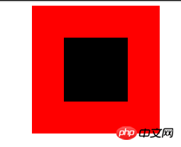
Set the background-clip to the content-box and set Crop the background to the outer edge of the content area, and then use padding to set it to half the difference between the outer p minus the inner p, to achieve:
.parent{
 margin:0 auto;
 width:200px;
 height:200px;
 background-color:red;
}
.children {
 width: 100px;
 height: 100px;
 padding: 50px;
 background-color: black;
 background-clip:content-box;/*居中的关键*/
The effect is as follows:
margin filling
Next, we will introduce the method of margin filling to achieve horizontal and vertical centering.
First we define the parent and child p:
7b6d85b0aa6e093a8249c39fc0694ef3
bd57cc860bfe6c93a3cd6a320a425abd94b3e26ee717c64999d7867364b1b4a3
0cba36f12cf561cef14ffa62bcdafa2c
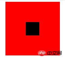
Here we set the margin-top of the child p to the height of the parent p minus half of the height of the child p, and then set the overflow to hidden to trigger the BFC of the parent p. The LESS code is as follows:
@parentWidth:200px;
@childrenWidth:50px;
.parent {
 margin:0 auto;
 height:@parentWidth;
 width:@parentWidth;
 background: red;
 overflow:hidden;/*触发BFC*/
}
.children {
 height:@childrenWidth;
 width:@childrenWidth;
 margin-left:auto;
 margin-right:auto;
 margin-top: (@parentWidth - @childrenWidth) / 2;
 background:black;
}
The final centering effect is as follows:
absolute positioning
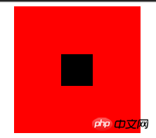
Use position:absolute with top, left 50%, and then set margin to a negative value to center p horizontally and vertically. First, you still need to define the parent and child p:
Copy code The code is as follows :
7b6d85b0aa6e093a8249c39fc0694ef3
bd57cc860bfe6c93a3cd6a320a425abd94b3e26ee717c64999d7867364b1b4a3
94b3e26ee717c64999d7867364b1b4a3
Then Set the corresponding css:
.parent {
 position:relative;
 margin:0 auto;
 width:200px;
 height:200px;
 background-color:red;
}
.children {
 position:absolute;
 left:50%;
 top:50%;
 margin:-25px 0 0 -25px ;
 height:50px;
 width:50px;
 background-color: black;
}
The value in margin is half of the width of p. The final rendering is:
Text-align is centered
As we all know, text-align can center the content in a p horizontally. But what if you want to center the sub-p in this p? You can set the display of sub-p to inline-block.
.parent {
 text-align:center;
 margin:0 auto;
 width:200px;
 height:200px;
 background:red;
}
.children {
 positiona;absolute;
 margin-top:75px;
 width:50px;
 height:50px;
 background: black;
 display:inline-block;/*使其父元素text-align生效*/
}
Picture centering
General picture centering is the same as text-align, which wraps the picture in a p. Just set the text-align of p to center.
You can refer to the following link:
Personal site
There is a special way to use an image as a placeholder to allow the parent container to obtain the height and width, thereby allowing a -50% offset. Images can have a reference container for percentage calculations. The advantage is that you don’t know the size of the image, and you can place any image that does not exceed the size of the parent container and it will be centered. In addition, the compatibility is good, and IE6 is smoothly compatible. The code is as follows:
Copy code The code is as follows:
7b6d85b0aa6e093a8249c39fc0694ef3
e388a4556c0f65e1904146cc1a846bee
4d23d5c3f4b0aaf9cbeac232bb31709b
99f21c13150c50ec34bf3f336701ab4a94b3e26ee717c64999d7867364b1b4a3
94b3e26ee717c64999d7867364b1b4a3
.parent {
 position:relative;
 width:100%;
 height:200px;
 background:red;
}
p {
 position:absolute;
 top:50%;
 left:50%;
}
.hidden-img {
 visibility:hidden;
}
.show-img {
 position:absolute;
 right:50%;
 bottom:50%;
}
The effect is as follows:

transform居中
上面讲到的p居中的例子中,p的宽度都是固定的,然而实际项目中,有可能遇到不定宽的p,特别是响应式或者移动端的设计中,更加常见。所以下面介绍一种不需要定宽的p水平垂直居中方法。
先上代码:
复制代码 代码如下:
0ebbc079c359d962fa7d284a06740928
801879b5b005f115d3c6e975b0a9cc7f
a0cef87aec67cb60216160347df5d9b5我是水平垂直居中噢!94b3e26ee717c64999d7867364b1b4a3
94b3e26ee717c64999d7867364b1b4a3
94b3e26ee717c64999d7867364b1b4a3
.parent {
 float: left;
 width: 100%;
 height: 200px;
 background-color: red;
}
.children {
 float:left;
 position:relative;
 top:50%;
 left:50%;
}
.children-inline {
 position: relative;
 left: -50%;
 -webkit-transform : translate3d(0, -50%, 0);
 transform : translate3d(0, -50%, 0);
 background-color: black;
 color:white;
}
效果如下:
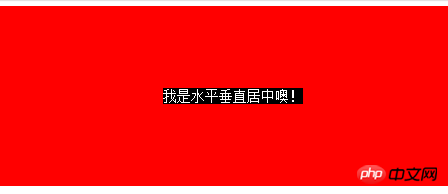
首先我们利用float,将需要居中的p的父p也就是children的宽度收缩,然后left:50%,将children的左边与水平中线对齐。这个时候,还没有真正居中,我们需要将children-inner左移动-50%,这样就水平居中了。
再来说说垂直方向,先将children的top设为50%,然后其上边和垂直中线对齐了,同样,我们需要将children-inner上移动-50%。但是这个50%是计算不出来的,所以我们用到了transform : translate3d(0, -50%, 0);
这个方法非常好用噢。
flex居中
最后来介绍一下CSS3中的display:flex来实现的水平垂直居中的方法。
复制代码 代码如下:
0ebbc079c359d962fa7d284a06740928
801879b5b005f115d3c6e975b0a9cc7f我是通过flex的水平垂直居中噢!94b3e26ee717c64999d7867364b1b4a3
94b3e26ee717c64999d7867364b1b4a3
html,body{
 width: 100%;
 height: 200px;
}
.parent {
 display:flex;
 align-items: center;/*垂直居中*/
 justify-content: center;/*水平居中*/
 width:100%;
 height:100%;
 background-color:red;
}
.children {
 background-color:blue;
}
效果如下:

这种方式最为简便,就是兼容性不好,不过随着时间的前进,各大浏览器一定会都兼容的。
The above is the detailed content of Summary of centering methods in CSS. For more information, please follow other related articles on the PHP Chinese website!