Home >Web Front-end >CSS Tutorial >Analysis of the difference between outline and border in css
Analysis of the difference between outline and border in css
- 黄舟Original
- 2017-07-27 09:21:083810browse
border and outline:
border attributes:
border-width, border-style, border-color where border-style can be none or hidden
outline (outline)
Draw a line surrounding the element around the edge of the element's border, including outline-color, outline-style, outline- The settings of the three sub-properties of width can be defaulted and there is no fixed order. Outlines do not take up page space and are not necessarily rectangular.
Browsers other than IE directly support outline. Only IE8 and above browsers that specify !DOCUMENT support outline.
outline-style can be none (does not contain the hidden attribute)
##Summary: The differences between the two are:
1.outline does not take up space and does not add extra width or height (this will not cause reflow or repaint when the browser renders)
2.outline has It may be non-rectangular (under Firefox browser)
In FireFox browser, there are rounded corners matching outlineoutline-radius

<!DOCTYPE html><html lang="en"><head>
    <meta charset="UTF-8">
    <title>直角三角形(右下角)</title>
    <style type="text/css">
        .use-outline-offset{
            margin-left: auto;
            margin-right: auto;
            width: 200px;
            height: 200px;
            border:40px solid #000000;
            background-color:#cccccc;
            outline-width:40px;
            outline-style:dotted;
            outline-offset:-80px;
            box-sizing: border-box;
        }
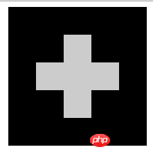
    </style></head><body><p class="use-outline-offset"></p></body></html>
Rendering:

outline-radiusAlthough No chance, but we can use other attributes to achieve similar effects. For example, box-shadow.
box- The most common parameters of shadow are the first three parameters, horizontal/vertical offset and blur size. Some friends may not know the purpose of the fourth optional parameter value? box-shadowThe fourth parameter value, expansion outside the name, can expand the projection range. Of course, the expanded area is a solid color area. We can use this feature to simulate the outline solid color border effect that does not affect the size of the element!
<!DOCTYPE html><html lang="en"><head>
    <meta charset="UTF-8">
    <title>圆角</title>
    <style type="text/css">
        .outline-radius {
            margin: 200px auto;
            width: 400px;
            height: 300px;
            border-radius: 1px;
            box-shadow: 0 0 0 30px #cd0000;
        }
        .outline-radius>img{
            width: 100%;
            height: 100%;
        }
    </style></head><body><p class="outline-radius">
    <img src="img/mm1.jpg"></p></body></html>
The rendering is as follows:

The following is a brief explanation of the meaning of the next two lines of CSS code:
##border-radius: 1px represents the rounded corner size 1 pixel. Some students may be surprised, why is it 1 pixel? The rounded corners of the screenshot are obviously dozens of pixels, which is explained below;
-
box- shadow: 0 0 0 30px #cd0000There are 4 values appearing, namely horizontal offset 0, vertical offset 0, blur 0 (solid color), and expanded size 30 pixels. We can imagine that the light is shining directly from above the box, because there is no offset or blur, and we cannot see any shadows. In fact, the shadow of the box is exactly the size of the box (with a 1-pixel rounded corner). At this time, it is expanded by 30 pixels. We can imagine that the shadow of the 1-pixel rounded corner is expanded by an additional 30 pixels. Oh, isn’t it the effect we need? Isn’t it the effect shown in the screenshot?
You knowborder-radius It’s about 1 pixel, right? After extending it by 30 pixels, the rounded corners will be 30 pixels in size.
border-radius and box-shadow for the outer labels.
The above is the detailed content of Analysis of the difference between outline and border in css. For more information, please follow other related articles on the PHP Chinese website!

