
Home >Web Front-end >CSS Tutorial >Introduction to size and font units (em, px, %) in CSS
Introduction to size and font units (em, px, %) in CSS

- 黄舟Original
- 2017-07-19 13:30:581943browse
In the overall layout of the page, the size of the page elements (length, width, inner and outer margins, etc.) and the size of the page font are also important tasks. A reasonable setting will make the page look hierarchical, focused, and pleasing to the eye. On the contrary, an unfriendly page size and font size setting will increase the complexity of the page and increase the complexity of the user's understanding of the page; even today, with the emergence of endless access terminals (iPhone, iPad, PC, Android...), adapting to Various access terminals will become a "hot potato" in your hands. Therefore, in recent years, the "nine-square grid" style "flow layout" has returned again. In order to provide page layout and other maintainability and scalability, we try to set the size of page elements and font size to relative values, no longer isolated fixed pixels. So that when the size of the parent element changes, the child elements can also adapt to the change. As well as combining a small number of the latest CSS3 @media queries to achieve "responsive layout", CSS frameworks such as bootstrap are on the rise.
However, in CSS, the W3C document divides size units into two categories: relative length units and absolute length units. However, relative length units can be divided into font relative units and window relative units according to different reference elements. Font relative units include: em, ex, ch, rem; window relative units include: vw, vh, vmin, vmax. Absolute positioning is a fixed size, and they use physical measurement units: cm, mm, in, px, pt, and pc. But in actual applications, the most widely used ones we use are em, rem, px and percentage (%) to measure the size of page elements.
px: is the pixel unit. It is every small dot displayed on the display screen, which is the smallest unit of display. It is an absolute size unit;
#em: It describes the font size relative to the current element, so it is also a relative length unit. The default font size of general browsers is 16px, then 2em == 32px;
%: Percent, which is a purer relative length unit. It describes the percentage value relative to the parent element. For example, 50% is half of the parent element.
What needs to be noted here is: em is relative to the font size applied to the current element; and percentage is relative to the size of the parent element. As an example below:
HTML:
<p class="parent">
     <p class="em-demo">
      设置长度为5em demo
     </p>

     <p class="percentage-demo">
      设置长度为80% demo
     </p>
</p>
CSS:
p{
    border: 1px dashed #808080;
    margin:10px
}

.parent{
    width: 200px;
    font-size: 18px;
}

.em-demo{
    width: 5em;
}

.percentage-demo{
    width: 80%
}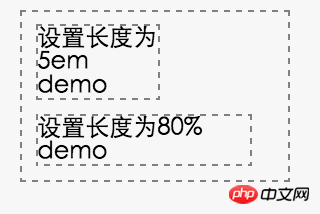
From the picture we can see: Set 5em The first line of p characters is exactly 5 characters in size, because as mentioned above, it is relative to the size of the current element font, 5 * 18 = 90px. The percentage display will be larger because it is relative to the size of the parent element, 200 * 80% = 160px.
You can set the size and font size of elements for px, em and percentage, but they each have their own different application scenarios. Unreasonable use will lead to page confusion, difficulty in maintenance and expansion. For their use, there are the following best practices that are recognized by everyone:
1. Try to use relative size units
Using relative size unit measurement, when adjusting the layout of the page, there is no need to traverse all internal DOM structures and reset the sizes of internal sub-elements. At the same time, it can also better adapt to multiple resolutions. rate and screen terminal. Using relative positioning does not mean that the page as a whole is adaptive.
Of course, for those who hope that the "responsive design" of the overall website can adapt to the various types of access terminals that are emerging in today's world, the relative size layout will play a greater value. We only need to leverage CSS3's @media query to set the overall width of the perimeter, and a small amount of inconsistent user experience across devices. Regarding "responsive layout", you can refer more to emerging CSS frameworks such as bootstrap.
For the setting of relative size units: em and % because their relative reference objects are different, they also have different usage scenarios. If you want the size to change with the font size of the current element, em is the best way to use it, such as line height and font size. On the contrary, if the size changes with the parent container or the overall page layout, it is better to use %, such as the height and width settings of the element.
2. Only use absolute sizes on predictable elements
Not all elements set relative sizes Just the best. For predictable sizes such as chart icons, multimedia elements such as videos, and the overall width of the web page, setting an absolute path may be the best choice. But they need to try out specific scenarios to get the best experience. No matter how we set the relative size, there will always be some absolute size measurements in the outer layer, so there can be relative size settings such as percentages.
3. Try to use em and rem for font size
Just like using relative size units as much as possible, for the maintainability and scalability of font size, W3C recommends using em as the font size unit. It should be noted that if there are 3 or more layers of font relative size settings, the calculation of the actual font size will become relatively troublesome. At this time, if browser compatibility is met, you can consider using the new feature rem of CSS3: setting the relative size based on the font size of the fixed root element. This is also a usage method that has emerged in mobile APPs in recent years.
rem compatibility, we can use the Can I Use website to obtain it.
4. @media queries for platform adaptation, but abuse is prohibited
As mentioned above, the @media query of CSS3 can help us achieve adaptive layout of multi-platform terminals and get a better user experience. But this does not mean that we can abuse it everywhere. There are too many platform differences in CSS code, which will also increase the difficulty of code readability and maintainability. A better way is to use it reasonably only in scenarios where it must be used, such as the overall width of the page periphery, menu bars with different displays, etc. More experience adaptability can be achieved by moving to "fluid layout".
Regarding responsive design, this is the result of a trade-off between development cycle, cost and platform experience. If the cost of development and maintenance is not considered, different page designs can be provided for different platform terminals, so that the user experience will be more friendly. But in actual development, development and maintenance costs and product life cycle are also important trade-offs, and responsive design is the result of the trade-off between them.
The above is the detailed content of Introduction to size and font units (em, px, %) in CSS. For more information, please follow other related articles on the PHP Chinese website!