
 Backend DevelopmentPython TutorialShare a case of how Python uses plotly to draw data charts (pictures and texts)
Share a case of how Python uses plotly to draw data charts (pictures and texts)

This article mainly introduces the method of using plotly to draw data charts in Python. It analyzes the techniques of plotly drawing with examples and has certain reference value. Interested friends can refer to it
Introduction: Use The python-plotly module is used to draw stress test data and generate static html page results for display.
Many friends have the experience of stress testing modules during the development process. After the stress test, everyone often likes to use Excel to process the stress test data and draw data visualization views, but this is not very convenient to use. Web page for data display. This article will introduce the use of the python-plotly module to draw stress test data and generate a static HTML page to facilitate the display of results.
Introduction to Plotly
Plotly is a charting tool developed using JavaScript, providing an API to interact with mainstream data analysis languages (such as: Python, R, MATLAB). You can go to the official website https://plot.ly/ for more detailed information. Plotly is capable of drawing beautiful charts with user interaction.
Python-Plotly installation
This document mainly introduces the use of plotly’s Python API to perform several A simple chart drawing. For more usage of Plotly, please refer to https://plot.ly/python/
Python-Plotly can be installed using pip, and it is best to install and use it in Python version 2.7 and above. If you use Python2.6 version, please install Python2.7 and the corresponding pip yourself.
Plotly drawing example
line-plots
Drawing effect:
The generated html page provides rich interactive tools in the upper right corner.

Code:
def line_plots(name):
  '''
  绘制普通线图
  '''
  #数据,x为横坐标,y,z为纵坐标的两项指标,三个array长度相同
  dataset = {'x':[0,1,2,3,4,5,6,7,8,9],
        'y':[5,4,1,3,11,2,6,7,19,20],
        'z':[12,9,0,0,3,25,8,17,22,5]}
  data_g = []
  #分别插入 y, z
  tr_x = Scatter(
    x = dataset['x'],
    y = dataset['y'],
    name = 'y'
  )
  data_g.append(tr_x)
  tr_z = Scatter(
    x = dataset['x'],
    y = dataset['z'],
    name = 'z'
  )
  data_g.append(tr_z)
  #设置layout,指定图表title,x轴和y轴名称
  layout = Layout(title="line plots", xaxis={'title':'x'}, yaxis={'title':'value'})
  #将layout设置到图表
  fig = Figure(data=data_g, layout=layout)
  #绘图,输出路径为name参数指定
  pltoff.plot(fig, filename=name)
scatter-plots
Plotting effect :

Code:
def scatter_plots(name):
  '''
  绘制散点图
  '''
  dataset = {'x':[0,1,2,3,4,5,6,7,8,9],
        'y':[5,4,1,3,11,2,6,7,19,20],
        'text':['5_txt','4_txt','1_txt','3_txt','11_txt','2_txt','6_txt','7_txt','19_txt','20_txt']}

  data_g = []

  tr_x = Scatter(
    x = dataset['x'],
    y = dataset['y'],
    text = dataset['text'],
    textposition='top center',
    mode='markers+text',
    name = 'y'
  )
  data_g.append(tr_x)

  layout = Layout(title="scatter plots", xaxis={'title':'x'}, yaxis={'title':'value'})
  fig = Figure(data=data_g, layout=layout)
  pltoff.plot(fig, filename=name)
bar-charts
Drawing Effect:

Code:
def bar_charts(name):
  '''
  绘制柱状图
  '''
  dataset = {'x':['Windows', 'Linux', 'Unix', 'MacOS'],
        'y1':[45, 26, 37, 13],
        'y2':[19, 27, 33, 21]}
  data_g = []
  tr_y1 = Bar(
    x = dataset['x'],
    y = dataset['y1'],
    name = 'v1'
  )
  data_g.append(tr_y1)

  tr_y2 = Bar(
    x = dataset['x'],
    y = dataset['y2'],
    name = 'v2'
  )
  data_g.append(tr_y2)
  layout = Layout(title="bar charts", xaxis={'title':'x'}, yaxis={'title':'value'})
  fig = Figure(data=data_g, layout=layout)
  pltoff.plot(fig, filename=name)
pie-charts
Plotting effect:

Code:
def pie_charts(name):
  '''
  绘制饼图
  '''
  dataset = {'labels':['Windows', 'Linux', 'Unix', 'MacOS', 'Android', 'iOS'],
        'values':[280, 25, 10, 100, 250, 270]}
  data_g = []
  tr_p = Pie(
    labels = dataset['labels'],
    values = dataset['values']
  )
  data_g.append(tr_p)
  layout = Layout(title="pie charts")
  fig = Figure(data=data_g, layout=layout)
  pltoff.plot(fig, filename=name)
filled-area-plots
This example is to draw a stacked line chart with a fill effect, which is suitable for analyzing data with stacked percentage attributes
Drawing effect:

Code:
def filled_area_plots(name):
  '''
  绘制堆叠填充的线图
  '''
  dataset = {'x':[0,1,2,3,4,5,6,7,8,9],
        'y1':[5,4,1,3,11,2,6,7,19,20],
        'y2':[12,9,0,0,3,25,8,17,22,5],
        'y3':[13,22,46,1,15,4,18,11,17,20]}

  #计算y1,y2,y3的堆叠占比
  dataset['y1_stack'] = dataset['y1']
  dataset['y2_stack'] = [y1+y2 for y1, y2 in zip(dataset['y1'], dataset['y2'])]
  dataset['y3_stack'] = [y1+y2+y3 for y1, y2, y3 in zip(dataset['y1'], dataset['y2'], dataset['y3'])]

  dataset['y1_text'] = ['%s(%s%%)'%(y1, y1*100/y3_s) for y1, y3_s in zip(dataset['y1'], dataset['y3_stack'])]
  dataset['y2_text'] = ['%s(%s%%)'%(y2, y2*100/y3_s) for y2, y3_s in zip(dataset['y2'], dataset['y3_stack'])]
  dataset['y3_text'] = ['%s(%s%%)'%(y3, y3*100/y3_s) for y3, y3_s in zip(dataset['y3'], dataset['y3_stack'])]

  data_g = []
  tr_1 = Scatter(
    x = dataset['x'],
    y = dataset['y1_stack'],
    text = dataset['y1_text'],
    hoverinfo = 'x+text',
    mode = 'lines',
    name = 'y1',
    fill = 'tozeroy' #填充方式: 到x轴
  )
  data_g.append(tr_1)

  tr_2 = Scatter(
    x = dataset['x'],
    y = dataset['y2_stack'],
    text = dataset['y2_text'],
    hoverinfo = 'x+text',
    mode = 'lines',
    name = 'y2',
    fill = 'tonexty' #填充方式:到下方的另一条线
  )
  data_g.append(tr_2)

  tr_3 = Scatter(
    x = dataset['x'],
    y = dataset['y3_stack'],
    text = dataset['y3_text'],
    hoverinfo = 'x+text',
    mode = 'lines',
    name = 'y3',
    fill = 'tonexty'
  )
  data_g.append(tr_3)

  layout = Layout(title="field area plots", xaxis={'title':'x'}, yaxis={'title':'value'})
  fig = Figure(data=data_g, layout=layout)
  pltoff.plot(fig, filename=name)
Summary
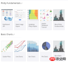
This article introduces the method of using python-plotly to draw data graphs, including line plots and scatter plots in examples. These five typical charts, scatter plots, bar charts, pie charts, and filled area plots, basically cover most types of test data. Dear friends, It can be deformed to draw more beautiful icons.
The above is the detailed content of Share a case of how Python uses plotly to draw data charts (pictures and texts). For more information, please follow other related articles on the PHP Chinese website!

 Merging Lists in Python: Choosing the Right MethodMay 14, 2025 am 12:11 AM
TomergelistsinPython,youcanusethe operator,extendmethod,listcomprehension,oritertools.chain,eachwithspecificadvantages:1)The operatorissimplebutlessefficientforlargelists;2)extendismemory-efficientbutmodifiestheoriginallist;3)listcomprehensionoffersf
 How to concatenate two lists in python 3?May 14, 2025 am 12:09 AM
In Python 3, two lists can be connected through a variety of methods: 1) Use operator, which is suitable for small lists, but is inefficient for large lists; 2) Use extend method, which is suitable for large lists, with high memory efficiency, but will modify the original list; 3) Use * operator, which is suitable for merging multiple lists, without modifying the original list; 4) Use itertools.chain, which is suitable for large data sets, with high memory efficiency.
 Python concatenate list stringsMay 14, 2025 am 12:08 AM
Using the join() method is the most efficient way to connect strings from lists in Python. 1) Use the join() method to be efficient and easy to read. 2) The cycle uses operators inefficiently for large lists. 3) The combination of list comprehension and join() is suitable for scenarios that require conversion. 4) The reduce() method is suitable for other types of reductions, but is inefficient for string concatenation. The complete sentence ends.
 Python execution, what is that?May 14, 2025 am 12:06 AM
PythonexecutionistheprocessoftransformingPythoncodeintoexecutableinstructions.1)Theinterpreterreadsthecode,convertingitintobytecode,whichthePythonVirtualMachine(PVM)executes.2)TheGlobalInterpreterLock(GIL)managesthreadexecution,potentiallylimitingmul
 Python: what are the key featuresMay 14, 2025 am 12:02 AM
Key features of Python include: 1. The syntax is concise and easy to understand, suitable for beginners; 2. Dynamic type system, improving development speed; 3. Rich standard library, supporting multiple tasks; 4. Strong community and ecosystem, providing extensive support; 5. Interpretation, suitable for scripting and rapid prototyping; 6. Multi-paradigm support, suitable for various programming styles.
 Python: compiler or Interpreter?May 13, 2025 am 12:10 AM
Python is an interpreted language, but it also includes the compilation process. 1) Python code is first compiled into bytecode. 2) Bytecode is interpreted and executed by Python virtual machine. 3) This hybrid mechanism makes Python both flexible and efficient, but not as fast as a fully compiled language.
 Python For Loop vs While Loop: When to Use Which?May 13, 2025 am 12:07 AM
Useaforloopwheniteratingoverasequenceorforaspecificnumberoftimes;useawhileloopwhencontinuinguntilaconditionismet.Forloopsareidealforknownsequences,whilewhileloopssuitsituationswithundeterminediterations.
 Python loops: The most common errorsMay 13, 2025 am 12:07 AM
Pythonloopscanleadtoerrorslikeinfiniteloops,modifyinglistsduringiteration,off-by-oneerrors,zero-indexingissues,andnestedloopinefficiencies.Toavoidthese:1)Use'i


Hot AI Tools

Undresser.AI Undress
AI-powered app for creating realistic nude photos

AI Clothes Remover
Online AI tool for removing clothes from photos.

Undress AI Tool
Undress images for free

Clothoff.io
AI clothes remover

Video Face Swap
Swap faces in any video effortlessly with our completely free AI face swap tool!

Hot Article
Hot Tools

SublimeText3 Linux new version
SublimeText3 Linux latest version

SecLists
SecLists is the ultimate security tester's companion. It is a collection of various types of lists that are frequently used during security assessments, all in one place. SecLists helps make security testing more efficient and productive by conveniently providing all the lists a security tester might need. List types include usernames, passwords, URLs, fuzzing payloads, sensitive data patterns, web shells, and more. The tester can simply pull this repository onto a new test machine and he will have access to every type of list he needs.

ZendStudio 13.5.1 Mac
Powerful PHP integrated development environment

DVWA
Damn Vulnerable Web App (DVWA) is a PHP/MySQL web application that is very vulnerable. Its main goals are to be an aid for security professionals to test their skills and tools in a legal environment, to help web developers better understand the process of securing web applications, and to help teachers/students teach/learn in a classroom environment Web application security. The goal of DVWA is to practice some of the most common web vulnerabilities through a simple and straightforward interface, with varying degrees of difficulty. Please note that this software

Notepad++7.3.1
Easy-to-use and free code editor

