Home >Web Front-end >JS Tutorial >Detailed explanation of examples of RN layout
Detailed explanation of examples of RN layout
- 零下一度Original
- 2017-07-18 17:37:04102026browse
Props and state
We use two kinds of data to control a component: props and state.props are specified in the parent component, and once specified, It will not change during the life cycle of the specified component. For data that needs to change, we need to use state.
Generally speaking, you need to initialize the state in the constructor (Annotation: This is the ES6 way of writing, many early ES5 examples used the getInitialState method to initialize the state, this approach will gradually be eliminated) , and then call the setState method when modification is needed.
That is to say, to refresh the UI is to call the setState method to change the state of the component.
Width unit and pixel density
The width of react does not support percentage. When setting the width, you do not need to bring the unit {width: 10}, then the specific width represented by 10 is how much?
I don’t know if it’s because the documentation on the official website is incomplete or because I’m blind, but I can’t find it anyway, so do an experiment and find it yourself:

The default is iPhone6 The simulator result is:

We know the size of the iPhone series as shown below:

You can see iphone 6 The width is 375pt, which corresponds to the 375 above. It can be seen that the unit of react is pt. So how to get the actual pixel size? This is very important for high-definition pictures. If my picture size is 100*100 px. Set the width to 100 * 100. Then the size on the iPhone will be blurry. The image size required at this time should be the size of 100 * pixelRatio.
react provides a way to obtain PixelRatio

flex layout
Default width
We know that if a div does not set a width, it will occupy 100% of the width by default. In order to verify the 100% problem, we did three experiments
A View above the root node, no width is set
Set a View on a fixed-width element, no width is set
Put a View width on the flex element without setting the width
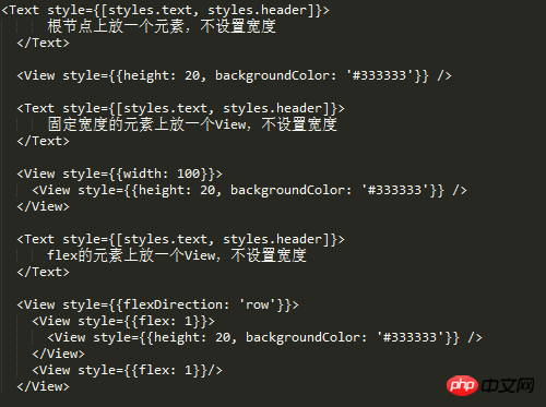
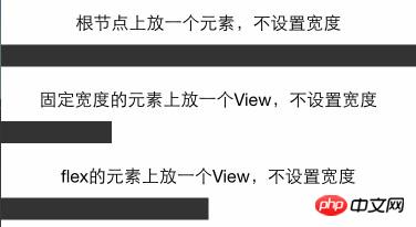
The result can be seen If the width of the flex element is not set, it will occupy 100% of the parent container.
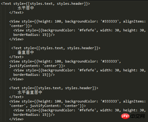
Horizontal and vertical centering
What is often done in css is to center a text or image horizontally and vertically. If you have used css Of course flexbox knows how to use alignItems and justifyContent. Let’s do some experiments with react-native
Grid Layout
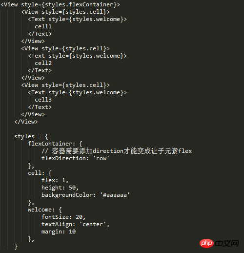
Grid layout experiment, grid layout can meet most daily development needs, so as long as the spec of grid layout is met, react's flex can be proved The layout can meet normal development needs
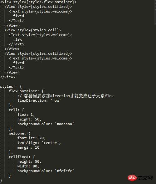
Equally divided grid


The left side is fixed, the right side is fixed, and the middle flex layout

Nested grid
Usually the grid is not one layer, and the layout containers are layered within one layer, so the grid layout under the real world must be verified
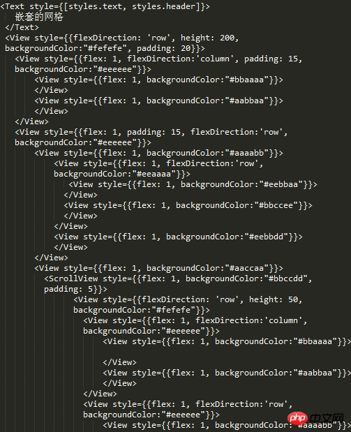
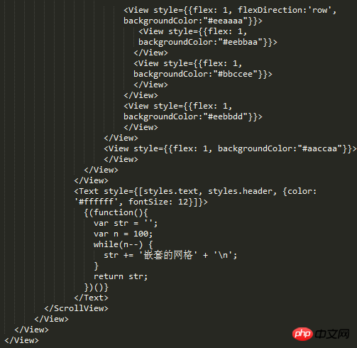

Fortunately, I didn’t mess it up. You can see the nesting relationship in the picture above. As complex as it is (I also added a ScrollView and then nested the entire structure) there is no problem with nesting multi-layer layouts.
Image layout
First we need to know that the image has a stretchMode. Access it through Image.resizeMode
Find out which modes are available

Try using these modes


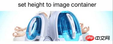
100px height, you can see that the picture adapts to 100 height and full screen width, and the background is centered to adapt to the unstretched but truncated cover.


contain mode container completely accommodates the image, and the image adapts to the width and height


cover mode is the same as 100px height mode


Absolute positioning and relative positioning
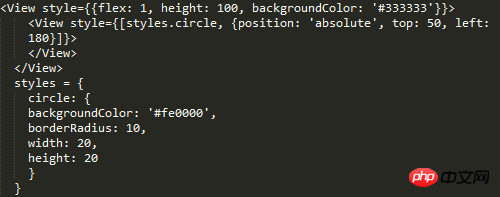
 ##The difference from the CSS standard is that the element The container does not need to set position: 'absolute|relative'.

 You can see that it is easy to match the margin with relative positioning. (I was also worried about not being able to match margin, so I tested it:-:)
padding and marginWe know how to distinguish inline in css Elements and block elements, since react-native implements a super small css subset. Then let's experiment with the use of padding and margin on inline and non-inline elements.
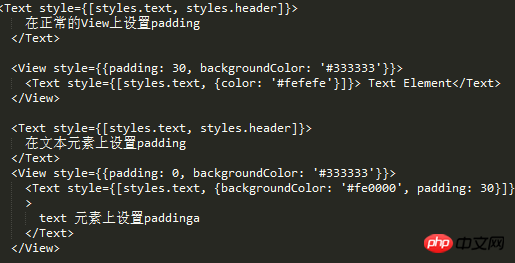
padding Setting the padding on the View went smoothly without any problems.
But if padding is set on the inline element, the above error will appear.
paddingTop and paddingBottom are squeezed into marginBottom. Logically speaking, Text should not be padded.
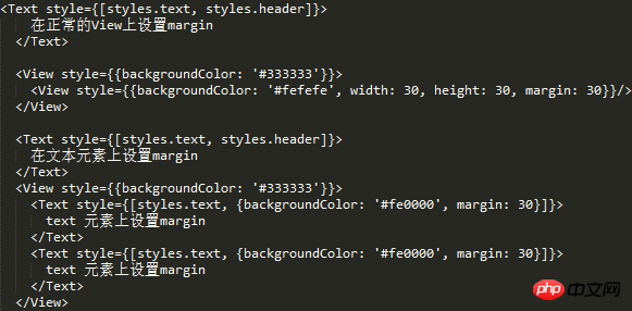
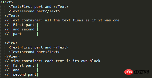
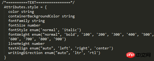
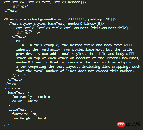
But such a problem does exist, so you can mark this problem. margin Text element First check what text is supported style attribute ##Experiment 1, 2, 3 ##From the results, 1, 2, and 3 are verified. But I don’t know if you have found the problem, why is there so much space at the bottom and no height setting. I removed the line of code numberOfLines={5}, and the effect is as follows: So in fact, that space is opened by text, but the text is occupied by numberOfLines={5} It has been intercepted, but the remaining space is still there. I guess this is a bug. Behind the scenes, this is going to be converted to a flat Okay, then for numberOfLines={5} put it in the child Text element That kind of bug can be explained. In fact, there is no such thing as style inheritance in React-native, but for the Text inside the Text element Element, as can be seen from the above example, there is inheritance. Since there is inheritance, the problem arises! The result shows that it directly inherits the father Text. Summary #react width is based on pt units, you can use Dimensions to get the width and height, and PixelRatio to get the density. If you want to use percentages, you can calculate it manually by getting the screen width. flex-based layout view default width is 100% horizontal Use alignItems for centering and justifyContent for vertical centering Based on flex, the existing grid system requirements can be realized, and the grid can be nested in various ways without bugs Image layout Use Image.resizeMode to adapt the image layout, including contain, cover, stretch The default mode is not set to be equal to the cover mode contain mode adapts to the width and height, and the height value can be given cover covers the container , but it will intercept stretch to fill the container, stretch positioning Positioning is relative to the parent element. The parent element does not need to set position. There will be a bug when padding is set on the Text element. All padding becomes marginBottom Text element The text must be placed inside the Text element Text elements can be nested into each other, and there is a style inheritance relationship numberOfLines needs to be placed on the outermost Text element, and although the text is intercepted, it is still Will take up space




The above is the detailed content of Detailed explanation of examples of RN layout. For more information, please follow other related articles on the PHP Chinese website!
Related articles
See more- An in-depth analysis of the Bootstrap list group component
- Detailed explanation of JavaScript function currying
- Complete example of JS password generation and strength detection (with demo source code download)
- Angularjs integrates WeChat UI (weui)
- How to quickly switch between Traditional Chinese and Simplified Chinese with JavaScript and the trick for websites to support switching between Simplified and Traditional Chinese_javascript skills


