Home >Web Front-end >CSS Tutorial >Tips related to text modification in CSS
Tips related to text modification in CSS
- 零下一度Original
- 2017-06-29 15:55:261629browse
This article mainly introduces you to some related techniques of text modification. Here we mainly start with the two properties text-decoration and text-shadow. The article introduces them in detail through sample code. Friends who need it can take a look below.
This article mainly introduces relevant information about CSS text modification. It is shared for everyone’s reference and study. Let’s take a look at the detailed introduction:
1. text -decoration
I believe everyone is familiar with the text-decoration attribute. When resetting the default style of the a tag, we often write like this: text-decoration: none; It may be true Very few people know about it. In fact, text-decoration is a composite attribute consisting of line, style and color.
So we can achieve this effect:

Underline yellow dotted line
Unfortunately, line only has underline (underline) and overline (overline) and line-through (strikethrough). What if you suddenly need to underline a tilde? Don't worry, the magic of CSS will do it for you. First, you need to know how to use gradients. Let’s start with the renderings:

Gradient to realize text wavy lines
Let’s talk about the idea here. We first need to use two gradients to construct a basic element: 'X' (I won't show the picture here), the next step is more important, we need to intercept the upper part of 'X', get a 'V', and combine it with repeat to form a wavy line. Below is a mixin written in scss for future use.
    @mixin waveline($color,$h) {
        position: relative;
        &::after {
            content: '';
            display: block;
            position: absolute;
            top: 100%;
            left: 0;
            width: 100%;
            height: $h;
            background: linear-gradient(135deg, transparent, transparent 45%, $color, transparent 55%, transparent 100%),
                        linear-gradient(45deg, transparent, transparent 45%, $color, transparent 55%, transparent 100%);
            background-size: $h * 2 $h * 2;
        }
    }
2. text-shadow
For text-shadow and box-shadow, they are almost the same. It also supports comma syntax, so it can generate multiple shadows. Here we will introduce a few simple applications:
1. 3D effect of text
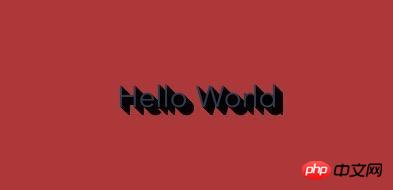
This kind 3D is also a technique of using multiple shadows. The following renderings:

text-shadow achieves 3D effect
    @mixin threeDText($color) {
        text-shadow: 1px 1px $color, 2px 2px $color,
                     3px 3px $color, 4px 4px $color,
                     5px 5px $color, 6px 6px $color,
                     7px 7px $color, 8px 8px $color;
    }
Here Several colors need to be adjusted properly to achieve better results.
2. Text stroke effect
The following rendering:

text-shadow achieves text stroke effect
    @mixin strokeText($w, $color) {
        text-shadow: $w 0 0 $color,
                     -$w 0 0 $color,
                     0 $w 0 $color,
                     0 -$w 0 $color;
    }
In fact, the effect here is not particularly good, but it can make us marvel at the small attributes and big usage.
The above is the detailed content of Tips related to text modification in CSS. For more information, please follow other related articles on the PHP Chinese website!

