Home >Web Front-end >CSS Tutorial >css3 animation property Transform example tutorial
css3 animation property Transform example tutorial
- 零下一度Original
- 2017-06-16 17:34:181959browse
Whether you are a front-end or a designer, I believe you are already comfortable operating in the two-dimensional space of web pages, and you are already familiar with JS processing timeline animation. Starting today, I will share with you some "new" things, the third dimension of web pages, and animations implemented in pure CSS. Due to space limitations, it will take about three or four rounds to talk about 3D animation from basic to more complex. Let’s start with the most basic things. Since most of this knowledge is what I personally understand based on documents, it is mainly used as notes. Therefore, it may be different from what many students understand, or even contradict it. I hope everyone can point out the wrong points below the article, and we can learn together.
We have already had preliminary contact with the Z axis when we used absolute positioning. At that time, it was just a simple layering. Now we introduce a more powerful attribute: Transform.
It can be seen from the literal meaning that Transform means transformation. Its values mainly include rotation rotate, distortion skew, scaling scale, moving translate and matrix deformation matrix.
This time I mainly use rotate to write examples, because it can better match the 3D part later. You only need to replace the other parameters one by one to understand their usage.
There are three methods of rotate in 3D Transform, rotateX(angle) X-axis rotation, rotateY(angle) Y-axis rotation, rotateZ(angle) Z-axis rotation.
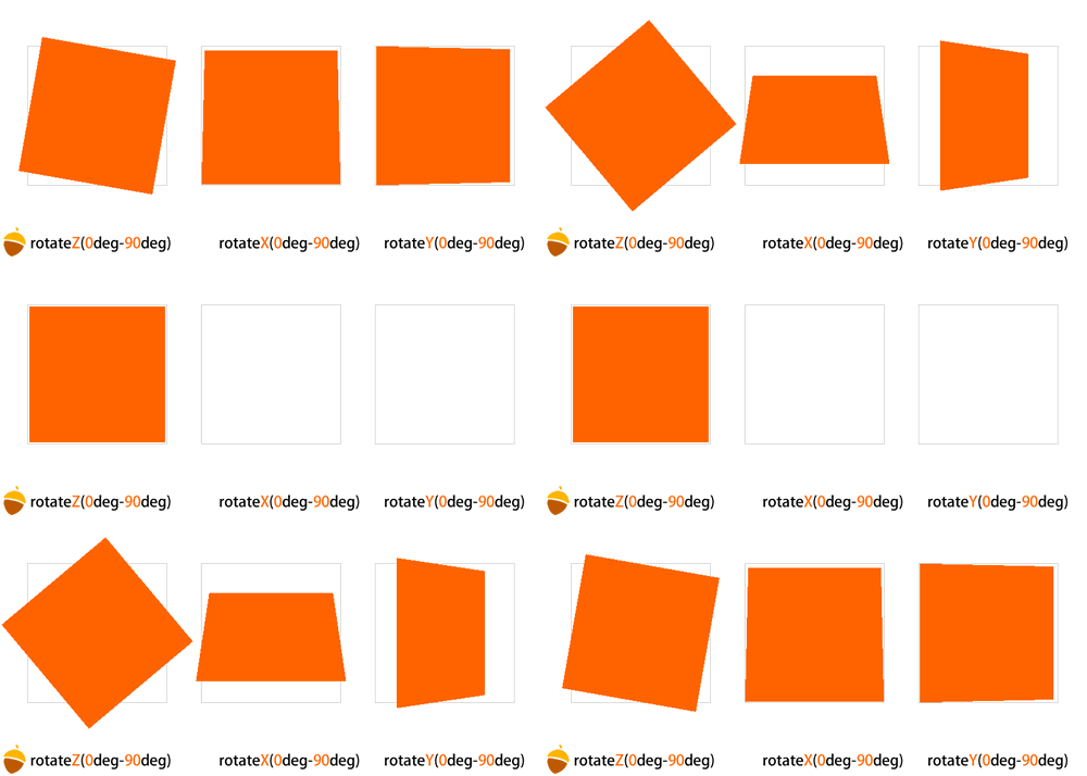
XYZ indicates which axis a plane is used as the coordinate to rotate, and the value inside is its angle. To make it more vivid, please look at this picture
transform: perspective(800);
or use the perspective attribute directly:
perspective: 800;
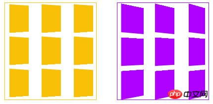
Perspective can be written on the canvas (parent element) or directly on the element itself. When a canvas has only one variant, there is almost no difference. But when there are multiple variants on a canvas, the difference between the two writing methods is immediately apparent. Just like this picture, in the yellow part, perspective is written directly on the color block, and in the purple part, perspective is written on the parent container, using the canvas as the perspective element, so the shapes of the child elements are different.

#The value of perspective determines the intensity of the 3D deformation effect. This value can be roughly understood as distance. Just the bigger it is, the further away you are from the object. Just like a cube (such as a Rubik's Cube) that is far away from you is rotating, its visual effect will be relatively weak, but if the Rubik's Cube is rotating in front of your eyes, the effect will be stronger.
Here we will use a new Transform parameter, translateZ.
rotateZ has already allowed us to find the Z axis, and translateZ can be used to process the coordinates of the Z axis. Let the elements appear near or far before your eyes. Its value is based on the perspective value of the parent element.
For example, if the perspective value of the parent element is 800, then the smaller the value of translateZ of the child element, the farther away the child element is from us, and the smaller it will look. When the translateZ of the child element is close to 800 but less than 800, such as 790+, then the element will fill the entire screen (note that it will exceed the browser), because this time it means that the element has arrived in front of you, and there is a small leaf in front of you. It can also cover everything behind it. When the number of child elements exceeds 800, it means that the element has reached behind our eyes. We cannot see what is behind the back of our heads, and the element will disappear.
(Just a quick mention here, in the three plane rotation pictures above, you can see that when the Y or Y axis rotates to 90 degrees, the graphics disappear. This is because 90 degrees When the angle is parallel to our line of sight, the plane has no thickness, so it will disappear again. This is called a visual blind spot)
Simply mentioned. After perspective, let’s look at the attribute perspective-origin, the perspective origin.
This attribute is easy to understand, it is the position of the perspective point. If you can use flash, then perspective-origin is equivalent to the alignment point in flash. When you animate, the element will surround This alignment point is used to rotate or something. The default perspective-origin in CSS3 is the center of the element.
When you have perspective and transformation, it’s time to use the transform-style attribute. It has two parameters, flat and preserve-3d. flat is the default value, indicating a plane; the latter, preserve-3d, indicates a 3D perspective.
You can simply understand that this is a method to open the 3D space:
transform-style: preserve-3d;
is just a switch, this attribute will not cause any impact on our picture Impact, unless you use flat.
3D世界里还有一个原理就是,你无法穿过一个物体看到他后面的物体,除非这个物体是透明的,这里我们就用到一个属性,backface-visibility,当他的值为hidden的时候,就是正常的3D世界,当不写这个属性的时候…….我建议大家试试。
现在简单的几何原理都有了,我们可以让平面变3D的过程动态的演示出来了,就是css3的 Animation !
在了解Animation之前,我们必须了解另一个特殊的东西,Keyframes。
这里用过flash的同学一看就能明白,就是关键帧,每一个关键帧代表动画的一个过程节点,Keyframes具有其自己的语法规则,他的命名是 由”@keyframes”开头,后面紧接着是这个“动画的名称”加上一对花括号“{}”,括号中就是一些不同时间段样式规则,有点像我们css的样式写 法一样。例如:
@-moz-keyframes name{     0% {       -moz-transform:rotateY(0deg) rotateX(0deg) rotateZ(0deg) translateZ(0px);
     }     25% {       -moz-transform:rotateY(90deg) rotateX(0deg) rotateZ(0deg) translateZ(0px);
     }     50% {       -moz-transform:rotateY(180deg) rotateX(0deg) rotateZ(0deg) translateZ(0px);
     }     75% {       -moz-transform:rotateY(90deg) rotateX(0deg) rotateZ(0deg) translateZ(0px);
     }     100% {       -moz-transform:rotateY(0eg) rotateX(0deg) rotateZ(0deg) translateZ(0px);
     }
  }
这里,name是动画的名称,百分比里边只要写你要实现的动画就行,可以写位移啊,色值变化啊,透明度变化啊等等。
然后我们再看一下Animation的几个常用属性:
animation-name:'name';/*动画属性名,也就是我们前面keyframes定义的动画名*/animation-duration: 2s;/*动画持续时间*/animation-timing-function: linear;/*动画频率,有匀速,先快后慢    linear:动画以匀速运动
ease:默认值,开始慢,中间快,结束慢,不对称
ease-in:开始慢,后面快
ease-out:开始快,后面慢
ease-in-out:开始慢,中间快,结束慢,对称(注意与ease的区别)
cubic-bezier(n,n,n,n):可以使用cubic-bezier自定义速度,n的取值从0到1*/animation-delay: 2s;/*动画延迟时间*/animation-iteration-count: 1;/*定义循环资料,infinite为无限次*/animation-direction: alternate;/*定义动画方式, normal 动画仅正向播放。 alternate 动画正向播放奇数次迭代,并反向播放偶数次迭代。在反向播放周期中,与 animation-timing-function 关联的值也会反转。*/
这些属性,看字面就能理解了,就不详细解释,用在例子里是最形象的。这里先写一个简单平面旋转的例子,就本例子而言,webkit核心的浏览器处理变型跟动画明显是最好的,而moz下会有明显的锯齿出现。


  <!DOCTYPE html PUBLIC "-//W3C//DTD XHTML 1.0 Transitional//EN" "www.w3.org/TR/xhtml1/DTD/xhtml1-transitional.dtd">
<html xmlns="http://www.w3.org/1999/xhtml">
<head>
<meta http-equiv="Content-Type" content="text/html; charset=utf-8" />
<title>无标题文档</title>
<style>
*{margin:0;
padding:0;}
.wrapper1{
    width:150px;
    height:191px;
    border:#eee 1px solid;
    border-radius:10px;
    padding:2px;    float:left;
    margin:200px 0 0 50px;    -moz-perspective:800px;      -moz-transform-style:preserve-3d;      -webkit-perspective:800px;      -webkit-transform-style:preserve-3d;      -moz-backface-visibility:;    -webkit-backface-visibility:hidden;
}
.box1{
    width:150px;
    height:191px;
    background:url(http://www.internetke.com/uploads/imgbg/other/rut.jpg);
    border-radius:10px;    -webkit-animation-name:wobble;  -webkit-animation-duration: 5s;  -webkit-animation-timing-function: linear;  -webkit-animation-delay: 0;  -webkit-animation-iteration-count: infinite;  -webkit-animation-direction: ;  -moz-animation-name:wobble;  -moz-animation-duration: 5s;  -moz-animation-timing-function: linear;  -moz-animation-delay: 0;  -moz-animation-iteration-count: infinite;  -moz-animation-direction: ;
}
@-webkit-keyframes wobble{     0% {          -webkit-transform:rotateY(0deg) rotateX(0deg) rotateZ(0deg) translateZ(0px);
     }     25% {          -webkit-transform:rotateY(90deg) rotateX(0deg) rotateZ(0deg) translateZ(0px);
     }     50% {          -webkit-transform:rotateY(180deg) rotateX(0deg) rotateZ(0deg) translateZ(0px);
     }     75% {          -webkit-transform:rotateY(90deg) rotateX(0deg) rotateZ(0deg) translateZ(0px);
     }     100% {          -webkit-transform:rotateY(0deg) rotateX(0deg) rotateZ(0deg) translateZ(0px);
     }
  }
@-moz-keyframes wobble{     0% {           -moz-transform:rotateY(0deg) rotateX(0deg) rotateZ(0deg) translateZ(0px);
     }     25% {           -moz-transform:rotateY(90deg) rotateX(0deg) rotateZ(0deg) translateZ(0px);
     }     50% {           -moz-transform:rotateY(180deg) rotateX(0deg) rotateZ(0deg) translateZ(0px);
     }     75% {           -moz-transform:rotateY(90deg) rotateX(0deg) rotateZ(0deg) translateZ(0px);
     }     100% {           -moz-transform:rotateY(0eg) rotateX(0deg) rotateZ(0deg) translateZ(0px);
     }
  }</style>
</head>
<body>
<p class="wrapper1">
    <p class="box1"></p>
</p>
</body>
</html>
View Code
题外话:希望大家不要因为IE9以下版本的不兼容就延迟学习新的东西,那就会处处比别人慢一步。另外,从Safari开始,浏览器已经可以由3D函数触发硬件加速。
The above is the detailed content of css3 animation property Transform example tutorial. For more information, please follow other related articles on the PHP Chinese website!

