Home >Web Front-end >CSS Tutorial >CSS drop-down box effects_HTML5 China
CSS drop-down box effects_HTML5 China
- 巴扎黑Original
- 2017-05-27 10:42:142672browse

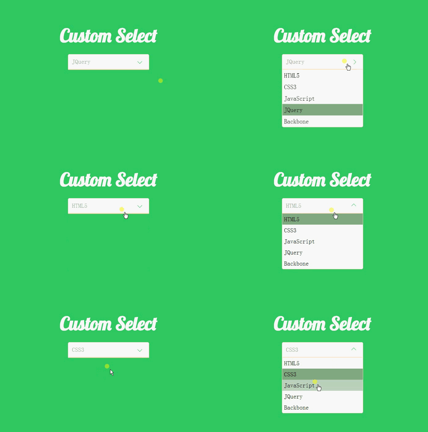
It is quite troublesome to create such an effect, but the code is not difficult to understand. First, let's take a look at the Html code.
<p class="container">
    <p class="heading">
        <h2>Custom Select</h2>
    </p>

    <p class="select">
        <p>Please select</p>
        <ul>
            <li data-value="HTML5">HTML5</li>
            <li data-value="CSS3">CSS3</li>
            <li data-value="JavaScript">JavaScript</li>
            <li data-value="JQuery">JQuery</li>
            <li data-value="Backbone">Backbone</li>
        </ul>
    </p>
</p>
It can be seen that we do not use the native select element, but use other elements to simulate this effect. We specified data-value for the li element, mainly because we will use JQuery to get the selected value and place it under the p element.
Let’s look at the CSS code step by step.
   * {
        margin: 0;
        padding: 0;
    }

    html {
        font-family: 'Terminal';
        font-size: 62.5%;
    }

    body {
        background-color: #33CC66;
    }
Set the margins and padding of all elements in the web page to 0.
Set the default font in the web page to Terminal and the font size to 62.5%, which is 10px.
Set the background color to #33CC66.
<link href='http://fonts.googleapis.com/css?family=Lobster|Terminal+Dosis' rel='stylesheet' type='text/css'>
We used the Terminal font above, and we will also use the Lobster font next, so use this line of code to add a reference.
   .heading, .select {
        display: block;
        width: 22rem;
        margin: 0 auto;
        text-align: center;
    }

    .heading {
        width: 28rem;
        margin-top: 10rem;
        margin-bottom: 2rem;
    }

    .heading h2 {
        font-size: 6rem;
        font-family: 'Lobster';
        color: #ffffff;
    }
Specify the headng, select width and specify its horizontal centering.
Modify the width of heading, mainly to make its width larger than the width of select and look more beautiful. Then specify its top and bottom margins.
Set the font, font size, and color of the h2 element under heading.
.select > p, .select ul {
        background-color: #ffffff;
        font-size: 2rem;
        border: 1px solid bisque;
        border-radius: 5px;
        margin-bottom: 0;
    }

.select > p {
        text-align: left;
        padding: 1rem;
        position: relative;
        border-bottom-right-radius: 0;
        border-bottom-left-radius: 0;
        cursor: pointer;
        color: rgba(102, 102, 102, .6);
    }
.select > p:after {
        display: block;
        width: 10px;
        height: 10px;
        content: '';
        position: absolute;
        top: 1.4rem;
        right: 2rem;
        border-bottom: 1px solid #33CC66;
        border-left: 1px solid #33CC66;
        transform: rotate(-45deg);
        transition: transform .3s ease-out, top .2s ease-out;
    }
Set the background color and border of p and ul elements.
Specify the style separately for the p element and set its position attribute, mainly to draw the drop-down button on the right below.
Use :after to draw the drop-down button on the right side of the p element. It can be seen that we use the lower left border and then rotate -45 degrees to simulate this effect. It is worth noting that we need to Set the display to block, and set the width and height, otherwise you will not see this effect.
.select ul {
        margin-top: 0;
        border-top-left-radius: 0;
        border-top-right-radius: 0;
        list-style-type: none;
        cursor: pointer;
        overflow-y: auto;
        max-height: 0;
        transition: max-height .3s ease-out;
    }

    .select ul li {
        padding-left: 0.5rem;
        display: block;
        line-height: 3rem;
        text-align: left;
    }
Set some default attributes of ul, set the maximum width to 0, and specify overflow-y as auto. At this time ul will be hidden.
I encountered a problem when setting here, that is, the li tag always occupies a line that is not full of ul. That is because it has margin and padding by default. , so the margins and padding of all elements in the web page are set to 0 at the beginning.
    .select.open ul {
        max-height: 20rem;
        transform-origin: 50% 0;
        -webkit-animation: slide-down .5s ease-in;
    }

    .select.open > p:after {
        position: absolute;
        top: 1.6rem;
        transform: rotate(-225deg);
        transition: transform .3s ease-in, top .2s ease-in;
    }
Set the maximum height for open and assign animation effects to it.
Rotate the drop-down button -225 degrees and animate it.
Let’s take a look at the slide-down animation effect specified for the ul element, which is also the key to this drop-down effect.
   @-webkit-keyframes slide-down {
        0% {
            transform: scale(1, 0);
        }
        25% {
            transform: scale(1, 1.25);
        }
        50% {
            transform: scale(1, 0.75);
        }
        75% {
            transform: scale(1, 1.1);
        }
        100% {
            transform: scale(1, 1);
        }
    }
When you see the above code, you may understand that it is to constantly change the size of ul and let it scale between 0.75-1.25, so there will be that jumping effect. .
There are some simple CSS codes below, which I won’t explain anymore.
   .select ul li:hover {
        background-color: rgba(102, 153, 102, 0.4);
    }

    .select .selected {
        background-color: rgba(102, 153, 102, 0.8);
    }
Now that we’ve finished talking about CSS, let’s take a look at how we use JQuery to control this effect.
We do not need to download JQuery to use it, because many websites now provide CDN services, such as the BootCDN I use.
<script src="http://cdn.bootcss.com/jquery/3.1.1/jquery.min.js"></script>
Now you can use JQuery.
<script>
$(document).ready(function () {
$('.select ul li').on("click", function (e) {
var _this = $(this);
$('.select >p').text(_this.attr('data-value'));
$(_this).addClass('selected').siblings().removeClass('selected');
$('.select').toggleClass('open');
cancelBubble(e);
});
$('.select>p').on("click", function (e) {
$('.select').toggleClass('open');
cancelBubble(e);
});
$(document).on('click', function () {
$('.select').removeClass('open');
})
})
function cancelBubble(event) {
if (event.stopPropagation) {
event.preventDefault();
event.stopPropagation();
} else {
event.returnValue = false;
event.cancelBubble();
}
}
</script>First, bind the click event to the p tag. When triggered, add or remove open class for select, that is, display ul.
Bind the click event for li. When an li element is selected, first obtain the data-value, then assign it to the p tag, and then Add to the selected li selected class, at the same time, use the siblings() method to remove the selected class of the sibling node.
Set the click event for document. When we click anywhere on the web page, if ul is open, close it. However, at this time, since all elements are document, so we need to prevent the event from bubbling and call the cancelBubble() method we wrote ourselves.
The above is the detailed content of CSS drop-down box effects_HTML5 China. For more information, please follow other related articles on the PHP Chinese website!

