

Example of using CSS code to achieve 360-degree rotation of a cube
This article introduces you to the method of using CSS to achieve the 360-degree rotation effect of a cube through example code. The effect after implementation is very cool, and the implemented code is very simple, which is very helpful for everyone's understanding and learning. Friends who need it can come and take a look below.
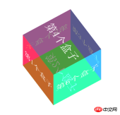
The static rendering is as follows:

##Sample code:
<!DOCTYPE html>
<html>
<head lang="en">
    <meta charset="UTF-8">
    <title></title>
    <style>
        * { margin: 0; padding: 0}
        ul {list-style: none;}
        ul {
            width: 200px;
            height: 200px;
            margin: 200px auto;
            position: relative;
            transition: all 6s;
            /*6秒时间转变*/
            transform-style: preserve-3d;
            /*放在父盒子内*/
        }
        ul li {
            width: 100%;
            height: 100%;
            position: absolute;
            text-align: center;
            line-height: 200px;
            font-size: 40px;
            color: #fff;
        }
        li:nth-child(1){
            transform: rotateX(0deg) translateZ(100px);
            /*translateZ是为了让立方体出现形状*/
            background-color: rgba(255, 0, 0, 0.6);
        }
        li:nth-child(2){
            transform: rotateX(-90deg) translateZ(100px);
            background-color: rgba( 0, 255,0, 0.6);
        }
        li:nth-child(3){
            transform: rotateX(-180deg) translateZ(100px);
            background-color: rgba(0,0,255,0.5);
        }
        li:nth-child(4){
            transform: rotateX(-270deg) translateZ(100px);
            background-color: rgba(50,50,25,0.5);
        }
        li:nth-child(5){
            transform: rotateY(-90deg) translateZ(100px);
            background-color: rgba(255,0,255,0.5);
        }
        li:nth-child(6){
            transform: rotateY(90deg) translateZ(100px);
            background-color: rgba(0,255,255,0.5);
        }
        ul:hover{
            transform :rotateX(360deg) rotateY(360deg);
        }
    </style>
</head>
<body>
<ul>
    <li>第1个盒子</li>
    <li>第2个盒子</li>
    <li>第3个盒子</li>
    <li>第4个盒子</li>
    <li>第5个盒子</li>
    <li>第6个盒子</li>
</ul>
</body>
</html>
The above is the detailed content of Example of using CSS code to achieve 360-degree rotation of a cube. For more information, please follow other related articles on the PHP Chinese website!

 The Lost CSS Tricks of Cohost.orgApr 25, 2025 am 09:51 AM
In this post, Blackle Mori shows you a few of the hacks found while trying to push the limits of Cohost’s HTML support. Use these if you dare, lest you too get labelled a CSS criminal.
 Next Level CSS Styling for CursorsApr 23, 2025 am 11:04 AM
Custom cursors with CSS are great, but we can take things to the next level with JavaScript. Using JavaScript, we can transition between cursor states, place dynamic text within the cursor, apply complex animations, and apply filters.
 Worlds Collide: Keyframe Collision Detection Using Style QueriesApr 23, 2025 am 10:42 AM
Interactive CSS animations with elements ricocheting off each other seem more plausible in 2025. While it’s unnecessary to implement Pong in CSS, the increasing flexibility and power of CSS reinforce Lee's suspicion that one day it will be a
 Using CSS backdrop-filter for UI EffectsApr 23, 2025 am 10:20 AM
Tips and tricks on utilizing the CSS backdrop-filter property to style user interfaces. You’ll learn how to layer backdrop filters among multiple elements, and integrate them with other CSS graphical effects to create elaborate designs.
 SMIL on?Apr 23, 2025 am 09:57 AM
Well, it turns out that SVG's built-in animation features were never deprecated as planned. Sure, CSS and JavaScript are more than capable of carrying the load, but it's good to know that SMIL is not dead in the water as previously
 'Pretty' is in the eye of the beholderApr 23, 2025 am 09:40 AM
Yay, let's jump for text-wrap: pretty landing in Safari Technology Preview! But beware that it's different from how it works in Chromium browsers.
 CSS-Tricks Chronicles XLIIIApr 23, 2025 am 09:35 AM
This CSS-Tricks update highlights significant progress in the Almanac, recent podcast appearances, a new CSS counters guide, and the addition of several new authors contributing valuable content.
 Tailwind's @apply Feature is Better Than it SoundsApr 23, 2025 am 09:23 AM
Most of the time, people showcase Tailwind's @apply feature with one of Tailwind's single-property utilities (which changes a single CSS declaration). When showcased this way, @apply doesn't sound promising at all. So obvio


Hot AI Tools

Undresser.AI Undress
AI-powered app for creating realistic nude photos

AI Clothes Remover
Online AI tool for removing clothes from photos.

Undress AI Tool
Undress images for free

Clothoff.io
AI clothes remover

Video Face Swap
Swap faces in any video effortlessly with our completely free AI face swap tool!

Hot Article
Hot Tools

Dreamweaver CS6
Visual web development tools

SublimeText3 English version
Recommended: Win version, supports code prompts!

mPDF
mPDF is a PHP library that can generate PDF files from UTF-8 encoded HTML. The original author, Ian Back, wrote mPDF to output PDF files "on the fly" from his website and handle different languages. It is slower than original scripts like HTML2FPDF and produces larger files when using Unicode fonts, but supports CSS styles etc. and has a lot of enhancements. Supports almost all languages, including RTL (Arabic and Hebrew) and CJK (Chinese, Japanese and Korean). Supports nested block-level elements (such as P, DIV),

EditPlus Chinese cracked version
Small size, syntax highlighting, does not support code prompt function

SAP NetWeaver Server Adapter for Eclipse
Integrate Eclipse with SAP NetWeaver application server.

