
Home >Web Front-end >CSS Tutorial >Detailed analysis of new features in CSS3
Detailed analysis of new features in CSS3

- Y2JOriginal
- 2017-05-20 11:50:521768browse
Note: Since CSS3 has many new features, it will be explained in two blog posts. The first article mainly includes new selectors, text and block shadows, multiple background images, color gradients, rounded corners, etc. The second article mainly details the various animation effects of CSS3, such as: rotation, movement, scaling, etc., and also includes the application of icon fonts.
CSS3Attribute Selector:
a[href $='.pdf'] means that the href attribute ending with .pdf is selected
a[href^='mailto'] means that the href attribute starting with mailto is selected
a[href*='item'] means that all items containing item in the href attribute are selected
where a only refers to the element tag
There are three ps, and the values of their attribute names are different:
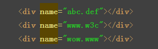
The style is as follows:

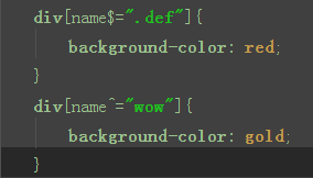
Join Selector:
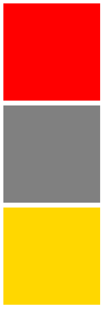
Effect:
Add another attribute selector:

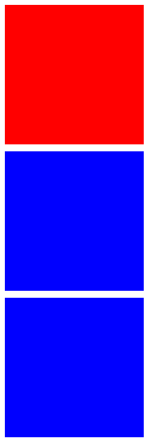
Effect:
I believe everyone is already familiar with the use of the selector, so it is relatively simple so I won’t go into details here. This kind of attribute selector is mostly used in the href attribute. It makes corresponding selections by loading different suffixes of the file name, such as: .jpg .png .gif, etc. .
CSS3 pseudoClass selector:
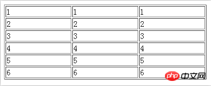
Existing one Table is as follows:
pseudo-classSelector:
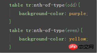
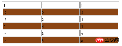
:nth-of-typeYou can select odd or even rows of the table through parameters, odd represents odd-numbered lines, even represents even-numbered lines.
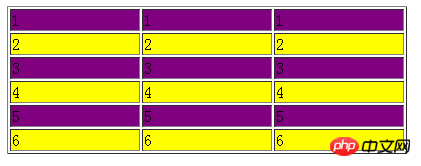
Effect:
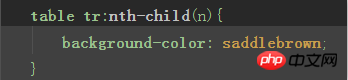
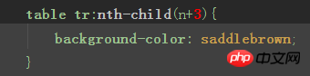
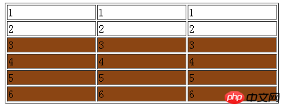
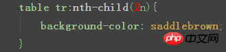
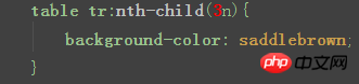
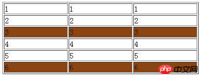
:nth-child Pseudo class, also used to select rows. When the parameter is n, all rows are selected. When the parameter is n+i, it means that all the following rows starting from the i line are selected, 2n means that rows that are multiples of 2 are selected, that is, even-numbered rows. 3n means that rows that are multiples of 3 are selected.
Effect: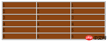
n+i:
2n:
##3n:
There is also a :nth-last-child() pseudo-class, the usage is basically the same as nth-child The same, except that all the rules are numbered from bottom to top, which is equivalent to turning the table upside down. There is no need to say more here, interested readers can try it themselves.
Multiple background images:
##backgroud-image## in CSS3 #You can set multiple background images, and you can also set the position of each background image.
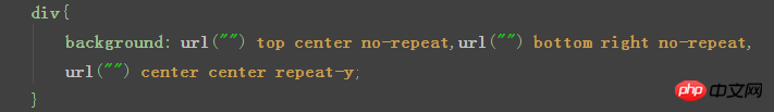 Each background image has four parameters, 1.url
top center bottom, you can also use percentage 3. Left and right position, including left center right, you can also use percentage 4. Repeat method, including no-repeat repeat-y repeat-x
. It's easy to understand, that is, no tiles, vertical tiles, and horizontal tiles.(I’m being lazy and didn’t take any screenshots here. Readers can try their favorite pictures
)---------- -------------------------------------------------- ----------------I am the dividing line-------------------------------- ------------------------------------
from here You should pay attention at the beginning. Since browsers with different cores have different support for CSS3, all subsequent features must be prefixed.
In the example below, the blogger did not add the prefix or only added the -webkit- prefix to save time.
The specific writing method is as follows:
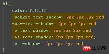 ##-webkit-:
The core browser is Google’s Chrome browser; -moz-:
GeckoCore browser; -o-:
Operabrowser; -ms-: Microsoft The
IEbrowser. Although a simple style needs to be written five times, it is the responsibility of the front-end engineer to ensure the compatibility of the web page. Each of the following features should be written according to the example when actually writing a web page, including the animation feature in the second blog post.
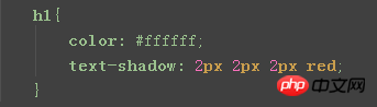
Text shadow:
Write a h1 tag here first, the content This is a sentence that my teacher likes to use, please don’t complain...
Writing:
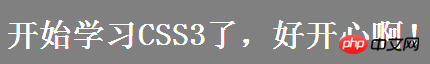
 Effect:
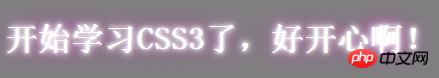
Setting a larger offset can produce the effect of floating and shadowing: 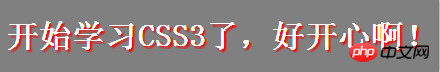
Is it like there is Light it down?
Set multiple shadows, separated by commas. The blur radius gradually increases, creating a glow effect.
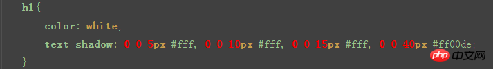
The feeling of a light box
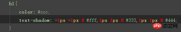
Set multiple shadows with different offset directions, and set them appropriately The color creates an embossed effect.

Block Shadow:
##Block shadows can be applied to many block-level elements
Now give me apAdd block shadow:
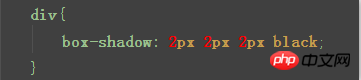 ## Effect :

has 6 parameters. 1. Projection method (optional), do not write the default outer shadow, inset represents the inner shadow 2&3. Indicates the offset, similar to the text shadow 4. Blur radius (optional ) 5. Shadow expansion radius (optional), the larger the value, the greater the shadow range 6. Shadow color Inner shadow effect:
 Existing red Circle:
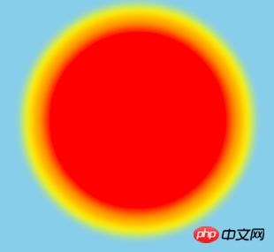
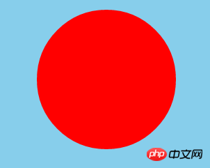 Add multi-level block shadows, and the expansion radius gradually increases:
 The sun comes out
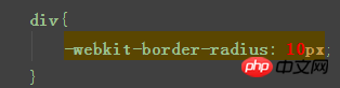
Rounded corners:
The feature of rounded corners is very widely used, and you can also use rounded corners to draw circles.
 ##Effect:
border-radius  The parameters can be 1 to 4:
1 parameter means that the value is applied to all four corners; 2 parameters means that the first value is used for the upper left and lower right, and the first value is used for the upper right. , the second value is used for the lower left;
3 parameters indicate that the first value is used for the upper left, the second value is used for the upper right and lower left, and the third value is used for the lower right;
4 parameters The parameter indicates that the four values are used in the upper left, upper right, lower right, and lower left (counterclockwise).
Generally, 1 and 4 parameters are used more, and the others are a bit painful.Four parameters:
Effect:


Infers the use of rounded corners to draw a circle:
First build a square p block, and make its fillet value greater than or equal to half of its side length. , the sun in the above example was made in this way.
Gradient:
##Gradient is divided into two types: linear gradient and radial gradient
Linear gradient:
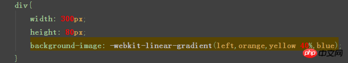
The first parameter of the gradient is the starting position:
left means from left to right top means from top to bottom, and so on . After that, you can set multiple colors, and after the color, you can set the starting position of the gradient (using percentage).
Effect:
 Radial gradient, as the name suggests, is based on the radius of the circle Gradient:
 ##center
Another sun comes out, Note that this is not done with shadows, but with radial gradients. 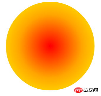
CSS3 free video tutorial
##2. Share a CSS3 animation library
3. CSS3 Learning Animation Detailed Explanation
4. CSS3 Teaching Animation Learning
5. Detailed explanation about the new features of css3
The above is the detailed content of Detailed analysis of new features in CSS3. For more information, please follow other related articles on the PHP Chinese website!
Related articles
See more- How Can I Reliably Hide `` Elements in `` Menus Using CSS?
- How Can Web Developers Overcome Limited Font Options and Add Visual Flair to Websites?
- How Can I Create an Elongated Hexagon Button Using Only One HTML Element and CSS?
- Use CSS3 to write grayscale filters to create black and white photo effects
- What is the text outline effect?