Home >Web Front-end >CSS Tutorial >Two ways to make background images transparent and text opaque using CSS
Two ways to make background images transparent and text opaque using CSS
- 巴扎黑Original
- 2017-05-14 13:34:032331browse
This article mainly introduces two methods of CSS to achieve the effect of transparent background images and opaque text. Friends in need can refer to it
Abstract:
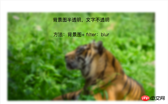
Method 1 (frosted glass effect): background image + pseudo class + flite:blur(3px)
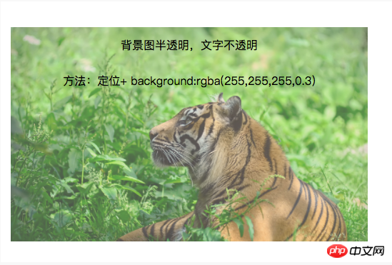
Method 2 (translucent effect): background image + positioning + background:rgba(255,255,255,0.3 )
Two methods to achieve transparent background images and opaque text effects using CSS
In projects, it is often used to put some text introductions on background images. Here are two techniques to achieve transparent background images. , text opacity effect, record it for future study.
1. Frosted glass effect:
Background image + pseudo class + flite:blur(3px)
.demo1{
    width: 500px;
    height: 300px;
    line-height: 50px;
    text-align: center;
}
.demo1:before{
    background: url(http://csssecrets.io/images/tiger.jpg) no-repeat;
    background-size: cover;
    width: 500px;
    height: 300px;
    content: "";
    position: absolute;
    top: 0;
    left: 0;
    z-index: -1;/*-1 可以当背景*/
    -webkit-filter: blur(3px);
    filter: blur(3px);
}
<p class="demo1">背景图半透明,文字不透明<br />方法:背景图+ filter:blur</p>

2. Translucent effect:
Background image + positioning + background :rgba(255,255,255,0.3)
.demo2-bg{
    background: url(http://csssecrets.io/images/tiger.jpg) no-repeat;
    background-size: cover;
    width: 500px;
    height: 300px;
    position: relative;
}
.demo2{
    position: absolute;
    left: 0;
    right: 0;
    top: 0;
    bottom: 0;
    width: 500px;
    height: 300px;
    line-height: 50px;
    text-align: center;
    background:rgba(255,255,255,0.3);
}
<p class="demo2-bg">
    <p class="demo2">背景图半透明,文字不透明<br />方法:定位+ background:rgba(255,255,255,0.3)</p>
</p>
The above is the detailed content of Two ways to make background images transparent and text opaque using CSS. For more information, please follow other related articles on the PHP Chinese website!

