Home >Web Front-end >H5 Tutorial >10 code snippets to create beautiful CSS buttons
10 code snippets to create beautiful CSS buttons
- 巴扎黑Original
- 2017-04-29 13:39:376092browse
If you’re looking for some high-quality examples of CSS buttons, this article is for you. In this article, we’ve collected a collection of 10 unique CSS buttons from CodePen, along with their code snippets so you can apply them to your web projects.
Web designers no longer have to rely on Photoshop to create cool buttons. By using CSS3, you can achieve background gradients, shadows, and glossy/shiny effects.
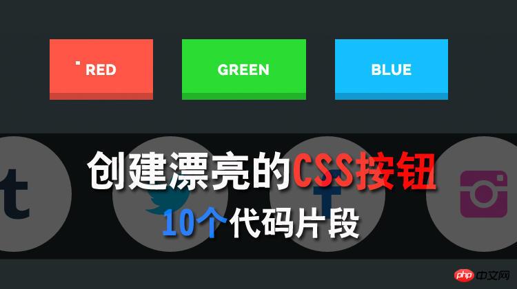
1. Plastic Buttons
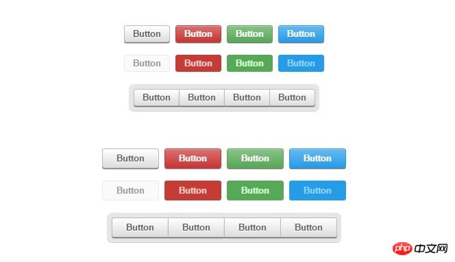
This set of buttons is quite simple and clean. Because they come in different colors, sizes, and styles, and offer small, medium, and large buttons for you to choose from. So, you can easily resize or replace them. And using pure CSS implementation, it may also be one of the most concise and clean button styles on the Internet.
Code address: [Portal]
2. Cool Buttons
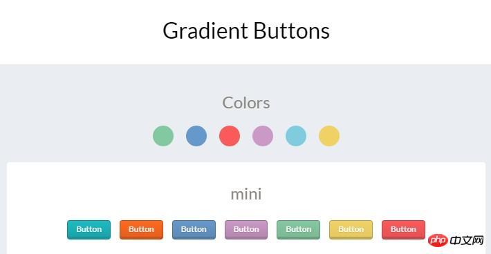
This is a cool set of buttons made by Felipe Marcos. A little different than the plastic buttons above, but they're also easy to use. Although there is no shiny plastic design, you will still feel a "push" effect when you click it.
You can choose from 6 default designed colors, or you can customize your favorite colors, sizes and styles. Because classification is based on CSS class names, you can set the default button style and color on a class.
Code address: [Portal]
3. Google Buttons
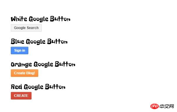
Google's online tools (such as Blogger, Cloud Drive, Gmail and its search function) all have different button styles, and developer Tim Wagner has cloned these styles in this Pen.
The author was inspired by Google's design and used pure CSS3 to implement these cool-looking buttons. Here's another example similar to this, which is an expansion button made by Monkey Raptor, who did some other mixing for these buttons.
Code address: [Portal]
4. Bunch-o-Buttons
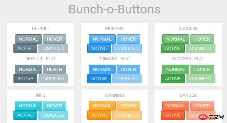
This is a collection of plastic-based buttons created by Alan Collins on CodePen. It comes in many colors and different styles. What’s unique about this button collection design is that it can switch between smooth and flat styles with just a single CSS class. Isn’t it very convenient?
Code address: [Portal]
5. Social Buttons
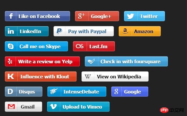
This is a collection of social buttons with unique color schemes and brand icons. Developer Stan Williams also released this collection on GitHub and is updating and maintaining the button colors and styles. It currently consists of 50 different buttons, all of which have a shiny gradient on the background, but they are all of good quality.
If you need to add some social sharing buttons to your website, then this pure CSS button collection is a good choice.
Code address: [Portal]
6. Jelly Animation
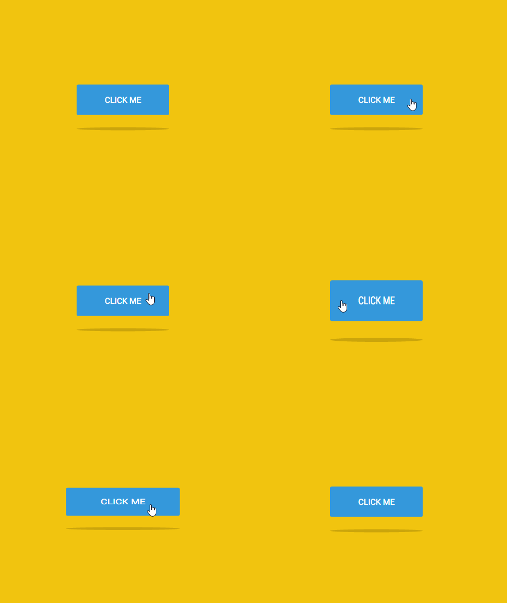
At first glance, you might think this is an ordinary button. But after clicking the button, you will find that this jelly button has a special animation effect bound to the click event.
Besides the interesting animation, what impressed me most was the shadow design under the button. The design of the buttons and shadows that animate together makes it easier for any user who launches a website or social network to have the desire to click.
Code address: [Portal]
7. Parallax Button
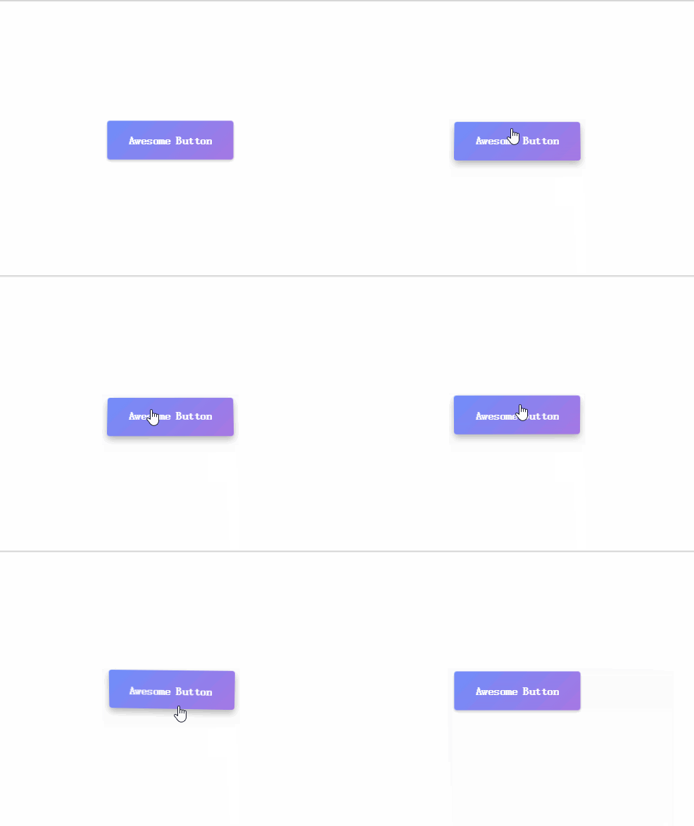
This is a parallax button implemented by Tobias Reich using CSS3 radial gradient. The entire background and shadow of the button was achieved using pure CSS and it really impressed me. However, Tobias also used some JavaScript to achieve visual distortion effects when the button is hovered and clicked.
This button is also one of the most advanced button effects I've seen, and it can fit nicely into any web page.
Code address: [Portal]
8. Hubspot Pills
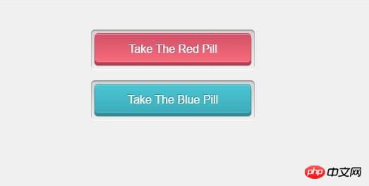
This set of buttons was created by developer Joe Henriod based on Hubspot’s design. Although they function similarly to traditional HTML buttons, they are built from CSS classes that can be applied to any element.
You will find that this set of pill buttons only displays red and blue, but it also supports custom colors. And the gorgeous hover and click effects are enough to attract anyone’s attention.
Code address: [Portal]
9. Sexy SCSS Buttons

Most front-end developers are keen to use Sass/SCSS because they are easier to write and can improve developer productivity.
These buttons implemented by SCSS have inner and outer shadow effects, and the details of the construction are impressive. You can change the color of a single class and even mix your own creativity into it.
When they are integrated into the page, the hover and active states of the buttons also have a 3D sense of sight.
These buttons are also relatively easy to implement on any website, or you can convert the SCSS code to CSS code on CodePen for your use.
Code address: [Portal]
10. Mozilla-Style Buttons
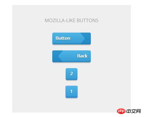
The Mozilla website went through a rebrand, and they ditched the traditional plastic design, but I loved their original design. Fortunately, developer Felix Schwarzer has recreated their design once again with his code.
We can see that the blue triangle, gradient background, and 3D bevel are all created using pure CSS. The design of this set of buttons also shows its grandeur and is easier to attract users' attention.
Code address: [Portal]
Summarize
These 10 unique button sets are developed with pure CSS3, and you can integrate them into projects such as businesses, blogs, social networks or e-commerce stores by changing their size, color and style.
The content compiled in this list is just the tip of the iceberg on CodePen. If you are looking for more resources, you may wish to browse CodePen frequently, maybe you will get more surprises.
Thank you for reading.
English original text: 10 Free Code Snippets for Creating Beautiful CSS Buttons
Translation address: http://www.jianshu.com/p/430817f5adee
The above is the detailed content of 10 code snippets to create beautiful CSS buttons. For more information, please follow other related articles on the PHP Chinese website!
Related articles
See more- AlloyTouch full-screen scrolling plug-in creates a smooth H5 page in 30 seconds
- HTML5 actual combat and analysis of touch events (touchstart, touchmove and touchend)
- Detailed explanation of image drawing examples in HTML5 canvas 9
- Regular expressions and new HTML5 elements
- How to combine NodeJS and HTML5 to drag and drop multiple files to upload to the server

