
Home >Web Front-end >CSS Tutorial >Code sharing for achieving good form validation effects using pure CSS3 (picture)
Code sharing for achieving good form validation effects using pure CSS3 (picture)

- 黄舟Original
- 2017-04-18 09:41:401715browse
This is a series of content that supplements the basic knowledge of HTML5, the others are:
1. HTML5--New structural elements
2. HTML5-- figure, time, details, mark
- ##3. HTML5-- details Learn and use
- 4. HTML5--Changes in existing elements
- 5. HTML5--Web forms Continue to learn about Web forms today Content, but today the focus is on implementation, using HTML5 forms and CSS3-UI to achieve a good form effect. The effect can be seen in the following animation:
- 1. New form types in HTML5: tel, email, url (introduced in the previous article)
- 2. Basic validation of HTML5 forms: required attribute
- 3. Custom validation rules of HTML5 forms: pattern attribute Main introduction content
- 1. Pseudo-classes in CSS3 user interface module
- 2. Custom error message TextSince it is a form , we have to have a basic form HTML structure. The following is the structure I created. All three forms are required fields, and we set a custom validation rule for the tel column: it must be an Code sharing for achieving good form validation effects using pure CSS3 (picture)-digit number.
<form>
 <ol>
   <li>
     <label for="tel">Tel:</label>
     <input type="tel" required name="" pattern="\d{Code sharing for achieving good form validation effects using pure CSS3 (picture)}" id="tel">
   </li>
   <li>
     <label for="url">Website:</label>
     <input type="url" required name="" id="url">
   </li>
   <li>
     <label for="email">Email:</label>
     <input type="email" required name="" id="email">
   </li>
   <li>
     <input type="submit" name="" value="Send the form">
   </li>
 </ol>
</form>
* {
    margin: 0;
    font: 13px tahoma, verdana, sans-serif;
    padding: 0;
}
ol {
    width: 400px;
    margin: 50px;
}
li {
    clear: both;
    list-style-type: none;
    margin: 0 0 10px;
}
li:nth-last-child(1) {
    text-align: center;
}
label {
    display: block;
    float: left;
    margin: 0 10px 0 0;
    padding: 5px;
    text-align: right;
    width: 100px;
}
input {
    border-radius: 5px;
    padding: 5px 5px 5px 30px;
    width: 155px;
}
input:focus {
    outline: none;
}
form verification. There are three situations in the above example:
When we define the form
, we actually already have an effect in mind. The code is a tool to achieve the effect. Let’s see below. How to define: Firstly, the input box is not activated. At this time, the input box status is invalid and required:
input:invalid:required {
    background-image: url('nor.png');
    box-shadow: 0 0 5px #f0bb18;
    border: 2px solid #f0bb18;
}input:focus:invalid {
background-image: url('warn.png');
box-shadow: 0 0 5px #b01212;
border: 2px solid #b01212;
} input:valid {
background-image: url('suc.png');
border: 2px solid #7ab526;
}How about it, it’s not bad.
I won’t introduce all the new CSS options here. More CSS options need to be explored. We only used a few to achieve such a good effect.
The pseudo-classes we use are as follows:
:valid - The form element obtains this class after the content matches the element type and is verified.1. Do not trigger browser validation
If you do not want the browser to validate the form, use the novalidate attribute or formnovalidate attribute to turn off the browser validation.
Among them, novalidate is an attribute of the form. Any error prompts and blank fields will be ignored when submitting the form.
<form novalidate>
    ...
</form><form>
...
<input type="submit" formnovalidate>
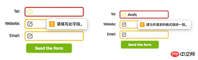
</form> 2、自定义错误提示内容
在上面的例子中可以看到,浏览器会对我们的表单进行验证,在这个过程中会弹出错误消息。而随着输入的不同,这些验证消息也是不一样的。
我们虽然不能更改提示框的样式,但我们可以使用JavaScript的setCustomValidity()函数修改错误文字:
<form>
<input oninput="check()" type="tel" id="tel">
</form>
<script>
function check() {
tel = document.querySelector('#tel');
tel.setCustomValidity('请输入正确的Code sharing for achieving good form validation effects using pure CSS3 (picture)位电话号码');
}
</script>
那么,现在当我们输入的时候,提示内容就变成我们自定义的了:
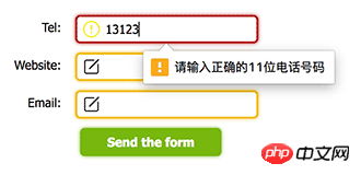
现在还有一个问题,浏览器的提示是不一样的,为空时的提示和错误的提示文案不一样,这样我们应该怎么分开处理呢?
这时候就需要validity来查看当前的验证状态:
tel = document.querySelector('#tel');
console.log( tel.validity )
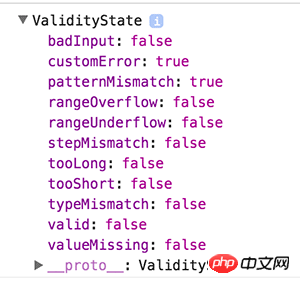
如上图所示,当前验证状态为:customError,就是说用户自定义的验证失败,我们可以根据这些状态来动态的更新提示信息。如果最终验证成功,其中的valid将变为true。
function check( el ) {
    var validity = el.validity;
    if ( validity.valueMissing ) {
        el.setCustomValidity('该字段为必填内容');
    } else if ( validity.patternMismatch ) {
        el.setCustomValidity('输入内容不符合格式');
    } else {
        el.setCustomValidity('输入有误');
    }
}
上述只是演示,实际场景时刻替换自己的提示内容。
最后,可以通过validationMessage来获取当前的错误提示信息:
console.log( el.validationMessage )
// "请填写此字段。"
总结
在本次学习中做了一个简单且最常见的Demo,另外介绍了一些关于表单验证修饰的细节,虽然这些东西五年前就已经有了,但补充基础知识什么时候都不算晚。
今天学习了valid、invalid、required的使用,知识点虽小,但效果却不错,每次学习都有新发现,慢慢积累。
<form>
 <ol>
   <li>
     <label for="tel">Tel:</label>
     <input type="tel" required name="" pattern="\d{Code sharing for achieving good form validation effects using pure CSS3 (picture)}" id="tel">
   </li>
   <li>
     <label for="url">Website:</label>
     <input type="url" required name="" id="url">
   </li>
   <li>
     <label for="email">Email:</label>
     <input type="email" required name="" id="email">
   </li>
   <li>
     <input type="submit" name="" value="Send the form">
   </li>
 </ol>
</form>
* {
margin: 0;
font: 13px tahoma, verdana, sans-serif;
padding: 0;
}
ol {
width: 400px;
margin: 50px;
}
li {
clear: both;
list-style-type: none;
margin: 0 0 10px;
}
li:nth-last-child(1) {
text-align: center;
}
label {
display: block;
float: left;
margin: 0 10px 0 0;
padding: 5px;
text-align: right;
width: 100px;
}
input {
border-radius: 5px;
padding: 5px 5px 5px 30px;
width: 155px;
}
input:focus {
outline: none;
}input:invalid:required {
background-image: url('nor.png');
box-shadow: 0 0 5px #f0bb18;
border: 2px solid #f0bb18;
}input:focus:invalid {
background-image: url('warn.png');
box-shadow: 0 0 5px #b01212;
border: 2px solid #b01212;
}input:valid {
background-image: url('suc.png');
border: 2px solid #7ab526;
}input[type="submit"] {
background: #7ab526;
border: none;
box-shadow: 0 0 5px #7ab526;
color: #fff;
cursor: pointer;
font-weight: bold;
padding: 7px;
width: 150px;
}<form novalidate>
...
</form><form>
...
<input type="submit" formnovalidate>
</form><form>
<input oninput="check()" type="tel" id="tel">
</form>
<script>
function check() {
tel = document.querySelector('#tel');
tel.setCustomValidity('请输入正确的Code sharing for achieving good form validation effects using pure CSS3 (picture)位电话号码');
}
</script>tel = document.querySelector('#tel'); console.log( tel.validity )
function check( el ) {
    var validity = el.validity;
    if ( validity.valueMissing ) {
        el.setCustomValidity('该字段为必填内容');
    } else if ( validity.patternMismatch ) {
        el.setCustomValidity('输入内容不符合格式');
    } else {
        el.setCustomValidity('输入有误');
    }
}
console.log( el.validationMessage ) // "请填写此字段。"
The above is the detailed content of Code sharing for achieving good form validation effects using pure CSS3 (picture). For more information, please follow other related articles on the PHP Chinese website!