
Home >Web Front-end >CSS Tutorial >Sample code sharing for CSS implementation of Tab layout (picture)
Sample code sharing for CSS implementation of Tab layout (picture)

- 黄舟Original
- 2017-04-15 09:30:491648browse
The following editor will bring you a simple example of using CSS to implement Tab layout (a must-read). The editor thinks it is quite good, so I will share it with you now and give it as a reference for everyone. Let’s follow the editor and take a look.
1. Layout method

2. Content and tab integrated
<p class="container">
   <ul>
     <li class="item active">
       <p class="title">1</p>
       <p class="content">1</p>
     </li>
     <li class="item">
       <p class="title">2</p>
       <p class="content ml1">2</p>
     </li>
     <li class="item">
       <p class="title">3</p>
       <p class="content ml2">3</p>
     </li>
     <li class="item">
       <p class="title">4</p>
       <p class="content ml3">4</p>
     </li>
   </ul>
</p>
ul,li,p{
  margin:0;
  padding:0;
  list-style:none;
}
.container{
  width:400px;
  height:300px;
  background-color:silver;
  border:1px solid silver;
}
.container ul{
  width:100%;
  height:100%;
  overflow:hidden;
}
.container .item{
  float:left;
  width:25%;
  height:100%;
  background-color:white;
}
.container .item .title{
  line-height:40px;
  border:1px solid silver;
  box-sizing:border-box;
  text-align:center;
  cursor:pointer;
}
.container .item .content{
  width:400%;
  height:100%;
  background-color:yellow;
}
.ml1{
  margin-left:-100%;
}
.ml2{
  margin-left:-200%;
}
.ml3{
  margin-left:-300%;
}
.active{
  position:relative;
  z-index:1
}
.container .item:hover{
  position:relative;
  z-index:1
}
.container .item:hover .title{
  border-bottom:none;
  background-color:yellow;
}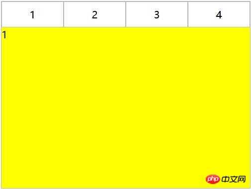
Use negative margin to align the content area, and then add the background color to the content , to avoid perspective overlap of areas corresponding to different tabs.
2. CSS interaction
1. Anchor pointImplementation (target)
(1) For layout one: items are arranged from top to bottom, and the parent element tab-content is added with overflow:hidden. Using the anchor point, when you click on different a tags, the item with the corresponding ID will switch to the view of the tab-content, and then use hover to add a switching style to the tab button.
<p class="container">
   <p class="tab-content">
     <p id="item1" class="item">内容1</p>
     <p id="item2" class="item">内容2</p>
     <p id="item3" class="item">内容3</p>
     <p id="item4" class="item">内容4</p>
   </p>
   <p class="tab-control">
     <ul>
        <li><a href="#item1">内容1</a></li>
        <li><a href="#item2">内容2</a></li>
        <li><a href="#item3">内容3</a></li>
        <li><a href="#item4">内容4</a></li>
     </ul>
   </p>
</p>
##
ul,li{
  margin:0;
  padding:0;
  list-style:none;
}
.container{
  width:400px;
  height:300px;
  background-color:silver;
}
.tab-content{
  width:100%;
  height:80%;
  overflow:hidden;
}
.tab-content .item{
  width:100%;
  height:100%;
}
.tab-control{
  width:100%;
  height:20%;
}
.tab-control ul{
  height:100%;
}
.tab-control li{
  width:25%;
  height:100%;
  float:left;
  border:1px solid silver;
  box-sizing:border-box;
  background-color:white;
  cursor: pointer;
}
.tab-control li:hover{
  background-color:#7b7474
}
.tab-control a{
  display:inline-block;
  width:100%;
  height:100%;
  line-height:100%;
  text-align:center;
  text-decoration: none;
}
.tab-control a::after{
  content:"";
  display:inline-block;
  height:100%;
  vertical-align:middle;
}
The above method only uses anchor point switching and does not use: target. Modify CSS
##
ul,li{
  margin:0;
  padding:0;
  list-style:none;
}
.container{
  width:400px;
  height:300px;
  background-color:silver;
}
.tab-content{
  position:relative;
  width:100%;
  height:80%;
  overflow:hidden;
}
.tab-content .item{
  position:absolute;
  left:0;
  top:0;
  width:100%;
  height:100%;
}
.tab-control{
  width:100%;
  height:20%;
}
.tab-control ul{
  height:100%;
}
.tab-control li{
  width:25%;
  height:100%;
  float:left;
  border:1px solid silver;
  box-sizing:border-box;
  background-color:white;
  cursor: pointer;
}
.tab-control li:hover{
  background-color:#7b7474
}
.tab-control a{
  display:inline-block;
  width:100%;
  height:100%;
  line-height:100%;
  text-align:center;
  text-decoration: none;
}
.tab-control a::after{
  content:"";
  display:inline-block;
  height:100%;
  vertical-align:middle;
}

.tab-content .item:target{
  z-index:1;
  background-color:yellow;
}
item uses absolute positioning
, and then use:target to modify the element z-index to achieve the switching effect (actually The switching effect can be achieved by controlling the display of elements)
(2) For layout two:
<p class="container">
   <ul>
     <li class="item active" id="item1">
       <p class="title"><a href="#item1">1</a></p>
       <p class="content">1</p>
     </li>
     <li class="item" id="item2">
       <p class="title"><a href="#item2">2</a></p>
       <p class="content ml1">2</p>
     </li>
     <li class="item" id="item3">
       <p class="title"><a href="#item3">3</a></p>
       <p class="content ml2">3</p>
     </li>
     <li class="item" id="item4">
       <p class="title"><a href="#item4">4</a></p>
       <p class="content ml3">4</p>
     </li>
   </ul>
</p>
ul,
li,
p {
margin: 0;
padding: 0;
list-style: none;
}
.container {
width: 400px;
height: 300px;
background-color: silver;
border: 1px solid silver;
}
.container ul {
width: 100%;
height: 100%;
overflow: hidden;
}
.container .item {
float: left;
width: 25%;
height: 100%;
background-color: white;
}
.container .item .title {
line-height: 40px;
border: 1px solid silver;
box-sizing: border-box;
text-align: center;
cursor: pointer;
}
.container .item a {
display:inline-block;
width:100%;
height:100%;
text-decoration: none;
}
.container .item .content {
width: 400%;
height: 100%;
background-color: yellow;
}
.ml1 {
margin-left: -100%;
}
.ml2 {
margin-left: -200%;
}
.ml3 {
margin-left: -300%;
}
.active {
position: relative;
z-index: 1
}
.container .item:target {
position: relative;
z-index: 1
}
.container .item:target .title {
border-bottom: none;
background-color: yellow;
}2. Hover implementation
(1) For layout one: cannot be simply achieved through CSS
(2) For layout Two:
<p class="container">
   <ul>
     <li class="item active">
       <p class="title">1</p>
       <p class="content">1</p>
     </li>
     <li class="item">
       <p class="title">2</p>
       <p class="content ml1">2</p>
     </li>
     <li class="item">
       <p class="title">3</p>
       <p class="content ml2">3</p>
     </li>
     <li class="item">
       <p class="title">4</p>
       <p class="content ml3">4</p>
     </li>
   </ul>
</p>
ul,li,p{
margin:0;
padding:0;
list-style:none;
}
.container{
width:400px;
height:300px;
background-color:silver;
border:1px solid silver;
}
.container ul{
width:100%;
height:100%;
overflow:hidden;
}
.container .item{
float:left;
width:25%;
height:100%;
background-color:white;
}
.container .item .title{
line-height:40px;
border:1px solid silver;
box-sizing:border-box;
text-align:center;
cursor:pointer;
}
.container .item .content{
width:400%;
height:100%;
background-color:yellow;
}
.ml1{
margin-left:-100%;
}
.ml2{
margin-left:-200%;
}
.ml3{
margin-left:-300%;
}
.active{
position:relative;
z-index:1
}
.container .item:hover{
position:relative;
z-index:1
}
.container .item:hover .title{
border-bottom:none;
background-color:yellow;
}3. Label and: checked implementation
(1) For layout one:
<p class="container">
  <p class="tab-content">
    <input type="radio" name="item" class="radio-item" id="item1" checked/>
    <p class="item">内容1</p>
    <input type="radio" name="item" class="radio-item" id="item2" />
    <p class="item">内容2</p>
    <input type="radio" name="item" class="radio-item" id="item3" />
    <p class="item">内容3</p>
    <input type="radio" name="item" class="radio-item" id="item4" />
    <p class="item">内容4</p>
  </p>
  <p class="tab-control">
    <ul>
      <li><label for="item1">内容1</label></li>
      <li><label for="item2">内容2</label></li>
      <li><label for="item3">内容3</label></li>
      <li><label for="item4">内容4</label></li>
    </ul>
  </p>
</p>
ul,
li {
margin: 0;
padding: 0;
list-style: none;
}
.container {
width: 400px;
height: 300px;
background-color: silver;
}
.tab-content {
position: relative;
width: 100%;
height: 80%;
overflow: hidden;
}
input {
margin: 0;
width: 0;
}
.tab-content .item {
position: absolute;
left: 0;
top: 0;
width: 100%;
height: 100%;
}
.tab-control {
width: 100%;
height: 20%;
}
.tab-control ul {
height: 100%;
}
.tab-control li {
width: 25%;
height: 100%;
float: left;
border: 1px solid silver;
box-sizing: border-box;
background-color: white;
}
.tab-control li:hover {
background-color: #7b7474
}
.tab-control label {
display: inline-block;
width: 100%;
height: 100%;
line-height: 100%;
text-align: center;
text-decoration: none;
cursor: pointer;
}
.tab-control label::after {
content: "";
display: inline-block;
height: 100%;
vertical-align: middle;
}
.tab-content .radio-item{
display:none;
}
.tab-content .radio-item:checked+.item {
z-index: 1;
background-color: yellow;
}Use css :checked and + (to select an element immediately after another element, and both have same parent element) selector.
(2) For layout two:
<p class="container">
   <ul>
     <li class="item active">
       <input type="radio" name="item" class="radio-item" id="item1" checked/>
       <label class="title" for="item1">1</label>
       <p class="content">1</p>
     </li>
     <li class="item">
       <input type="radio" name="item" class="radio-item" id="item2" />
       <label class="title" for="item2">2</label>
       <p class="content ml1">2</p>
     </li>
     <li class="item">
       <input type="radio" name="item" class="radio-item" id="item3" />
       <label class="title" for="item3">3</label>
       <p class="content ml2">3</p>
     </li>
     <li class="item">
       <input type="radio" name="item" class="radio-item" id="item4" />
       <label class="title" for="item4">4</label>
       <p class="content ml3">4</p>
     </li>
   </ul>
</p>
ul,li,p{
margin:0;
padding:0;
list-style:none;
}
.container{
width:400px;
height:300px;
background-color:silver;
border:1px solid silver;
}
.container ul{
width:100%;
height:100%;
overflow:hidden;
}
.container .item{
float:left;
width:25%;
height:100%;
background-color:white;
}
.container .item .title{
display:inline-block;
width:100%;
line-height:40px;
border:1px solid silver;
box-sizing:border-box;
text-align:center;
cursor:pointer;
}
.container .item .content{
position:relative;
width:400%;
height:100%;
background-color:yellow;
}
.ml1{
margin-left:-100%;
}
.ml2{
margin-left:-200%;
}
.ml3{
margin-left:-300%;
}
.radio-item{
display:none;
}
.radio-item:checked~.title{
background-color:yellow;
border-bottom:none;
}
.radio-item:checked~.content{
background-color:yellow;
z-index:1;
}The above is the detailed content of Sample code sharing for CSS implementation of Tab layout (picture). For more information, please follow other related articles on the PHP Chinese website!