Home >Web Front-end >CSS Tutorial >Detailed interpretation of visual effects in the application of css3 new features
Detailed interpretation of visual effects in the application of css3 new features
- 迷茫Original
- 2017-03-25 14:29:251558browse
Table of Contents
Background and Border Part One
Background and Border Part Two
shape
- ##Visual effects
- Typography
- User experience
- Structure and layout
- Transition and animation
- Source code download
- Application of box-shadow attribute, format: h-shadow v-shadow blur spread color inset attribute value introduction
- h-sahdow: The position of the horizontal shadow, negative values are allowed
- v-shadow: The position of the vertical shadow, negative values are allowed
- blur: blur distance
- spread: the size of the shadow, expansion distance, can be a negative number
- color: the color of the shadow
- inset/outset: inner or outer shadow
- The shadow’s expansion distance is effective for all four sides and cannot be applied to one side alone.
- box-shadow supports settings for multiple sets of values to take effect at the same time
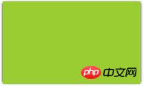
- Sample code:
.wrap{
  width: 200px;
  height: 120px;
  background: yellowgreen;
  box-shadow: 2px 0px 4px -2px black,
  -2px 0px 4px -2px black;
}
- Using the shape generated by border-radius, projection is good, but if pseudo elements and translucent elements are added Decoration and shadow performance are very poor, and there will be problems in the following situations.
- Semi-transparent image,
Background image, or border-image
- element is set to dotted, Dotted or translucent border, but no background (or
background-clip is not border-box)
- The small corners inside the element are generated using pseudo elements
- Shapes generated by clip-path
- Solution: Use drop-shadow of svg to achieve
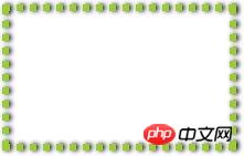
- Sample code:
.wrap{
   width: 200px;
   height: 120px;
   border: 6px dotted yellowgreen;
   --box-shadow: 0px 0px 4px 0px black;
   -webkit-filter: drop-shadow(2px 0px 2px rgba(0,0,0,1))
 }
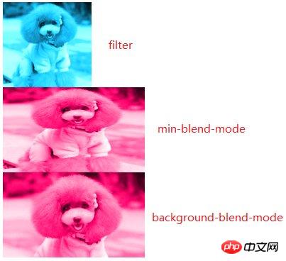
- Based on filters , apply the relevant values of the filter attribute to adjust the saturation, brightness and other values of ## is implemented based on min-bl
- end
-mode, Function: To realize the "mixing" of element content and background and the following elements
Basic background-blend-mode implementation, Function: To realize the mixing of background color and background image, background image and image - Sample codes for three situations:
-
.wrap1{
            width: 200px;
            height: 120px;
            overflow: hidden;
        }
        .wrap1 > img{
            max-height: 100%;
            max-width: 100%;
            -webkit-filter: sepia(1) saturate(4) hue-rotate(150deg);
        }

        .wrap2{
            width: 200px;
            height: 120px;
            background: hsl(335, 100%, 50%);
            overflow: hidden;
        }
        .wrap2 > img{
            height: 100%;
            width: 100%;
            mix-blend-mode: luminosity;
        }

        .wrap3{
            width: 200px;
            height: 120px;
            background-size: cover;
            background-color: hsl(335, 100%, 50%);
            background-image: url("../img/cat.png");
            background-blend-mode: luminosity;
        }
 4. Frosted glass effect
pseudo-elementsThe code is as follows:
body{
    background: url("../img/cat.png") no-repeat;
    background-size: cover;
}.wrap{
    position: relative;
    width: 500px;
    margin: 0px auto;
    padding: 10px;
    line-height: 1.5;
    background: hsla(0, 0%, 100%, .3);
    overflow: hidden;
}.wrap::before{
    content: '';
    background: url("../img/cat.png") 0/cover fixed;
    position: absolute;
    top: 0; right: 0; bottom: 0; left: 0;
    filter: blur(20px);
    z-index: -1;
    margin: -30px;
}
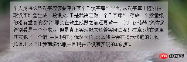 Code description:
- Both body and wrap pseudo-elements are applied The same background image
- wrap's background-attachment is set to fixed, so that the background image does not move with the scroll
- wrap pseudo-element is set to
- Absolute positioning Use blur to set the blur size of the wrap pseudo-element
- Use negative margin values to increase the width, and use overflow:hidden for the parent element to hide overflow to make the blurred background more realistic.
- 5. Corner effect
- First use linear-gradient to achieve corner cutting Effect
- Then use linear-gradinet to generate a triangle, and set its position, width and height
- The code is as follows:
-
.wrap{
        background: linear-gradient(to left bottom, transparent 50%, rgba(0, 0, 0, .4) 0) no-repeat 100% 0/2em 2em,
        linear-gradient(-135deg, transparent 1.4em, #58a 0);
        width: 200px;
        height: 120px;
    }
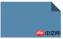 Note
Note
- 100% 0/2em 2em in positioning the position and width of background elements, especially 2em The width and height are the normal width of the background element.
- The 1.4em in the second linear-gradient is measured along the gradient axis, which is the distance from the gradient axis to the top edge of the element. In this case, it is the gradient axis to the upper right The distance from the top of the edge
- to left bottom means that the gradient starts from the lower left corner
The above is the detailed content of Detailed interpretation of visual effects in the application of css3 new features. For more information, please follow other related articles on the PHP Chinese website!
Statement:
The content of this article is voluntarily contributed by netizens, and the copyright belongs to the original author. This site does not assume corresponding legal responsibility. If you find any content suspected of plagiarism or infringement, please contact admin@php.cn
Previous article:How to center an image verticallyNext article:How to center an image vertically

