
Home >Web Front-end >H5 Tutorial >HTML5 practice-detailed explanation of how to complete Google graffiti animation using css3
HTML5 practice-detailed explanation of how to complete Google graffiti animation using css3

- 黄舟Original
- 2017-03-22 16:22:241766browse
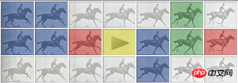
Today we will introduce how to use css3 to complete google graffiti animation. When you click the [Start] button on the demo page, the riders and horses on the page will move.
One thing that needs to be emphasized here is that IE does not support the animation properties of CSS3. I will complain about the evil IE again. . But we cannot use this as a reason not to embrace css3.
Let’s look at the html code first.
<!DOCTYPE html>
<html>
<head>
    <title></title>
    <link rel="stylesheet" type="text/css" href="css/google-doodle-animation-in-css3-without-javascript.css"/>
</head>
<body>
<p id="logo">
    <p class="frame">
        <img src="img/muybridge12-hp-v.png"/>
    </p>
    <label for="play_button" id="play_label"></label>
    <input type="checkbox" id="play_button" name="play_button"/>
    <span id="play_image">
        <img src="img/muybridge12-hp-p.jpg"/>
    </span>
    <p class="horse"></p>
    <p class="horse"></p>
    <p class="horse"></p>
</p>
</body>
</html>
The following is part of the css.
*{margin:0px;padding:0px;}
#logo{position: relative;}
.horse{
    width:469px;
    height:54px;
    background: url('../img/muybridge12-hp-f.jpg');
}
.frame{position:absolute;left:0;top:0;z-index: 1;}

#play_button{display: none;}
#play_label{
    width:67px;
    height:54px;
    display:block;
    position: absolute;
    left:201px;
    top:54px;
    z-index: 2;
}
#play_image{
    position: absolute;
    left:201px;
    top:54px;
    z-index: 0;
    overflow: hidden;
    width: 68px;
    height: 55px;
}
#play_image img{
    position: absolute;
    left: 0;
    top: 0;
}
This part of the code is not too difficult, so I won’t explain it in detail. Readers who do not have a very solid foundation in CSS may wonder how the [Start] button is positioned. You can read the position attribute yourself to understand the specific role of absolute.
The following is the page effect completed by the above html and css code.
Next we will introduce how to produce animation effects. We first need to define keyframes, which specify the effects of animation at different stages. You can learn more at http://www.w3schools.com/css3/css3_animations.asp.
We created a keyframe called horse-ride. For chrome and firefox, you need to add -webkit- or -moz- prefix in front. 0% and 100% are the beginning and end of the code respectively. New cases can be added as needed, such as the animation effect at 50%.
@-webkit-keyframes horse-ride {
    0% {background-position: 0 0;}
    100% {background-position: -804px 0;}
}
@-moz-keyframes horse-ride {
    0% {background-position: 0 0;}
    100% {background-position: -804px 0;}
}
Next, let’s add CSS3 animation effects to the horse.
#play_button:checked ~.horse{
    -webkit-animation:horse-ride 0.5s steps(12,end) infinite;
    -webkit-animation-delay:2.5s;
    -moz-animation:horse-ride 0.5s steps(12,end) infinite;
    -moz-animation-delay:2.5s;
    background-position: -2412px 0;
    -webkit-transition: all 2.5s cubic-bezier(0.550, 0.055, 0.675, 0.190);
    -moz-transition: all 2.5s cubic-bezier(0.550, 0.055, 0.675, 0.190);
}
Here we first introduce :checked and ~, :checked is a pseudo-class, which refers to the css effect when #play_button is selected, and ~ refers to the sibling node of #play_button.
Next, we will introduce the css properties related to .horse. We use 4 values in animation, which represent: keyframe (horse-ride we defined above), animation interval, animation effect and execution number. Then we set the animation delay time through animation-delay. Set the background transition animation by combining transition and background-position.
Finally, we add animation effects to the [Start] button.
#play_button:checked ~#play_image img{
    left:-68px;
    -webkit-transition: all 0.5s ease-in;
    -moz-transition: all 0.5s ease-in;
}
The above is the detailed content of HTML5 practice-detailed explanation of how to complete Google graffiti animation using css3. For more information, please follow other related articles on the PHP Chinese website!
Related articles
See more- AlloyTouch full-screen scrolling plug-in creates a smooth H5 page in 30 seconds
- HTML5 actual combat and analysis of touch events (touchstart, touchmove and touchend)
- Detailed explanation of image drawing examples in HTML5 canvas 9
- Regular expressions and new HTML5 elements
- How to combine NodeJS and HTML5 to drag and drop multiple files to upload to the server